What’s In The Box?

2019 has been a productive year so far, and has featured a few more ambitious music-packaging projects than I usually get the pleasure of contributing toward. The project I’ve been most excited by this year has finally become real:

Jet Star meets Hospital stopmotion

Jet Star Meets Hospital is a collaboration album between Drum & Bass record-label-and-good-friends Hospital Records, and legendary reggae record label Jet Star Music. The album has been a long time coming. We have all worked on it for multiple years, through various moments of flipflopping between looking like it’s definitely going to happen and looking like it’s never going to see the light of day, but it’s finally here!
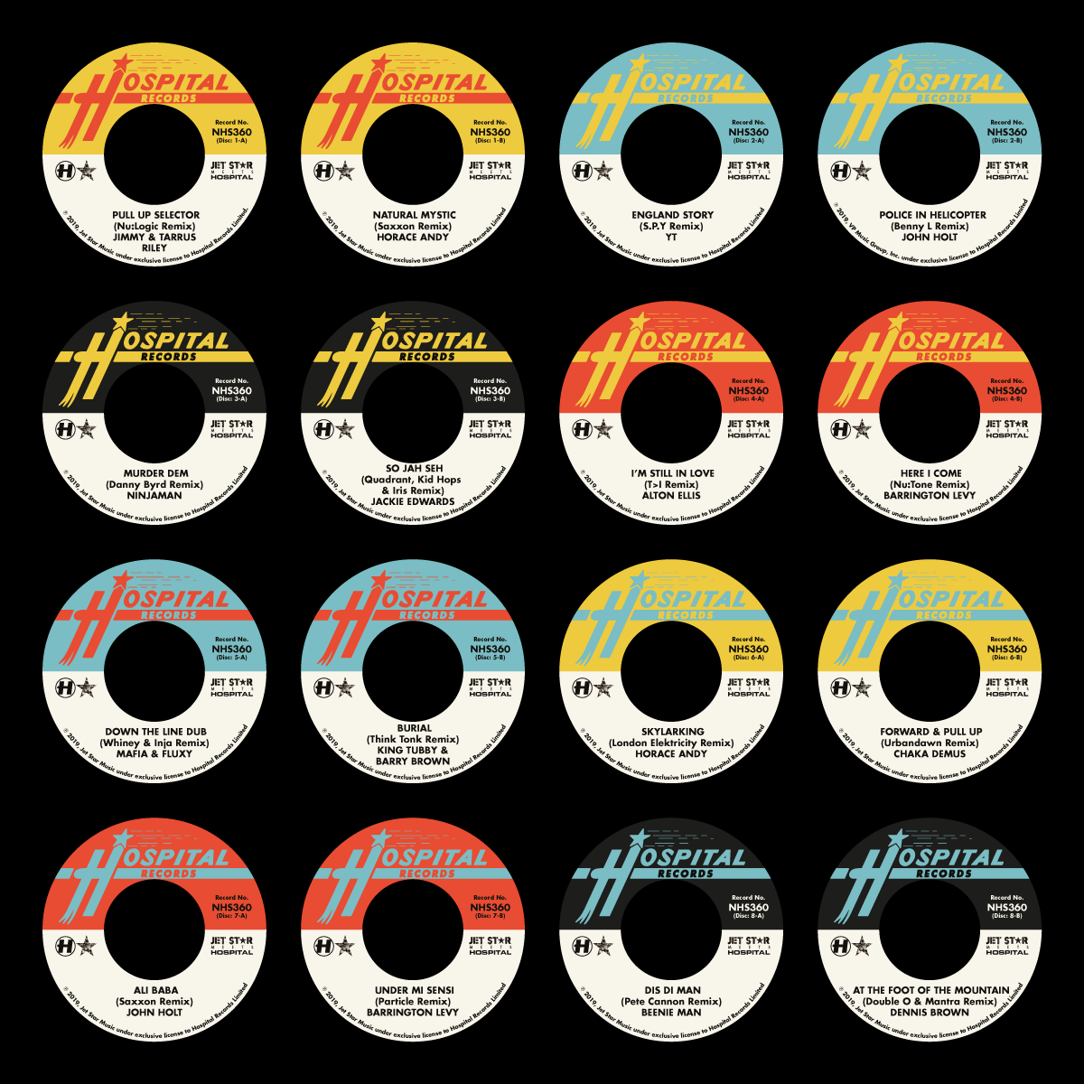
JSMH Dinked Centre Labels

The physical product is special. It’s eight 7″ 45RPM records, each of which have been ‘dinked’ (which means they have the huge centre holes, like classic reggae 7″s have). It’s a full version of the album on CD in a digipak packaging. It’s a pair of exclusive 7″ Hospital logo slipmats in a unique ‘Surgical Slippers’ packaging. And because centre holes are big and label copy is long for collaboration records, it’s also a minuiature poster/flyer of the artwork and credits too. And all of this is wrapped up in a miniature record box adorned with the artwork, and ready to fill with the rest of your 45RPM record collection.
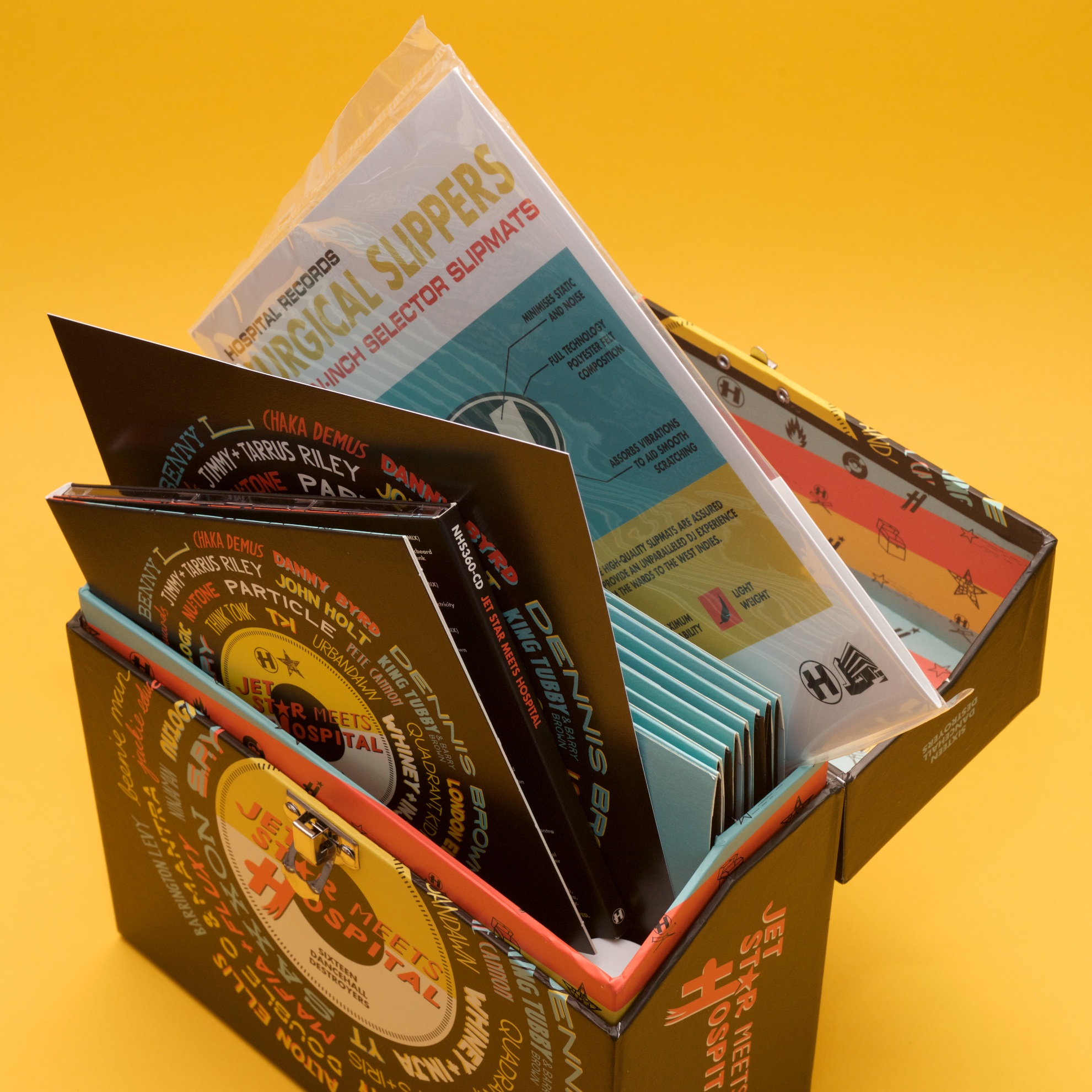
Inside the JSMH box

It’s not often I get to design a package with so many individual parts, but doing all the pieces proved to be the easy bit. As is often the case in my world, the much harder part is the creative idea. We didn’t want to go too dumb with the reggae clichés, so we agreed on a cover design approach featuring all the names of the artists involved in the album. I found a nice old record sleeve from the seventies I liked as a starting point, but quickly found that fitting so many names around a central title using pre-designed type an unnecessarily difficult task, so quickly changed my approach to doing it all by hand.
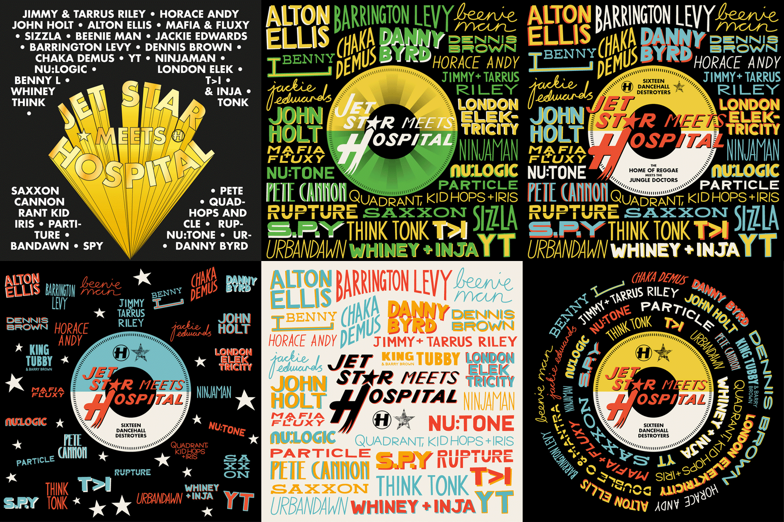
JSMH Cover Design Process

This idea was sound, but direction came from Hospital to make the title more pronounced and to use this as an excuse to emphasise the 7″ format of the project, so we did that. Everyone on the Hospital side was happy, but when Jet Star saw it, they were concerned that it looked too much like one of their competitors’ albums, so back to the drawing board I went. The solution I ended up finding was to not throw all my nice hand-drawn type out completely, but to change its layout, wrapping it around the centre-label design in the middle. The idea got signed off, and after a few more foolish changes, we were approved enough for me to get working on everything else.
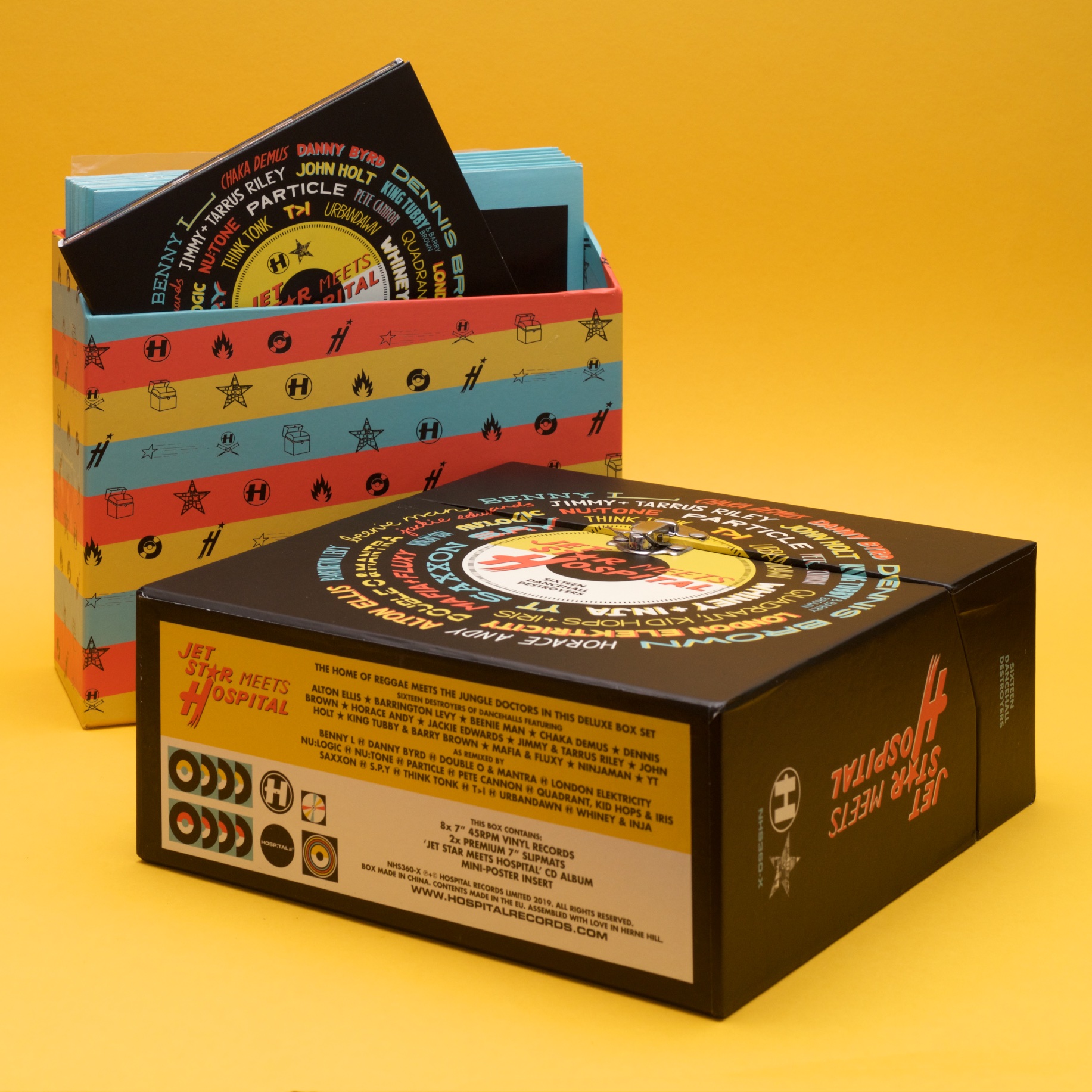
JSMH Box

Many elements of the package (the centre labels in particular) were inspired by some of Jet Star’s designs from the seventies. Using these and a little of my own inventiveness, the package came together like a dream. I was very excited to assemble my own box on a visit to Hospital’s offices earlier this month, and I’m very proud of the work!

My Alma Mater

America is pervasive: Every March, Twitter lights up with talk of March Madness, a huge college basketball knockout tournament, and I am gradually beginning to understand what’s fun about it. Even though I made a new hobby out of watching NBA basketball this winter (which is another story in itself), it’s not the March Madness games that caught my attention.

America is pervasive: It’s always puzzled me a little as to why American college-style clothing became such a thing in the UK, but it did, and it always made me a little happy that my American better-half has a genuine college hoodie from a real university that she, you know, actually graduated from.

As I don’t really have any skin in the game(s), I learned that the fun part of March Madness is to look at the bracket. Look at all those fancy schools, with their fancy logos that the world likes to emulate in fashion. It brings me a small amount of disappointment to think that Kentucky would be full of kids in ‘UK’ hoodies, and small amount of pleasure to think that there are probably thousands of students walking around in Houston wearing sweatshirts that say ‘UH’ in massive on them.

Because I’m neither American nor someone who even made it to a bachelors programme to drop out of, it all made me feel a little left-out. What I am, though, is a capable designer, so in the spirit of March Madness, I took it upon myself to create an alma mater of my own:

University of Great Hair

Here’s a little timelapse of the design process:

Now I don’t feel so left out. The finished result:

On Line

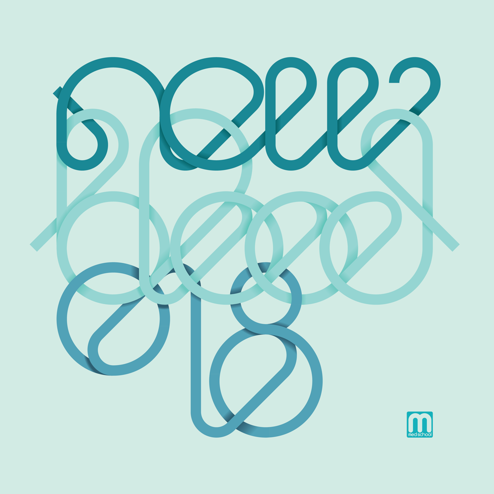
I’ve been feeling good about a lot of the record covers to come out of my brain-hands lately, but the cover for New Blood 018 deserves a spot of text to go with it – perfect for the blog.

New Blood 018

This artwork was inspired by a visit to my brother, who managed to break his leg while taking his kids to the park, and was in real-hospital as a result of the accident. One of his ward-mades was getting a transfusion while I was visiting, and I found the vividness of the blood running from the bag and through its tubing partly fascinating and partly humbling as it squiggled all over this poor chap’s bed.

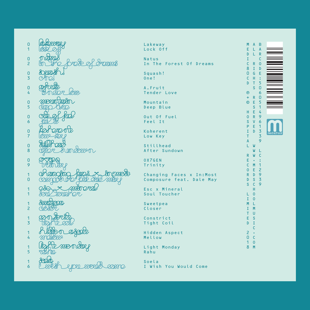
NB018 CD Reverse

The image stayed with me, so I took the idea of the constant line to the typography for this artwork, and designed a suite of artwork around the concept. My original version was just as bold as the blood I saw in the hospital that day, but the creators of an album series called ‘New Blood’ insisted that it was too bloody, so I changed the palette entirely to some classic clinical teal shades.

Sweetpea - Closer - custom typography

Ox7gen - Trinity - custom typography

As well as the typography that made the cover itself, I also sweated the details with the entire tracklisting, with every artist and title drawn in the same single-line style. I was really pleased with how it looks, but we all agreed it wasn’t the most legible, so we compromised and I created a design that had transcriptions too.

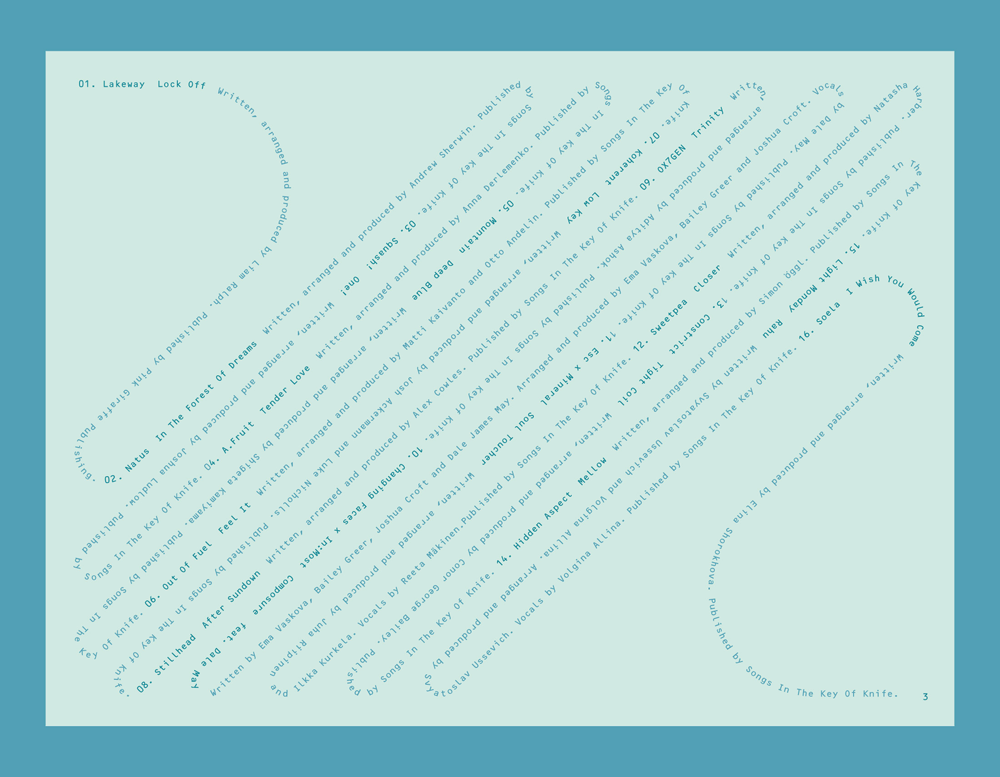
NB018 Digital booklet label copy

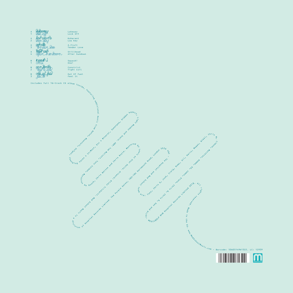
I continued the single-line concept through all aspects of the design, including all of the label copy, which I snaked on single weaving lines through the artwork on all formats. With most of my indulgences approved in the end, the album went off to press, and is out on Med School Music this week.

NB018 Vinyl LP back cover

“It’s almost 3D, this album!”

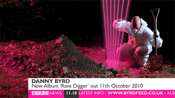
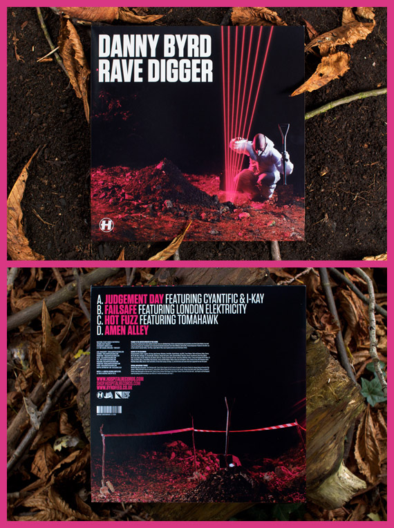
Today’s the day Rave Digger comes out- Danny Byrd’s latest album and my latest project for Hospital. This has been my biggest project both in terms of the amount of stuff I’ve created for it and the amount of exposure it has been getting, so in my usual feigned attempt at quantifying the work I’ve put in, here is a blog post showing everything I’ve managed to round up from the album, along with a bit about the process of designing it.

Continue reading ““It’s almost 3D, this album!””

Learning, Improving things and Play:musik

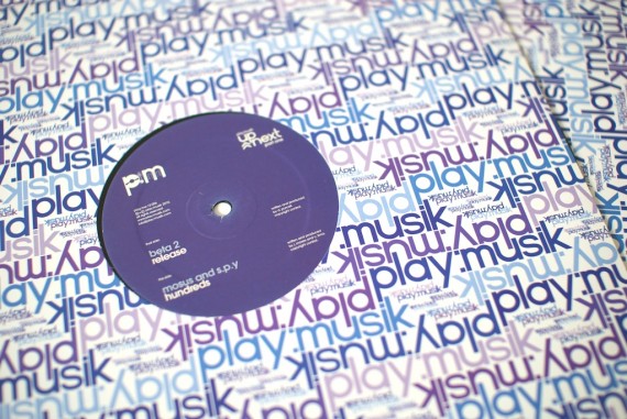
DJ Flight’s label play:musik is back! I was only nineteen when Flight very kindly gave me the opportunity to create the original artwork and identity for the label, but I have learnt a lot in the past five years, so the label’s relaunch was a good time to make some improvements to the artwork. This post is about the changes I have made, the things I have learnt, and the artwork, so if you’re interested, Continue reading “Learning, Improving things and Play:musik”

Little Oranges

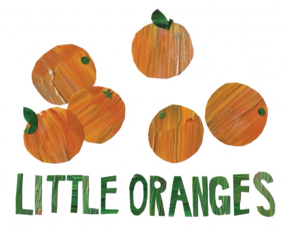
Good work comes from good projects, which in my line of work, usually means good record titles to design for. ‘Little Oranges’ has to be the best track title I’ve had the pleasure of working with since Credit Crunch! Was B-Complex thinking of satsumas? Clementines? Tangerines? We may never know!

More pictures after the fold. Continue reading “Little Oranges”

Remix Your Mind

OK, so here is the artwork I did for the remixes of Bop’s debut album, Clear Your Mind. As it’s a remix EP, like the musicians featuring, I was given the original in pieces and left to produce my own take on it- a remix! Clever huh?!

Scott AKA Ithinkitsnice was responsible for the original artwork. He is probably the most inspiring person to pass through the Drum+Bass artwork world in a while- his drawings are genius and make me wish I was less afraid of pencils and sheets of paper bigger than post-it notes!

Anyway, despite it meaning less work for me, I was rather pleased when I found out Med School had commissioned him to do the artwork, as it was like nothing I would’ve thought up! I was quite excited when I was asked to give it a rethink, as I had a few ideas of where I could take it. I tried a few things, including an ill-thought-out idea for projecting the graphic with light to form the image, but after some fruitless experimenting with lights and some time spent mucking around with the art on the computer, I ended up with a cleaned-up and rejigged version of the original artwork.

As for the book, if you follow my SCED project, you will have seen it already. When Tom at Hospital saw the artwork, he said he liked it because it looked like some kind of old 70s textbook cover. I thought yeah! so I set about turning it into one with a bit of photoshop fun. The book ended up even more interesting than the record cover in my opinion, but the cover had already gone to print. I guess you need the actual record cover as the middleground for it to make complete sense.

Remix Your Mind by Bop features Remixes from Blu Mar Ten, Lynx+Hellrazor, Subwave, Unquote and remix competition winner Thinnen. It is out now on full-artwork promo, and will be out on general release 2×12″ doublepack and MP3 Download on 10th May 2010 on Med School.

What I do all day

If you follow me on the Twitter/Flickr/SCED thing, you will likely have seen this already, but it’s worth posting here. It’s a little taster of the sort of thing I do every day, condensed down to about 30 seconds through the magic of timelapse! Unfortunately my little Flip only records two hours in one hour segments, so that’s all we have in this video. I probably could’ve done with setting my nikon to timelapse more frequently than one frame per minute too, but it works!

It seemed to get a good reception on the flickrtwitter, so I guess it’s relatively interesting, although I think a lot of the interest came from Hospital stalkers – I know you meticulously went through this frame by frame to get the Sick 2 tracklisting out of it!! Yikes!

Crash Bang Wallop – Process

NHS156CD-Packshot-2

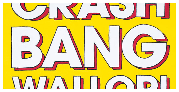
Music-making man-machine Logistics’ third album (well, fourth if you count a digital-only album) Crash Bang Wallop! is hitting stores, shelves and record players worldwide next month, so as this blog is now somewhat alive again, here is a little bit about the process of creating this album’s arwork.

This project started in typically late-notice fashion (ah, my topsy-turvy relationship with underground music), as while the project was mentioned several weeks prior, there wasn’t a title until mid-July. This meant a fast schedule, and the project came a long way in a short time.

Continue reading “Crash Bang Wallop – Process”

 
You are currently reading
Page 1