What’s In The Box?

2019 has been a productive year so far, and has featured a few more ambitious music-packaging projects than I usually get the pleasure of contributing toward. The project I’ve been most excited by this year has finally become real:

Jet Star meets Hospital stopmotion

Jet Star Meets Hospital is a collaboration album between Drum & Bass record-label-and-good-friends Hospital Records, and legendary reggae record label Jet Star Music. The album has been a long time coming. We have all worked on it for multiple years, through various moments of flipflopping between looking like it’s definitely going to happen and looking like it’s never going to see the light of day, but it’s finally here!

JSMH Dinked Centre Labels

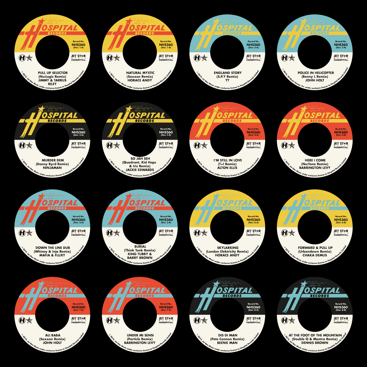
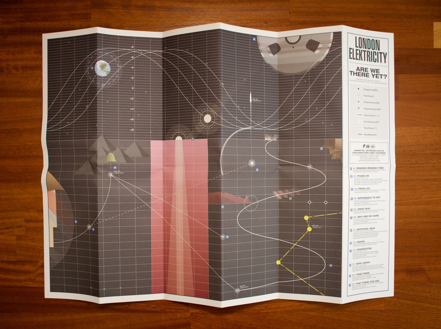
The physical product is special. It’s eight 7″ 45RPM records, each of which have been ‘dinked’ (which means they have the huge centre holes, like classic reggae 7″s have). It’s a full version of the album on CD in a digipak packaging. It’s a pair of exclusive 7″ Hospital logo slipmats in a unique ‘Surgical Slippers’ packaging. And because centre holes are big and label copy is long for collaboration records, it’s also a minuiature poster/flyer of the artwork and credits too. And all of this is wrapped up in a miniature record box adorned with the artwork, and ready to fill with the rest of your 45RPM record collection.

Inside the JSMH box

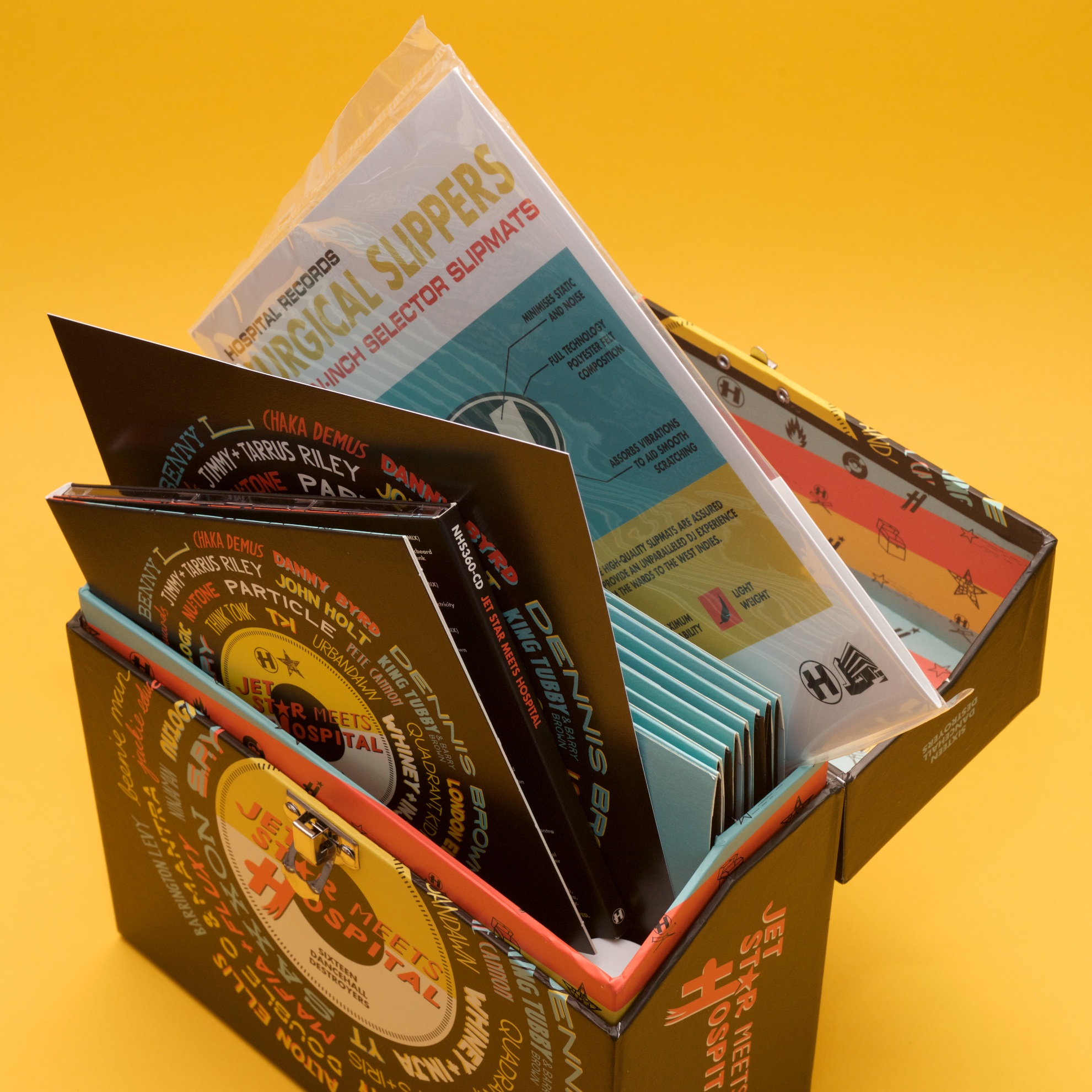
It’s not often I get to design a package with so many individual parts, but doing all the pieces proved to be the easy bit. As is often the case in my world, the much harder part is the creative idea. We didn’t want to go too dumb with the reggae clichés, so we agreed on a cover design approach featuring all the names of the artists involved in the album. I found a nice old record sleeve from the seventies I liked as a starting point, but quickly found that fitting so many names around a central title using pre-designed type an unnecessarily difficult task, so quickly changed my approach to doing it all by hand.

JSMH Cover Design Process

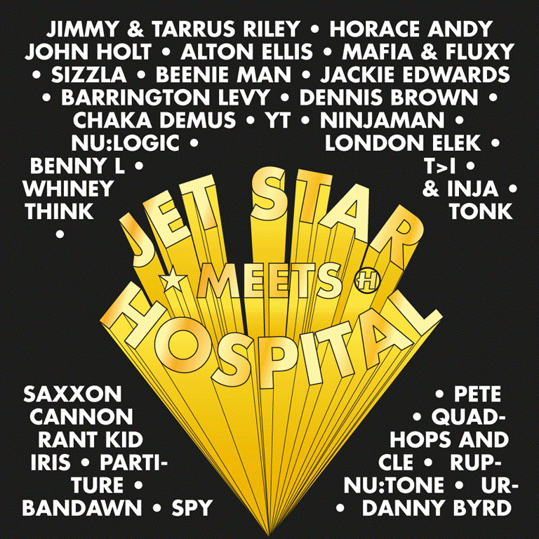
This idea was sound, but direction came from Hospital to make the title more pronounced and to use this as an excuse to emphasise the 7″ format of the project, so we did that. Everyone on the Hospital side was happy, but when Jet Star saw it, they were concerned that it looked too much like one of their competitors’ albums, so back to the drawing board I went. The solution I ended up finding was to not throw all my nice hand-drawn type out completely, but to change its layout, wrapping it around the centre-label design in the middle. The idea got signed off, and after a few more foolish changes, we were approved enough for me to get working on everything else.

JSMH Box

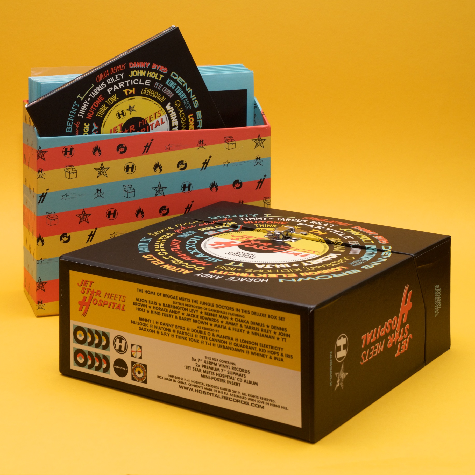
Many elements of the package (the centre labels in particular) were inspired by some of Jet Star’s designs from the seventies. Using these and a little of my own inventiveness, the package came together like a dream. I was very excited to assemble my own box on a visit to Hospital’s offices earlier this month, and I’m very proud of the work!

Odyssey Oddity

Exciting times arrived in Rickmansland this spring, bringing a small commission from a big company. Red Bull asked me to design a T-shirt for a music event they were hosting in June. Named The Odyssey, the event took place on a small armada of boats on the Thames.

I was asked to come up with a design that I felt represented Drum & Bass music, and being me, I wanted to steer away from the hoodies-and-graffiti visual cliches of the genre. Instead I tried to illustrate what the music does – offers a place to escape into something totally different to other stuff we have on our planet and sink into a different dimension.


Red Bull were also kind enough to post a brief interview with me onto their website, which you can read here. I am thankful that even with the tint of hindsight, I don’t sound too ridiculous in the article. If you like the T-shirt design, you can order yourself one here!

More Pandas Than China

Lilly and I went on a summer holiday to Sardinia this year, and while we were there, we were astonished by the amount of Pandas everywhere. Of course, I’m not talking about the Chinese bears, but the Fiat manufactured in the 1980s and 90s.

It was almost as if Sardinia is where Italy sent its Pandas not to die but to just keep on living.

We were both charmed by these boxy little powerhouses, so it was a good cue to make Lilly a new piece of artwork for her birthday. I began researching the materials that were used to sell the car during its original run, but there was no escaping this being a car of the eighties:

As magnificent as those are, I was looking for something that spoke a bit more to how thirty years later, the cars were still so happy rattling through the dusty landscapes of the Mediterranean. The native Italian materials weren’t any more inspiring with their woefully stretched typography, but France proved to have some more playful typographic ideas for selling these little Fiats:

The only trouble is I had no idea what the French typography said, and online translation wasn’t being much help to me either. My first few attempts of running the full slogan ‘Les Voitures à Malices’ through the internet tried to tell me it meant ‘The Cars With Malice’ or ‘The Malicious Cars’, and I couldn’t imagine even the French would try and sell a car on the idea that it would harm you.

Instead I decided it must’ve been idiomatic, so I asked a French friend to help me (her response: ‘I’m so French it’s beyond belief’), who explained that it meant ‘cheeky, facetious, witty all at once’, and was like boite à malices, ‘a box with lots of stuff that would be fun for kids’; a box of tricks. That sounded perfect to me, so I had to get back into the other hard part, illustrating the car in a way that captured its humble boxiness.

My first couple of attempts looked too boyish, and like something from a video game. Definitely not the right flavour. Instead, a basic profile shot proved to be the winner, and when combined with a bit of the mountainous terrain of Sardinia and a little more of the French marketing materials, everything came together just right.

Of course, the most important thing in all of this is that Lilly loved the artwork, so we immediately put it up on the wall!

A Quick Cuppa

Here is my latest and greatest record cover artwork! It’s for St. Petersburg’s Bop, and a collaboration between Med School and Microfunk.

Bop wanted the artwork to look “pretty but a little bit dangerous so you wouldn’t drink it”. I tried using petrol to get a thin-film effect, but it made my Rickmansland studio smell like a garage. After a different approach, I ended up on this psychedelic cup of cha. It’s one of my favourite pieces of artwork in a little while, and it’s out today!

Appendix: A Nice Way to End a Strange Year

It’s not often you get the opportunity to revisit a commissioned design project, but it happened to me this year. To close out their twentieth year in business (and the coincidental timing of the big-number NHS300 in their catalogue), Hospital has published another book.

NHS300: Appendix

We called it Appendix, which I’m sure my more loyal followers wouldn’t be surprised to hear was my idea, given my puntastic instagram feed. It’s a 180-page hardback book, approximately the size of a 12″ record, that comes with a six-track EP of collaborations between some of the label’s current album roster. It’s a proper coffee-table art book!

Appendix: Identity

NHS300 is like a bigger, better version of NHS200. As well as being a lot larger and more robust physically, it also includes a lot more content. Naturally, it includes all of the label’s history and artwork roots, a lot of which has been expanded upon and rephotographed for the project.

Appendix: Early Logistics

It also encompasses the five years that have (unbelievably) happened since NHS200. In that short time, there has been a hundred more releases on Hospital, another 38 on little-sister Med School, a huge shift in the stable of artists working on albums for the labels, and countless ever-growing parties, all of which is covered in this book.

Appendix: New Blood

As well as rethinking the design of the book from the ground up, another new feature is more writing from me! I seem to have made a bit of a career at Hospital of writing silly things on products as placeholder, only to have the label staff tell me to leave it there as they like it.

Ricky's Rejects
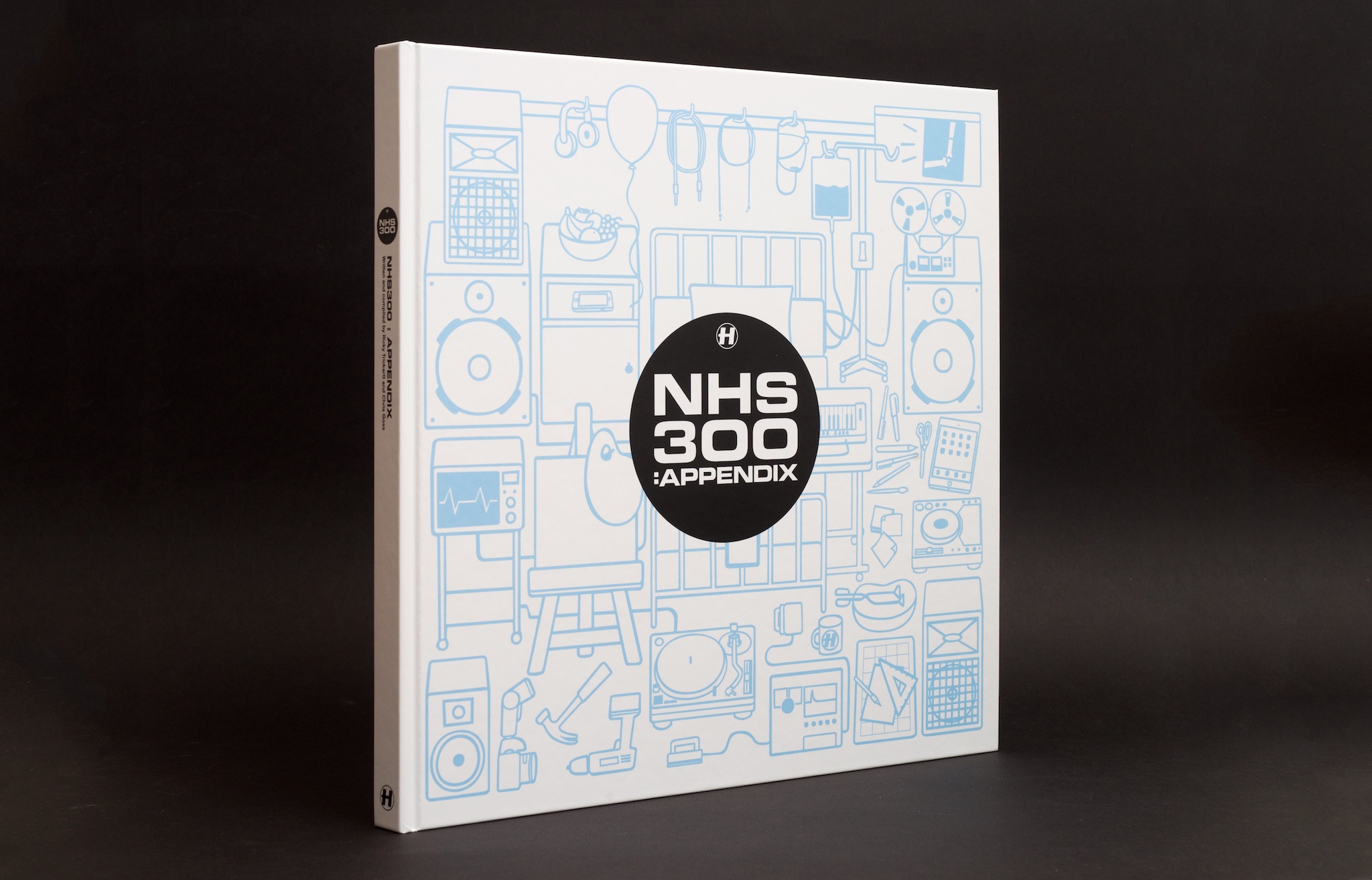
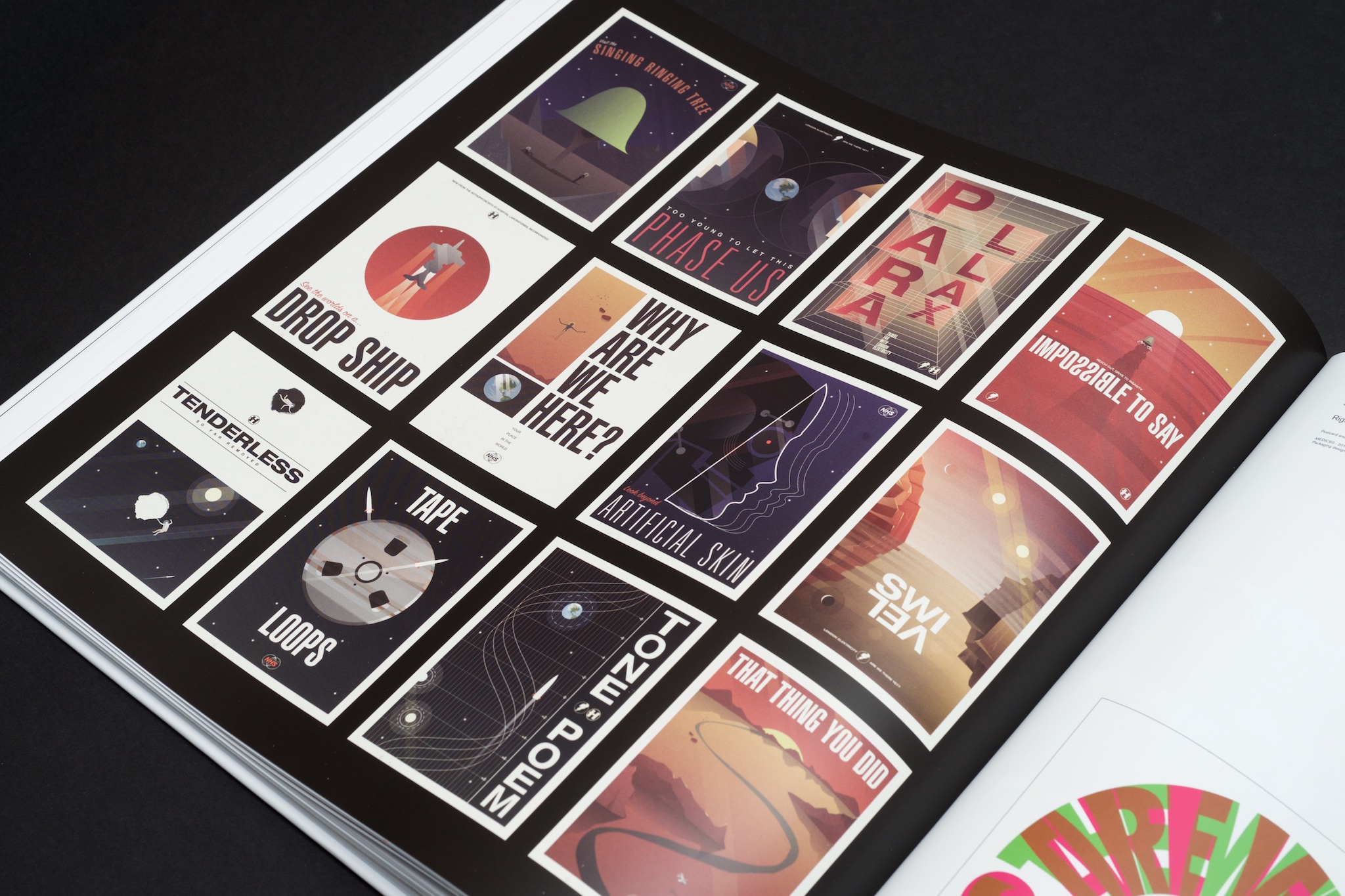
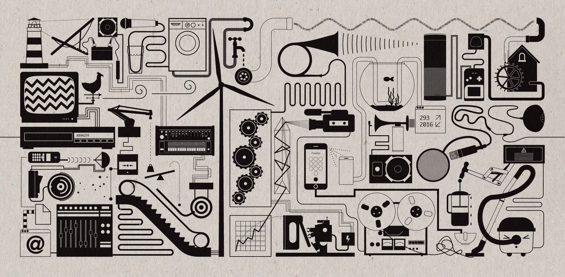
This has come out in Appendix in the form of a running ‘Ricky’s Rejects’ section, where I pick out some of my favourite record covers that never were and explain why they didn’t make the cut. From my first-ever album project at Hospital a decade ago, all the way up to NHS298, things are still getting caught in the filters, and I pick out some of the highlights. You’ll have to get the book to see them!

Appendix: Are We There Yet?

Appendix: 2016

I also got to illustrate a unique cover for this, which is another satisfying improvement over NHS200. It’s a hospital room entangled with all the things that make Hospital Records what it is – music, medicine and making things, which I hope is reflected in this book!

To promote the book, Hospital MD Chris came out to my studio in the shires and we chatted about some of the artwork highlights from the catalogue. You can see the video (and some odds and ends from inside my world!) here:

NHS300: Appendix is being sold exclusively on the Hospital Shop. It’s a totally limited product – we won’t be manufacturing any more once they’re sold. So if you want one, you can have it, and just in time for Christmas too. They’re shipping now! It’s an essential object for fans of the label.

Appendix: Spines

Mystery Machine

Krakota's Strange System

More newness! Here is the artwork I created for Krakota’s debut album. He called the album ‘Strange System’, which is totally up my alley when it comes to record titles.

The title made me think of black boxes (as in science/engineering, not aerospace), which are systems that you can give input to and get output from without having any idea of what happens inside the system. I had some crazy idea to create some artwork completely obscured by a black box, but that was too, well, obscure. Everyone on the project seemed to like what I was drawing to go into the box though, so we ended up with that as the cover itself.

Krakota Black Box

Everything is connected in this artwork! Clearly some of the objects are straight out of the mechanical/system corners of my noggin, but a lot of it comes from Krakota – his love of vinyl, celebratory beers and coffee to fuel the writing process, audio bits and pieces, and objects taken from some of his track titles. On the cover is a xylophone (from Xylo), a ghost, some samphire, an ice machine (for Ice Hands), some bones (for Lazy Bones), and the odd elastic bands. There are more track titles in the gatefold artwork too.

krakota-gatefold

I kept my illustrations on this artwork as geometric as possible to make it feel very mechanical, so to contrast that and bring it back into the world of humans, we had all the artwork printed on a nice and heavy unbleached card stock. It roughs it up just the right amount and looks pretty fresh in physical too.

Check the Hospital Shop if you need a copy in your life!

Where We Going?

swi-tl

The other big album project I’ve been working on lately is London Elektricity’s ‘Are We There Yet?’. Tony already had the image he wanted for his album cover from a photo shoot while touring in Japan, but he wanted to go all-out for the special edition of the album, and it was left to me to figure out how.

art-its

Because of the album’s travel-related title, we agreed to do a series of twelve postcards (one for each track on the LP) and a fold-out map too. First I was given a list of track titles, then I got to listen to the album not long after. Tony’s music always sounds like a slightly-retro adventure to me, and I know he’s really into science fiction, so I decided to treat each track as an intergalactic destination, and made each postcard to be a 1960s-inspired travel poster.

five

Once I finished all the postcards I turned my attention to the fold-out map. I couldn’t really make a conventional map as the elements from the postcards transcended planets, oceans and objects, so I came up with this abstract illustration for the job.

mapp

The style of this work is a little bit outside of my usual repertoire, but I’m really pleased with how everything turned out! The map artwork is included in all formats, but to get the postcards, you had to get one of the super-limited box sets.

tdp

My baby: NHS200

I’m pleased to announce (or rather acknowledge as it has been public for a couple of weeks now) that NHS200 is not actually a salmon slicer but a book!

This project has been my baby for the past several months. Making a book of all of the art and other visual stuff from the label is something that Chris and I have wanted to do for a long time, with the idea being suggested several times at Hospital over the past few years. More notes and photos after the fold! Continue reading “My baby: NHS200”

 
You are currently reading
Page 1