Epitaph for a record label

NHS381 marks a sad moment in my music industry design career. I’m no stranger to design and identity projects for labels that have had short runs and naturally fizzled out, but Med School is the first one to very firmly close its proverbial doors after more than a decade.

It came as a bit of a shock to me – and everyone, including the decision-makers, I think, to wind down the label at just shy of 100 releases. It was a hell of a thirteen-year run, but the decision was made, and Hospital decided the best way to acknowledge the label and its exploits should be in the form of a ‘Graduation’ LP on the big label.

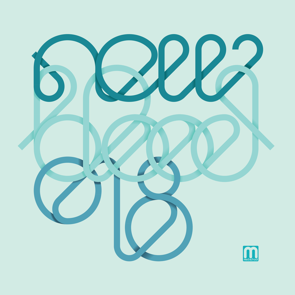
The artwork project proved to be a bit of a battle, but in the end my awkward illustration skillz saved the day, and we ended up with something we all liked. Below is an alternative cut in classic Med School scrubs-green, which didn’t quite win the office popular vote over the full-colour version, but it’s the one I prefer anyway.

Alternative, classic-green Med School Graduation record cover

Beside the Graduation LP, though, it’s worth a moment to look back at the Med School design history, if a little critically. Continue reading “Epitaph for a record label”

On Line

I’ve been feeling good about a lot of the record covers to come out of my brain-hands lately, but the cover for New Blood 018 deserves a spot of text to go with it – perfect for the blog.

New Blood 018

This artwork was inspired by a visit to my brother, who managed to break his leg while taking his kids to the park, and was in real-hospital as a result of the accident. One of his ward-mades was getting a transfusion while I was visiting, and I found the vividness of the blood running from the bag and through its tubing partly fascinating and partly humbling as it squiggled all over this poor chap’s bed.

NB018 CD Reverse

The image stayed with me, so I took the idea of the constant line to the typography for this artwork, and designed a suite of artwork around the concept. My original version was just as bold as the blood I saw in the hospital that day, but the creators of an album series called ‘New Blood’ insisted that it was too bloody, so I changed the palette entirely to some classic clinical teal shades.

Sweetpea - Closer - custom typography

Ox7gen - Trinity - custom typography

As well as the typography that made the cover itself, I also sweated the details with the entire tracklisting, with every artist and title drawn in the same single-line style. I was really pleased with how it looks, but we all agreed it wasn’t the most legible, so we compromised and I created a design that had transcriptions too.

NB018 Digital booklet label copy

I continued the single-line concept through all aspects of the design, including all of the label copy, which I snaked on single weaving lines through the artwork on all formats. With most of my indulgences approved in the end, the album went off to press, and is out on Med School Music this week.

NB018 Vinyl LP back cover

Tiny Dance

Flea Waltz

The latest cover art project to come out of Rickmansland is Frederic Robinson’s Flea Waltz. It’s his second album, but first on Med School and first I got to create artwork for, and it’s a good one!

The brief started with Joan Miró, but I brought in a little bit of a Matisse to it too with the cut-out vibes, then I made it all out of wood. It turned out really well, and compliments the music too (if I do say so myself). Thanks to all involved for indulging me, and to Frederic for making a great album to inspire it!

 
You are currently reading
Page 1