Christmas Cards 2015: The Santa Cruiser

card2015

I’m selling christmas cards again this year. Click here to buy some!

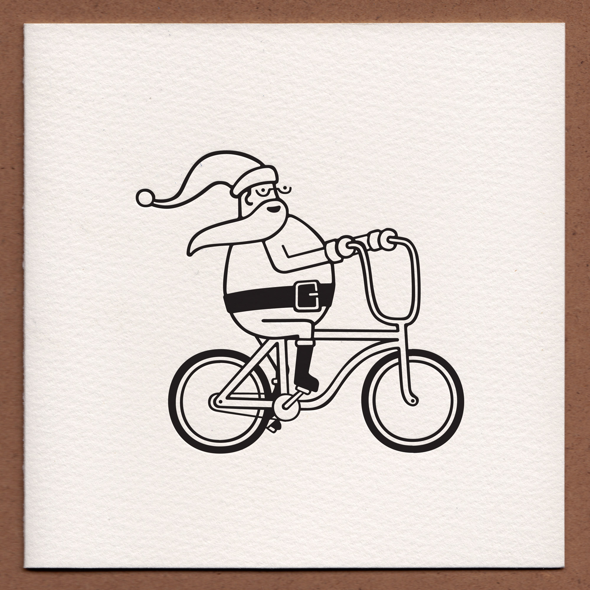
Last year was my first year selling my letterpressed christmas cards, and in hindsight, it was a bit ambitious to try and sell every single design I’ve done all at once when I was printing them on demand. To keep things simpler, particularly under the time constraints, I’m just going to be printing and selling the one design this year, which you should be seeing a mockup of above.

This year was the year of the bicycle for me – Lilly and I got bicycles for the first time since we were teenagers, and spent the summer cycling around Hertfordshire, so we decided to reflect that in this year’s design. In developing the illustration, I tried to put Santa on a variety of bicycles (he looked particularly ridiculous on a racer bike!) and found he fit best on a slightly beach-ish cruiser.

As ever, these cards are being hand-letterpressed onto high-quality 300gsm Somerset card stock, and they will come with appropriately-sized envelopes. This year the envelopes are made of recycled paper, which is a big look!

Cards will be pressed and sent out to you during the first week of December, so they arrive with you in good time to send out to your people. It’s a small selling window, so get yours now!

Would you like some to send to your nearest and dearest? Go and get some here!

S.C.R.A.W.L.S.

This month my beloved American became American-British, so to celebrate, I took her to see the latest James Bond movie with a seven-lettered-word-beginning-with-S-written-in-all-caps-for-a-title. Just like all the other bond movies, this one didn’t make a huge impression on me, but it did yield my favourite post-it note of the month, which was a musing on how Daniel Craig seemed to be wearing a different pair of designer sunglasses in pretty much every scene of the movie. Very stylish, but it made the movie feel a little like a Sunglasses Hut commercial.

Elsewhere this month, I’ve been watching the World Gymnastics Championships and chuckling every time someone did a move called a pike, pondering how technology makes impossible things possible, and hiding robots into everyday scenes.

A pretty good, pretty scattered month!

After the fold are all the old direct links, for posterity’s sake. Continue reading “S.C.R.A.W.L.S.”

Where We Going?

swi-tl

The other big album project I’ve been working on lately is London Elektricity’s ‘Are We There Yet?’. Tony already had the image he wanted for his album cover from a photo shoot while touring in Japan, but he wanted to go all-out for the special edition of the album, and it was left to me to figure out how.

art-its

Because of the album’s travel-related title, we agreed to do a series of twelve postcards (one for each track on the LP) and a fold-out map too. First I was given a list of track titles, then I got to listen to the album not long after. Tony’s music always sounds like a slightly-retro adventure to me, and I know he’s really into science fiction, so I decided to treat each track as an intergalactic destination, and made each postcard to be a 1960s-inspired travel poster.

five

Once I finished all the postcards I turned my attention to the fold-out map. I couldn’t really make a conventional map as the elements from the postcards transcended planets, oceans and objects, so I came up with this abstract illustration for the job.

mapp

The style of this work is a little bit outside of my usual repertoire, but I’m really pleased with how everything turned out! The map artwork is included in all formats, but to get the postcards, you had to get one of the super-limited box sets.

tdp

 
You are currently reading
Page 1