Headstand

Whiney's Waystone LP

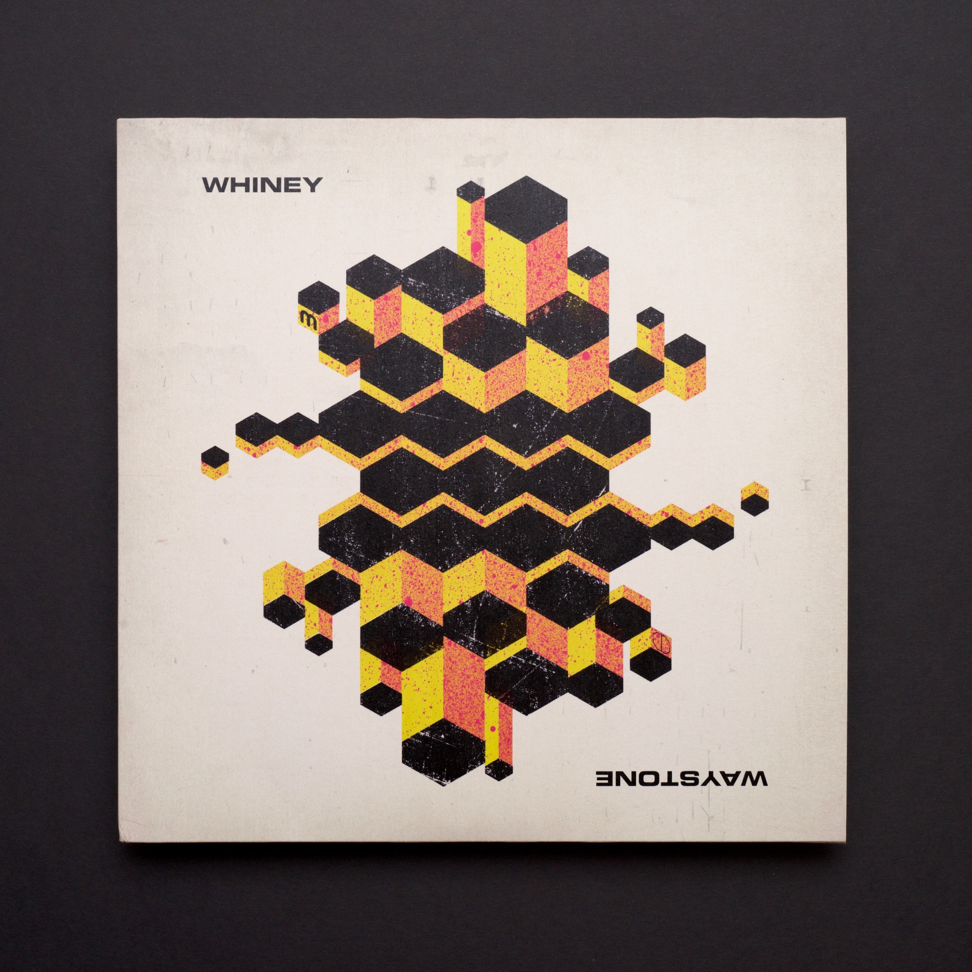
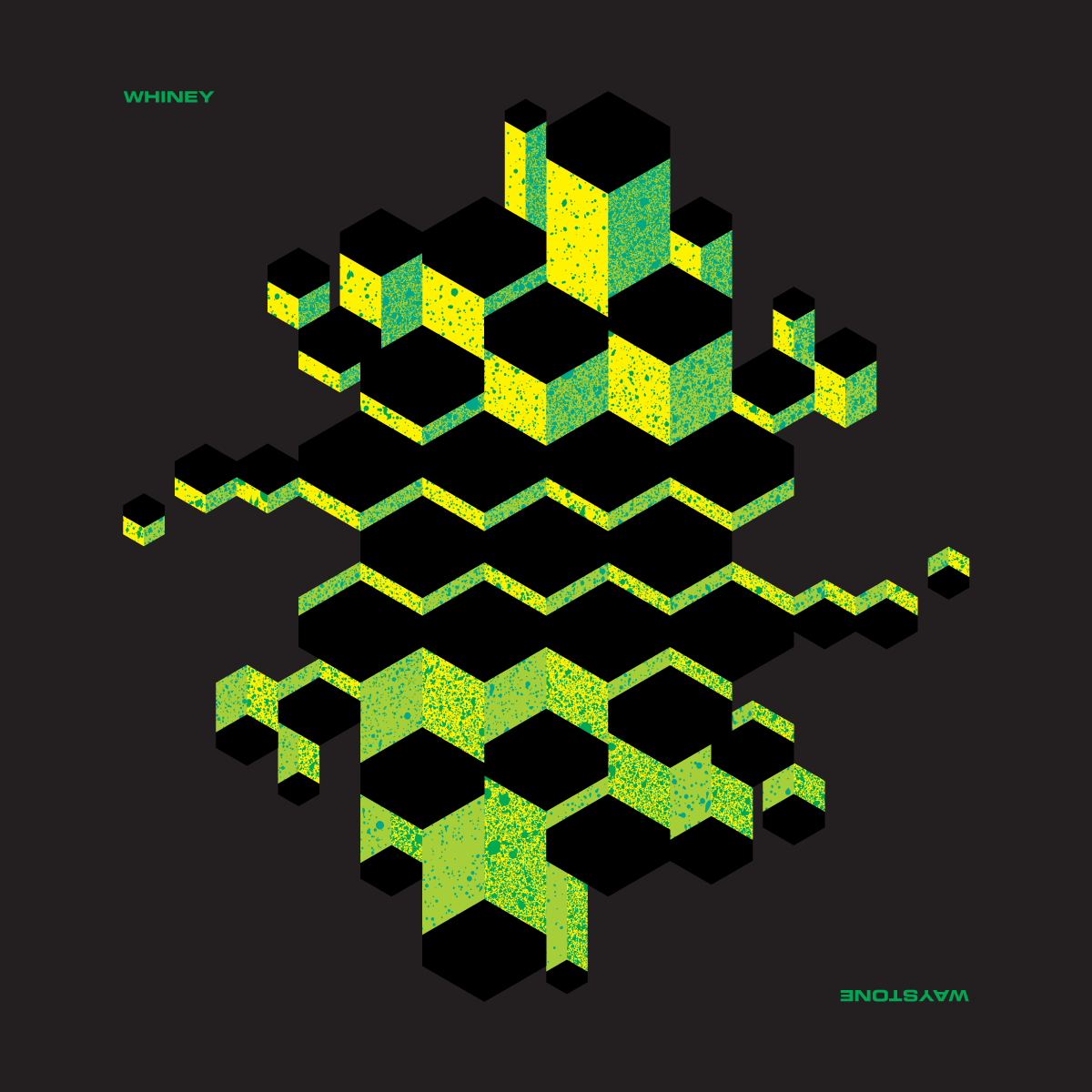
Catching up a little on this one: Last autumn I had a fun extra-project for an album I worked on. Med School came to me with Whiney’s second album, and the title for it was ‘Waystone’. I really liked the title, and it made me think of the Giant’s Causeway, which was the main inspiration for the artwork. To make it a bit more interesting, I had an idea of using rotational symmetry to ‘break’ the faux-3D graphics, making it feel like it bent around the other way.

The idea was a sell, but as this is Drum and Bass, Whiney wanted my original version to be grimier. I obliged, and although it wouldn’t have been my choice, it ended up opening up an interesting opportunity further down the album’s development run. The label wanted some extra video content and asked me if there was some way I could do a live painting of the artwork – I thought a stencil would suit the more roughed-up design very well.

Conveniently, the label had recently moved into a new office featuring some dead space waiting to be converted into a new studio. The back wall of this space was offered to me to fill with spray fumes, and I was glad I brought a new respirator with me (Don’t spray-paint indoors without one, kids)! I spent a dark winter afternoon down south of the river laying down a bit of colour:

It made for a good backdrop for a live-streamed DJ set before it was entombed behind the new Hospital Records studio this winter. And it gave me a good excuse to do a bit of artwork on a different scale to what I usually do!

On Line

I’ve been feeling good about a lot of the record covers to come out of my brain-hands lately, but the cover for New Blood 018 deserves a spot of text to go with it – perfect for the blog.

New Blood 018

This artwork was inspired by a visit to my brother, who managed to break his leg while taking his kids to the park, and was in real-hospital as a result of the accident. One of his ward-mades was getting a transfusion while I was visiting, and I found the vividness of the blood running from the bag and through its tubing partly fascinating and partly humbling as it squiggled all over this poor chap’s bed.

NB018 CD Reverse

The image stayed with me, so I took the idea of the constant line to the typography for this artwork, and designed a suite of artwork around the concept. My original version was just as bold as the blood I saw in the hospital that day, but the creators of an album series called ‘New Blood’ insisted that it was too bloody, so I changed the palette entirely to some classic clinical teal shades.

Sweetpea - Closer - custom typography

Ox7gen - Trinity - custom typography

As well as the typography that made the cover itself, I also sweated the details with the entire tracklisting, with every artist and title drawn in the same single-line style. I was really pleased with how it looks, but we all agreed it wasn’t the most legible, so we compromised and I created a design that had transcriptions too.

NB018 Digital booklet label copy

I continued the single-line concept through all aspects of the design, including all of the label copy, which I snaked on single weaving lines through the artwork on all formats. With most of my indulgences approved in the end, the album went off to press, and is out on Med School Music this week.

NB018 Vinyl LP back cover

 
You are currently reading
Page 1