Speedbeard

This is my creative activity for today, but I’m far too amused by it to only post it on my Flickr-based SCED project, so it’s going up here too! Besides, it looks a lot better via Vimeo than Flickr’s video service.

I took the Vespa out for the first time in the best part of three months this week, and came back feeling rather hairy. I’ve been convinced for almost as long as I’ve been driving this machine that my facial hair grows quicker when I ride the Vespa. It kinda makes sense in a fuzzy (pun not intended) logic kind of way- my face feels the cold, so my body probably tries to do something about it short of growing a scarf!

Fresh Slabs

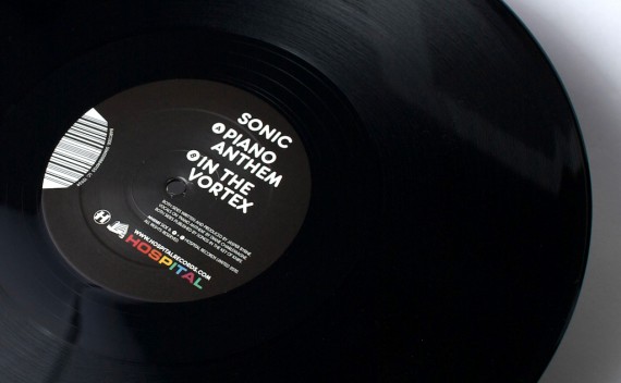
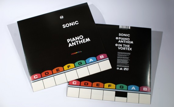
Another trip to Forest Hill today meant another excuse to pick up some finished copies of my work for Hospital! As well as picking up finished copies of Sweet Harmony, some recent flyers and the New Blood 010 album on Med School I tidied up, I also picked this up:

I love designing for print! Finished copies are always, well, finished, whereas designing for Web can always be tinkered with indefinitely (as long as the client lets you!). One of my favourite things about collecting finished copies of records I designed has to be centre labels:

Centre label designs are difficult to keep fresh. They can so easily just be an afterthought to the sleeve’s design and I am always conscious of not just reusing layouts already used for a different artist/label/whatever. Pulling the record out of the sleeve to give it a spin when I get it home usually results in a nice surprise along the lines of ‘Hey! That’s a cool centre label design. I wonder who did that? Oh wait, I did!’, as during the weeks between finishing the artwork and getting finished copies, I only tend to see the front cover, forgetting what I did for the centre labels.

Piano Anthem is out on Monday 1st March on Hospital Records.

Bonus points to anyone who can spot the typographical innuendo in this artwork!

Blue Sunday

Lilly and I got the press back in action today! We printed up a few bits and bobs (Including the Howdy card above, but we only got one ink out, so everything we did is blue!

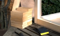
I finally did some linocut stuff to print! I wrote to Jax a couple of months ago after she made a nice linocut print, asking what the lowdown on linocut was (I was surprised it really was as straightforward as sticking some lino to a block of wood), so I ordered some lino from Hawthorn Printmaker Supplies, along with some other bits and bobs, and the package turned up last week. I spent the day yesterday with power tools, working on some small furniture items for the home, and while I was there, chopped a slab of appropriately thick MDF into chase-sized chunks, as seen in the left picture.
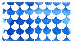
I followed these instructions Jax pointed me in the direction of, and mounted up a few blocks ready to carve. I came up with a simple little fishscale-y pattern to see how it worked, which seemed to go pretty well! It was a lot easier to carve and yielded a lot more even a result than the wood carvings I tried last year. After Lilly printed it up a couple of times, I realised it looked like a big crowd of people sitting in a cinema or something when the other way up:

Hello!

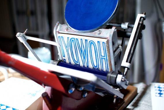
As that went well, I made a nice big Howdy card for us to print, which you should have seen above. Here is my linocut in the press, with some nice off-camera flash action to help bring it out a bit:
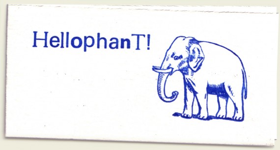
We didn’t stop there either! We also printed a tiny greeting using some of the Mixed type I bought off ebay last week, and the bonus elephant block I bought Lilly as a surprise, which came out much cuter than we were anticipating. Cool!
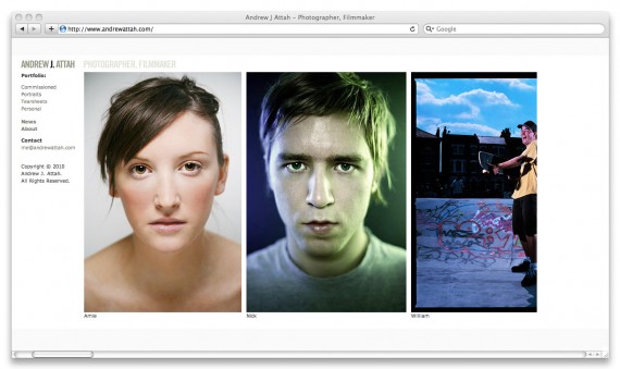
Andrew Attah Website

This week I helped Photographer Extraordinaire Andrew Attah spruce up his website. Now it’s finished, I don’t feel like I did much at all to contribute, but I guess my, er, expertise made a difference. I am pleased with it regardless!

Andrew had the right idea from the start, by moving away from Flash for his online portfolio. He found the nice little open-source CMS Indexhibit to base his new site on, which I then offered to help tidy up. I tinkered a little with the plugins and layout and flexed some CSS to make what we have here – a lot more balanced and user-friendly, but still minimal enough to let the photography do the talking, which is the idea of a photographer’s portfolio!

Check out AndrewAttah.com for a better view of the site and his photos, and keep your eyes peeled for the snaps from his recent Danny Byrd and Netsky photoshoots. Yeah!

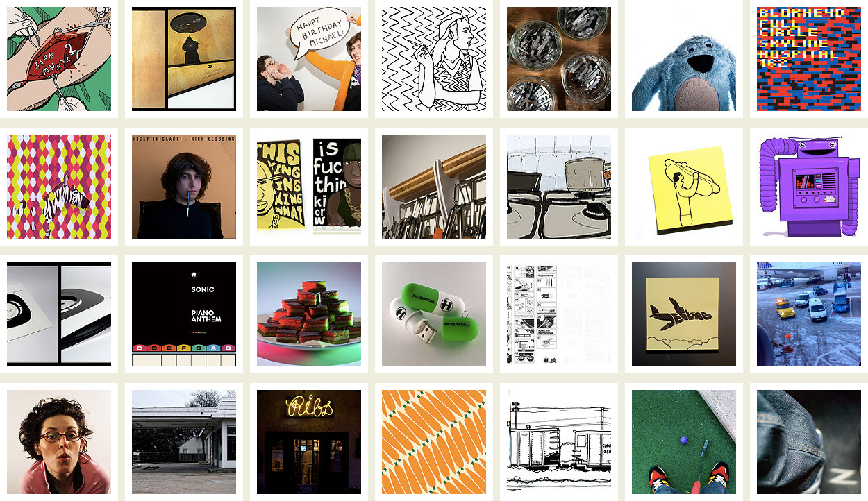
SCED Roundup January 2010

And there goes another month of daily creativity! It’s a bit more work-related than usual as a big catchup was in order when I got back to my desk. I guess the other highlight was my new flashes, which have been helping with some random creativity and nice pictures of things I’ve made too. Disappointingly, not much letterpress action in the past month, but it should be picking up again this month!

Don’t forget, you can follow me on Twitter @trickartt, which tweets whenever I post something here, or now whenever I post my daily creative activity to Flickr! Cool!

After the fold are all the old direct links, for posterity’s sake. Continue reading “SCED Roundup January 2010”

 
You are currently reading
Page 1