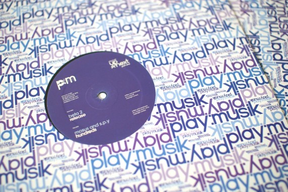
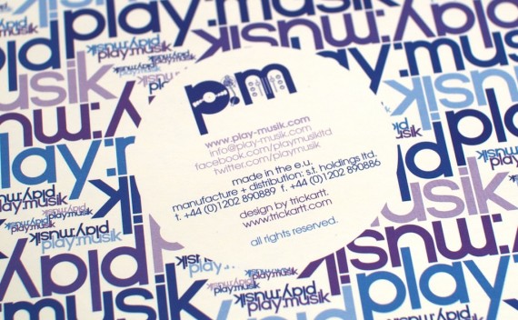
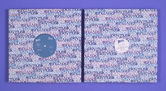
DJ Flight’s label play:musik is back! I was only nineteen when Flight very kindly gave me the opportunity to create the original artwork and identity for the label, but I have learnt a lot in the past five years, so the label’s relaunch was a good time to make some improvements to the artwork. This post is about the changes I have made, the things I have learnt, and the artwork, so if you’re interested, read on!
My biggest sin when I created this artwork five years ago was not knowing about the existence of ITC Avant Garde Gothic. I have to say I’m slightly embarrassed by that now. This was shameful as my original brief for the wordmark was to create a geometric sans-serif like the Adidas logo, which unbeknownst to me at the time, is actually set in Avant Garde. I ended up hand-drawing a geometric alphabet to use, which I think it worked out in a funny kind of way, as I (obviously very subjectively) think what I created is much more unique and interesting than the off-the-shelf font would’ve been. I went to painstaking efforts to get that S right, and I’m proud of it!

So my own handywork might’ve worked out for the wordmark, but it didn’t stop it causing problems for me everywhere else. I had not long fallen out of art school when I designed the original artwork, so I think my resistance to Helvetica as a neutral sans-serif typeface was at its highest. Believing Helvetica was a cliché, I was hell-bent on using Akzidenz Grotesk as I thought it was so much cooler at the time. This was a terrible choice in retrospect, as it’s not modernist in the slightest, and caused a bit of friction with Flight and Paula as the lower-case a was double-story, which didn’t match our wordmark.
So in the new artwork, I am still using my own hand-drawn effort for the wordmarks, but have fully embraced Avant garde Gothic for the small text:
The redesign is about much more than changing a typeface though. The sleeve went through a variety of modifications, some more significant than others.
The biggest change, of course, is colour. I embarked into this career as a designer just before some significant changes happened in the print industry- it was a time where QuarkXpress ruled over InDesign and Illustrator, everything was EPS not PDF, and it was still cheaper to print in a single Pantone than four-colour CMYK process. Because of this, the original artwork’s concept was for each release to be the same artwork printed in a different hand-picked Pantone colour. Flight seems to know her way around colours better than me, so we used to have random meetings in the East End of London over some Pantone swatch books, picking out colours for future releases.
After the first release, however, we learnt times were changing and that one colour per release wasn’t going to be cost-effective. We ended up leaving the sleeve in the original indigo colour and doing each centre label in a complimentary colour. Now full-colour CMYK is the most cost-effective option, we’ve embraced it with the multicolour purple-violet-indigo-blue you should be seeing with this post!
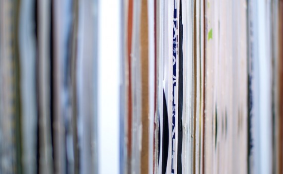
The pattern was staying, as I have always considered it a valuable asset. I always found it stood out nicely on my record shelves; I could always find exactly where my play:musik records were, despite my idiosyncratic shelving technique:
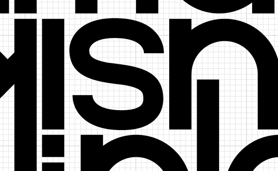
Although we were keeping the pattern, I redrew it so everything fit precisely on a grid and all the characters lined up with each other perfectly. I even managed to fix a detail that had been bothering me for a while- I’d be impressed if anyone else had noticed it, but the smaller elements of the pattern weren’t perfectly rotationally symmetrical on the original sleeve, which drove me mad after I noticed it! The pattern now wraps around both sides of the sleeve too, with the contact information reduced to a small circle in the middle of the back cover.
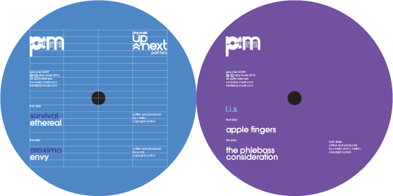
The labels got a redesign I had been itching to do for a while too. I was never convinced by the original centre label designs, which had the artist’s name across the middle of the label. Something never sat right with me about the centre hole going through the text or the point-size of the name changing depending on how short or long it was, but I think the idea was for the focal point of the record to be all about the artists.
The new design has done away with the problem with a completely new grid-based design. The grid makes it diverse enough to work for split 12″s or single-artist records, while still maintaining a consistency.
So that’s the package all together! I got finished copies of the artwork through this morning and they look every bit as good as I had hoped!
Play:me:12:006 and 007 (Up Next parts One and Two) are out on beautiful full-artwork promo now, and should be hitting stores on general release later this month!
