Lilly and I went on a summer holiday to Sardinia this year, and while we were there, we were astonished by the amount of Pandas everywhere. Of course, I’m not talking about the Chinese bears, but the Fiat manufactured in the 1980s and 90s.
It was almost as if Sardinia is where Italy sent its Pandas not to die but to just keep on living.
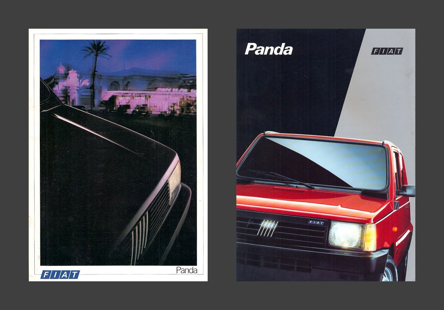
We were both charmed by these boxy little powerhouses, so it was a good cue to make Lilly a new piece of artwork for her birthday. I began researching the materials that were used to sell the car during its original run, but there was no escaping this being a car of the eighties:

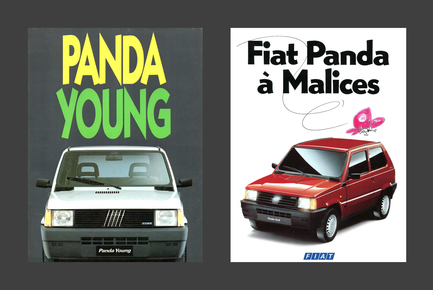
As magnificent as those are, I was looking for something that spoke a bit more to how thirty years later, the cars were still so happy rattling through the dusty landscapes of the Mediterranean. The native Italian materials weren’t any more inspiring with their woefully stretched typography, but France proved to have some more playful typographic ideas for selling these little Fiats:

The only trouble is I had no idea what the French typography said, and online translation wasn’t being much help to me either. My first few attempts of running the full slogan ‘Les Voitures à Malices’ through the internet tried to tell me it meant ‘The Cars With Malice’ or ‘The Malicious Cars’, and I couldn’t imagine even the French would try and sell a car on the idea that it would harm you.
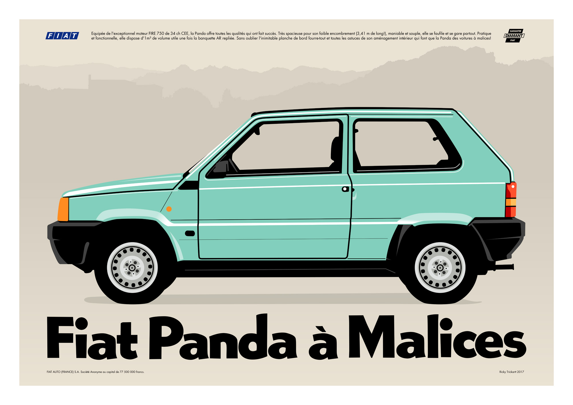
Instead I decided it must’ve been idiomatic, so I asked a French friend to help me (her response: ‘I’m so French it’s beyond belief’), who explained that it meant ‘cheeky, facetious, witty all at once’, and was like boite à malices, ‘a box with lots of stuff that would be fun for kids’; a box of tricks. That sounded perfect to me, so I had to get back into the other hard part, illustrating the car in a way that captured its humble boxiness.
My first couple of attempts looked too boyish, and like something from a video game. Definitely not the right flavour. Instead, a basic profile shot proved to be the winner, and when combined with a bit of the mountainous terrain of Sardinia and a little more of the French marketing materials, everything came together just right.

Of course, the most important thing in all of this is that Lilly loved the artwork, so we immediately put it up on the wall!