Somewhere Between The VCR Heads

Another record cover I designed recently has been getting a surprising amount of love… Nu:Logic’s second album ‘Somewhere Between The Light’ has been out for a couple of weeks now, and is my first Instagram post to not just reach but blow past 100 likes!

The design is a homage to old VHS packaging, which was an idea suggested by Nu:Tone and Logistics themselves. It was down to me to turn this idea into a record package, which tied together nicely with a retro thumb-hole cutout, printed inner sleeves for the records, and a solid black jewel case for the CD version too.

Even the shrink wrap looks good with the thumb hole design. Nice!

A Quick Cuppa

Here is my latest and greatest record cover artwork! It’s for St. Petersburg’s Bop, and a collaboration between Med School and Microfunk.

Bop wanted the artwork to look “pretty but a little bit dangerous so you wouldn’t drink it”. I tried using petrol to get a thin-film effect, but it made my Rickmansland studio smell like a garage. After a different approach, I ended up on this psychedelic cup of cha. It’s one of my favourite pieces of artwork in a little while, and it’s out today!

Tiny Dance

Flea Waltz

The latest cover art project to come out of Rickmansland is Frederic Robinson’s Flea Waltz. It’s his second album, but first on Med School and first I got to create artwork for, and it’s a good one!

The brief started with Joan Miró, but I brought in a little bit of a Matisse to it too with the cut-out vibes, then I made it all out of wood. It turned out really well, and compliments the music too (if I do say so myself). Thanks to all involved for indulging me, and to Frederic for making a great album to inspire it!

Still Not There Yet

One day in a meeting at The Purple Gates, Tony said ‘I’ve had a great remix done from Are we There Yet, maybe we should do a whole album of remixes’. A few weeks later, I was briefed on ‘Are We There Yet: The Med School Scans’.

Tony’s idea for the artwork was Soviet X-ray bootlegs, but this wasn’t something we could produce with any kind of authenticity, even on a small scale, without looking like just another X-ray record cover.

Instead I came up with an idea for coloured vinyl with a purpose (rather than coloured vinyl for novelty), and made a cover design that you have to scan with the record to be able to read.

The whole project looked great once printed – fluorescent Pantones worked perfectly with the colour-blocking idea and look super-tasty in person!

Mystery Machine

Krakota's Strange System

More newness! Here is the artwork I created for Krakota’s debut album. He called the album ‘Strange System’, which is totally up my alley when it comes to record titles.

The title made me think of black boxes (as in science/engineering, not aerospace), which are systems that you can give input to and get output from without having any idea of what happens inside the system. I had some crazy idea to create some artwork completely obscured by a black box, but that was too, well, obscure. Everyone on the project seemed to like what I was drawing to go into the box though, so we ended up with that as the cover itself.

Krakota Black Box

Everything is connected in this artwork! Clearly some of the objects are straight out of the mechanical/system corners of my noggin, but a lot of it comes from Krakota – his love of vinyl, celebratory beers and coffee to fuel the writing process, audio bits and pieces, and objects taken from some of his track titles. On the cover is a xylophone (from Xylo), a ghost, some samphire, an ice machine (for Ice Hands), some bones (for Lazy Bones), and the odd elastic bands. There are more track titles in the gatefold artwork too.

krakota-gatefold

I kept my illustrations on this artwork as geometric as possible to make it feel very mechanical, so to contrast that and bring it back into the world of humans, we had all the artwork printed on a nice and heavy unbleached card stock. It roughs it up just the right amount and looks pretty fresh in physical too.

Check the Hospital Shop if you need a copy in your life!

Lost Property

I received a package from Russia this week, which isn’t something that happens very often in Ricky Trickartt HQ. Inside were finished copies of some artwork I had created for St. Petersburg’s Microfunk – more cardboard cassettes, but in a totally different vein to last time!

Lost Dubs on Microfunk

The album is a collection of tracks from various members and friends of the Microfunk collective that were lost or unreleased over the years. The concept was about finding new life in something that had been left behind. I was commissioned by Bop to illustrate this concept with the bouquet from the bowl, and got to have plenty of fun filing the inside with pipes too!

Lost Dubs on Microfunk

I love print so much. The art looks great on the heavy brown paper stock and white ink – it almost looks like I drew each copy myself with some super-fine white Posca markers.

Thanks to Bop and everyone at Microfunk for the project. You can get a copy on their Bandcamp page.

It’s Made of Paper!

Here are another two recent record covers I’m pretty proud of, both following a paper theme:

NHS291-Packshot-2400px

The Hospital Mixtape series has been a bit of a puzzle since it started a couple of years back because despite it being called ‘mixtape’, there’s a certain discomfort with cassettes behind The Purple Gates. That means it’s down to me to find a way to think alternatively about tapes.

This year the mixtape was put together by S.P.Y, so I took the raw and minimal production finishes from his last album Back To Basics, and set about mixing them up. I got the knives out and ended up crafting a 1:1 scale cassette tape out of reverse cereal box and ribbon. I even made a cardboard case for it too, for the ongoing messy desk imagery used in the series.

ddesk

A bit of careful photography and a lot of retouching later, it all came together.

Hugh Hardie is a new Hospital signing. For his debut EP, titled ‘City Soul’, I drew a very rudimentary skyline and chopped it up into something a lot more abstract. I had recently bought myself a slightly mad paper circle cutter, and this proved the perfect job to take it for a spin.

NHS292EP-Packshot-2400px

The textures came courtesy of logarithmic graph paper from my grandpa, excess ink from Etherwood’s Blue Leaves album project, and a copy of The Lonely Londoners by Sam Selvon (which I thought was appropriately city), ran through my increasingly temperamental photocopier.

The whole cover then got a bit of explosion treatment on the back cover.

hardie-back

It’s all made of paper!

Record Cover Roundup: Spring Tingz

Spring Records

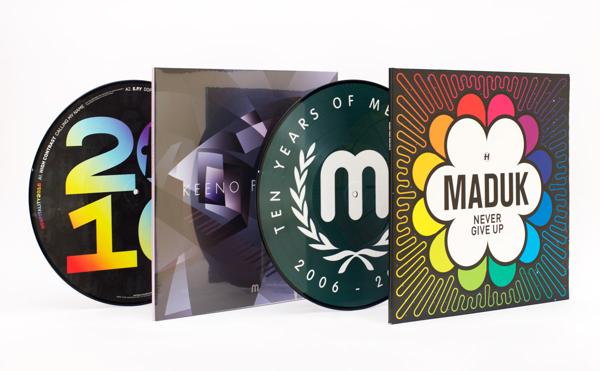
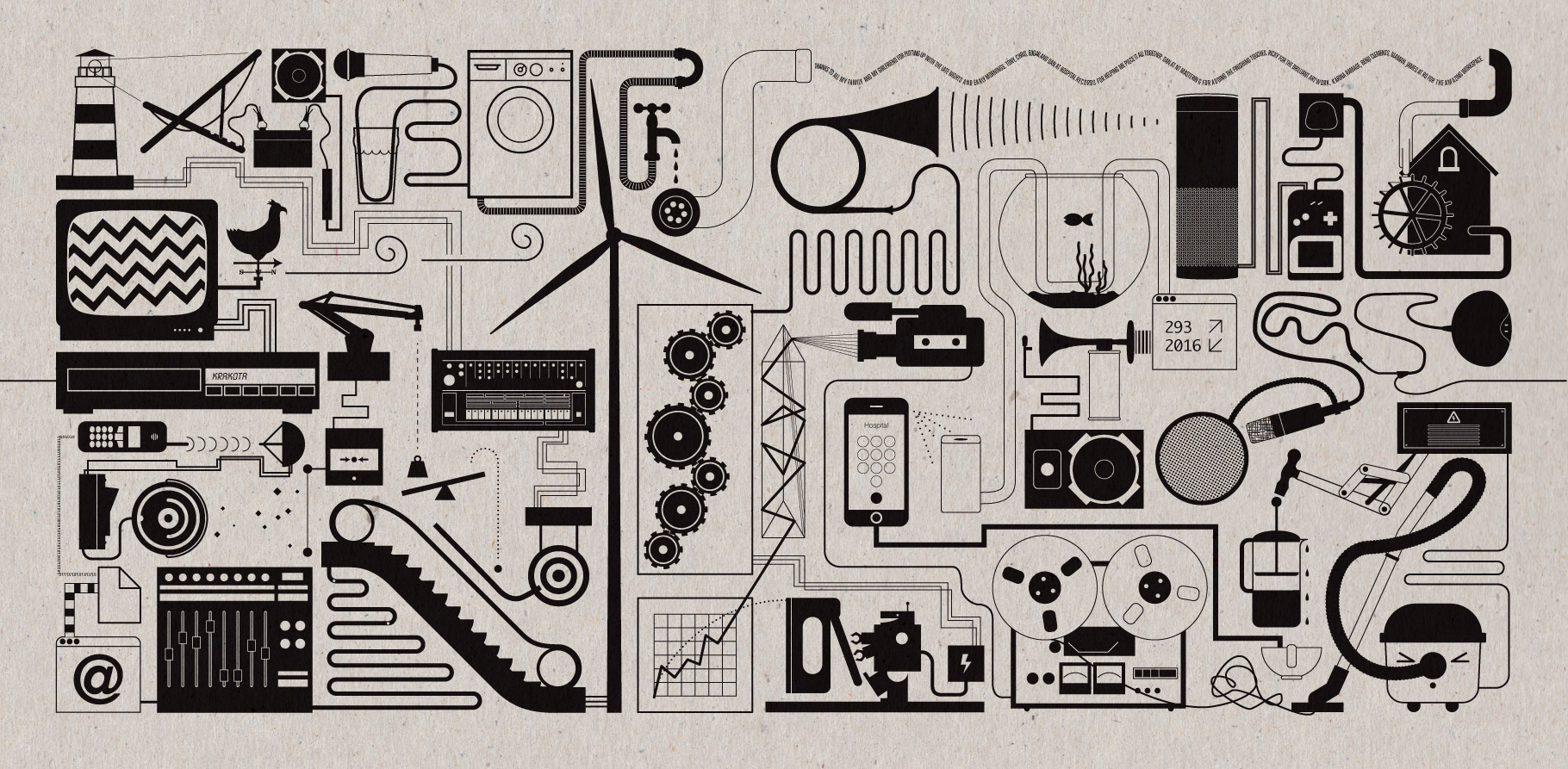
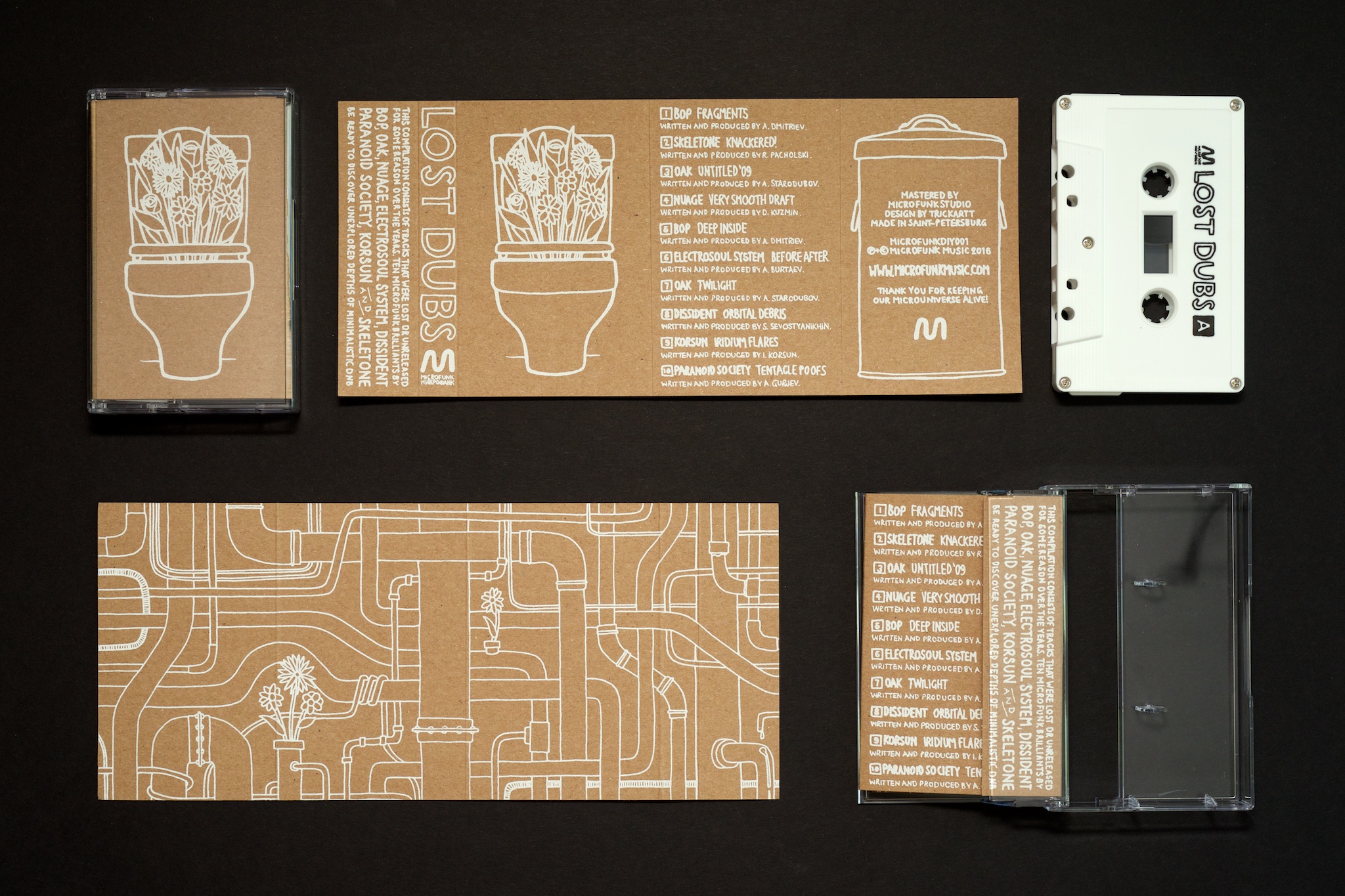
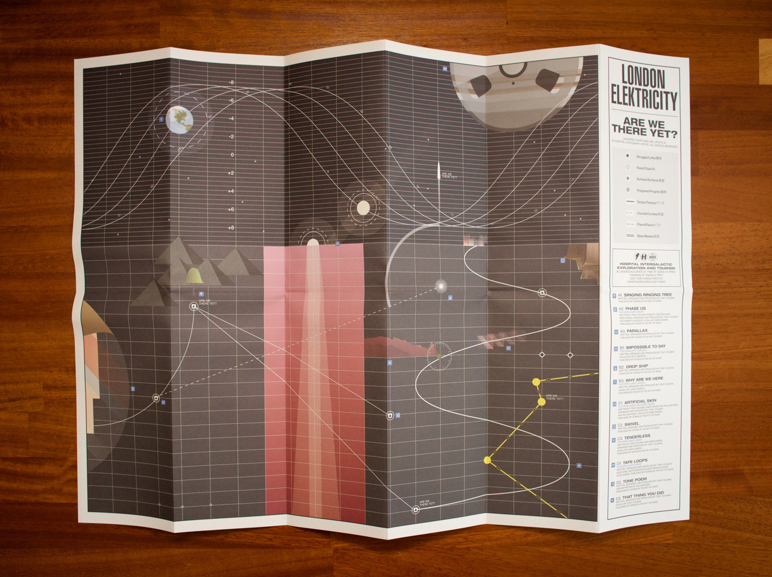
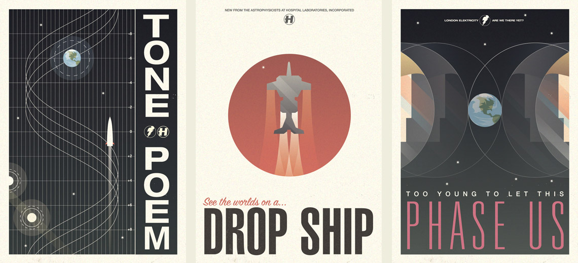
Hello Internet! I thought I should show you some highlights from the record covers I’ve been designing over the past couple of months.

NHS283-Packshot-1200px

rainbows

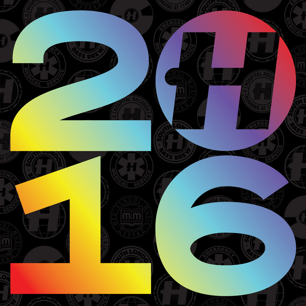
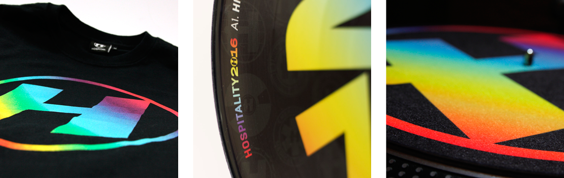
2016 started a lot like 2015 at Hospital Records, just with a lot more rainbows. It’s a trusted design, now with rainbows on everything (just how I like it!) – CDs, picture discs, posters, T-shirts, stickers, slipmats, you name it.

MEDIC56-Packshot-1200px

futurist-gatefold

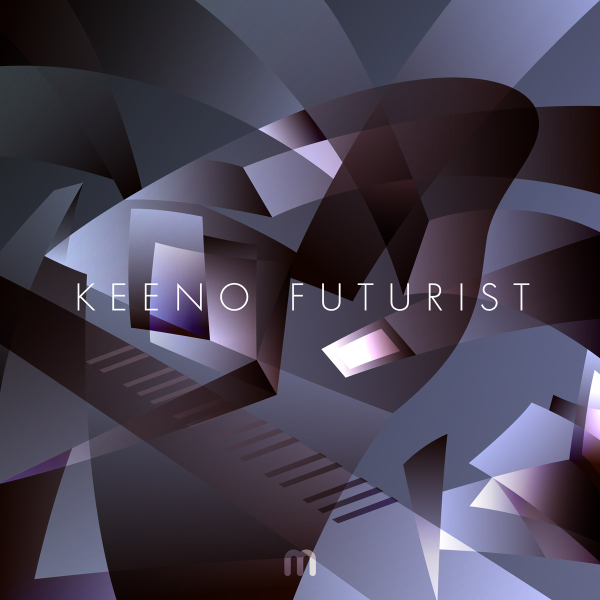
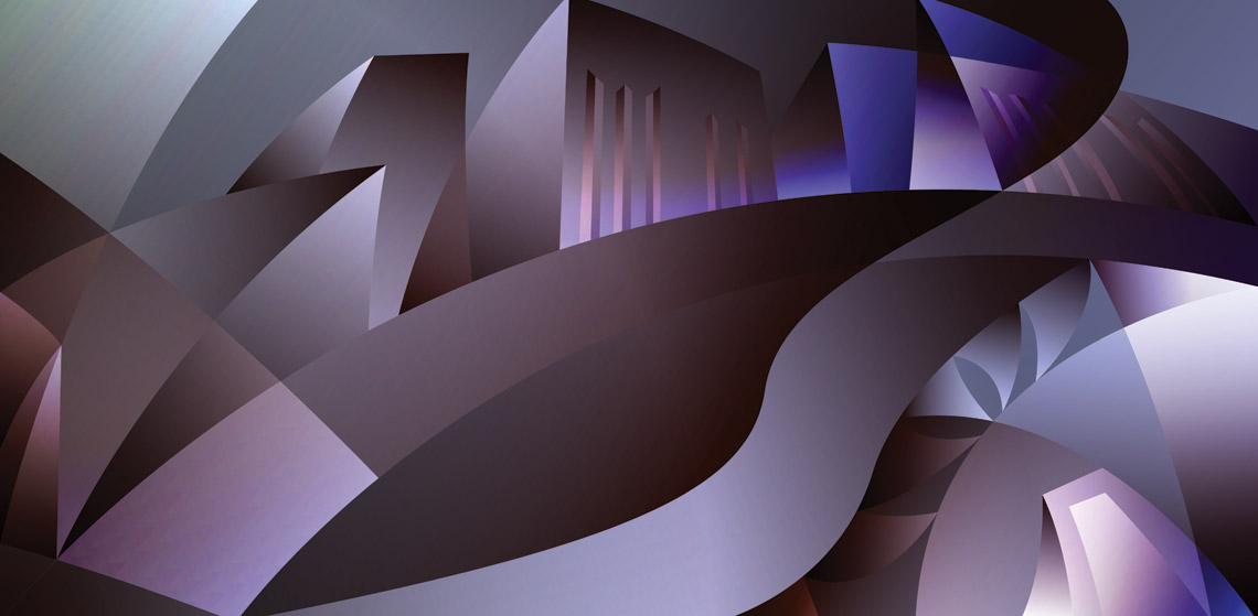
Over at Med School the first album of the year was ‘Futurist’ by Keeno. Young Keeno picked the title just because he liked the word, so I came up with this futurism-inspired illustration of a man composing at a grand piano. Of course, with a title like Futurist, I had to use the typeface Futura for the artwork!

tyoms

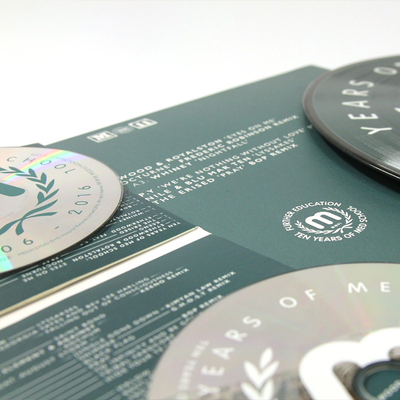
Med School hit the decade landmark in 2016, which is a terrifies me if I think about it too much because I came up with the original blood-stained identity for the label back in 2006. The Ten Years extravaganza took a few twists and turns, but ended up here, in what I’m affectionately referring to ‘Tennis Years of Med School’.

tyoms-early

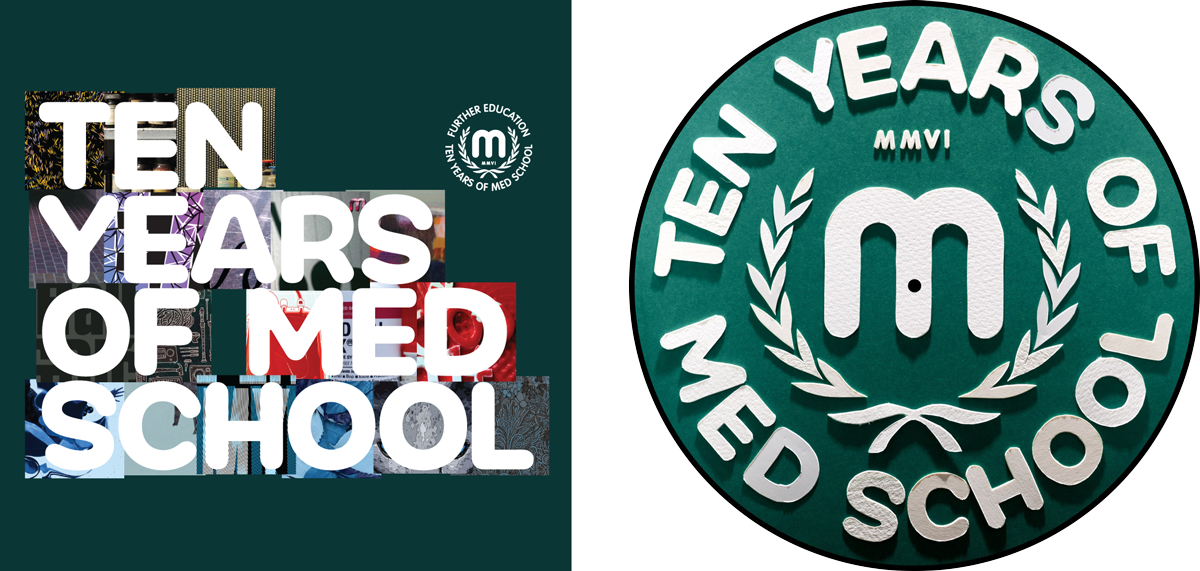
Also included here are a couple of earlier ideas for this artwork – one looking back at some of the artwork from the past decade (which made no sense as this album is all new material!), and one papercut version of the final artwork that got downvoted by the label.

maduk-gatefold-brighter

onecolourpertrack

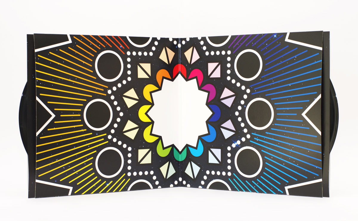
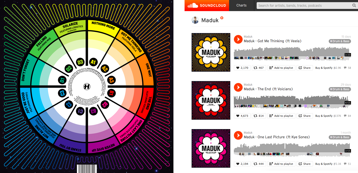
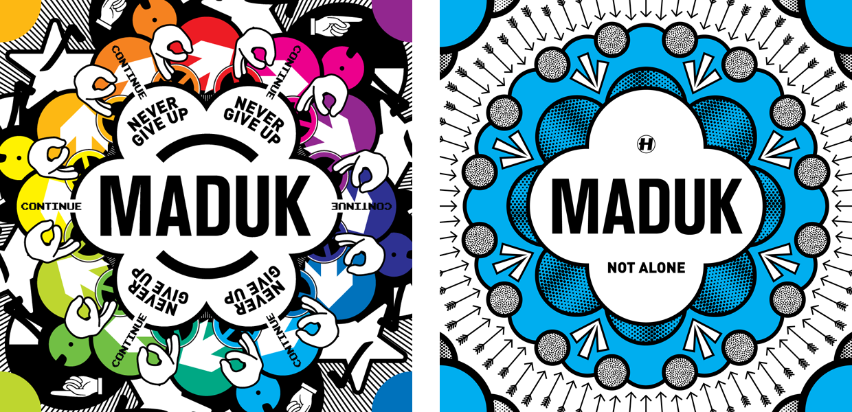
Lastly for now is Maduk’s debut album, Never Give Up. Maduk had 12 tracks on the album and a concept that each track corresponded to a position on a clock-face of colours, which gave a nice rotational direction to the artwork. Creating the artwork involved working backwards, trying to minimise what I started with his single last year. I’m really pleased with this one, but as is no secret, I’m always pleased by bright colours!

Where We Going?

swi-tl

The other big album project I’ve been working on lately is London Elektricity’s ‘Are We There Yet?’. Tony already had the image he wanted for his album cover from a photo shoot while touring in Japan, but he wanted to go all-out for the special edition of the album, and it was left to me to figure out how.

art-its

Because of the album’s travel-related title, we agreed to do a series of twelve postcards (one for each track on the LP) and a fold-out map too. First I was given a list of track titles, then I got to listen to the album not long after. Tony’s music always sounds like a slightly-retro adventure to me, and I know he’s really into science fiction, so I decided to treat each track as an intergalactic destination, and made each postcard to be a 1960s-inspired travel poster.

five

Once I finished all the postcards I turned my attention to the fold-out map. I couldn’t really make a conventional map as the elements from the postcards transcended planets, oceans and objects, so I came up with this abstract illustration for the job.

mapp

The style of this work is a little bit outside of my usual repertoire, but I’m really pleased with how everything turned out! The map artwork is included in all formats, but to get the postcards, you had to get one of the super-limited box sets.

tdp

Kinda Literal

crinkled

The first of two big albums I’ve been working on this year is out today – Etherwood’s second album, Blue Leaves. There was a lot of artwork involved in it, so here’s a drop of some imagery, notes, and a few exclusive bits that didn’t make the cut.

final-YABAPOM

work on the project started way back in January with the single ‘You’ll Always Be A Part Of Me’. Continue reading “Kinda Literal”