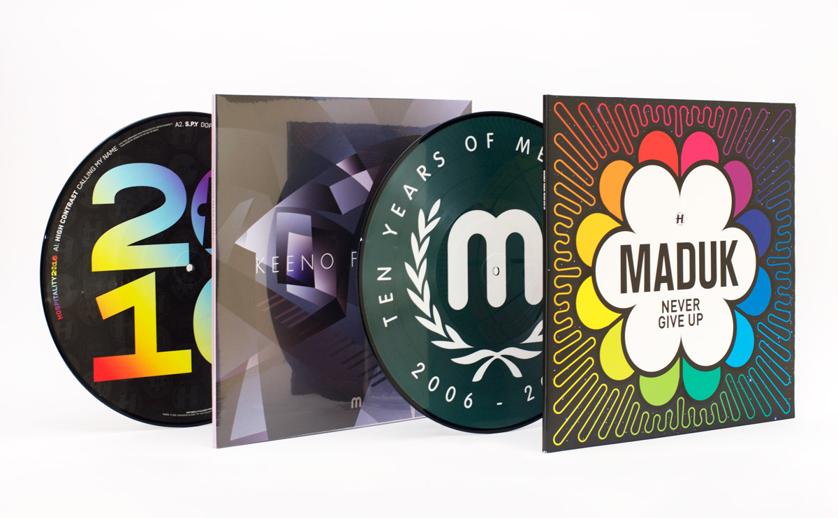
Hello Internet! I thought I should show you some highlights from the record covers I’ve been designing over the past couple of months.


2016 started a lot like 2015 at Hospital Records, just with a lot more rainbows. It’s a trusted design, now with rainbows on everything (just how I like it!) – CDs, picture discs, posters, T-shirts, stickers, slipmats, you name it.


Over at Med School the first album of the year was ‘Futurist’ by Keeno. Young Keeno picked the title just because he liked the word, so I came up with this futurism-inspired illustration of a man composing at a grand piano. Of course, with a title like Futurist, I had to use the typeface Futura for the artwork!
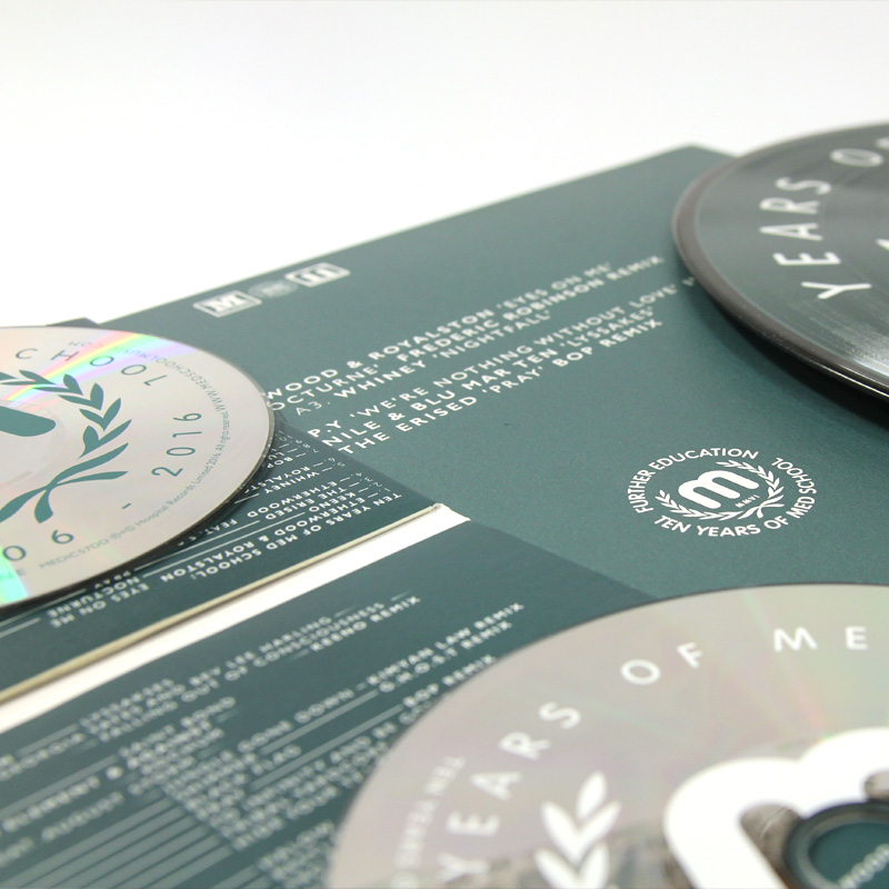
Med School hit the decade landmark in 2016, which is a terrifies me if I think about it too much because I came up with the original blood-stained identity for the label back in 2006. The Ten Years extravaganza took a few twists and turns, but ended up here, in what I’m affectionately referring to ‘Tennis Years of Med School’.
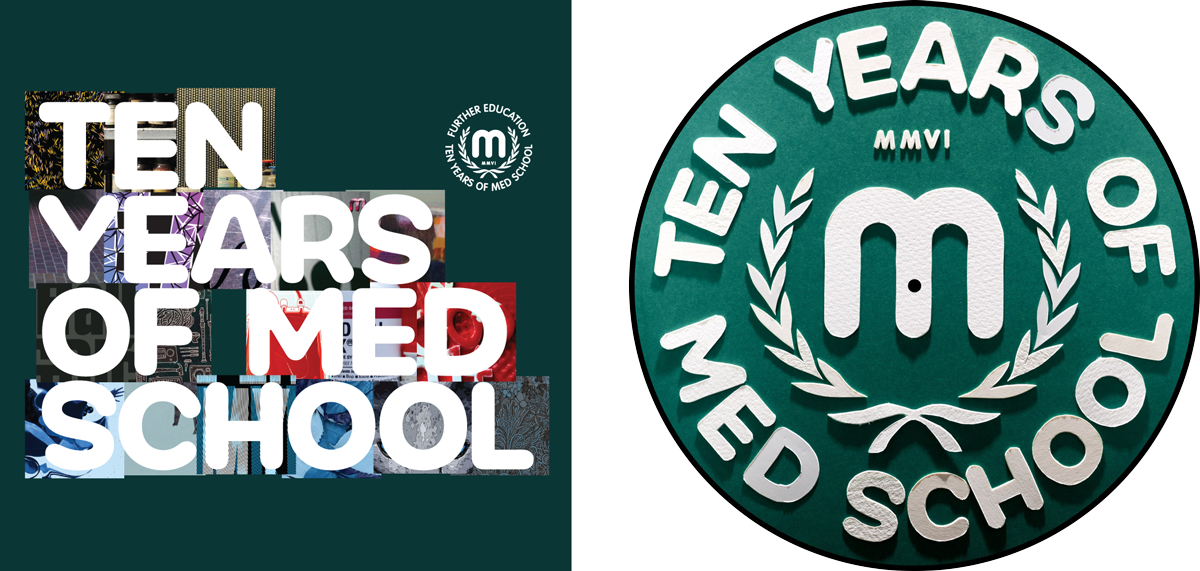
Also included here are a couple of earlier ideas for this artwork – one looking back at some of the artwork from the past decade (which made no sense as this album is all new material!), and one papercut version of the final artwork that got downvoted by the label.
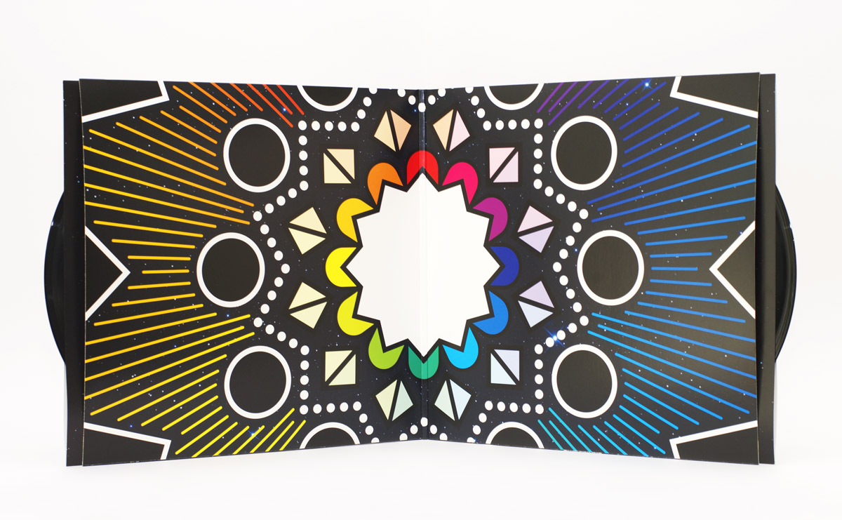
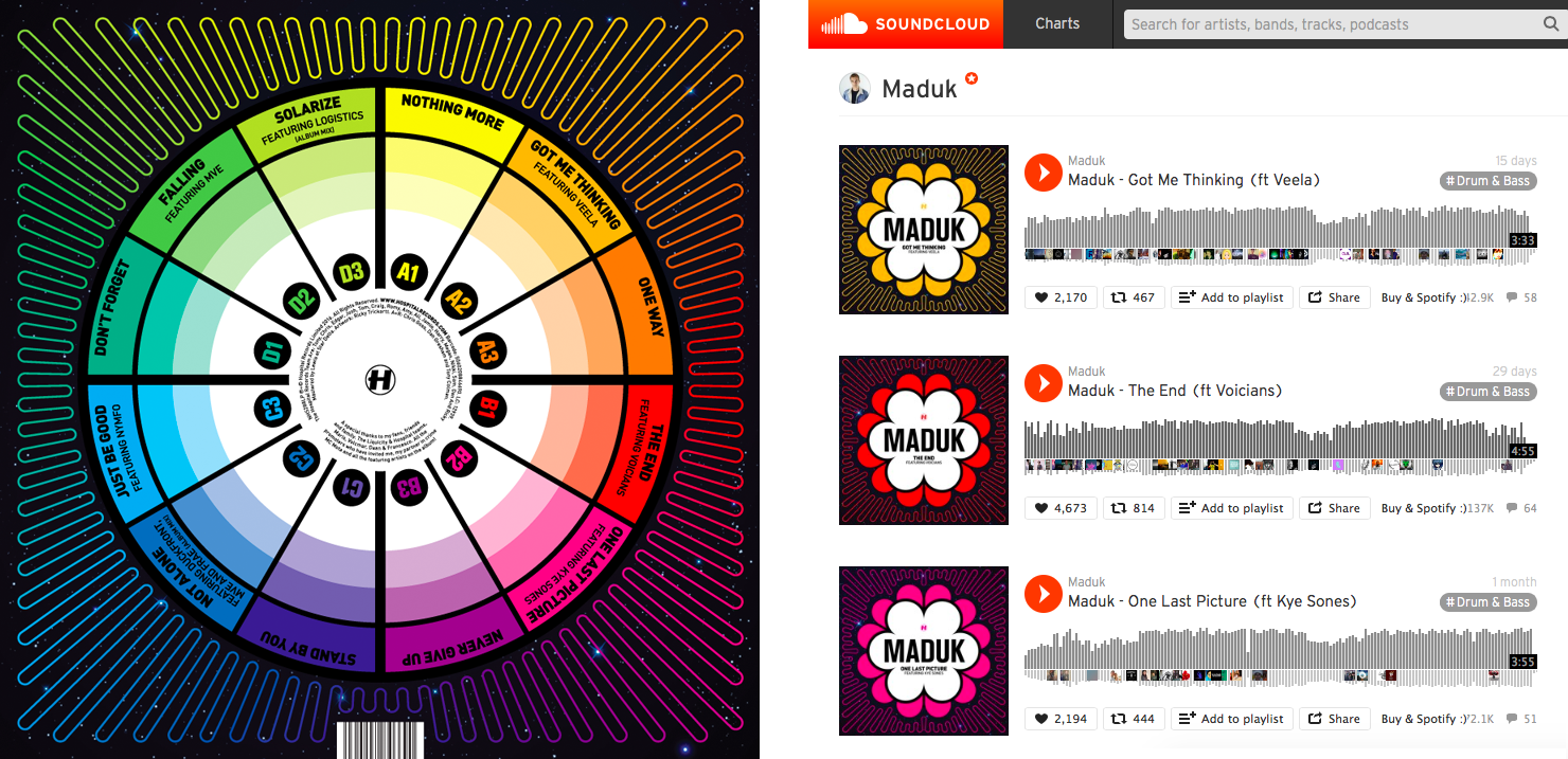
Lastly for now is Maduk’s debut album, Never Give Up. Maduk had 12 tracks on the album and a concept that each track corresponded to a position on a clock-face of colours, which gave a nice rotational direction to the artwork. Creating the artwork involved working backwards, trying to minimise what I started with his single last year. I’m really pleased with this one, but as is no secret, I’m always pleased by bright colours!