25 Years of Hospital Art

I’ve never really thought of Hospital as the establishment, but having been a going concern for a quarter of a decade now, it suddenly seems pretty well-settled in the musical landscape. For one of the many facets of this anniversary, Hospital organised a virtual art exhibition with our old friends at Art Vinyl, makers of nifty ‘Play and Display’ record cover frames.

Animation of moving through the 25 Years of Hospital Art virtual exhibition

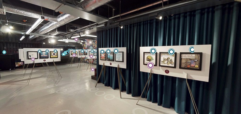
The virtual nature obviously makes it pandemic-friendly (I still haven’t got my second vaccine yet!), so after a couple of false starts and venue changes, Chris at Hospital and the Art Vinyl guys got set up in Defected Records’ basement event space.

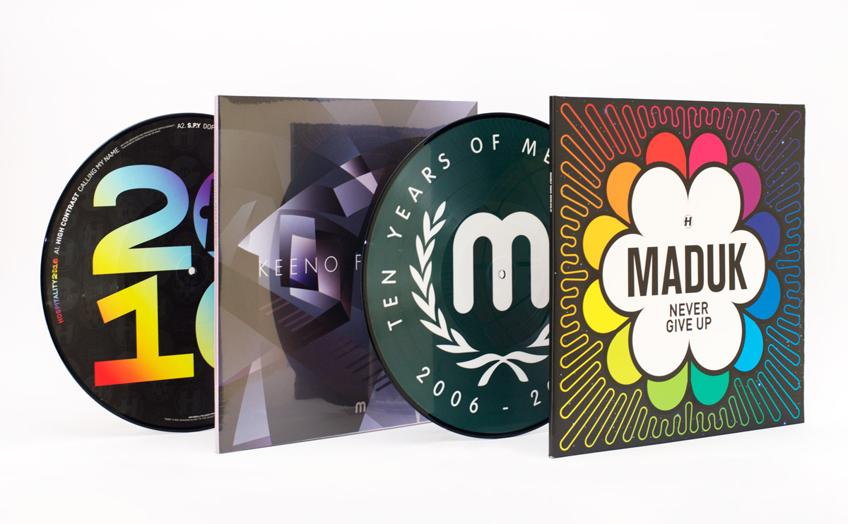
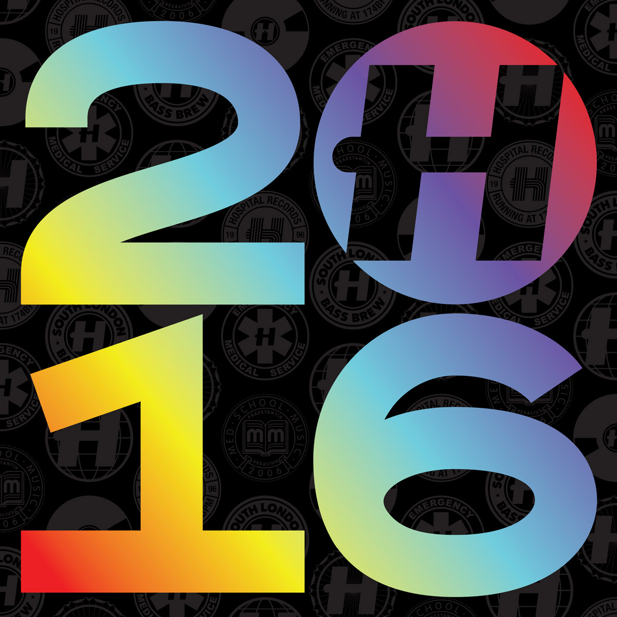
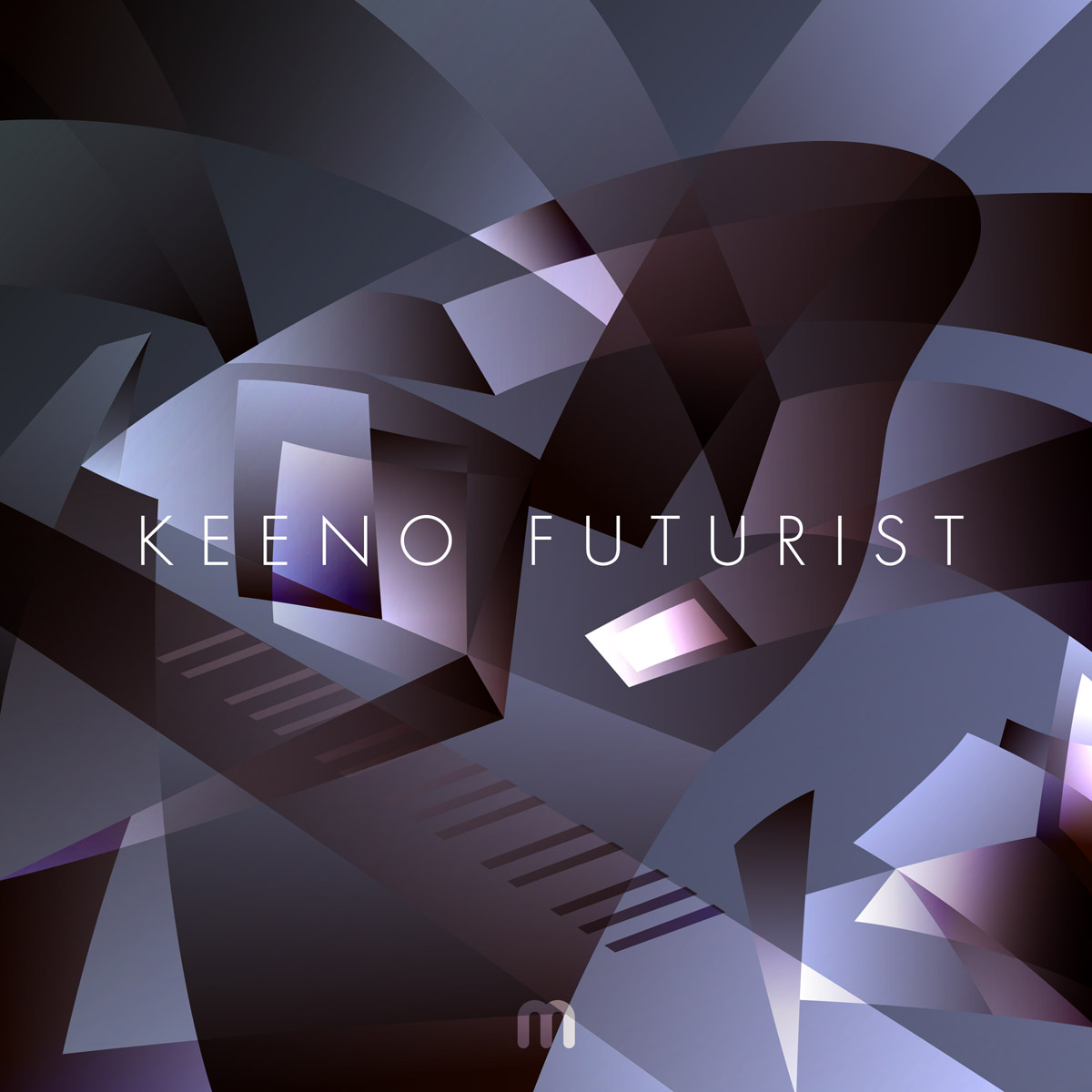
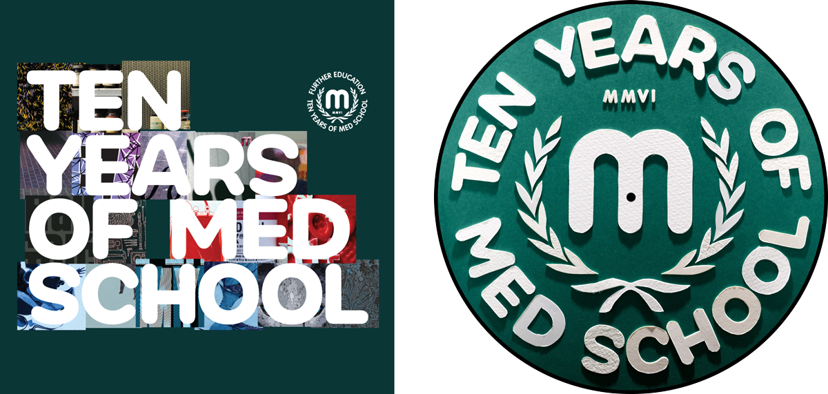
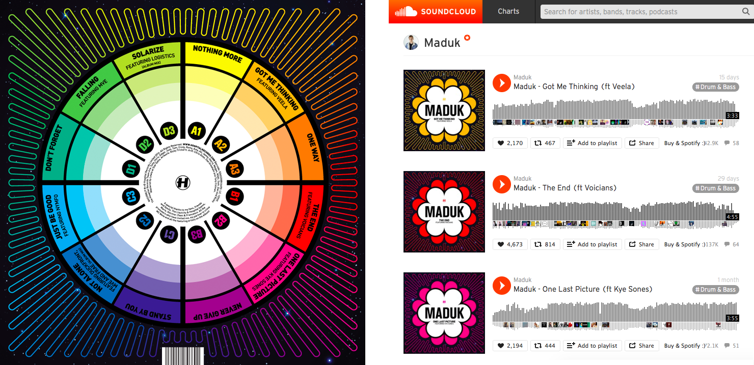
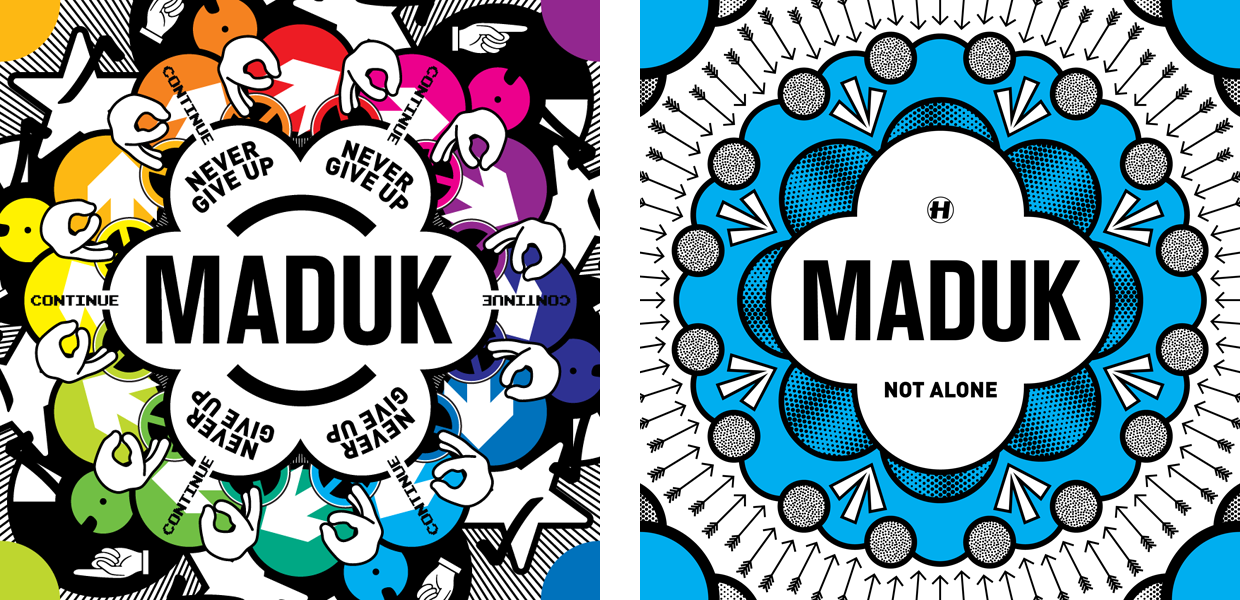
Chris and I had to pick fifty covers, which seems like a lot, but was pretty difficult considering Hospital’s catalogue is closer to 450 now, and that doesn’t even include the not-quite-100 on Med School as well. We filtered it down to albums that came out on vinyl only, and began whittling down to our favourites from there.

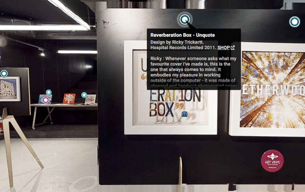
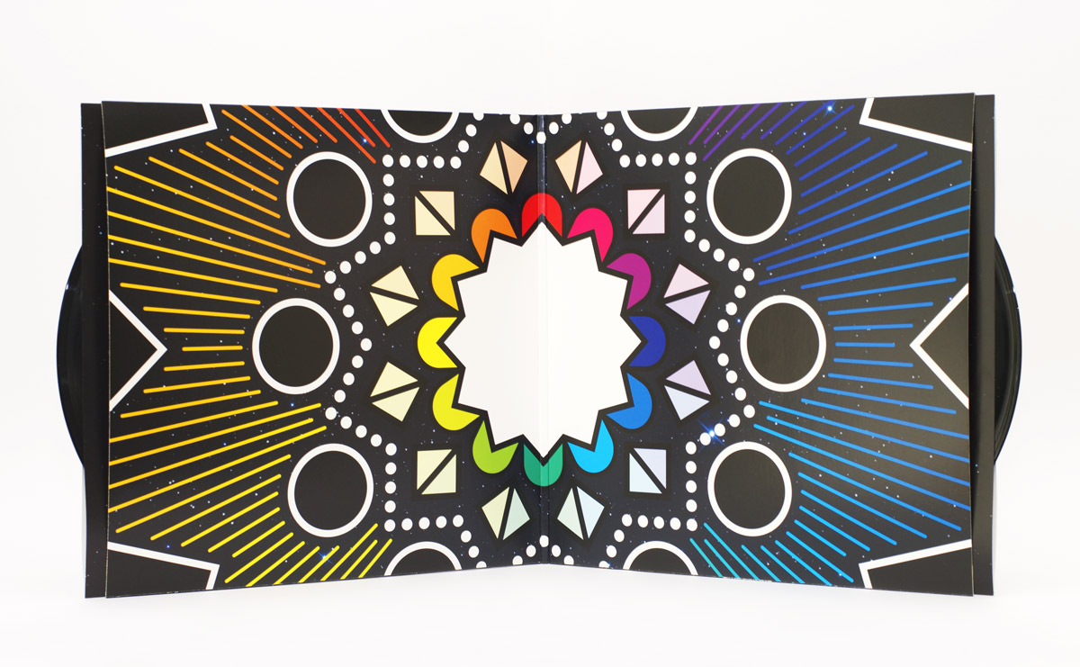
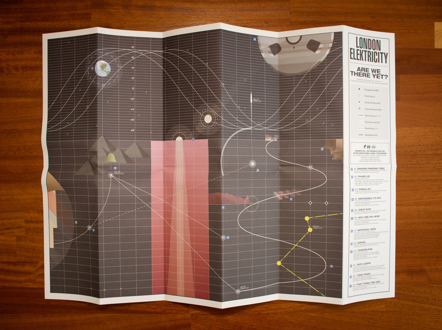
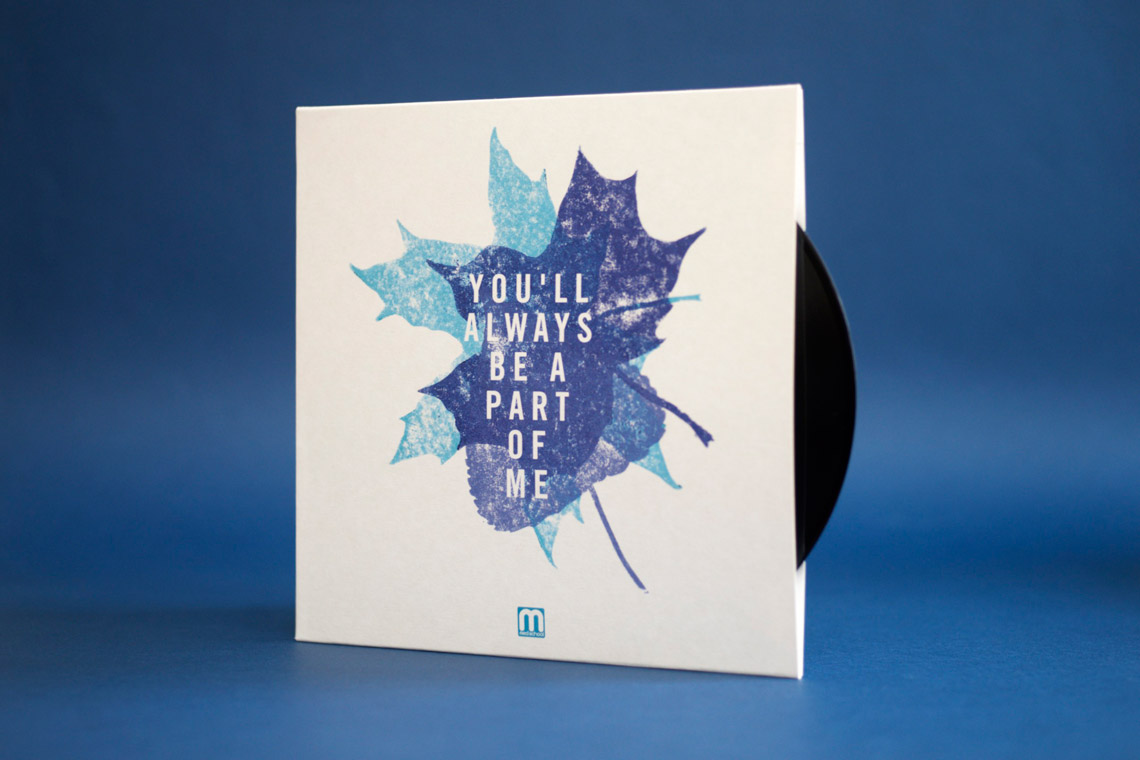
There’s more than just the record covers in the exhibition though – there are a selection of some of the original pieces of art I made for the covers dotted around, as well as many other bonus features. And! Chris and I also wrote a little commentary about some of our particular favourites in the exhibition.

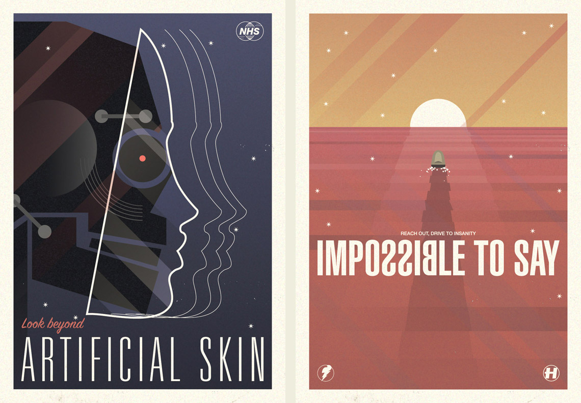
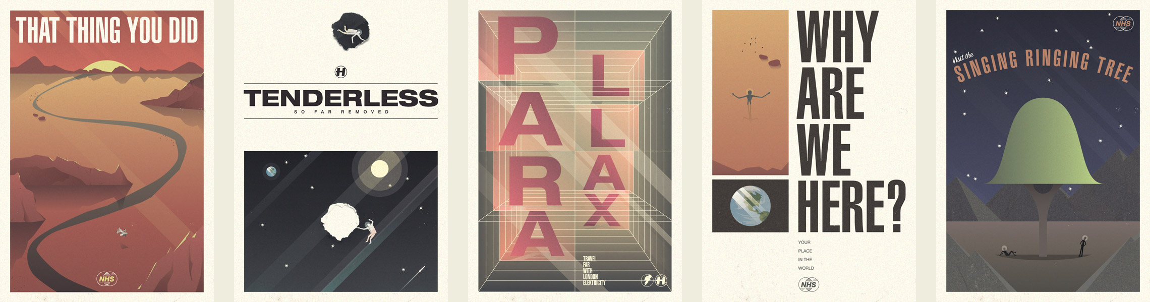
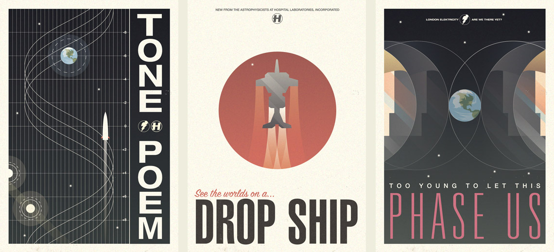
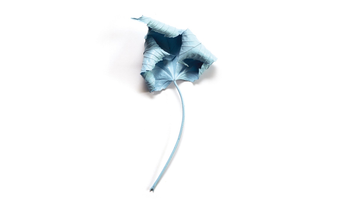
I’ve been designing covers for Hospital for about fifteen years now, and I’m not sure if I’m proud or terrified when looking at this exhibition!

On the subject of how I make record covers for Hospital…

I also recently revisited the footage of making a pair of EPs for Logistics, from just before the pandemic-era. I’ve edited them into a nice new ‘How did this happen?’ video, which talks through the inspiration, and how I made the artwork. Check it out below!

And check out the 25 Years of Hospital Art exhibition!

Super Victory

I had a small victory this summer in the form of finally getting Hospital Records’ Spotify playlists rebranded. I’m an old man and still haven’t bought into the value of streaming services, so I’ve never had to personally interface with these playlists, but they have been a bit of a bugbear of mine for a while.

They seemed to crop up on my jobs radar for Hospital every eighteen months or so for the past few years – I would be asked to redesign them, I would mock something up, then it would fizzle out and they’d either make something else in-house or just leave whatever was there. Finally word came from higher-up though, and I was given free reign to redo them more thoughtfully.

Despite Akzidenz Grotesk always being a crucial part of Hospital’s identity, we had never given much time to the Super weight of the font, until now. I pulled through some of the elements from my illustrated NHS300 cover into these playlists too.

A series of six thematic cover designs for Hospital Records' Spotify playlists

The x-ray for the house party particularly tickles me – it might just seem like a bit of a medical non-sequitur, but really it makes me think of my big brother and his university days: I don’t think it was strictly a house party, but there was definitely a party he went to where he ended up breaking a bone. It just feels like the sort of inevitability of something that would happen at a wild house party!

I’m really happy to have finally tidied these up and not had them slip down the back of the sofa *again*! I love being able to create little series like this too!

Record Cover Roundup: Spring Tingz

Spring Records

Hello Internet! I thought I should show you some highlights from the record covers I’ve been designing over the past couple of months.

NHS283-Packshot-1200px

rainbows

2016 started a lot like 2015 at Hospital Records, just with a lot more rainbows. It’s a trusted design, now with rainbows on everything (just how I like it!) – CDs, picture discs, posters, T-shirts, stickers, slipmats, you name it.

MEDIC56-Packshot-1200px

futurist-gatefold

Over at Med School the first album of the year was ‘Futurist’ by Keeno. Young Keeno picked the title just because he liked the word, so I came up with this futurism-inspired illustration of a man composing at a grand piano. Of course, with a title like Futurist, I had to use the typeface Futura for the artwork!

tyoms

Med School hit the decade landmark in 2016, which is a terrifies me if I think about it too much because I came up with the original blood-stained identity for the label back in 2006. The Ten Years extravaganza took a few twists and turns, but ended up here, in what I’m affectionately referring to ‘Tennis Years of Med School’.

tyoms-early

Also included here are a couple of earlier ideas for this artwork – one looking back at some of the artwork from the past decade (which made no sense as this album is all new material!), and one papercut version of the final artwork that got downvoted by the label.

maduk-gatefold-brighter

onecolourpertrack

Lastly for now is Maduk’s debut album, Never Give Up. Maduk had 12 tracks on the album and a concept that each track corresponded to a position on a clock-face of colours, which gave a nice rotational direction to the artwork. Creating the artwork involved working backwards, trying to minimise what I started with his single last year. I’m really pleased with this one, but as is no secret, I’m always pleased by bright colours!

Where We Going?

swi-tl

The other big album project I’ve been working on lately is London Elektricity’s ‘Are We There Yet?’. Tony already had the image he wanted for his album cover from a photo shoot while touring in Japan, but he wanted to go all-out for the special edition of the album, and it was left to me to figure out how.

art-its

Because of the album’s travel-related title, we agreed to do a series of twelve postcards (one for each track on the LP) and a fold-out map too. First I was given a list of track titles, then I got to listen to the album not long after. Tony’s music always sounds like a slightly-retro adventure to me, and I know he’s really into science fiction, so I decided to treat each track as an intergalactic destination, and made each postcard to be a 1960s-inspired travel poster.

five

Once I finished all the postcards I turned my attention to the fold-out map. I couldn’t really make a conventional map as the elements from the postcards transcended planets, oceans and objects, so I came up with this abstract illustration for the job.

mapp

The style of this work is a little bit outside of my usual repertoire, but I’m really pleased with how everything turned out! The map artwork is included in all formats, but to get the postcards, you had to get one of the super-limited box sets.

tdp

Kinda Literal

crinkled

The first of two big albums I’ve been working on this year is out today – Etherwood’s second album, Blue Leaves. There was a lot of artwork involved in it, so here’s a drop of some imagery, notes, and a few exclusive bits that didn’t make the cut.

final-YABAPOM

work on the project started way back in January with the single ‘You’ll Always Be A Part Of Me’. Continue reading “Kinda Literal”

Speed & Ecstasy

This winter I worked concurrently on two album projects: John B’s Light Speed and High Contrast’s The Agony & The Ecstasy. Both projects are for different artists and evolved in different ways, but since the art was completed and wheels were set in motion, I’ve been noticing increasing unintended parallels between the two projects and their artwork.

Both album covers were driven by the artists themselves and both had different motivations- High Contrast rather controversially wanted the baroque Caravaggio classic The Martyrdom of Saint Matthew to represent The Agony & The Ecstasy, while John B had some press photos done last year complete with full make-up and styling, one of which he wanted to use for his album cover.

Both albums use transitional serif typefaces – I tend not to use serifs very often in my line of work, so two at once was a rarity! HC pushed for Perpetua on his – I have to admit this wouldn’t have been my first choice (the upper-case U having a tail bugs me) – I was angling for either Garamond (historically appropriate) or Bodoni (classical Italian), but Perpetua works in the entirety of the project. John left it up to me so I took the extravagant haute-fashion stylings of his photos and decided Baskerville fit that aesthetic and the more grown-up sound of this album quite well.

As well as both being driven by the artists’ own motivations for the cover image and both using transitional serif typefaces for different reasons, the most curious parallel that struck me was in this interview John B did with This Is Drum & Bass:

TiD&B: If you could compare your sound, and your new album to perhaps a work of art, what would it be?

John B: No idea… Maybe one of those crazy Renaissance scenes where there’s loads of stuff going on; someone dying from a dagger wound, a bunch of sexy Renaissance ladies with their boobies showing, some angels, and a lion or two.

I’m reasonably sure John hadn’t seen HC’s album cover at the time he did this interview, but it struck me as curious that he pretty much described it (minus the boobies and lions, of course) to analogise his own sound!

Lastly, both albums were a long time coming! It has been six years since Electrostep and five since Tough Guys Don’t Dance, both of which facts are a slightly alarming reminder of how long I have been doing my job now!

Light Speed is out now on Beta Recordings, and The Agony & The Ecstasy is out tomorrow on Hospital Records.

 
You are currently reading
Page 1