Twentieth Century Maps

An illustration of a lost robot attempting to look at a paper map

My grandpa passed away last year, and though it wasn’t Covid-19 that got him, one of the nth-order-effects of the pandemic is that I’ve had loads of time to explore my grandparents’ legacy. They were fervent travellers, and I recently discovered a box of old tourist maps from some of the places they visited across their lives.

Tourist maps may not seem like such an interesting artefact today, but some of these were just plain lovely. Products of a pre-computer design era, and before they became cheaply-printed vehicles for advertising, they’re just nice to look at.

While I’m sure a 45-year-old map of bus routes in Rome isn’t going to have a functional purpose any more, they’re still such attractive images that I’ve decided to share them with the wider internet under a liberal usage license. I think some of these images have the potential to be used in artwork in interesting ways, which is part of the reason I’ve digitised them myself, in arbitrarily high resolution.

How high-res they are largely depends on how big the physical map was – for the bigger maps I photographed them in pieces, then did a quick stitching of them in my ancient version of Photoshop. Some of the seams aren’t perfect, but that’s not really why the images are there.

Two crops from some of the old maps I found

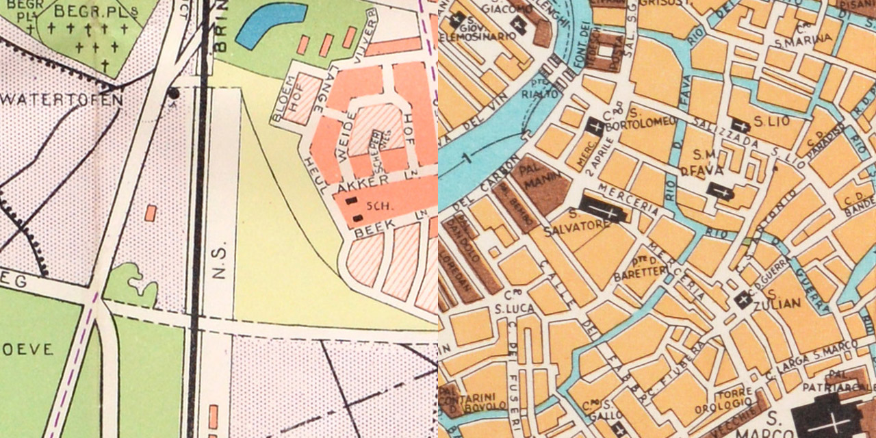
Surprisingly, this isn’t anywhere near all of the maps in the collection I found, but I just picked out the ones I thought were the prettiest. I particularly like one of the maps of Venice, a surprisingly-cheerful and hand-drawn map of Manhattan, and how much Washington DC looks like a Sim City map.

I hope whoever finds them makes something interesting with them – hopefully something better than opportunists selling overpriced prints of them on Etsy, because that would make me sad. Make something cool, internet!

Twentieth century maps in high resolution

Alley Cat Rally mini projects

The release of my book is creeping closer! It’s less than a month before Alley Cat Rally is published in the UK, and over the past few weeks I have been nervously trying to think of things I can do to promote the book myself.

I’ve started by making a mini-site that gives a good overview of the book, the characters, and the places you can preorder it, alongside some other fun graphics and odds-and-ends.

That’s table stakes though, so I’ve done a couple more interesting projects that I’ve also made videos about.

The first mini-project is the ballad of the little washer. I’ve had this on my shelves for years, but a desire to open it up and add some ballast to it became a mission to connect it to the internet, programming it so it will spin whenever anyone visits the short link I set up to preorder the book:

The second project is a bit less technical, but only slightly: I made a plush version of Asta, the star of the book. She wears a great pair of goggles in Alley Cat Rally, so I had to figure out how to make them, and ended up rigging up my own vacuum-forming setup, on a home kitchen scale:

I am pleased with both of these projects, and also with the videos themselves! I think I am slowly getting more natural at using my voice, which I’m hoping will come in handy as I try to join my publisher in promoting the book!

A small gift to a niche of the internet

I discovered a Great Thing a couple of years ago: The Casio VL-1. It was totally up my alley – a combination synthesizer/calculator invented 40 (!) years ago. It pushed two practically-unrelated functions together to make one charmingly terrible device (maybe it was more impressive in 1979?). I adore things that make me wonder how they came to be – how someone had the notion to make such a device, how a corporation approved the creation and sale of the machine, how people must’ve also thought it was a great enough idea to buy it (me?). Brilliant.

I couldn’t help but gravitate toward eBay almost as soon as I learned of the VL-1’s existence. The one I bought showed up wrapped in somebody’s local newspaper, but without a manual. No big deal, I thought – these things would be easily available on the internet. I wasn’t wrong, but I wasn’t right either: The only copies I could find were available by jumping through some hoops on some questionable websites, and yielded pretty miserable, almost unreadable scans of the manual, which naturally upset the designer in me.

I can’t really explain what took over me, but I got an urge to recreate the entire manual. I matched the typography, redrew the illustrations by measuring my own VL-1, and put it all together as a nice and shiny PDF. I did a slight bit of re-flowing of the text to avoid splitting some of the paragraphs like Casio did with the original, but otherwise it’s a faithful recreation*.

This recreation has been sitting on my hard drive for two years, so I figured I would gift it to the VL-1 owners of the internet. Maybe I was the only one who wanted a more legible copy than the existing scans, but if you do too, here is a link to the manual in all its glory. Happy calculating, internet!

*I wish I was smart enough to have amended the instructions to make the synthesiser sound like a duck or something, but alas it’s beyond my skillset!

The New Future of Pop Music

Like most dorks of the internet, I have a small habit of buying domains without projects to go along with them. A great example of this is TheLivingJacksons.com; a domain I have been sitting on for more years than I care to admit.

There is half a reason for keeping this domain – around the time I bought it, I had decided that if I had a band, I would call it The Living Jacksons. Never mind the fact that I have no known musical skills – I can still just about beat-match records on a pair of SL-1200s, and I can drop the Rhumba rhythm on my Casio VL-1 to great effect, but beyond that, I’ve never even tried to learn an instrument. I figured, though, that an absence of musical skill doesn’t necessarily exclude a career in pop music, and decided I would put a stake in the ground and claim The Living Jacksons as my own idea by buying the domain.

If this all sounds like an incomplete thought, that’s because it was: I knew I had no musical talent, but I didn’t even consider that I didn’t have something to put on the website. The domain sat doing less than nothing, absorbing renewal money for years, until the penny finally dropped on what the shape of my band was. Introducing The Living Jacksons:

N.b. I’m a lot more handy playing the washing machine than ironing boards, but the publicist and I both agreed that bending over to unload a washer wouldn’t have conveyed the message we are looking to convey with this band!

So finally – I created some press images of the band, and put a website together, with marginally more than nothing on it. Still no music though.

The loosely triennial Trickartt.com redesign rings ever true

res1

As noted before, every three years or so I get an itch to redesign my portfolio website. Almost like clockwork, I was hit with the itch at the beginning of the year, but this time it wasn’t the appearance of the site, nor so much the content of my portfolio, but the way the site worked that was bothering me.

It’s Buzzword Time

There’s a new principal in web design called responsive design. The idea is that instead of maintaining different versions of a website for different devices, the design of the site should respond to the size of the device by rearranging its content in a more user-friendly way.

To be kind to myself, the problem with my old site is it was a little bit ahead of its time. I had designed it to be responsive to different sized desktop computers, but simultaneously managed to make a terrible experience for any portrait-oriented devices.

I went the wrong way about trying to fix it too, by attempting to create a mobile version that I never even properly finished, let alone kept up-to-date. It wasn’t until I got an iPad that I realised how badly this worked – if you tried looking at my site in portrait, all you got was three quarters of a picture and nothing else usful. Oops!

res2

So I did finally get around to fixing it, and it is now properly responsive, albeit in my own abstract way. Everything is the same site whatever device you’re using to browse my portfolio, and things collapse together elegantly like they should. I pretty much had to start from scratch to make it happen, but that was a gift in itself because I’ve also managed to make the site a lot more energy efficient in the process by slimming its codebase down by about 30% too.

Of course, starting from scratch did give me the opportunity to review my portfolio. As I mentioned above, I was happy with a lot of it, but I did take the time to add a few newer things too. The biggest update is to the SCED area – I’ve now broken it out into some of my favourite things from each annual season, including its latest Post-it iteration.

Like so much of my iterative design work, it’s small changes that few would notice, but I feel a whole lot better for having implemented them!

Hospital Internet Evolution

surgeradio

The Hospital Records website and I have been on a long journey since I began working with the label. I’ve been planning on writing this piece about it for what must be several years now, but the thing with working on the internet is there’s never a finished point. You can’t carry on tinkering with a product once it’s been printed, but you can when you publish something on the internet! We launched a major redesign this winter, so now it’s had a few weeks to settle in, it finally seems like a good time to look back at how it evolved.

Back in 2005, before I got my foot in the door, their sites looked like this:

2005 2005-shop

They had their own website, which could only be updated by one member of staff, and their webshop was run by a third party. Oh how I remember that store – I used to buy white labels from it as soon as they were available, only to regret being impatient and not waiting a few weeks for the full artwork. Sometimes I would buy both anyway – Sainsbury’s must have paid me well if I afford so much Vinyl back then! Continue reading “Hospital Internet Evolution”

Shock; wonder: I am now Likeable on Facebook

Facebook and I don’t get along. I’m not a tin-foil-hat, but I consider Facebook to be a privacy catastrophe, so I have so far managed to avoid it at all costs.

Hospital have, on several occasions now, attempted to railroad me into signing up, with varying degrees of failure – one of my least successful attempts involved Facebook deleting my account as they wouldn’t let me use the alias Creamy Horse. What a hate parade.

Despite my concerns, I have since managed to come to a compromise with the platform: I now have a page. This seems like a reasonable compromise to me – it means you (that’s right, you!) can like me now, and I have a presence there instead of an uncomfortable void.

So what do you get for liking me? Well, that’s not something I can answer, being as inexperienced as I am with the day-to-day workings of the platform. I will be posting links to stuff I post here, which might be of interest to you if you don’t want to have to deliberately visit this site to see if anything is new. I may also start linking to daily creativities if I can wire it up too, but I had a spot of bother attempting to do so earlier today. Oh well. One day at a time!

Three Little Websites

Hospital realised that WordPress isn’t the be-all and end-all of creating functional websites, which was great news for me as hacking up themes take a surprisingly long time! Instead, I’ve been getting to be a little more freeform with the websites I’ve been creating for them lately, resulting in these three little websites:

NuTone.org

The idea for this site was borne out of a conversation with Matt Riley, the man in charge of web promo at Hospital. He suggested that as our tracks end up on YouTube anyway and we had such a striking cover photo, that we could make the page a big version of the album cover made up of YouTube videos.

Continue reading “Three Little Websites”

That’s right, it’s time for the loosely triennial website redesign!

Hello Internet types, and welcome to the latest incarnation of my website/portfolio! I find myself doing this once every couple of years, which makes sense being a designer and all.

The old site was getting out of control!

The new site now has bigger images, a less sprawling portfolio and some nice slidey interfaces, which I am surprised I even got to work! There is also a new iPhone-friendly version of the site too, which to be honest needs a bit more work, and I shall hopefully do over the next couple of days.

This blog has seen a tiny slice of updatery too, but nothing too drastic- I have upped the size of the text by one point, as I thought it was a bit difficult to read before, and increased the grid it is designed to alongwith it. The new site also adheres to the same grid too, to try and finally give my site and blog a bit of coherence again. Hooray for grids!

This Central Station lark

Shock Horror, I’ve joined another social network recently! This one is called Central Station– it appears to be a network for creative people. I guess it’s similar to Behance, but I never really understood that, and this appears to be a bit more British (well, Scottish, to be precise) and a bit more personal.

Anyway, I don’t really understand this either, but it’s probably because I’m not very good at being social, and to me a network is something you make with CAT5 cables and Wi-Fi. Regardless, it seems pleasant and I approve of the post-it-note yellow, so I’ve put up a bit of work for other members to look at!

Putting stuff up seemed to be the right thing to do too, as people are looking at it! CenSta first added my Post-it book to their blog of things they like in February, which was very kind of them. It’s nice to be nice to the nice!

Not only that, but they then went on to feature my stopmotion experiment from 2008 ‘Full Mouse’ (embedded above or here on Central Station) in a prominent position on their site, which went on to get more views in the space of a week than it ever did anywhere else on the internet combined. Amazing!

So if you’re creative too, or if you just want to be a member of another social network, you should check Central Station out! It doesn’t matter if you’re not Scottish – I’m pretty sure I’m not a Scot, and they’ve been very welcoming to me, as I think they are trying to grow beyond Scotchland.

Update: They’ve put the video on their front page now too! cool!

 
You are currently reading
Page 1