The Hospital Records website and I have been on a long journey since I began working with the label. I’ve been planning on writing this piece about it for what must be several years now, but the thing with working on the internet is there’s never a finished point. You can’t carry on tinkering with a product once it’s been printed, but you can when you publish something on the internet! We launched a major redesign this winter, so now it’s had a few weeks to settle in, it finally seems like a good time to look back at how it evolved.
Back in 2005, before I got my foot in the door, their sites looked like this:


They had their own website, which could only be updated by one member of staff, and their webshop was run by a third party. Oh how I remember that store – I used to buy white labels from it as soon as they were available, only to regret being impatient and not waiting a few weeks for the full artwork. Sometimes I would buy both anyway – Sainsbury’s must have paid me well if I afford so much Vinyl back then!
About the same time I joined, the team moved south of the river to their current home in SE26. The new property, The Purple Gates, included a warehouse which allowed them to run their own shop in-house. I started paying Hospital for my white labels in the form of flash web banners instead of cash, and they launched a new shop:

 06h 17m 25s'")
This shop was Art-directed by Chris at Hospital and was built by Kleber, who were making waves after building the original Bleep.com, an independent store that sold music both physically and digitally. They brought this technology to Hospital, all in one tiny website.
In the mean time, after proving myself with flash banners that were getting sillier and sillier, Chris was beginning to trust me with more and more matters of design, and eventually I was allowed to start putting a plan together for redesigning the website. As there was only one staff member who could update the site, updates would be made once a month at best, and by 2006 the label was moving faster than that, so it was the right time to start over.
We got friend of the label Joash (who at the time was a mighty web developer, but is now a musician signed to Compost) involved. With his help, we started the site again from scratch, backing it with a database that allowed any of the staff to update pages on the fly, and I brought a much whiter, more clinical feel to the site.


It even had a space for my dodgy flash web banners! It seems ridiculously cramped to look back at now, but when we launched in 2006 the overwhelming majority of displays connected to the internet were still 800x600px. Phones have more pixels than that these days!
Things ticked over quite nicely for the next couple of years, during which time computers got faster, screens got bigger and Hospital’s catalogue grew ever larger. By 2008, the shop was ripe for a refresh, which I got to design this time around. The goals were to bring it more in line with the design of the main Hospital website, and to take better advantage of the growing sizes of computer displays.


After a series of development setbacks, the new version of the shop launched. The code was adopted by Alex+Alex, who managed to get my modern designs working on the old shop’s codebase. In the mean time, I decided to bring the bigger-screens-and-more-space principals from this design to the main website (and finally convince Hospital that rotating flash web banners on every single page were a waste of everybody’s time!).


Although the two sites shared a design language, they didn’t share much else. As time went on, we discovered increasing problems resulting from them operating independently of one another. Getting around between the two sites was a pretty one-sided affair, and keeping stock levels in sync was a virtual impossibility.
Time continued its relentless march on technology as well: By 2010 iOS (and it’s lack of support for Flash, which our sites still relied on for playing audio) had exploded, and everybody’s internet connections were getting faster. The latter was causing no end of problems for our shop – it was still running on code that dated as far back as 2003, and just couldn’t keep up. A full rewrite-from-scratch was commissioned in 2011, and working with Alex+Alex again (which eventually became just the one Alex), we started all over again. Welcome to today:
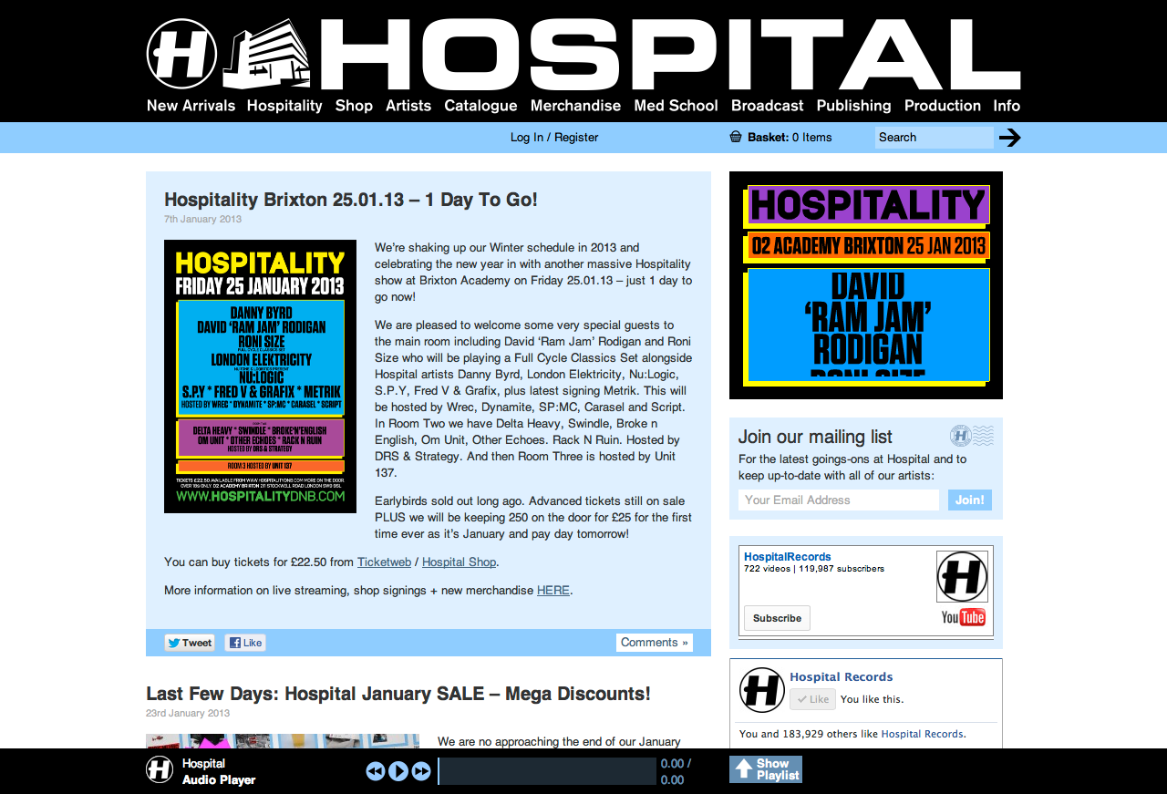
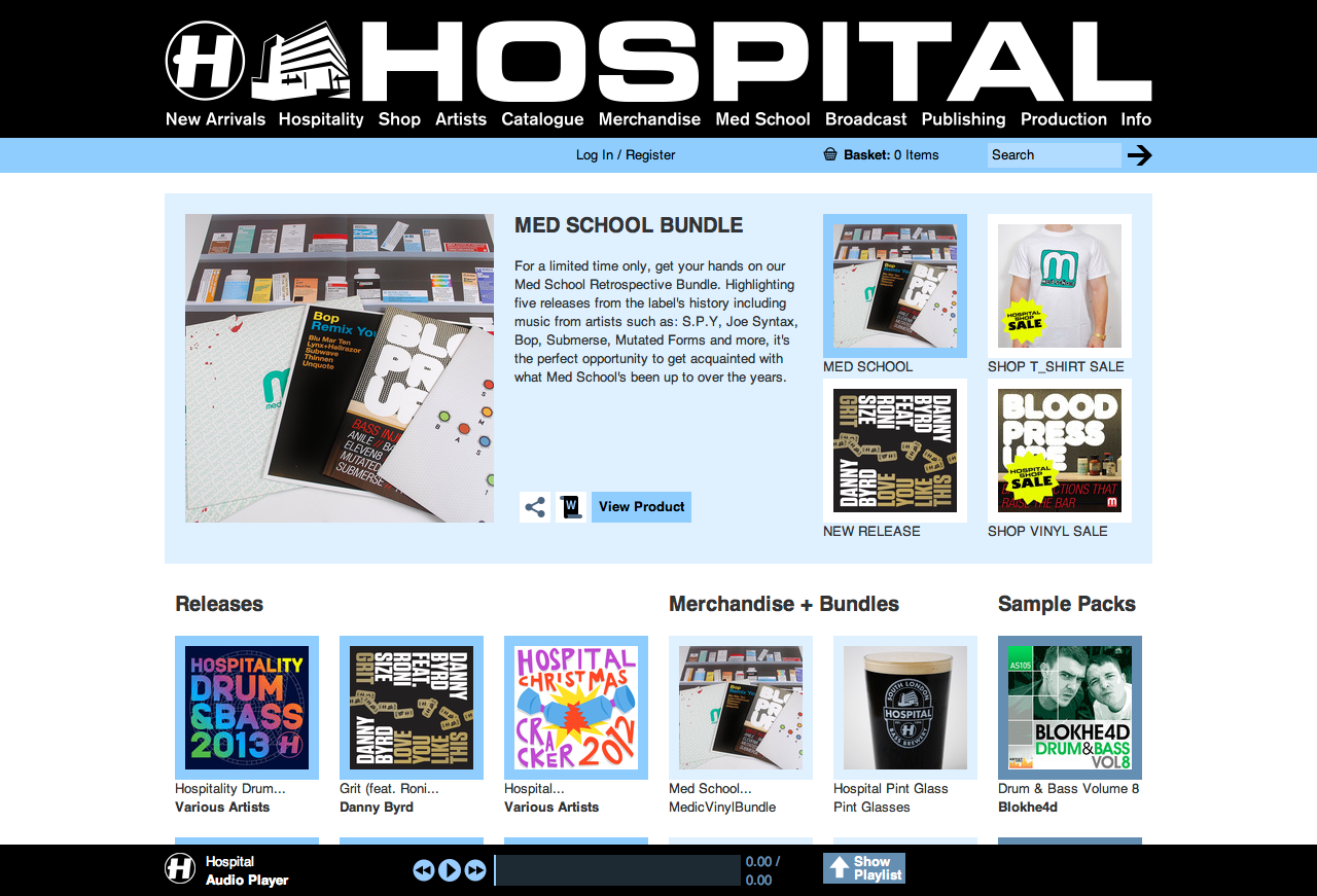
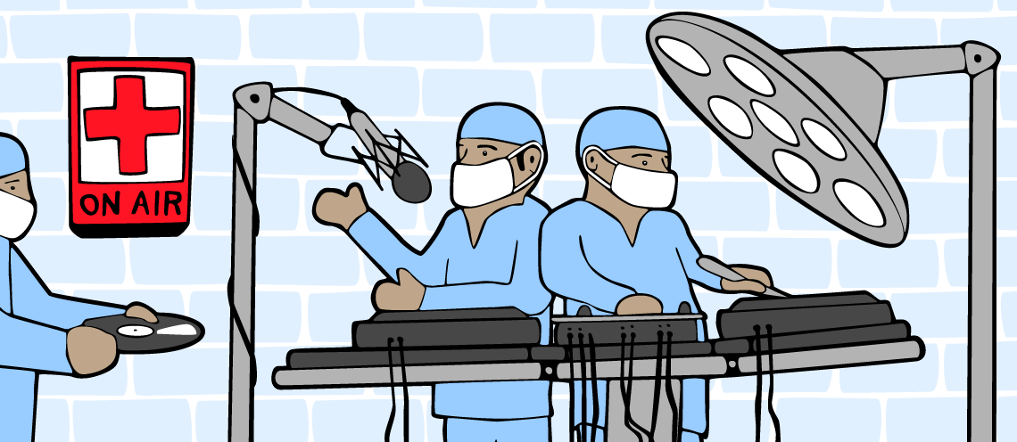
We launched in December 2012, just in time for the Christmas shopping rush. It’s by no means a finished project (as I noted about web design at the top of this post!), but I’m proud of how this has turned out so far! One of my favourite things about the site is that I’ve begun embracing some of my bad illustrations on the site, like the surgeons at the very top of this post. I’d like to think the best example of this is the 404 page:

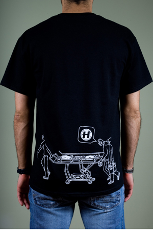
The illustration comes from a T-shirt design I started in 2005, and eventually finished and printed in 2008. Belinda in the Promotions department said it was perfect for a 404 page because they all look really dejected, but I must admit that wasn’t my original intention with the illustration- that’s just how bad my drawings were in 2005!