As noted before, every three years or so I get an itch to redesign my portfolio website. Almost like clockwork, I was hit with the itch at the beginning of the year, but this time it wasn’t the appearance of the site, nor so much the content of my portfolio, but the way the site worked that was bothering me.
It’s Buzzword Time
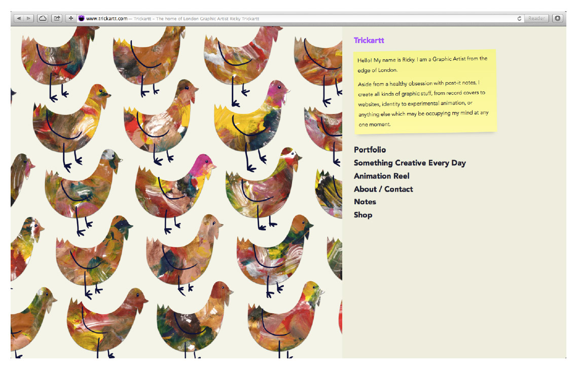
There’s a new principal in web design called responsive design. The idea is that instead of maintaining different versions of a website for different devices, the design of the site should respond to the size of the device by rearranging its content in a more user-friendly way.
To be kind to myself, the problem with my old site is it was a little bit ahead of its time. I had designed it to be responsive to different sized desktop computers, but simultaneously managed to make a terrible experience for any portrait-oriented devices.
I went the wrong way about trying to fix it too, by attempting to create a mobile version that I never even properly finished, let alone kept up-to-date. It wasn’t until I got an iPad that I realised how badly this worked – if you tried looking at my site in portrait, all you got was three quarters of a picture and nothing else usful. Oops!
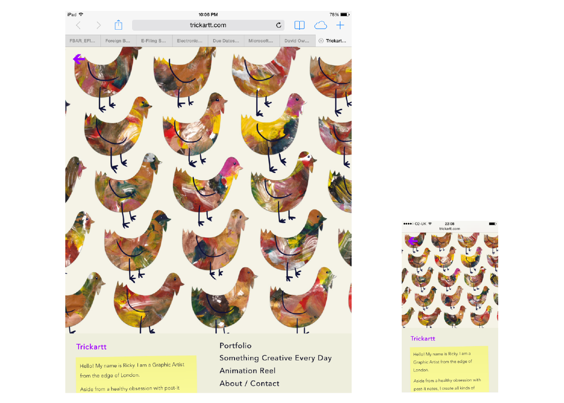
So I did finally get around to fixing it, and it is now properly responsive, albeit in my own abstract way. Everything is the same site whatever device you’re using to browse my portfolio, and things collapse together elegantly like they should. I pretty much had to start from scratch to make it happen, but that was a gift in itself because I’ve also managed to make the site a lot more energy efficient in the process by slimming its codebase down by about 30% too.
Of course, starting from scratch did give me the opportunity to review my portfolio. As I mentioned above, I was happy with a lot of it, but I did take the time to add a few newer things too. The biggest update is to the SCED area – I’ve now broken it out into some of my favourite things from each annual season, including its latest Post-it iteration.
Like so much of my iterative design work, it’s small changes that few would notice, but I feel a whole lot better for having implemented them!
