Sweet, Noggy Christmas

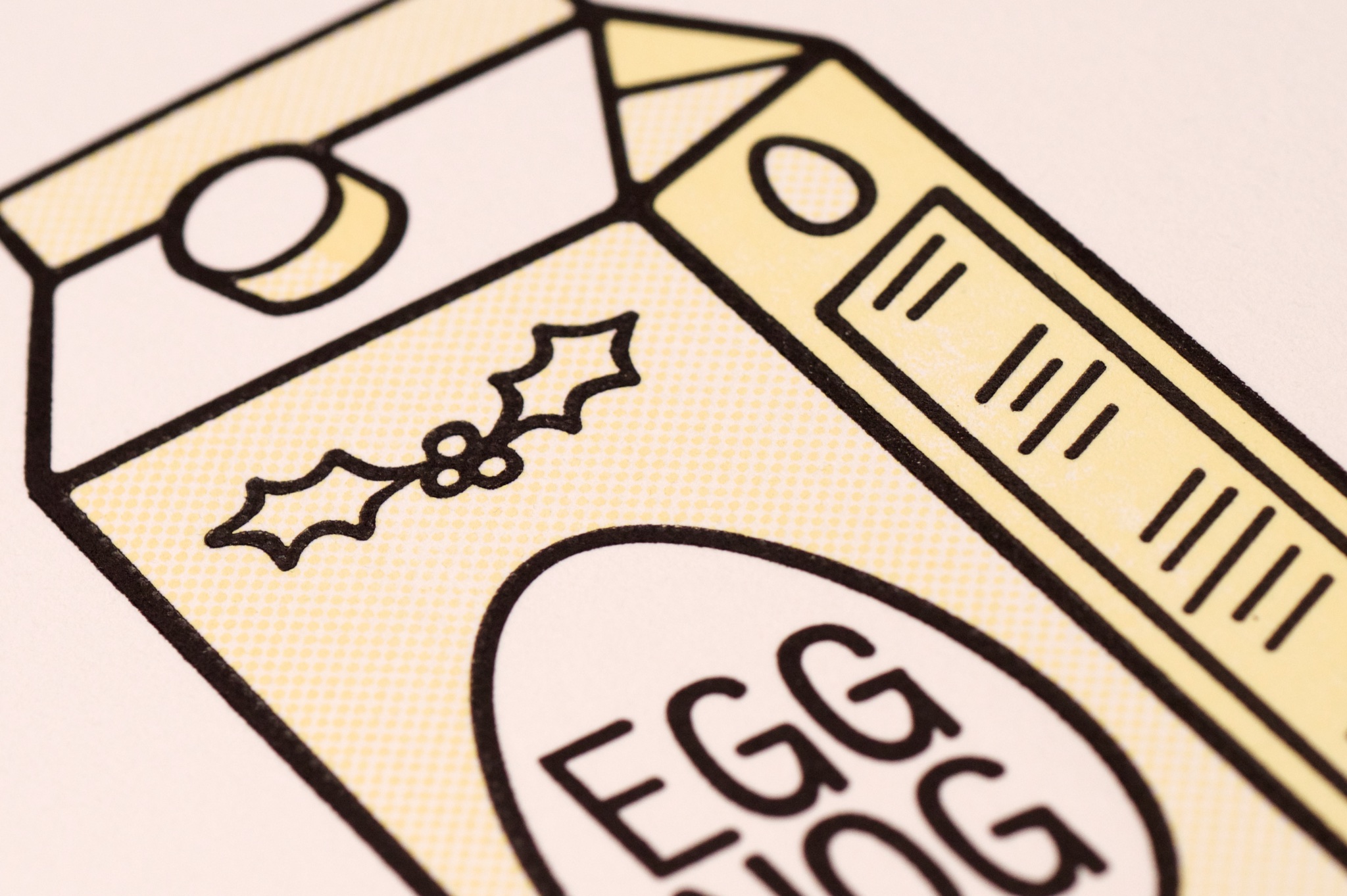
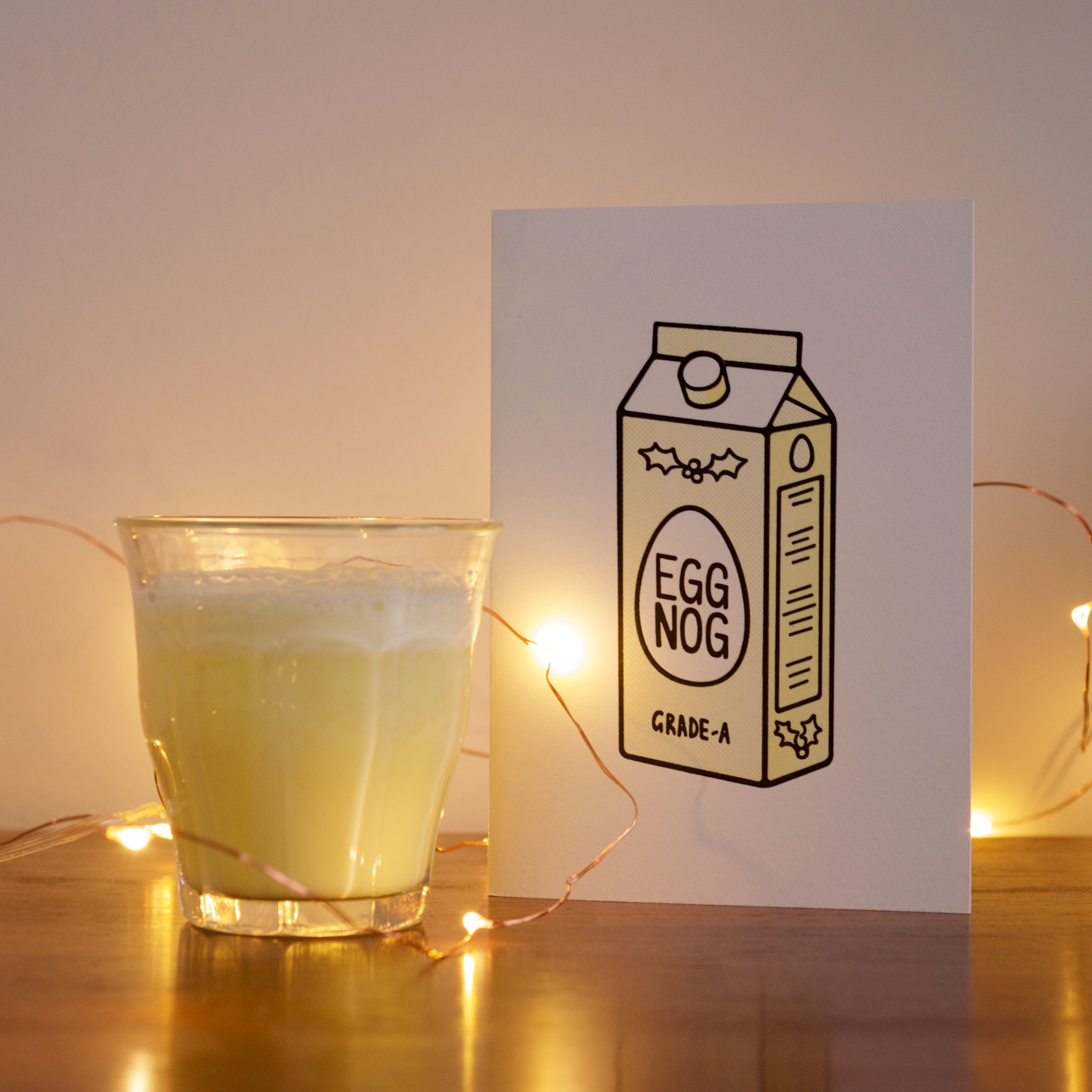
We’re always searching for unconventional ideas for our annual hand-letterpressed Christmas cards in my world. Always plenty of bad unconventional ideas come up (I actually think the Angel Grinder was pretty good!), but this year’s was a doozy: eggnog.

I’ve been spending Christmas outside of the UK for so long now I’m not sure if eggnog has finally been imported to these shores, but even in its cultural home of America, it still baffles me. It’s kind of like the milkshake you never wanted.

It doesn’t really taste eggy. It sits in the same American Holiday category as pumpkin pie in my mind – a kind of not-entirely-sweet thing that is equally misunderstood outside of the US. I’ve acquired a taste for pumpkin pie now, but every year I’m on that side of the Atlantic ocean at Christmastime, I drink eggnog and wonder why I’m doing it.

I even went to the effort this year of making my own eggnog from fresh ingredients – the real stuff is basically the same ingredient set as a good gelato, so nothing to be afraid of (though your pipes might feel differently). The homemade stuff was definitely better, but still utterly perplexing.

Perplexing – perfect for our Christmas cards! To print we went, with a nice little halftone pattern giving the illustration that extra bit of depth. Super satisfying!

Post-it Book Number Four

For a variety of boring technical reasons I’m not developmentally-inclined-enough to address, my monthly roundups of daily post-it notes stopped functioning on this blog. It was around about the time I filled up my last sketchbook, but that definitely didn’t mean these daily drawings stopped! In fact, it was quite the opposite- as I noted in the aforelinked post, I’m filling up books faster than ever.

So – book number four is full, and works as kind of a diary of my life from March 2017 to October 2018. I never even realised it was possible to generate so many puns and terrible ideas!

This all inevitably means it’s time to start a new book. Number five, here we come:

Rickmansland Calling

It’s a slow process, but I’ve been trying to get myself out to more portfolio reviews when I can get them. I’ll usually give people cat stickers or post-it notes, but I had an idea recently to use the tiny letterpress to make some calling cards. Not business cards- I’m far too independent and self-depreciating for them – just something to give someone, to hopefully remind them they met me.

Letterpressing alone would make for a nice and somewhat-unique thing in this world, but I had an idea for how to make them more interesting. I’m constantly drawing robots doing mundane things, which I’ve combined into the cards – along with my name, I’ve letterpressed in a template for a robot, which I can fill in for the recipient based on the mood of the encounter.

As I was printing something as small as intended with my little letterpress (for once), it gave a really good deep impression on the paper stock.

Check out the tiny video I made about making these tiny cards!

Now let’s hope I can find some interesting people to give them to.

Freezing in a Heatwave

A new record cover I created is released today! It’s the debut single for a new signing to Med School Music – a chap called Lakeway. Aside from the title, I was kind of given carte blanche with the direction for this project, so I ended up creating some artwork intended to feel ‘connected’ like nerves, which I then physically froze.

I made it by hammering some carefully-placed nails into a surface I painted, then winding cotton thread between the nails (it’s all one continuous piece again!) to form the letters. I was happy with the design at that point, but it needed to represent the frozen part of the title too, so (obviously?) I put the whole thing in my kitchen’s freezer. I sprayed it with water at intervals until the ice had built up enough around the cotton threads for the lettering to solidify satisfactorially.

It hung out with the frozen peas for a couple of days while we got final approval, then for a little something extra, I timelapsed the ice melting away from it again and reversed the result, so it was becoming frozen again. Harry at Hospital Records then swept in and edited the timelapse into some nice motion graphics to accompany the track uploads to YouTube.

It’s nice to have a bit of ice-cold artwork for this long hot summer we’ve been having in Britain!

Odyssey Oddity

Exciting times arrived in Rickmansland this spring, bringing a small commission from a big company. Red Bull asked me to design a T-shirt for a music event they were hosting in June. Named The Odyssey, the event took place on a small armada of boats on the Thames.

I was asked to come up with a design that I felt represented Drum & Bass music, and being me, I wanted to steer away from the hoodies-and-graffiti visual cliches of the genre. Instead I tried to illustrate what the music does – offers a place to escape into something totally different to other stuff we have on our planet and sink into a different dimension.


Red Bull were also kind enough to post a brief interview with me onto their website, which you can read here. I am thankful that even with the tint of hindsight, I don’t sound too ridiculous in the article. If you like the T-shirt design, you can order yourself one here!

On Line

I’ve been feeling good about a lot of the record covers to come out of my brain-hands lately, but the cover for New Blood 018 deserves a spot of text to go with it – perfect for the blog.

New Blood 018

This artwork was inspired by a visit to my brother, who managed to break his leg while taking his kids to the park, and was in real-hospital as a result of the accident. One of his ward-mades was getting a transfusion while I was visiting, and I found the vividness of the blood running from the bag and through its tubing partly fascinating and partly humbling as it squiggled all over this poor chap’s bed.

NB018 CD Reverse

The image stayed with me, so I took the idea of the constant line to the typography for this artwork, and designed a suite of artwork around the concept. My original version was just as bold as the blood I saw in the hospital that day, but the creators of an album series called ‘New Blood’ insisted that it was too bloody, so I changed the palette entirely to some classic clinical teal shades.

Sweetpea - Closer - custom typography

Ox7gen - Trinity - custom typography

As well as the typography that made the cover itself, I also sweated the details with the entire tracklisting, with every artist and title drawn in the same single-line style. I was really pleased with how it looks, but we all agreed it wasn’t the most legible, so we compromised and I created a design that had transcriptions too.

NB018 Digital booklet label copy

I continued the single-line concept through all aspects of the design, including all of the label copy, which I snaked on single weaving lines through the artwork on all formats. With most of my indulgences approved in the end, the album went off to press, and is out on Med School Music this week.

NB018 Vinyl LP back cover

 
You are currently reading
Page 1