I’ve enjoyed making my own one-off T-shirts (to various degrees of success) for longer than I’ve been writing on this weblog. You can find some really terrible ideas if you go back far enough in time! My designs have got more graphic and minimalist over the years, and this has been enhanced by my recent discovery of using heat-transfer vinyl.
A lot of the designs I’ve created lately have involved re-contextualising found graphic elements – if something makes you think ‘why would a T-shirt with that logo on it even exist?!’, then I feel like I’ve succeeded in what I’m trying to do.
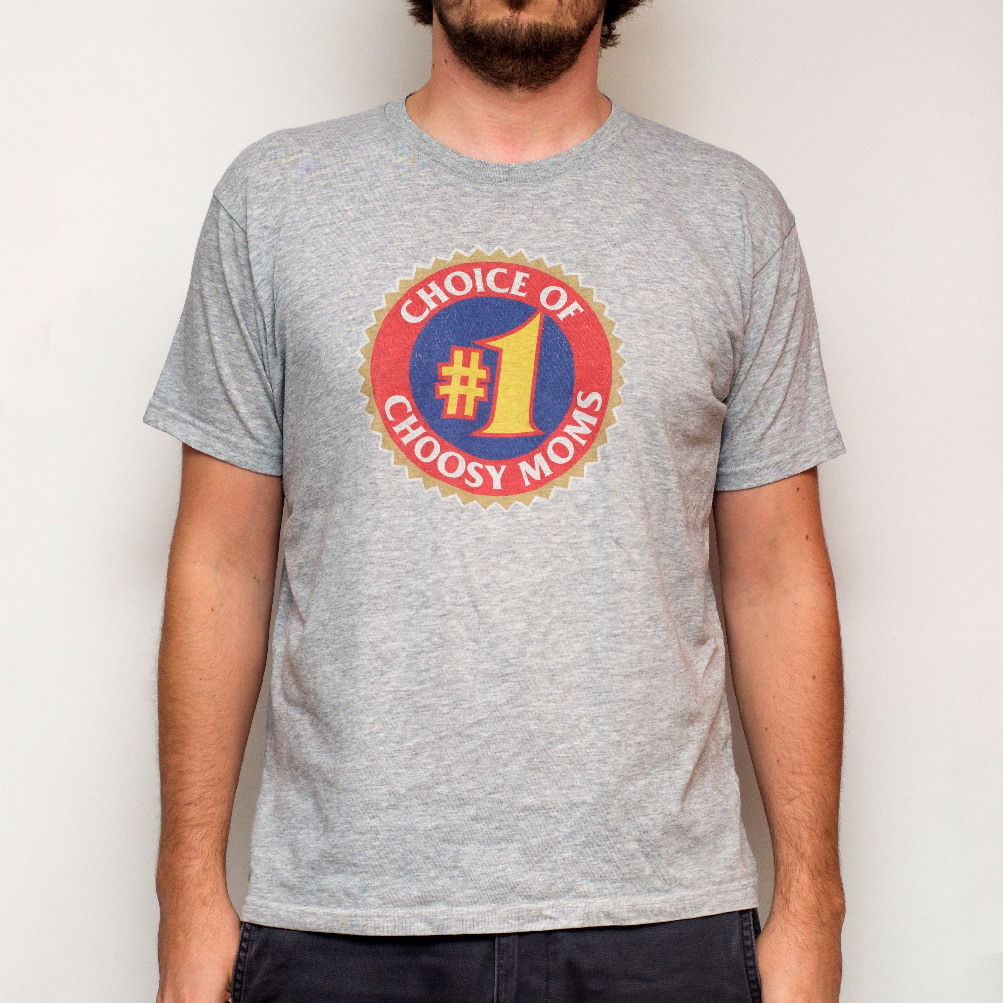
One of my earlier ideas was this logo I found on the side of a peanut butter jar while in America. It’s a great unsubstantiated claim on a peanut butter jar, and just as good for me too!

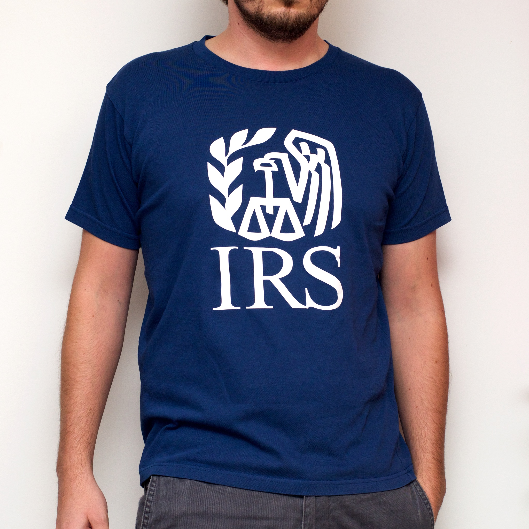
Also on the American subject is this design:

I can’t imagine a context in which either America’s federal tax collection agency would produce this T-shirt, or anyone would want to support the agency, which was exactly in my wheelhouse. Testament to this was when I thoughtlessly wore the T-shirt to a craft fair in the infamously liberal Austin, Texas. Just by wearing it, I managed to upset a couple of hippies who just didn’t see the humour in the situation.
Beside its irony, though, I do think the IRS has a great and under-appreciated logo. There’s a lot going on in very few strokes, and it condenses down very clearly and recognisably. There’s the eagle, the scales, a laurel, and the eagle’s wing also evokes the good old stars and stripes too. It’s way more futuristic than most other aspects of American government. So federal.
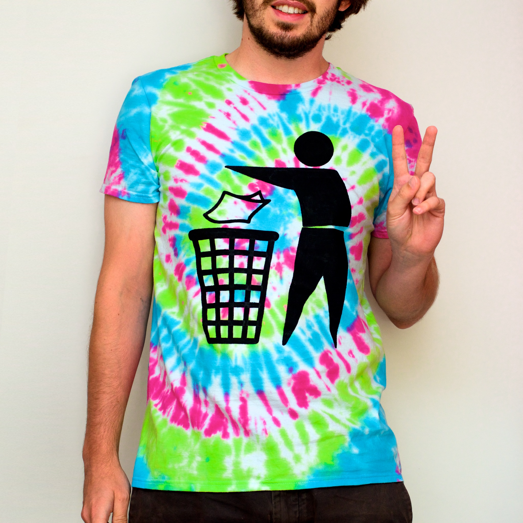
Bringing things a bit closer to home, I’ve been a fan of the International Tidyman logo for a long time, an icon I associate best with the Keep Britain Tidy campaign. So I thought, if I’m going to put it onto a T-shirt, why not make it ‘Keep Britain Tie-dyed’?

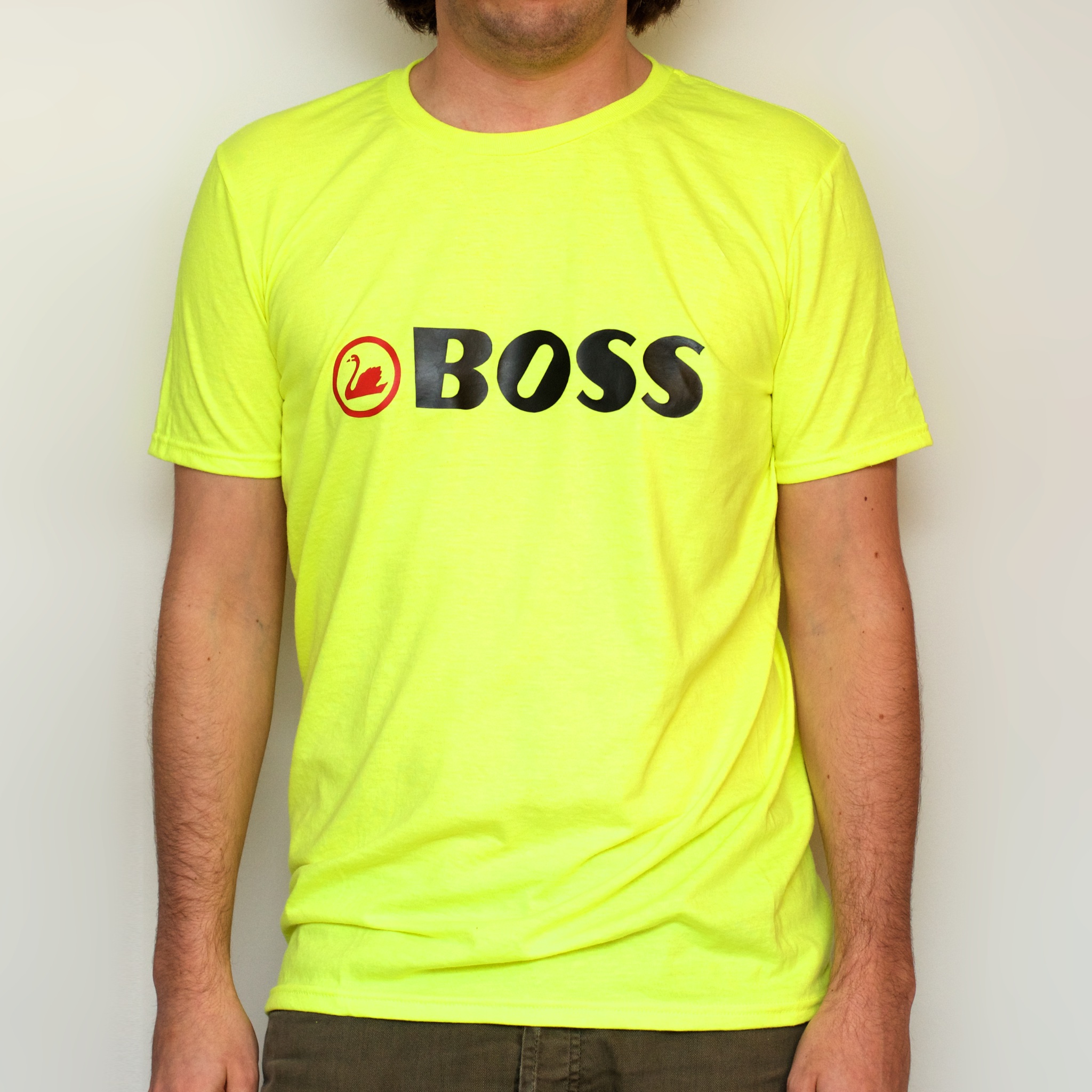
And if that design wasn’t bright enough for you, then there’s always this.

I don’t think I need to say anything more about that, other than it’s the highlight of my wardrobe.