NHS381 marks a sad moment in my music industry design career. I’m no stranger to design and identity projects for labels that have had short runs and naturally fizzled out, but Med School is the first one to very firmly close its proverbial doors after more than a decade.
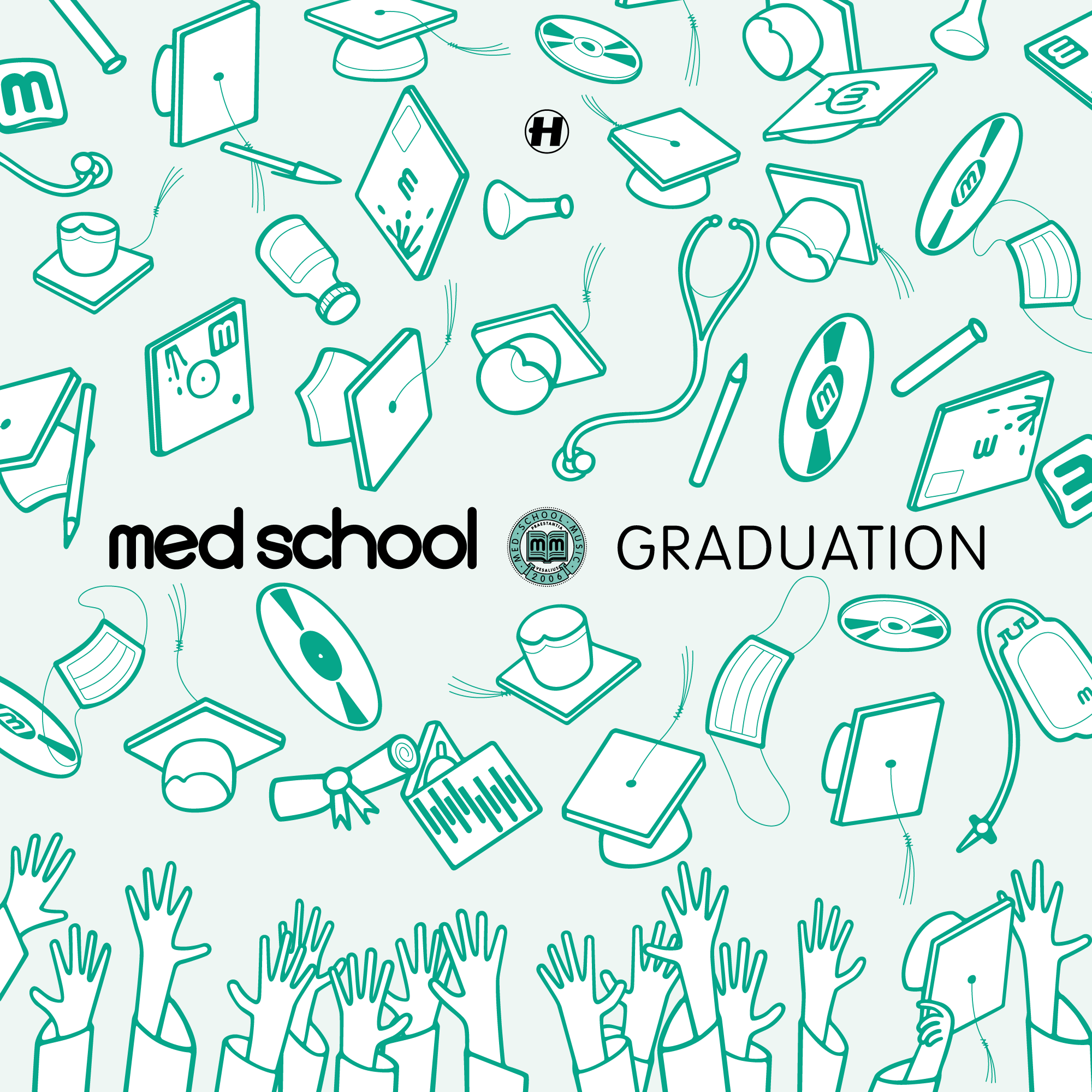
It came as a bit of a shock to me – and everyone, including the decision-makers, I think, to wind down the label at just shy of 100 releases. It was a hell of a thirteen-year run, but the decision was made, and Hospital decided the best way to acknowledge the label and its exploits should be in the form of a ‘Graduation’ LP on the big label.
The artwork project proved to be a bit of a battle, but in the end my awkward illustration skillz saved the day, and we ended up with something we all liked. Below is an alternative cut in classic Med School scrubs-green, which didn’t quite win the office popular vote over the full-colour version, but it’s the one I prefer anyway.
Beside the Graduation LP, though, it’s worth a moment to look back at the Med School design history, if a little critically.
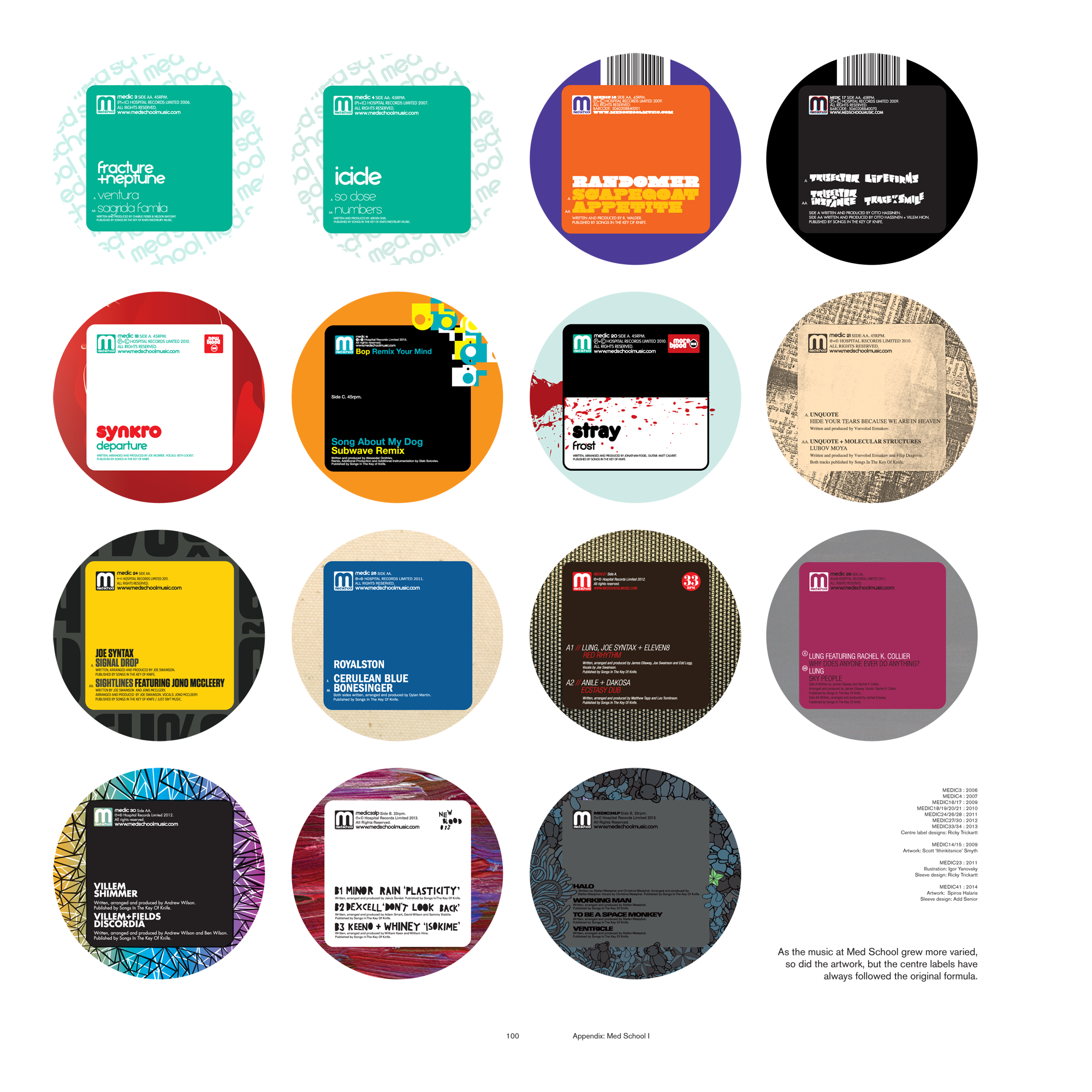
One small victory with Med School is that short of maybe two releases, every vinyl record in the catalogue followed the same label design template. I tightened said template up in 2013, about halfway through the label’s lifespan, and made sure each centre label adhered to a grid system.
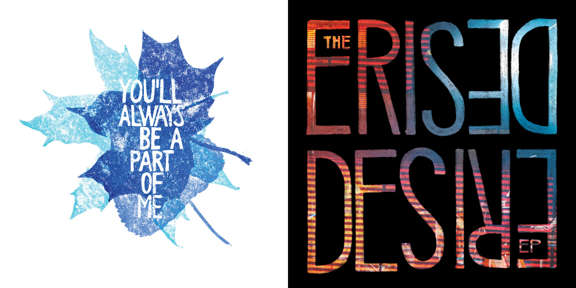
The idea for the original house sleeve was to change up the blood spatters every few releases (or few-thousand copies! Imagine printing that many record sleeves today!), but I think we only managed two generations of this design idea before the house sleeve design got radically changed and quickly abandoned altogether, in favour of bespoke artwork for each release.
After this move to bespoke covers, I always felt a little uncertain about the visual distinction between Hospital and Med School. There was a period in the middle where I started trying to do all of the Med School artwork in a hand-drawn, handmade style (and keeping the clean lines for the big label), but after a series of these pitched ideas were knocked back by the musicians, I had to abandon that idea. Oh well, sometimes you just have to do the right artwork for the project.
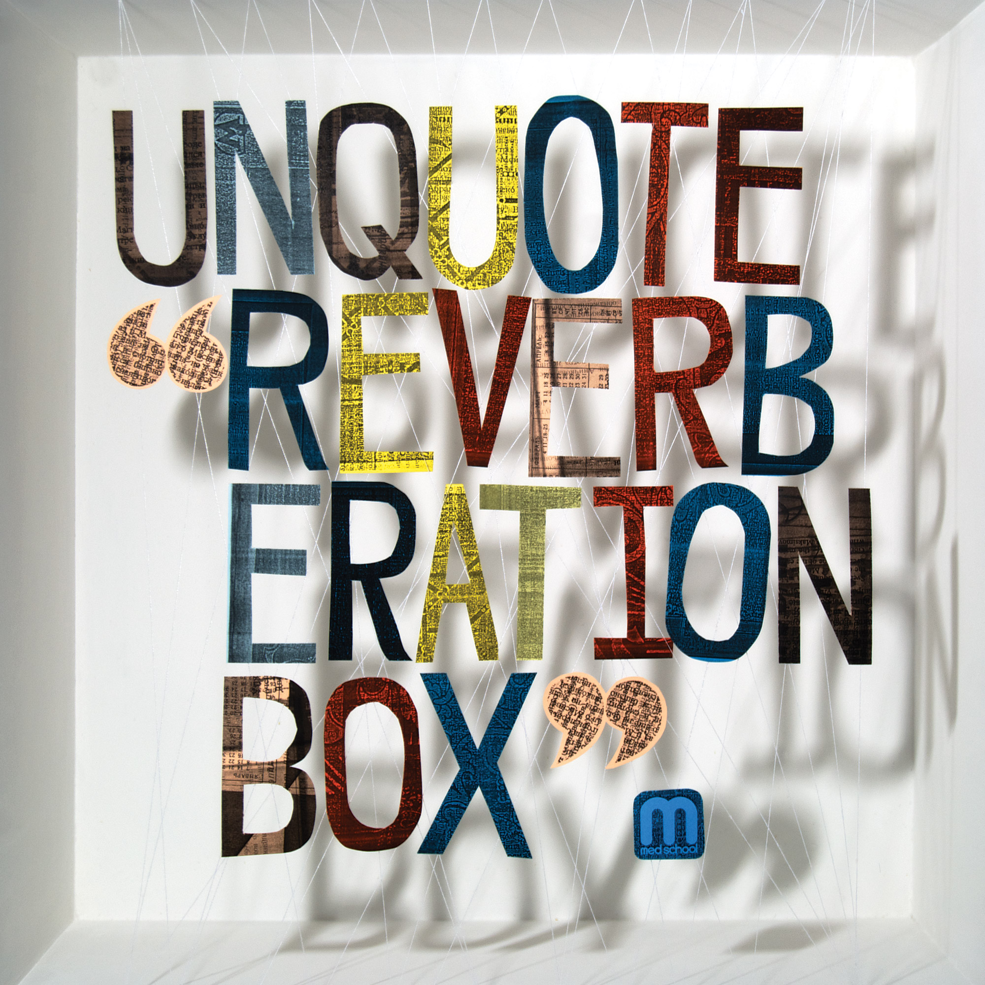
The great thing about Med School and my entanglement therewith, is it produced some of my favourite covers I ever made. Unquote’s Reverberation Box is not just handmade, but the one that always comes to mind when I’m asked what my favourite cover I ever made is. I also love the New Blood 013 and 016 albums in their own ways (the entire New Blood series is also fabulous listening!), and much later in the label’s lifespan, I was very proud of Lakeway’s Frozen Nerves cover too. And that’s not to mention some of the albums on the label I really love to listen to!
As mentioned, the end of Med School was a big shock, but all good things must come to an end.
September 2020 update: I’ve been thinking about this cover a lot recently because of this crazy pandemic, which I would like you to believe I had no idea was going to happen when I made this cover. Of all the nonsense the hands are throwing into the air, I got the most questions as to what these were supposed to be when I was drawing the cover:
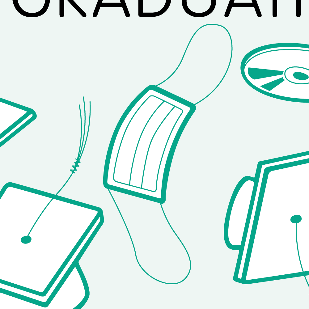
I don’t think anyone that lived through 2020 as a sentient being would have any trouble recognising now that it’s a mask. I think about this cover now every time I see one of these masks littered on the streets, as is such a common sight right now.