Chimney Christmas

While I understand the conventional wisdom that Christmas cards are a postal-service-propping hassle, my good lady Lilly and I do like the annual excuse to put our tiny letterpress through its paces.

Like every year, we try and make the card vaguely thematic to an event from our own past-twelve-months, and this year’s standout event was Lilly showing how excellently she does something when she turns her hand to it – she won the World Bread Award for her home-baked wild-yeast bread this autumn!

Alas, we don’t even have a garden for a wood-fired stove, but Santa’s affinity for chimneys made it a good way to link the season with the achievement. Like one of Lilly’s loaves, the card came out great!

More Pandas Than China

Lilly and I went on a summer holiday to Sardinia this year, and while we were there, we were astonished by the amount of Pandas everywhere. Of course, I’m not talking about the Chinese bears, but the Fiat manufactured in the 1980s and 90s.

It was almost as if Sardinia is where Italy sent its Pandas not to die but to just keep on living.

We were both charmed by these boxy little powerhouses, so it was a good cue to make Lilly a new piece of artwork for her birthday. I began researching the materials that were used to sell the car during its original run, but there was no escaping this being a car of the eighties:

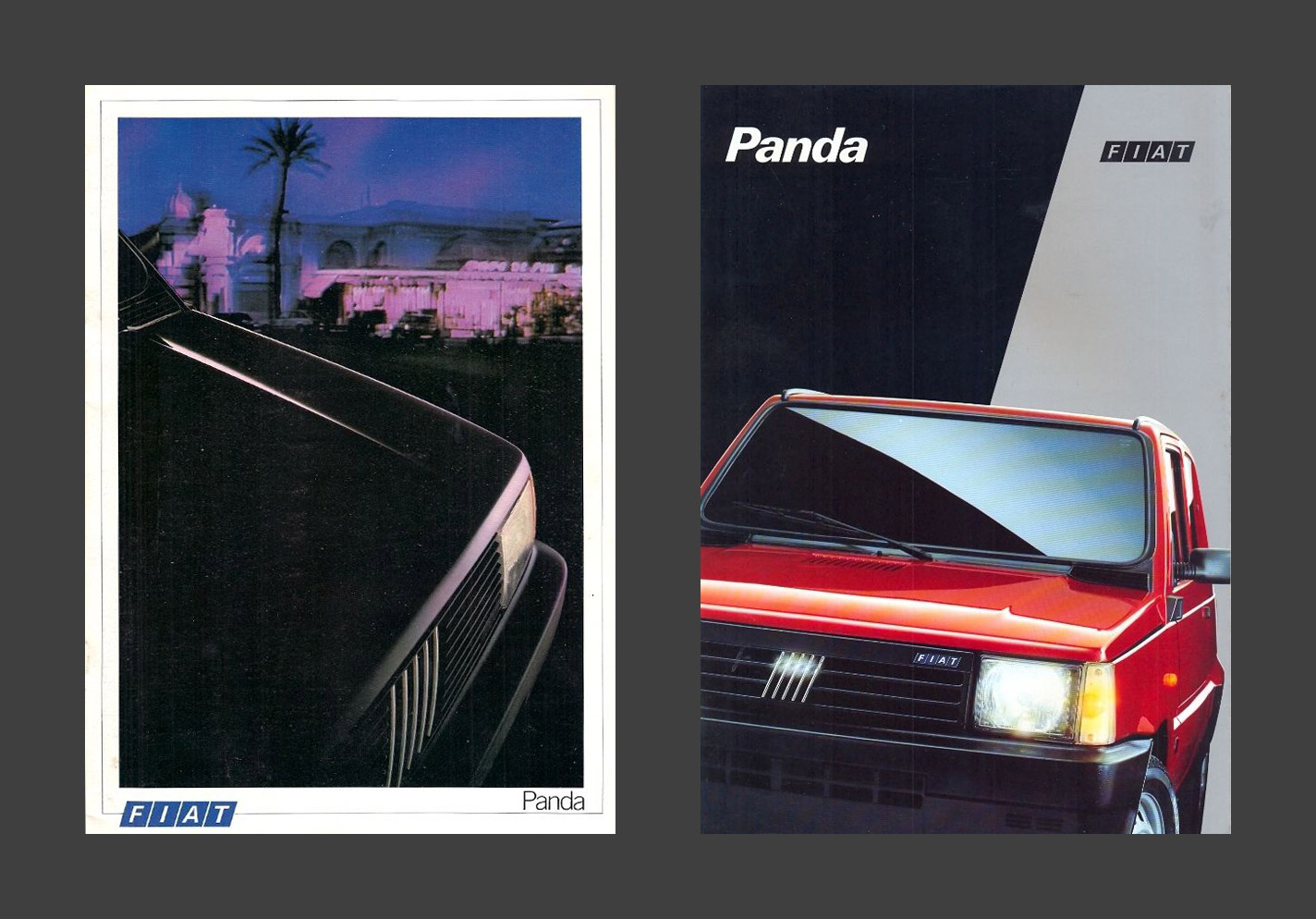
As magnificent as those are, I was looking for something that spoke a bit more to how thirty years later, the cars were still so happy rattling through the dusty landscapes of the Mediterranean. The native Italian materials weren’t any more inspiring with their woefully stretched typography, but France proved to have some more playful typographic ideas for selling these little Fiats:

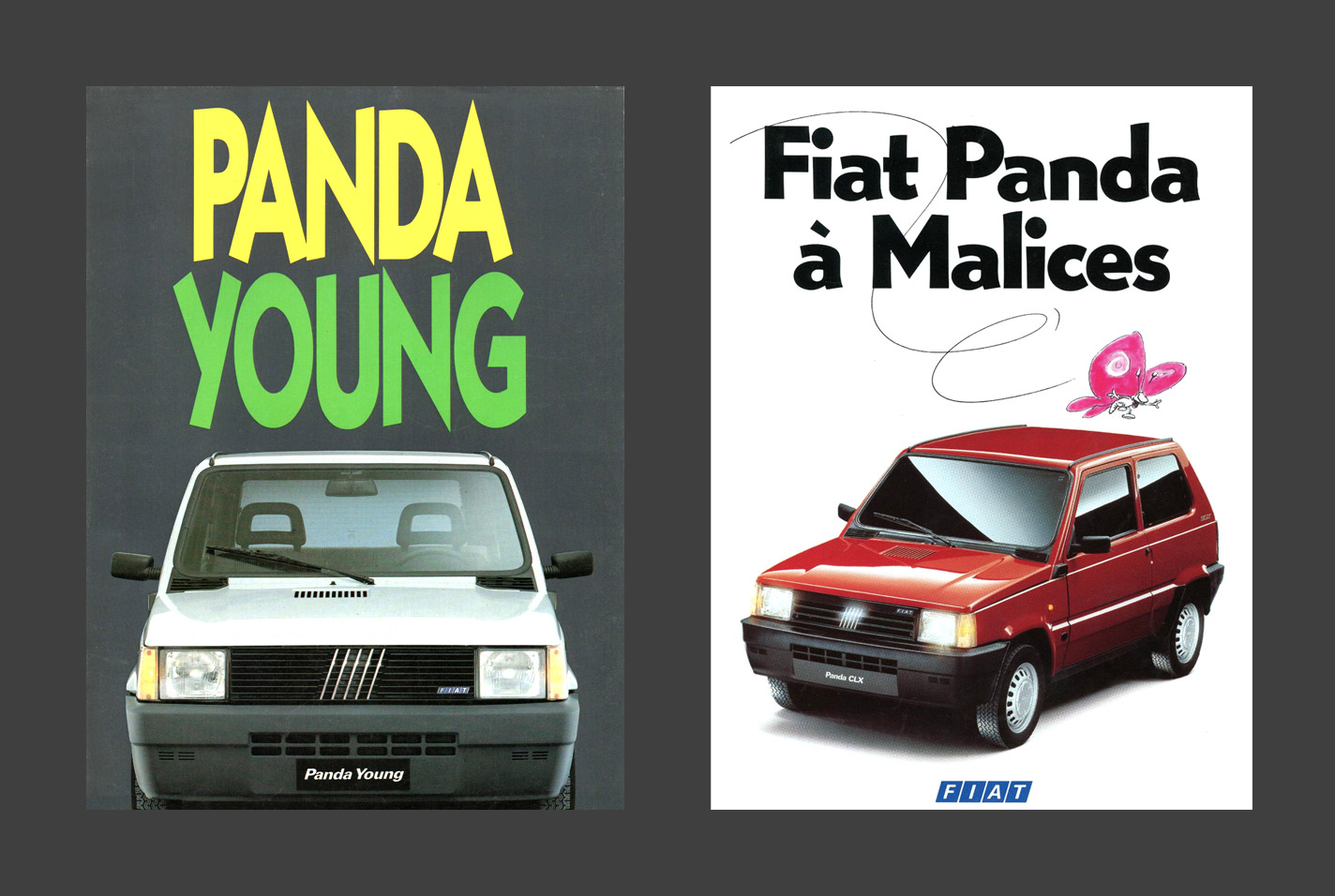
The only trouble is I had no idea what the French typography said, and online translation wasn’t being much help to me either. My first few attempts of running the full slogan ‘Les Voitures à Malices’ through the internet tried to tell me it meant ‘The Cars With Malice’ or ‘The Malicious Cars’, and I couldn’t imagine even the French would try and sell a car on the idea that it would harm you.

Instead I decided it must’ve been idiomatic, so I asked a French friend to help me (her response: ‘I’m so French it’s beyond belief’), who explained that it meant ‘cheeky, facetious, witty all at once’, and was like boite à malices, ‘a box with lots of stuff that would be fun for kids’; a box of tricks. That sounded perfect to me, so I had to get back into the other hard part, illustrating the car in a way that captured its humble boxiness.

My first couple of attempts looked too boyish, and like something from a video game. Definitely not the right flavour. Instead, a basic profile shot proved to be the winner, and when combined with a bit of the mountainous terrain of Sardinia and a little more of the French marketing materials, everything came together just right.

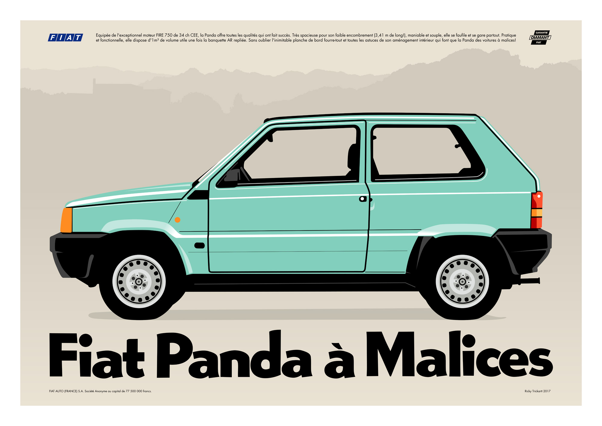
Of course, the most important thing in all of this is that Lilly loved the artwork, so we immediately put it up on the wall!

Somewhere Between The VCR Heads

Another record cover I designed recently has been getting a surprising amount of love… Nu:Logic’s second album ‘Somewhere Between The Light’ has been out for a couple of weeks now, and is my first Instagram post to not just reach but blow past 100 likes!

The design is a homage to old VHS packaging, which was an idea suggested by Nu:Tone and Logistics themselves. It was down to me to turn this idea into a record package, which tied together nicely with a retro thumb-hole cutout, printed inner sleeves for the records, and a solid black jewel case for the CD version too.

Even the shrink wrap looks good with the thumb hole design. Nice!

My Favourite None-More-Black Client

Critical Music marks its fifteenth anniversary and hundredth catalogue number today with the release of a super-limited-edition boxset I designed.

The design is intended to be part fanzine, part ultra-minimalist blackness, and contains five (!) pieces of black vinyl, in black sleeves, with a black booklet and black poster, in a matte black box with a gloss black print on it. Short of being made of vantablack, it’s like how much more black could I make this artwork for Kasra, and the answer is none… None more black.

To celebrate the blackness (and to torture myself photographically), here are a load of photos of black objects from the package, set against a black background.

Clean-up in Sector Six

I created the above illustration for Barbican’s Sci-fi poster competition. Clean-up in Sector Six imagines a team of domesticated robots commissioned to travel into junk orbit and collect the space junk that is floating out there. Inside their rocket ship, they dismantle the trash they capture, and after sorting it for valuables, use the rest as fuel for their engine that powers the ship. They’re kind of like space wombles! Of course, because their job is cleaning, they can’t help cleaning up their ship perpetually as well.

Here we see a robot vacuuming the vacuum chamber

I do like to think about junk orbit from time to time. Some of the stuff floating around up there would have been the most expensive objects ever created in their time. Now they just hover around out there, trying not to cause any accidents. Kind of like how I feel on the internet.

A Quick Cuppa

Here is my latest and greatest record cover artwork! It’s for St. Petersburg’s Bop, and a collaboration between Med School and Microfunk.

Bop wanted the artwork to look “pretty but a little bit dangerous so you wouldn’t drink it”. I tried using petrol to get a thin-film effect, but it made my Rickmansland studio smell like a garage. After a different approach, I ended up on this psychedelic cup of cha. It’s one of my favourite pieces of artwork in a little while, and it’s out today!

Another Post-it sketchbook is filled

Since I started making an effort to publish a new Post-it note every day, these books have been filling up a lot faster! I filled up my latest sketchbook in February, and it covers the time from Summer 2015 to now. It’s like watching my life flash before my eyes!

Let’s Make Tortillas!

I’ve got into the habit of making my own fresh flour tortillas. They’re more satisfying and less alarming than the store-bought ones you get here in Britain, and as a bonus you can make them the right size for the job, instead of the not-quite-burritos-but-too-big-for-tacos one-size-fits-all approach they have here.

They’re not difficult to make either, but things do start getting a bit jugglesome when they’ve finished their second rest and it’s time to cook them. I usually find I could do with several extra pairs of hands between the rolling out, transferring to the pan, flipping, and putting in the tortilla warmer, which happens on loop until I’ve run out of dough.

Several extra pairs of hands, or a squad of small robots! I realised the process was prime for the production line treatment.

Tortilla Production Line

As ever, this is an animated gif that loops about every second, but there is a lot more to look at than just one second of looping. As the dough disappears off the bottom and top (under its cling film), you have to imagine it’s going to rest for twenty and ten minutes respectively.

These robots are doing a pretty legit job of making these tortillas otherwise. We’d need an army of hungry people to eat them before they go stale though!

2016’s Christmas Card

STOLLEN

Lilly and I were busy travelling a bit this autumn, so Christmas cards became a bit more of a clandestine operation than in past years. As usual, we struggled to come up with a design. When I sent Lilly a sketch of this it made her laugh, so in absence of a better idea I took a punt on it.

When the plates arrived, Lilly was worried that it wouldn’t be understood by most of our recipients, but sometimes you’ve just gotta be weird. Our rotund Santa has stolen the stollen (which wasn’t the only thing we believe to have been stolen in 2016… Ahem).

Decent impression

I went for slightly smaller cards this year thinking I would do a design that didn’t max out our tiny press so much, but I still ended up pushing the tiny Adana’s limits. We got surprisingly good results out of it though, and the silver ink highlighted the reasonable impression it made too!

 
You are currently reading
Page 1