Waschmann spins again

My new attempt at an old painting of a spaceman-washing-machine

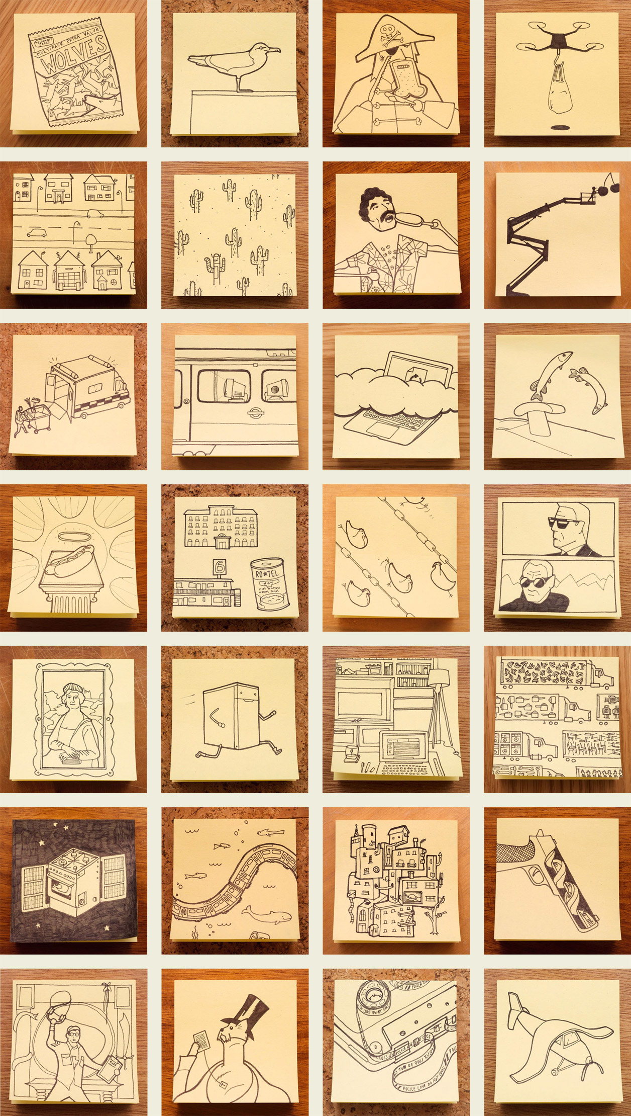
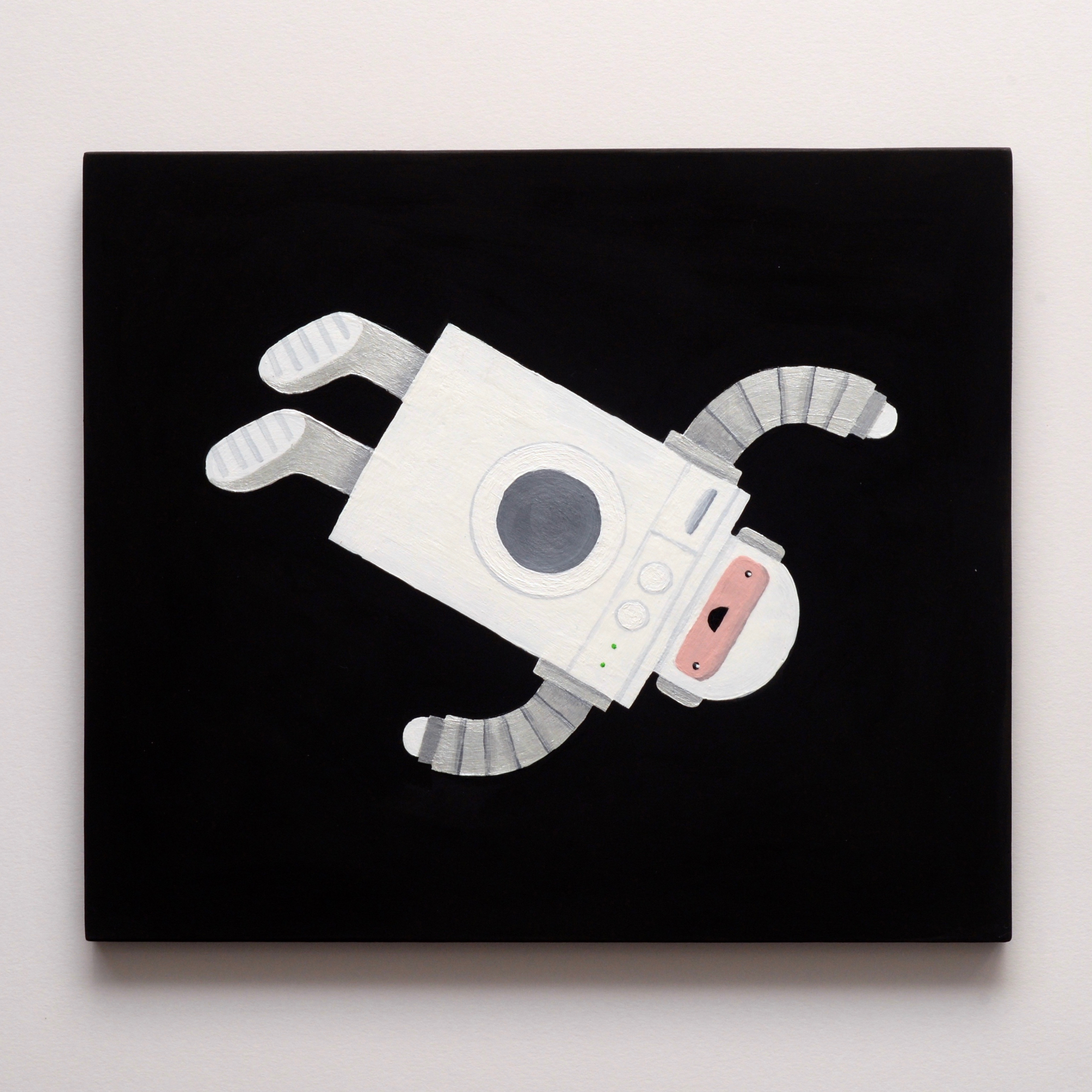
It feels a little silly to paint a picture I already painted a few years ago, but the Waschmann caught my attention again recently. I was thinking about how my attempt at contrasting a matte space sky with a glossy robot body didn’t really work on the canvas surface. I decided I’d give it another go on a harder surface, and it would be a good excuse to have another go with Stuart Semple’s Black 2.0 paint (and by funny coincidence I then heard it featured on 99 Percent Invisible recently too). I’ve got to say – the Black 2.0 paint is super disappointing. The best thing about it is how it photographs, as it’s very easy to blow it out to 100% black when post-processing, but in person it’s laughably not-black. Even regular old System 3 process black is dramatically darker to the human eye, even with a gloss glaze over it. I hope Semple’s Black 3.0 paint is an improvement, but I’m less inclined to try it considering how disappointed I am by the 2.0.

My old attempt at painting the Waschmann

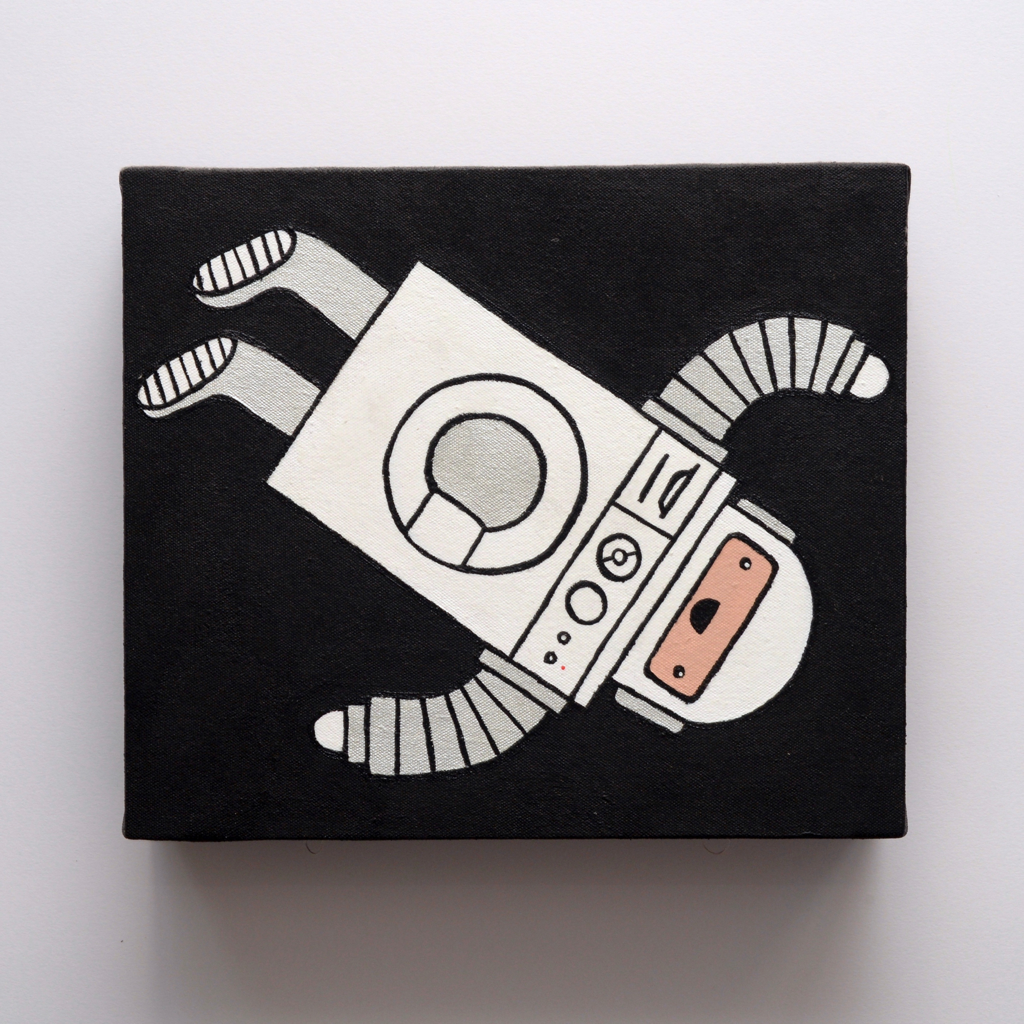
My painting is a little better anyway – it’s a lot more subtle without the thick black outlines.

My Favourite None-More-Black Client

Critical Music marks its fifteenth anniversary and hundredth catalogue number today with the release of a super-limited-edition boxset I designed.

The design is intended to be part fanzine, part ultra-minimalist blackness, and contains five (!) pieces of black vinyl, in black sleeves, with a black booklet and black poster, in a matte black box with a gloss black print on it. Short of being made of vantablack, it’s like how much more black could I make this artwork for Kasra, and the answer is none… None more black.

To celebrate the blackness (and to torture myself photographically), here are a load of photos of black objects from the package, set against a black background.

S.C.R.A.W.L.S.

This month my beloved American became American-British, so to celebrate, I took her to see the latest James Bond movie with a seven-lettered-word-beginning-with-S-written-in-all-caps-for-a-title. Just like all the other bond movies, this one didn’t make a huge impression on me, but it did yield my favourite post-it note of the month, which was a musing on how Daniel Craig seemed to be wearing a different pair of designer sunglasses in pretty much every scene of the movie. Very stylish, but it made the movie feel a little like a Sunglasses Hut commercial.

Elsewhere this month, I’ve been watching the World Gymnastics Championships and chuckling every time someone did a move called a pike, pondering how technology makes impossible things possible, and hiding robots into everyday scenes.

A pretty good, pretty scattered month!

After the fold are all the old direct links, for posterity’s sake. Continue reading “S.C.R.A.W.L.S.”

 
You are currently reading
Page 1