Christmas Crafts

Stained-glass star Christmas tree topper

2020 was a strange year for us all, and one of the (unimportant? privileged?) ways it impacted me is it meant I didn’t travel for Christmas for the first time in more than a decade. The nice thing about this is it gave more time and need for craft projects!

I did multiple projects for Christmas, but a couple stand out enough that I made videos about the creation process on my YouTube channel.

Letterpressed ice skater Christmas card

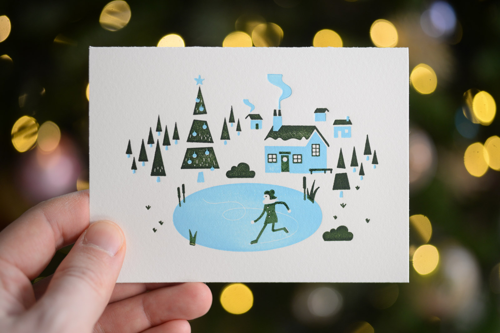
We letterpress our Christmas cards every year, but this year I made a video of the process of creating them, from trying to figure out a design all the way through to trying to figure out who to send them to.

I really like how these turned out – the design is a little out of our usual Christmas card comfort zone, and I think it was all the more successful for it. Watch the video to see the process!

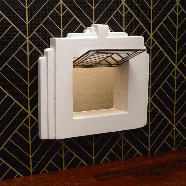
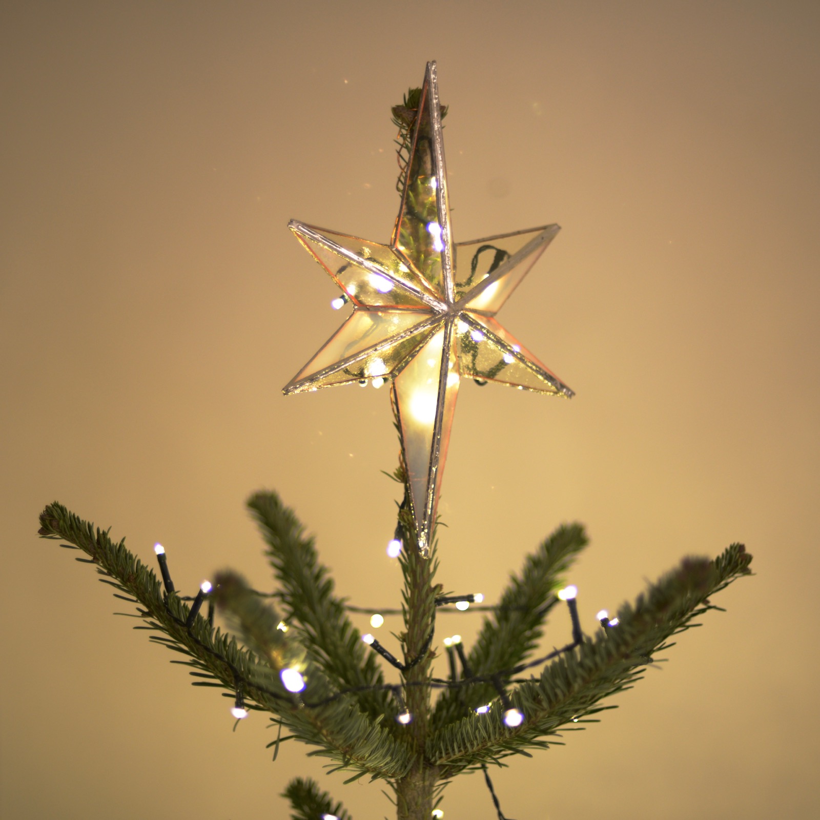
The other project I videoed was a mini-project of making a stained-glass tree topper. It was my first time needing to decorate my own tree, and when we realised we didn’t have a topper, I put the skill I learned from making my cat flap (see previous post!) to work, making one out of glass.

The project came together surprisingly quickly, and surprisingly effectively too. Christmas champion!

Grow Lamp

Grow Lamp story book

A year ago, I did a Risograph-printing workshop with Hato Press that resulted in a miniature story book called ‘Grow Lamp’ – it’s a simple little eight-page wordless story about a robot who learns to care for its houseplant. The story was inspired a little by me buying some grow-lamps to care for my own growing collection of houseplants over winter, when the days are terribly short here in London. I felt really awkward ordering grow-lamps off the internet – like I was the only person using them for their legitimately stated purpose!

The Riso workshop was brilliant – I found it fascinating, like a crazy halfway house between screenprinting and olschool photocopying, but with wicked colours. Here are a few images from the process, and my daily drawing featuring my instructor Rachel Davey wrangling the machine.

Riso machine drum
Gnarly book stapler
Riso prints coming out of the machine
Daily drawing of maching wrangling
Cropping my finished pages

If you’d like a copy of Grow Lamp, I’m happy to send one to you for a modest fee: they are £15 including worldwide delivery on my tiny webshop!

The Great Catsby

Art Deco Cat Flap

Another personal project I’ve worked on during the 2020 pandemic has been an entirely useless Art Deco cat flap! It’s useless on two levels: firstly because I don’t have a cat to flap through it, and secondly because I don’t think it would hold up to a cat’s claws or the elements here in Blighty.

I’ve made another nice video about it, featuring the entire making process. It’s really real stained glass! It was a total push out of my making comfort zone, and I feel quite rewarded for it.

My Solar Robot

My solar robot, sitting on the windowsill, harvesting sunlite

If anybody else is still out there blogging in 2020, I’m sure the last thing anyone needs is a post about the impact of Coronavirus and the public lockdowns that have ensued. I have to acknowledge it though, and stress that I’m trying to not take for granted the fact that I’ve been doing quite well under the circumstances.

I told my dad on a phone call earlier this summer that it’s the introvert’s time to shine: working from home is how I’ve always done it, and doing things like trying to work out cycle routes where I would encounter as few other people as possible is exactly my kind of task.

I haven’t let my foot off the creative accelerator either. It’s physically small, but my biggest personal project this summer has been a robot I have made out of some tiny solar panels I ordered from China, a can of chickpeas, and a tiny little computer.

All he does is rotate his arms to collect power, so he can use that power to rotate his arms again the next day: a perfectly useless little machine!

The project took a couple of months of simmering, and I made a nice little video of the project. A few recent experiences have encouraged me to get over the hump of the sound of my own voice, so I have narrated this video, and I think I’ve done a nice job! I’m proud of the little robot, and proud of the video I’ve made, so I’d love for you to give a couple of minutes to watch it.

Super Victory

I had a small victory this summer in the form of finally getting Hospital Records’ Spotify playlists rebranded. I’m an old man and still haven’t bought into the value of streaming services, so I’ve never had to personally interface with these playlists, but they have been a bit of a bugbear of mine for a while.

They seemed to crop up on my jobs radar for Hospital every eighteen months or so for the past few years – I would be asked to redesign them, I would mock something up, then it would fizzle out and they’d either make something else in-house or just leave whatever was there. Finally word came from higher-up though, and I was given free reign to redo them more thoughtfully.

Despite Akzidenz Grotesk always being a crucial part of Hospital’s identity, we had never given much time to the Super weight of the font, until now. I pulled through some of the elements from my illustrated NHS300 cover into these playlists too.

A series of six thematic cover designs for Hospital Records' Spotify playlists

The x-ray for the house party particularly tickles me – it might just seem like a bit of a medical non-sequitur, but really it makes me think of my big brother and his university days: I don’t think it was strictly a house party, but there was definitely a party he went to where he ended up breaking a bone. It just feels like the sort of inevitability of something that would happen at a wild house party!

I’m really happy to have finally tidied these up and not had them slip down the back of the sofa *again*! I love being able to create little series like this too!

Lo; post-it note book number five!

It’s the customary ‘I’ve filled up another post-it book!’ post!

Book number five spans from late 2018 to summer 2019 – about a year and a half. Across that time, I put 720 notes into my book, at a rate of at least one a day, as one gets put on the social medias every day too.

Every page from my fifth sketchbook full of illustrated post-it notes

It’s not just the dailies though – I use post-it notes to sketch out other things too. In this looping, blink-of-the-eye video, I’ve tried to highlight some of the notes that have already become other things.

These books are such a valuable trove of ideas for me, I’m sure more is going to come of them over time!

A simple message

I was thinking about how the abysmal state of some of my printing screens would yield some mega grunge. I put that thought to the test today in the form of a little hand-lettered design with a big message.

Peace signs

I really like how this mini-series turned out. Send me an email or an Instagram message if you’d like to buy one – I only did twelve of them! They’re printed on 28x38cm watercolour paper, so they’re a little smaller than A3. £15 including postage!

Picture of one of my peace screenprints in a frame on my wall

Epitaph for a record label

NHS381 marks a sad moment in my music industry design career. I’m no stranger to design and identity projects for labels that have had short runs and naturally fizzled out, but Med School is the first one to very firmly close its proverbial doors after more than a decade.

It came as a bit of a shock to me – and everyone, including the decision-makers, I think, to wind down the label at just shy of 100 releases. It was a hell of a thirteen-year run, but the decision was made, and Hospital decided the best way to acknowledge the label and its exploits should be in the form of a ‘Graduation’ LP on the big label.

The artwork project proved to be a bit of a battle, but in the end my awkward illustration skillz saved the day, and we ended up with something we all liked. Below is an alternative cut in classic Med School scrubs-green, which didn’t quite win the office popular vote over the full-colour version, but it’s the one I prefer anyway.

Alternative, classic-green Med School Graduation record cover

Beside the Graduation LP, though, it’s worth a moment to look back at the Med School design history, if a little critically. Continue reading “Epitaph for a record label”

Waschmann spins again

My new attempt at an old painting of a spaceman-washing-machine

It feels a little silly to paint a picture I already painted a few years ago, but the Waschmann caught my attention again recently. I was thinking about how my attempt at contrasting a matte space sky with a glossy robot body didn’t really work on the canvas surface. I decided I’d give it another go on a harder surface, and it would be a good excuse to have another go with Stuart Semple’s Black 2.0 paint (and by funny coincidence I then heard it featured on 99 Percent Invisible recently too). I’ve got to say – the Black 2.0 paint is super disappointing. The best thing about it is how it photographs, as it’s very easy to blow it out to 100% black when post-processing, but in person it’s laughably not-black. Even regular old System 3 process black is dramatically darker to the human eye, even with a gloss glaze over it. I hope Semple’s Black 3.0 paint is an improvement, but I’m less inclined to try it considering how disappointed I am by the 2.0.

My old attempt at painting the Waschmann

My painting is a little better anyway – it’s a lot more subtle without the thick black outlines.

 
You are currently reading
Page 1