Three Little Websites

Hospital realised that WordPress isn’t the be-all and end-all of creating functional websites, which was great news for me as hacking up themes take a surprisingly long time! Instead, I’ve been getting to be a little more freeform with the websites I’ve been creating for them lately, resulting in these three little websites:

NuTone.org

The idea for this site was borne out of a conversation with Matt Riley, the man in charge of web promo at Hospital. He suggested that as our tracks end up on YouTube anyway and we had such a striking cover photo, that we could make the page a big version of the album cover made up of YouTube videos.

Continue reading “Three Little Websites”

“It’s almost 3D, this album!”

Today’s the day Rave Digger comes out- Danny Byrd’s latest album and my latest project for Hospital. This has been my biggest project both in terms of the amount of stuff I’ve created for it and the amount of exposure it has been getting, so in my usual feigned attempt at quantifying the work I’ve put in, here is a blog post showing everything I’ve managed to round up from the album, along with a bit about the process of designing it.

Continue reading ““It’s almost 3D, this album!””

Little Oranges

Good work comes from good projects, which in my line of work, usually means good record titles to design for. ‘Little Oranges’ has to be the best track title I’ve had the pleasure of working with since Credit Crunch! Was B-Complex thinking of satsumas? Clementines? Tangerines? We may never know!

More pictures after the fold. Continue reading “Little Oranges”

Fresh Slabs

Another trip to Forest Hill today meant another excuse to pick up some finished copies of my work for Hospital! As well as picking up finished copies of Sweet Harmony, some recent flyers and the New Blood 010 album on Med School I tidied up, I also picked this up:

I love designing for print! Finished copies are always, well, finished, whereas designing for Web can always be tinkered with indefinitely (as long as the client lets you!). One of my favourite things about collecting finished copies of records I designed has to be centre labels:

Centre label designs are difficult to keep fresh. They can so easily just be an afterthought to the sleeve’s design and I am always conscious of not just reusing layouts already used for a different artist/label/whatever. Pulling the record out of the sleeve to give it a spin when I get it home usually results in a nice surprise along the lines of ‘Hey! That’s a cool centre label design. I wonder who did that? Oh wait, I did!’, as during the weeks between finishing the artwork and getting finished copies, I only tend to see the front cover, forgetting what I did for the centre labels.

Piano Anthem is out on Monday 1st March on Hospital Records.

Bonus points to anyone who can spot the typographical innuendo in this artwork!

How Sweet!

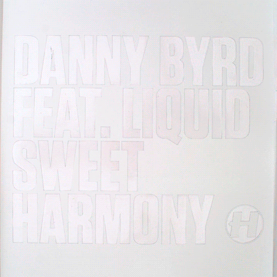
Hey look! Here is my cover artwork for Danny Byrd’s new release ‘Sweet Harmony’! It’s only a single, but it appears to be getting a bit of attention- yesterday I discovered it has been playlisted on Radio 1, which means it’s getting daytime airplay by the likes of Fearne Cotton (Fun fact: she went to the same high school as me, and was a pretty good artist. Agh! Digression!) on the country’s biggest young radio station… Pretty cool! And not only that, but Dev, the early morning breakfast DJ, has nominated it as his record of the week- Imagine waking up to that at 6 in the morning if you weren’t expecting it!

Anyway, here’s a little bit about the cover art, as I am pretty pleased with it!

I was thinking about doing something rave-related, as the original is a classic of the early 90s rave era. This got me thinking about candy ravers, which brought me around to sweets. I told Hospital about the idea, who immediately saw the pun in the track’s title, which I had overlooked until it was pointed out to me. Agh! I got to work on the idea as the visual pun was too good to ignore, but after several trips to the local sweet shop and many cover ideas using all things from red rope liquorice to candy bracelets, it just wasn’t working.

It wasn’t until the weekend, when Lilly was baking, that I found myself staring at her collection of cake decorations, thinking how much I liked the colours of them, when suddenly the idea clicked with me, and I realised the decorations were essentially tiny sweets in themselves.

To the right, you should be seeing a tiny video. It is a (very short!) timelapse I took while putting the cover together. I made a reverse stencil using the lovely new typeface Tungsten (I couldn’t resist after it was noted as an answer to Compacta, which I have been using for Danny’s artwork for a while now), which I backed with sticky labels for the sugary treats to stick to. I guess it was a bit like giant glittering really!

Sweet Harmony will be out at all your favourite physical and digital record stores on 1st February 2010.

A graphical tribute to Laika, or The Future Sound of Russia

laika

I went to Hospital’s offices at The Purple Gates today, and while I was there, I managed to pick up some finished copies of the new Future Sound of Russia album. I think it isn’t out for another two weeks yet, but Hospital themselves have started Pushing it around the internet, so I figured I could do the same too!

As you should be seeing above, I managed to slot a tiny drawing of a space dog into the artwork as a tribute to Laika and her contemporaries. Poor animals! It’s probably not too hard to find now you’ve seen the above image, but see if you can spot it if you have a copy of the album yourself.

Anyway, like all good Hospital record covers, the artwork is a nod to another obscure artist- under the usual direction of Chris Goss, this cover is based on a really handsome old poster by a Russian designer called Alexander Rodchenko. Hopefully my Sputnik additions and hand-drawn type add a bit of my own artistic merit to it though!

So if you’re into Drum & Bass (and let’s face it, you probably are if you’re sitting here reading this, as nobody seems to know me outside of this little world), go buy the album!

DSC_0280

Crash Bang Wallop – Process

NHS156CD-Packshot-2

Music-making man-machine Logistics’ third album (well, fourth if you count a digital-only album) Crash Bang Wallop! is hitting stores, shelves and record players worldwide next month, so as this blog is now somewhat alive again, here is a little bit about the process of creating this album’s arwork.

This project started in typically late-notice fashion (ah, my topsy-turvy relationship with underground music), as while the project was mentioned several weeks prior, there wasn’t a title until mid-July. This meant a fast schedule, and the project came a long way in a short time.

Continue reading “Crash Bang Wallop – Process”

You are currently reading
Page 3