“It’s almost 3D, this album!”

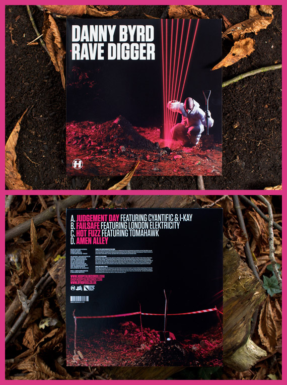
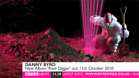
Today’s the day Rave Digger comes out- Danny Byrd’s latest album and my latest project for Hospital. This has been my biggest project both in terms of the amount of stuff I’ve created for it and the amount of exposure it has been getting, so in my usual feigned attempt at quantifying the work I’ve put in, here is a blog post showing everything I’ve managed to round up from the album, along with a bit about the process of designing it.

Continue reading ““It’s almost 3D, this album!””

Learning, Improving things and Play:musik

DJ Flight’s label play:musik is back! I was only nineteen when Flight very kindly gave me the opportunity to create the original artwork and identity for the label, but I have learnt a lot in the past five years, so the label’s relaunch was a good time to make some improvements to the artwork. This post is about the changes I have made, the things I have learnt, and the artwork, so if you’re interested, Continue reading “Learning, Improving things and Play:musik”

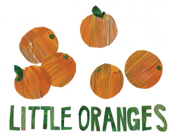
Little Oranges

Good work comes from good projects, which in my line of work, usually means good record titles to design for. ‘Little Oranges’ has to be the best track title I’ve had the pleasure of working with since Credit Crunch! Was B-Complex thinking of satsumas? Clementines? Tangerines? We may never know!

More pictures after the fold. Continue reading “Little Oranges”

Remix Your Mind

OK, so here is the artwork I did for the remixes of Bop’s debut album, Clear Your Mind. As it’s a remix EP, like the musicians featuring, I was given the original in pieces and left to produce my own take on it- a remix! Clever huh?!

Scott AKA Ithinkitsnice was responsible for the original artwork. He is probably the most inspiring person to pass through the Drum+Bass artwork world in a while- his drawings are genius and make me wish I was less afraid of pencils and sheets of paper bigger than post-it notes!

Anyway, despite it meaning less work for me, I was rather pleased when I found out Med School had commissioned him to do the artwork, as it was like nothing I would’ve thought up! I was quite excited when I was asked to give it a rethink, as I had a few ideas of where I could take it. I tried a few things, including an ill-thought-out idea for projecting the graphic with light to form the image, but after some fruitless experimenting with lights and some time spent mucking around with the art on the computer, I ended up with a cleaned-up and rejigged version of the original artwork.

As for the book, if you follow my SCED project, you will have seen it already. When Tom at Hospital saw the artwork, he said he liked it because it looked like some kind of old 70s textbook cover. I thought yeah! so I set about turning it into one with a bit of photoshop fun. The book ended up even more interesting than the record cover in my opinion, but the cover had already gone to print. I guess you need the actual record cover as the middleground for it to make complete sense.

Remix Your Mind by Bop features Remixes from Blu Mar Ten, Lynx+Hellrazor, Subwave, Unquote and remix competition winner Thinnen. It is out now on full-artwork promo, and will be out on general release 2×12″ doublepack and MP3 Download on 10th May 2010 on Med School.

Fresh Slabs

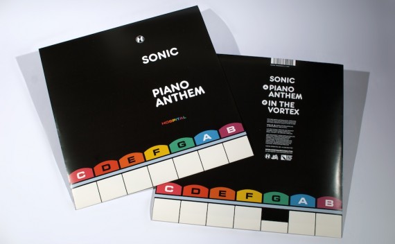
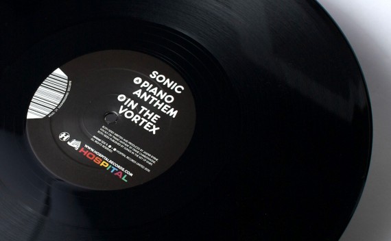
Another trip to Forest Hill today meant another excuse to pick up some finished copies of my work for Hospital! As well as picking up finished copies of Sweet Harmony, some recent flyers and the New Blood 010 album on Med School I tidied up, I also picked this up:

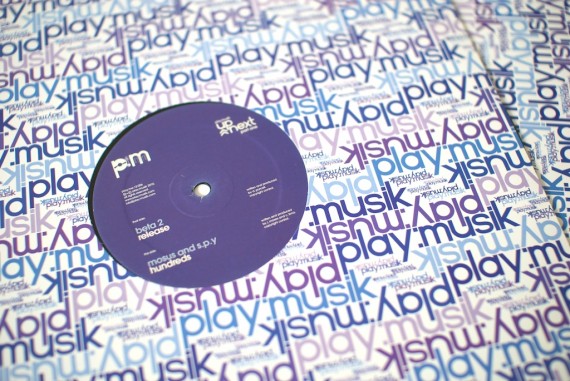
I love designing for print! Finished copies are always, well, finished, whereas designing for Web can always be tinkered with indefinitely (as long as the client lets you!). One of my favourite things about collecting finished copies of records I designed has to be centre labels:

Centre label designs are difficult to keep fresh. They can so easily just be an afterthought to the sleeve’s design and I am always conscious of not just reusing layouts already used for a different artist/label/whatever. Pulling the record out of the sleeve to give it a spin when I get it home usually results in a nice surprise along the lines of ‘Hey! That’s a cool centre label design. I wonder who did that? Oh wait, I did!’, as during the weeks between finishing the artwork and getting finished copies, I only tend to see the front cover, forgetting what I did for the centre labels.

Piano Anthem is out on Monday 1st March on Hospital Records.

Bonus points to anyone who can spot the typographical innuendo in this artwork!

How Sweet!

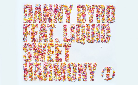
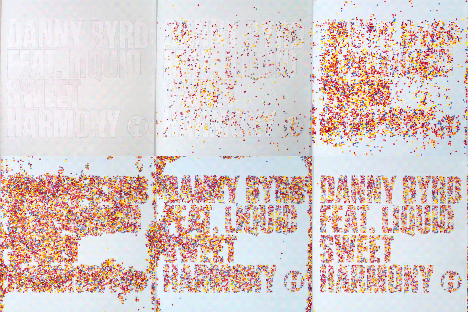
Hey look! Here is my cover artwork for Danny Byrd’s new release ‘Sweet Harmony’! It’s only a single, but it appears to be getting a bit of attention- yesterday I discovered it has been playlisted on Radio 1, which means it’s getting daytime airplay by the likes of Fearne Cotton (Fun fact: she went to the same high school as me, and was a pretty good artist. Agh! Digression!) on the country’s biggest young radio station… Pretty cool! And not only that, but Dev, the early morning breakfast DJ, has nominated it as his record of the week- Imagine waking up to that at 6 in the morning if you weren’t expecting it!

Anyway, here’s a little bit about the cover art, as I am pretty pleased with it!

I was thinking about doing something rave-related, as the original is a classic of the early 90s rave era. This got me thinking about candy ravers, which brought me around to sweets. I told Hospital about the idea, who immediately saw the pun in the track’s title, which I had overlooked until it was pointed out to me. Agh! I got to work on the idea as the visual pun was too good to ignore, but after several trips to the local sweet shop and many cover ideas using all things from red rope liquorice to candy bracelets, it just wasn’t working.

It wasn’t until the weekend, when Lilly was baking, that I found myself staring at her collection of cake decorations, thinking how much I liked the colours of them, when suddenly the idea clicked with me, and I realised the decorations were essentially tiny sweets in themselves.

To the right, you should be seeing a tiny video. It is a (very short!) timelapse I took while putting the cover together. I made a reverse stencil using the lovely new typeface Tungsten (I couldn’t resist after it was noted as an answer to Compacta, which I have been using for Danny’s artwork for a while now), which I backed with sticky labels for the sugary treats to stick to. I guess it was a bit like giant glittering really!

Sweet Harmony will be out at all your favourite physical and digital record stores on 1st February 2010.

Lights+Camera Action!

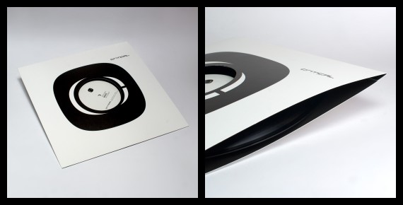
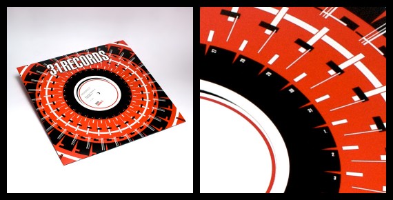
I got a couple of finished copies of some of my new housebag designs through the post this morning, so I decided to use it as an excuse to see what I can do with my new strobes (aside from pratting around with lighting gels and colourful cakes) and try and take some nice pictures of them!

Mmm- luxury double-sided print action for Critical!

And here is the 31 Records sleeve I did late last year.

I am experimenting! Wooo!

A graphical tribute to Laika, or The Future Sound of Russia

laika

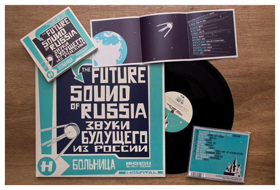
I went to Hospital’s offices at The Purple Gates today, and while I was there, I managed to pick up some finished copies of the new Future Sound of Russia album. I think it isn’t out for another two weeks yet, but Hospital themselves have started Pushing it around the internet, so I figured I could do the same too!

As you should be seeing above, I managed to slot a tiny drawing of a space dog into the artwork as a tribute to Laika and her contemporaries. Poor animals! It’s probably not too hard to find now you’ve seen the above image, but see if you can spot it if you have a copy of the album yourself.

Anyway, like all good Hospital record covers, the artwork is a nod to another obscure artist- under the usual direction of Chris Goss, this cover is based on a really handsome old poster by a Russian designer called Alexander Rodchenko. Hopefully my Sputnik additions and hand-drawn type add a bit of my own artistic merit to it though!

So if you’re into Drum & Bass (and let’s face it, you probably are if you’re sitting here reading this, as nobody seems to know me outside of this little world), go buy the album!

DSC_0280

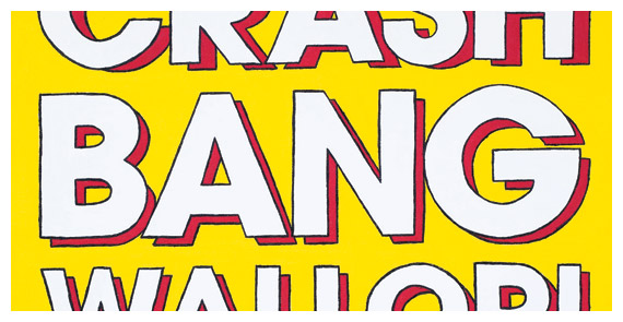
Crash Bang Wallop – Process

NHS156CD-Packshot-2

Music-making man-machine Logistics’ third album (well, fourth if you count a digital-only album) Crash Bang Wallop! is hitting stores, shelves and record players worldwide next month, so as this blog is now somewhat alive again, here is a little bit about the process of creating this album’s arwork.

This project started in typically late-notice fashion (ah, my topsy-turvy relationship with underground music), as while the project was mentioned several weeks prior, there wasn’t a title until mid-July. This meant a fast schedule, and the project came a long way in a short time.

Continue reading “Crash Bang Wallop – Process”

Wrangles

Hello, internet world! As usual, it has been aeons since I wrote anything here. I’m quite sure I have a reasonable amount of stuff to write about to show for my time between writing here. so let’s see what we have!

Stopmotion
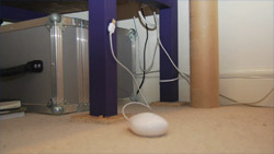
moustillMouse Stopmotion

I’ve been having rather a lot of fun with my Nikon, as you may have been noticing if you follow my Flickr, as heaven knows it gets updated a lot more than this. Although I don’t think I’m taking anything particularly exciting, I’m enjoying hiding behind a nice big peice of glass wherever I go. Anyway, that’s mild digression. Following a bit of inspiration from the Lilliship, I have found myself dabbling in stopmotion animation, which I’ve put some of the fruits of up on YouTube– They’re only a few seconds long but I’m rather fond of them, so check them out!

Black and Red
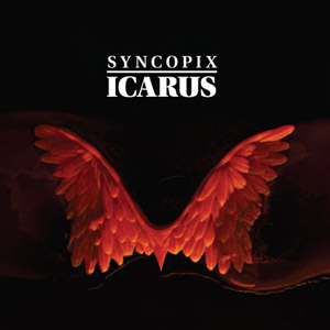
icarusSyncopix – Icarus
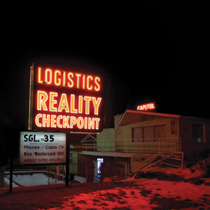
rcpLogistics – Reality Checkpoint

Like the first felt tip markers in the pack to run out on you as a child, the past three album covers I have made have all ended up mostly black with red detailing, by some freak coincidence. This includes the long-coming Icarus album cover. When Syncopix told me he was calling his album Icarus, I decided to take the title semi-literally for the art and ended up sculpting a pair of wings, casting them out of wax and melting them back down again for the cover imagery, photographing it all along the way.
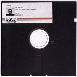
 
John B - Mr. FreudJohn B – Mr. Freud

There are smatterings of new works throughout the portfolio for those who are looking for a new reason to shower me with money and to entertain you Trickartt-stalkers out there, in various sections. A couple worth talking about are the sleeve for John B’s new single, ‘Mr. Freud’, and the Sausage Bracelet. Mr. Freud appears to be a runaway popular sleeve, and despite my apprehensions when I made it, it turned out rather nicely. I was worried it was going to be a bit too much like a cheap blue monday, but it ended up holding itself up. When I received the finished copies, it made me feel like I was holding a giant floppy disc, which in my eyes qualifies it a success. The sausage bracelet was a valentine’s gift for Lilly (aren’t I sweet?), modelled on her sausage dog, hand-sculpted by me. It’s not perfect, but i don’t think anything I make by hand is.

As usual, there are other random bits forthcoming that I’m not really in a position to talk up, as well as a whole world of incertainty. I guess if you’re interested, you’ll find out whenever the time is appropriate. So that’ll do for now!