Considering that it’s probably the biggest project I’ve had the pleasure of working on to date, I’ve come to realise I haven’t said much about the work I’ve been doing for Netsky over the past twelve months!
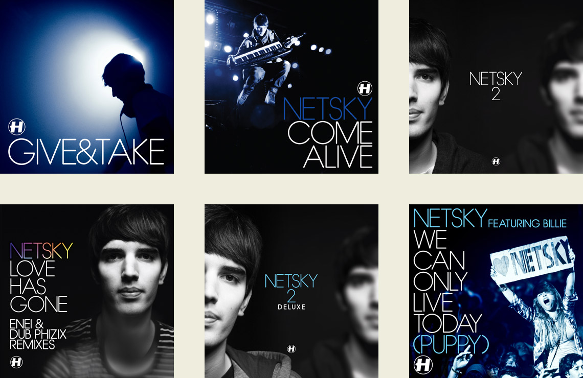
2012 has really shaped up to be our Belgian friend’s year- I remember being astonished at how quickly he ascended over the course of his debut album in 2010, but that was nothing in comparison to his follow-up! The sheer expanse of this project has really brought it together – it’s not just record covers; the artwork goes much further!
The direction for the art was set by Chris at Hospital, and evolved through collaboration between Chris, Boris and yours truly. The first single, Give and Take, was the first release of the year for us at The Purple Gates, and it set the tone for the artwork to come: Great, single-colour photography with Hess Gothic looking nice and clean.
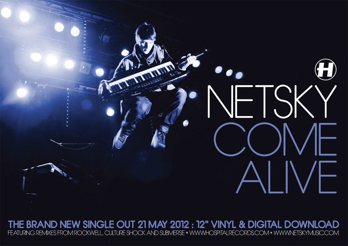
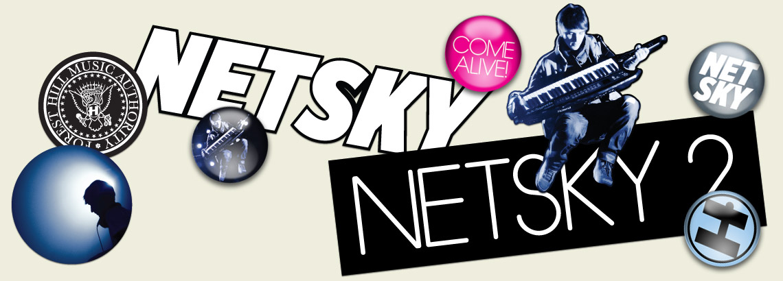
Before we knew it, Boris had put together a live band and was rehearsing like crazy while simultaneously finishing his album. Word went around in Forest Hill that he would play a keytar during his live show, and Andrew Attah caught evidence of that during a rehearsal, which became the cover for Come Alive. And it became stickers. And posters. And websites. And pinbadges.
When it was my turn to get to work on the album, everyone at Hospital, including myself (and Boris of course!) grappled with titles. I had suggested we call the album ‘Like This’; a reference to the mind-boggling amount of ‘Like’s he has on Facebook amongst its other interpretations, and for a while it stuck, but eventually it was decided against (we didn’t want any trouble from Facebook!) in favour of going Led Zeppelin style (or Cerrone style, as was a more relevant point of reference to me!).
We had some great portraits shot by Guillaume Kayacan, and with the title settled on as ‘Netsky 2’, I got to work on it. The idea for the cover was obvious – it’s called Netsky 2, so I split one photo to look like two Netskys. Right at crunch-time, we-need-to-get-this-signed-off-now-time, my computer decided to have a meltdown, and in a fit of rage it turned Netsky’s album cover into this:
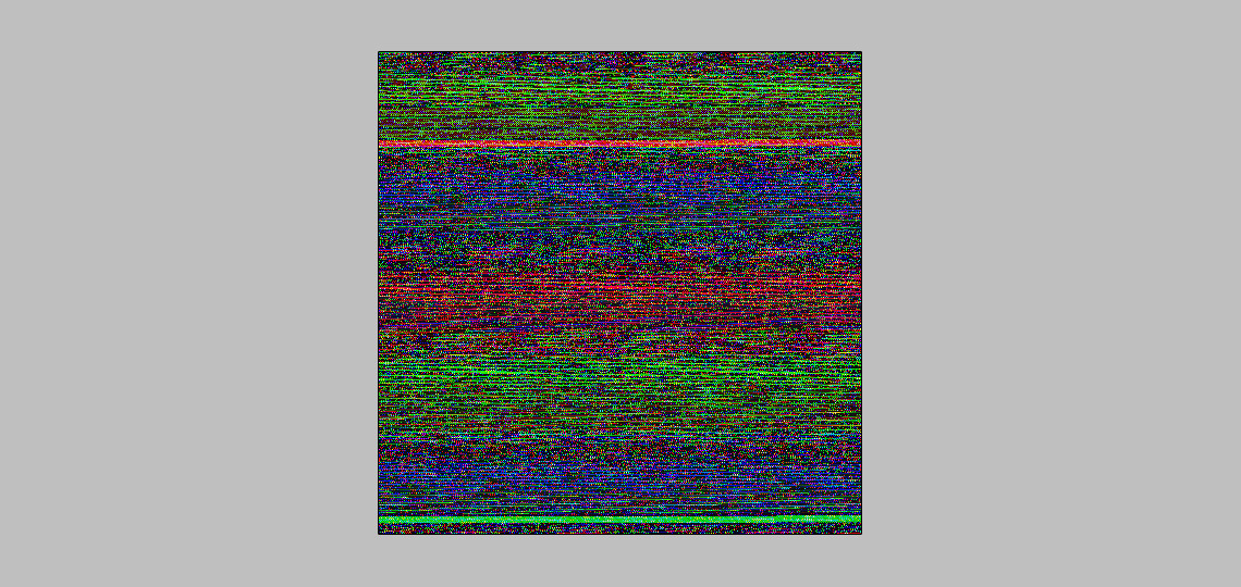
I wasn’t even mad; I was impressed. I almost wanted to keep it as the album cover, but I knew that wouldn’t fly- it looked like attempting to pirate satellite TV in the early nineties! I got back on track quickly though, and took it as a sign that I needed to inject a little colour into the album. I came up with another net pattern after the one on his first album (which was loosely based on major internet exchanges across the world, you know, NETsky), and it ended up going in the gatefold of the vinyl edition amongst other places. Woo!

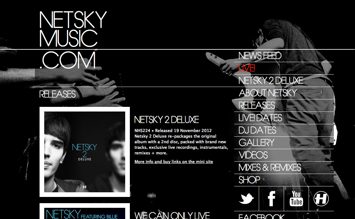
After the album came the website. I was never really happy with the website I built to coincide with his first album, so this was a good chance to start again. I was pleased to discover that our choice typeface, Hess Gothic, was available for use as a webfont, and I came up with a slightly controversial jaunty page layout.
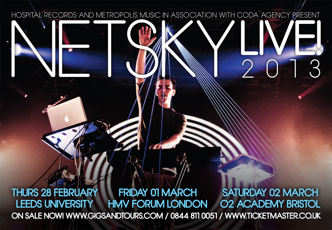
The live touring started, and we maintained the style of the project with more great photography from Andrew Attah:
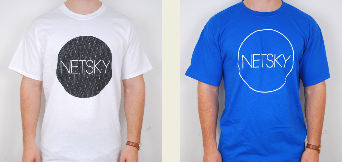
Of course, after a few live shows, the crowds wanted merchandise:
I wasn’t really expecting the scale of this project to become as big as it has, and my post here really does nothing to emphasise it either. It’s left me feeling proud to be the little cog I have been in Netsky’s 2012! Chris at Hospital summed it up well in an email he sent to us all from Rock Werchter festival this summer – its subject was ‘Look what we did!’ and contained three photos:

Wowch! All of those people are there to see something I’ve been a little part of! To get a real feel for how massive Netsky has become, check out NetskyMusic.com and see for yourself the expansive tour dates, huge venues and numerous appearances he’s been making on national TV in his native Belgium.