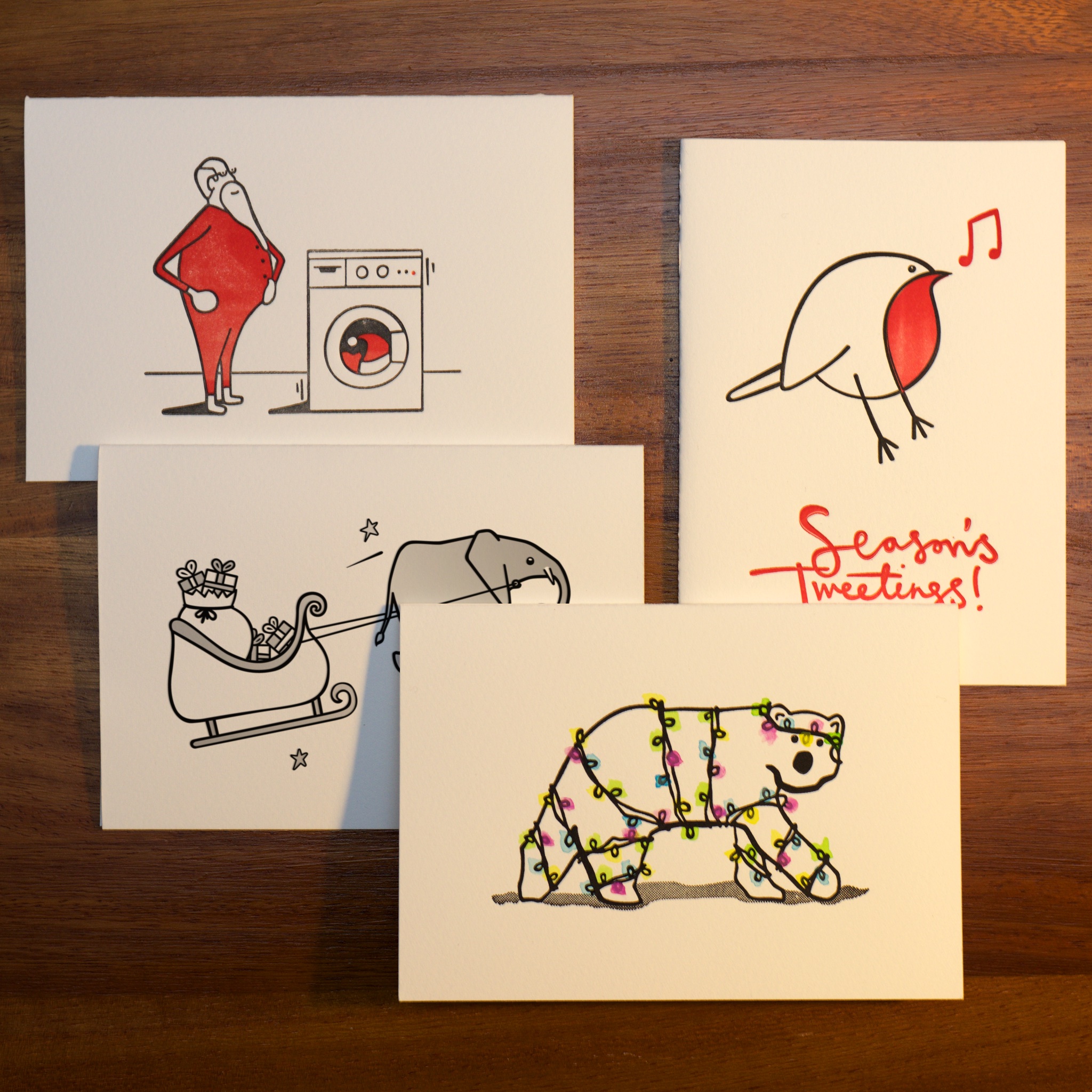
Back when she lived in the States, Lilly used to have posters from her favourite movies on the wall. For her birthday this year, I decided to bring some of her world back to our apartment here in Rickmansland, but being the artist I am, I couldn’t help but redesign them for her too.
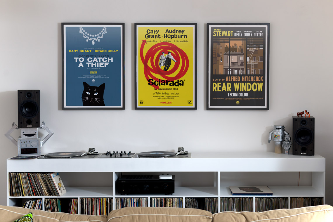
 The To Catch A Thief poster was the biggest gamble. Lilly is very fond of Grace Kelly and not-so-fond of cats, so obviously (?) this is a poster with a great big picture of a cat and no pictures of Princess Grace. I know my audience. The design is based on the first edition cover of the original novel, and it was such a great idea I couldn’t resist repurposing it. Besides, it’s a whole lot easier to draw a silly cat than it is to draw a decent picture of Grace Kelly! Lilly’s reaction was that we should get a pet cat, simply so we can name him John Robie. Coming from a cat-agnostic, I’m taking that as high praise!
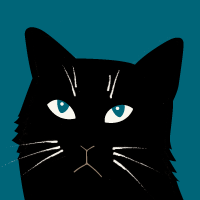
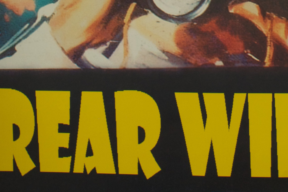
 Rear Window‘s poster took the longest to come together. My biggest problem with the original poster was the inappropriate use of Showcard Gothic. Not only was it a massive anachronism, given that the font was designed almost 40 years after the movie came out, but it was pixelated to high hell on the printed poster too. Once that was fixed, it took a few runs at getting the illustration to do justice to the fantastic set the whole movie is based around.
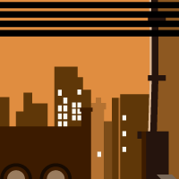
 The poster for Charade came together easiest, but that’s because the source material was so great. I loved all the typography in Italian on her original poster, so that had to stay, and the bright yellow colour scheme was great fun too. All that was needed to tie it together were some of the graphics from Maurice Binder’s wonderful animated title sequence.
Movie posters are a little out of my wheelhouse, but I’m really pleased with the results. They took a bit longer than usual to work on, but that was mostly because I was trying to keep them a surprise. More importantly than what I think about them though, Lilly likes them too – she couldn’t wait to get them up on the walls!