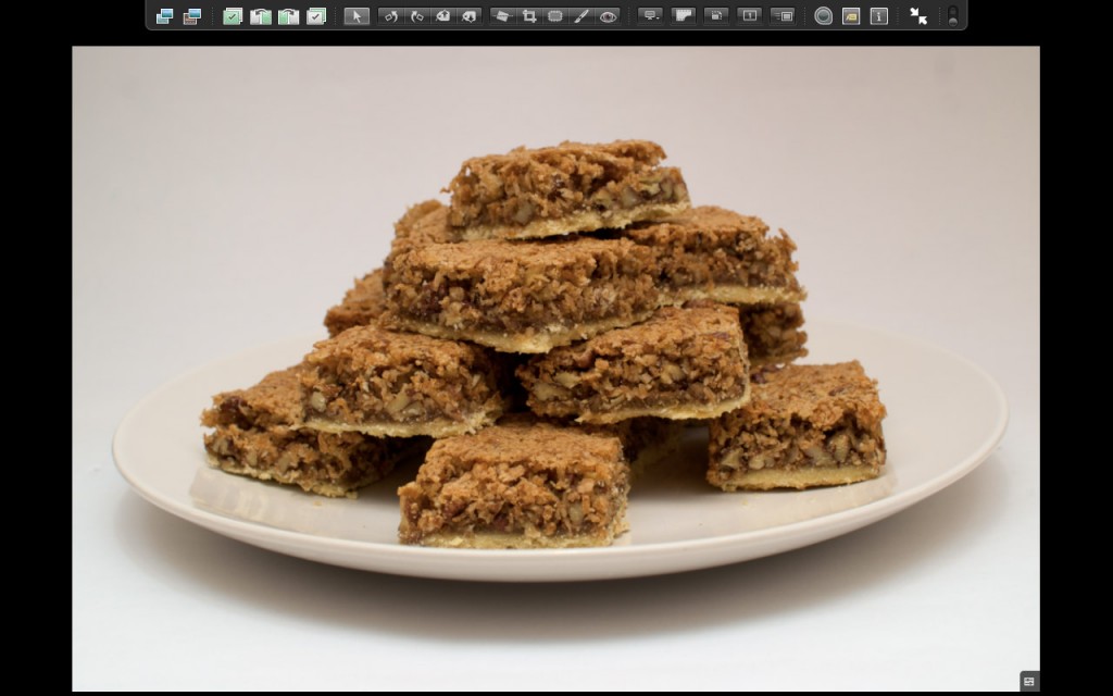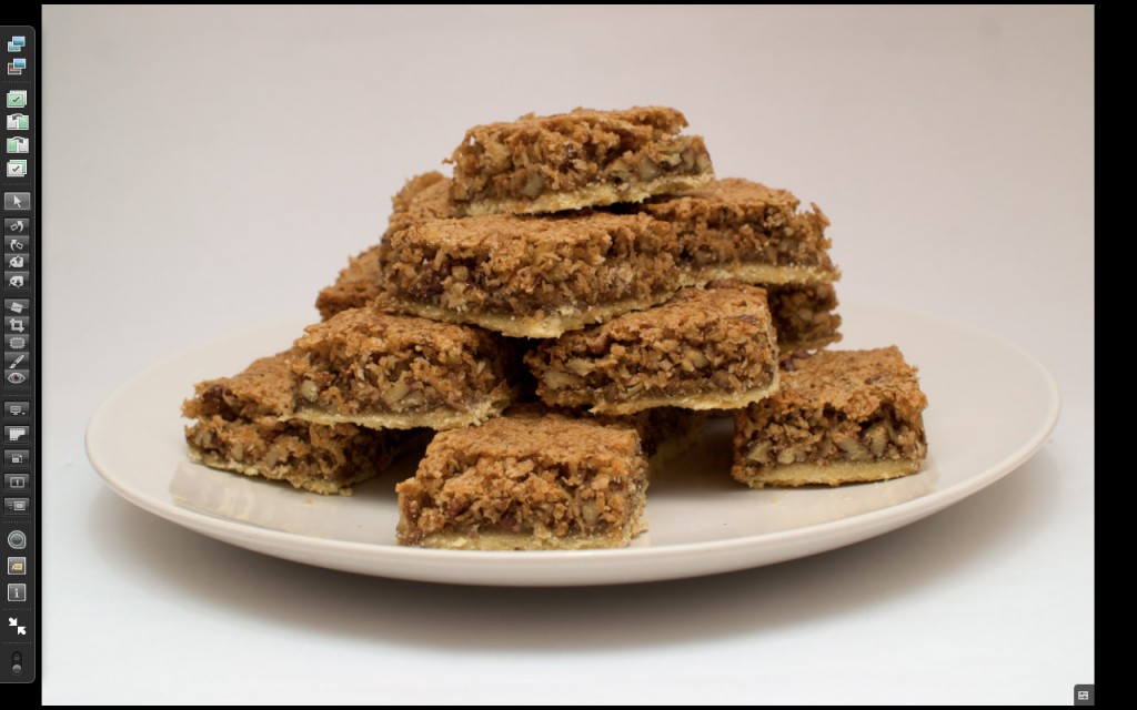
I hope I’m not an idiot and can’t actually do this, but I really wish the fullscreen toolbar in aperture went the other direction. I mean, having it horizontally across the top makes sense if you have a 4:3 screen, but you can’t by any Apple computer that doesn’t have a 16:10 screen.

Aperture’s usual toolbar position. Look at all that wasted space!

…and my more efficient version. Nice snacks huh?
Note that it even fits on a 1280×800 screen (the smallest size Apple makes now), but this really causes me the most frustration on my dual screen setup!
If you’re using Aperture, then you probably have a digital camera, so you probably have photos in 3:2 or 4:3, so if you’re using aperture in fullscreen mode, you’ll almost always have wasted space on the left and right, so why not put the toolbar there instead of making the photo you’re trying to look at smaller?
So here is my ‘doesn’t this make a lot more sense?’ mockup of a vertical toolbar. Not that anybody is going to read about it or care. Who knows though, maybe someone will, and I’ll see this implemented in a future version! I can hope can’t I?