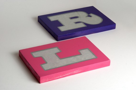
Hey Internetters! Today’s creative activity has taken me so much time, money and effort, I am trying to quantify it by making a blog post out of it, despite it not really being exciting!
This is what I made!
Some of the boats along the towpath have really beautiful hand-painted lettering on them. Recently, there was a boat moored up called ‘Victoria’, which has this really nice lettering filled with this rough-looking golden texture and a smooth golden outline, which gave a nice contrast. Every time I walked past, I wondered how it was done. Eventually I came to the hypothesis that it was done with a lot of gloss to separate the fill and outline, and built up an image in my mind that soon ended up a little more ambitious and texturey than what was actually there, so I set about giving it a go.
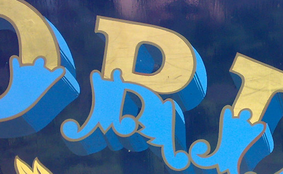
Nice lettering
I started off with acrylic on canvas, as that’s what I had in the fridge. I’m not much of a fan of gold though, so the silver came out. After so many coats of the gloss I lost count, I decided it was hopeless. It just looked like silver paint on canvas (which ultimately is what it was), without the depth or texture I wanted. It soon became apparent that this wasn’t going to be achievable without big boys’ paints, so I ventured out and bought some of the most expensive paint I have ever crossed, and some spraypaints of various kinds.
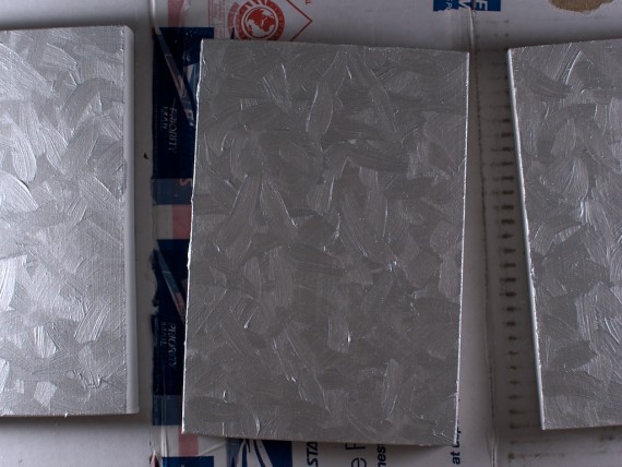
And this is where the slow process began: painting, sanding, waiting for it to stop raining, painting, sanding, waiting for it to stop raining…
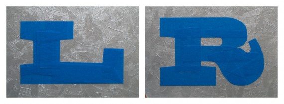
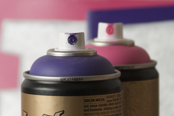
Eventually I got them to the deep, smooth finish with the very textured look I was after for the fill, so it was time to mask up the lettering. I was pretty pleased with myself for managing to make the letterforms as accurately as I did using only blue painters’ tape. Then it was time for the colours to come out! I sent Lilly to London Graphic Centre on her way home from work for their wide array Montana colours, where she encountered her first celebrity spotting since living in London. It was the beautiful Pete Doherty, but she couldn’t remember his name when she phoned me, so described him as ‘that skanky dude who used to date Kate Moss’, which worked. Apparently he left as quickly as he arrived though, so our best conclusion is he was hoping to sniff some glue and got turned away. I digress. She picked out a nice Trickartt-style purple named ‘Gonzo’, and a pink for herself called ‘Erika’.
After more rain/sanding/spraying, the last step was the silver enamel outline, which really tied the room together.
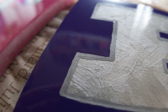
So after all this time, effort and expensive paint, they are finished, but I have no idea what I’m going to do with them. It’s one of those finishes that would never be achievable any other way, and looks the best in reality. They’re pointless, but at least they look the way I intended, which is always a victory in my world!
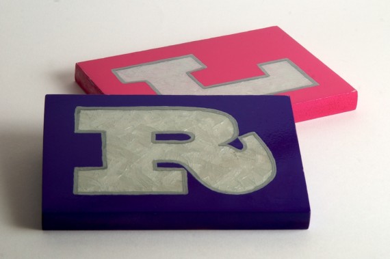
And I guess L&R could be left and right as well as Lilly and Ricky!
