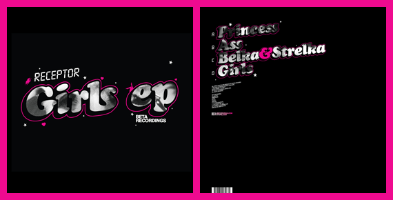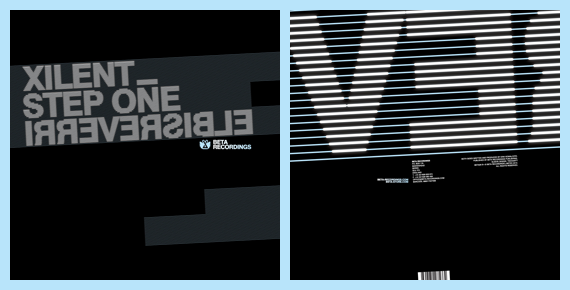
Record buyers should be seeing a trilogy of Beta Recordings releases hitting stores over the coming weeks, wrapped in artwork courtesy of me! BETA23 is by Terravita, BETA25 is an EP (and one of my favourite releases in a long time) by a Russian fella called Receptor, and BETA26 is by Xilent.

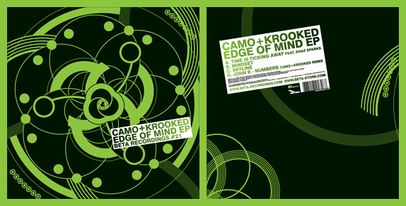
I wasn’t really given a brief for these record covers, so it was down to my initiative. I followed on from the artwork I did for Beta last year- black, white and a single hue in colour scheme, as seen in Edge of Mind EP by Camo + Krooked:

I like type! When working on a project, I will hunt for typefaces everywhere – in books, on my computer, on the internet, on the street – to find something appropriate for the job. I always cross typefaces I think are great but not right, and make note of them to try and use them in the future. When asked to do these Beta sleeves, I thought it would be a good excuse to use some of these finds, but it didn’t really work out that way as I ended up using some trusty favourites- Futura Bold Condensed, Cooper Black Italic and a Helvetica Bold variant.

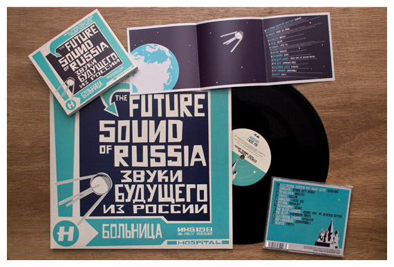
I didn’t really set out to revisit soviet space dogs, having made a tiny tribute to them in last year’s Future Sound of Russia, but one of the tracks on this EP is called ‘Belka & Strelka’, named after the dogs who flew on Sputnik 5 together in 1960. Their appearance in this artwork was meant to be subtle- I used an old photo of them for the halftone pattern filling the text on the sleeve, but they ended up getting carried over onto the centre labels too. As it was a doublepack and Belka & Strelka were a double-act, I thought it’d be fun to have one record for each dog. I used the halftoned photo of them on one side of each record, which I sent to John B expecting it to be a bit silly, but he was into it. Although it wasn’t an idea I took seriously, I am glad they were liked as they look great on the finished copies!

‘Step One’ wasn’t much of a title to make a cover out of, but Irreversible was a winner, as I managed to make it irreversible by nature too, by reversing the letters but not the order they are placed in. Therefore, if you try and reverse it in a mirror, it will still be reversed!

I like the centre labels for this trilogy of releases too! I followed them on from the design I did for the Xilent single last year. It’s easy to forget when designing in a computer that records don’t actually have a specific way up as they are circular and rotate by nature. Therefore, the idea behind these centre labels is the text can be going in different directions, but will never be the wrong side up.
You can get full artwork vinyl from the Beta Store, or MP3s from Beatport or iTunes now!

