Speed & Ecstasy

This winter I worked concurrently on two album projects: John B’s Light Speed and High Contrast’s The Agony & The Ecstasy. Both projects are for different artists and evolved in different ways, but since the art was completed and wheels were set in motion, I’ve been noticing increasing unintended parallels between the two projects and their artwork.
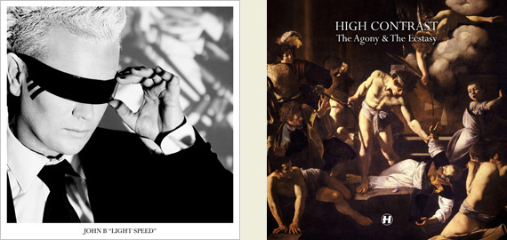
Both album covers were driven by the artists themselves and both had different motivations- High Contrast rather controversially wanted the baroque Caravaggio classic The Martyrdom of Saint Matthew to represent The Agony & The Ecstasy, while John B had some press photos done last year complete with full make-up and styling, one of which he wanted to use for his album cover.

Both albums use transitional serif typefaces – I tend not to use serifs very often in my line of work, so two at once was a rarity! HC pushed for Perpetua on his – I have to admit this wouldn’t have been my first choice (the upper-case U having a tail bugs me) – I was angling for either Garamond (historically appropriate) or Bodoni (classical Italian), but Perpetua works in the entirety of the project. John left it up to me so I took the extravagant haute-fashion stylings of his photos and decided Baskerville fit that aesthetic and the more grown-up sound of this album quite well.
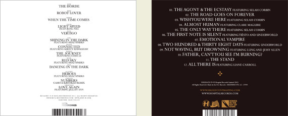
As well as both being driven by the artists’ own motivations for the cover image and both using transitional serif typefaces for different reasons, the most curious parallel that struck me was in this interview John B did with This Is Drum & Bass:

TiD&B: If you could compare your sound, and your new album to perhaps a work of art, what would it be?

John B: No idea… Maybe one of those crazy Renaissance scenes where there’s loads of stuff going on; someone dying from a dagger wound, a bunch of sexy Renaissance ladies with their boobies showing, some angels, and a lion or two.

I’m reasonably sure John hadn’t seen HC’s album cover at the time he did this interview, but it struck me as curious that he pretty much described it (minus the boobies and lions, of course) to analogise his own sound!

Lastly, both albums were a long time coming! It has been six years since Electrostep and five since Tough Guys Don’t Dance, both of which facts are a slightly alarming reminder of how long I have been doing my job now!

Light Speed is out now on Beta Recordings, and The Agony & The Ecstasy is out tomorrow on Hospital Records.

More Soviet Spacedogs: Beta Autumn 2010

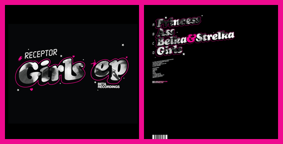
Record buyers should be seeing a trilogy of Beta Recordings releases hitting stores over the coming weeks, wrapped in artwork courtesy of me! BETA23 is by Terravita, BETA25 is an EP (and one of my favourite releases in a long time) by a Russian fella called Receptor, and BETA26 is by Xilent.

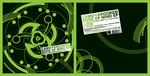
I wasn’t really given a brief for these record covers, so it was down to my initiative. I followed on from the artwork I did for Beta last year- black, white and a single hue in colour scheme, as seen in Edge of Mind EP by Camo + Krooked:

I like type! When working on a project, I will hunt for typefaces everywhere – in books, on my computer, on the internet, on the street – to find something appropriate for the job. I always cross typefaces I think are great but not right, and make note of them to try and use them in the future. When asked to do these Beta sleeves, I thought it would be a good excuse to use some of these finds, but it didn’t really work out that way as I ended up using some trusty favourites- Futura Bold Condensed, Cooper Black Italic and a Helvetica Bold variant.

I didn’t really set out to revisit soviet space dogs, having made a tiny tribute to them in last year’s Future Sound of Russia, but one of the tracks on this EP is called ‘Belka & Strelka’, named after the dogs who flew on Sputnik 5 together in 1960. Their appearance in this artwork was meant to be subtle- I used an old photo of them for the halftone pattern filling the text on the sleeve, but they ended up getting carried over onto the centre labels too. As it was a doublepack and Belka & Strelka were a double-act, I thought it’d be fun to have one record for each dog. I used the halftoned photo of them on one side of each record, which I sent to John B expecting it to be a bit silly, but he was into it. Although it wasn’t an idea I took seriously, I am glad they were liked as they look great on the finished copies!

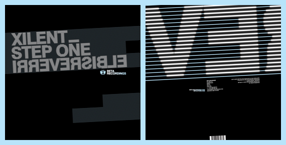
‘Step One’ wasn’t much of a title to make a cover out of, but Irreversible was a winner, as I managed to make it irreversible by nature too, by reversing the letters but not the order they are placed in. Therefore, if you try and reverse it in a mirror, it will still be reversed!

I like the centre labels for this trilogy of releases too! I followed them on from the design I did for the Xilent single last year. It’s easy to forget when designing in a computer that records don’t actually have a specific way up as they are circular and rotate by nature. Therefore, the idea behind these centre labels is the text can be going in different directions, but will never be the wrong side up.

You can get full artwork vinyl from the Beta Store, or MP3s from Beatport or iTunes now!

 
You are currently reading
Page 1