It’s Made of Paper!

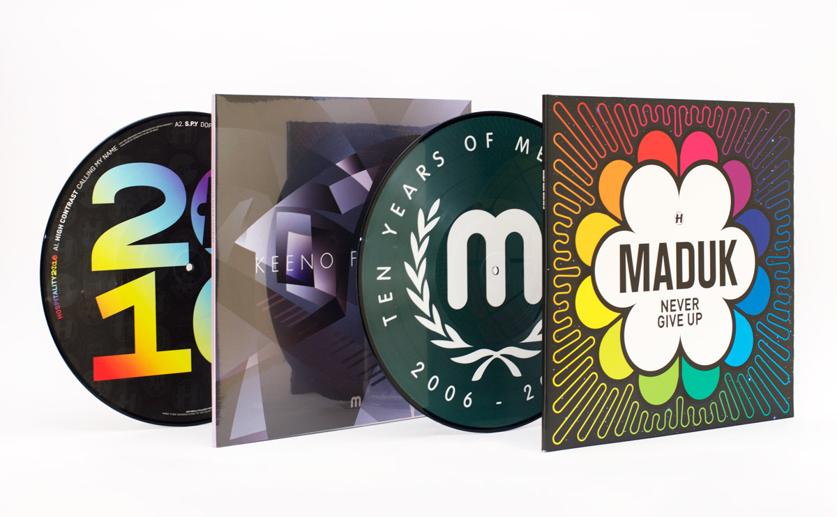
Here are another two recent record covers I’m pretty proud of, both following a paper theme:

NHS291-Packshot-2400px

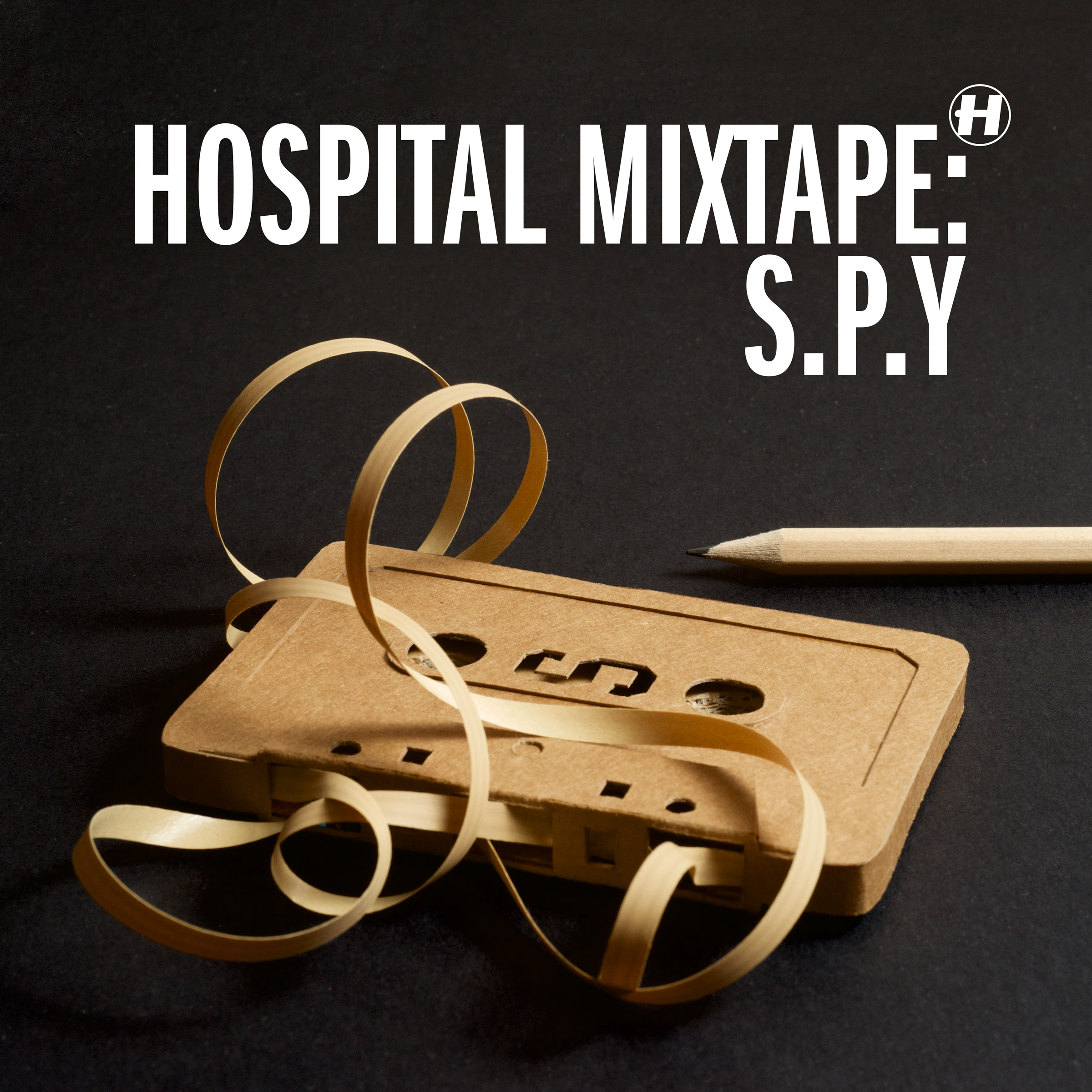
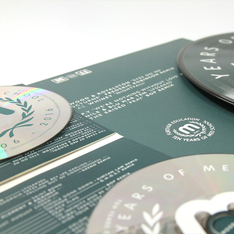
The Hospital Mixtape series has been a bit of a puzzle since it started a couple of years back because despite it being called ‘mixtape’, there’s a certain discomfort with cassettes behind The Purple Gates. That means it’s down to me to find a way to think alternatively about tapes.

This year the mixtape was put together by S.P.Y, so I took the raw and minimal production finishes from his last album Back To Basics, and set about mixing them up. I got the knives out and ended up crafting a 1:1 scale cassette tape out of reverse cereal box and ribbon. I even made a cardboard case for it too, for the ongoing messy desk imagery used in the series.

ddesk

A bit of careful photography and a lot of retouching later, it all came together.

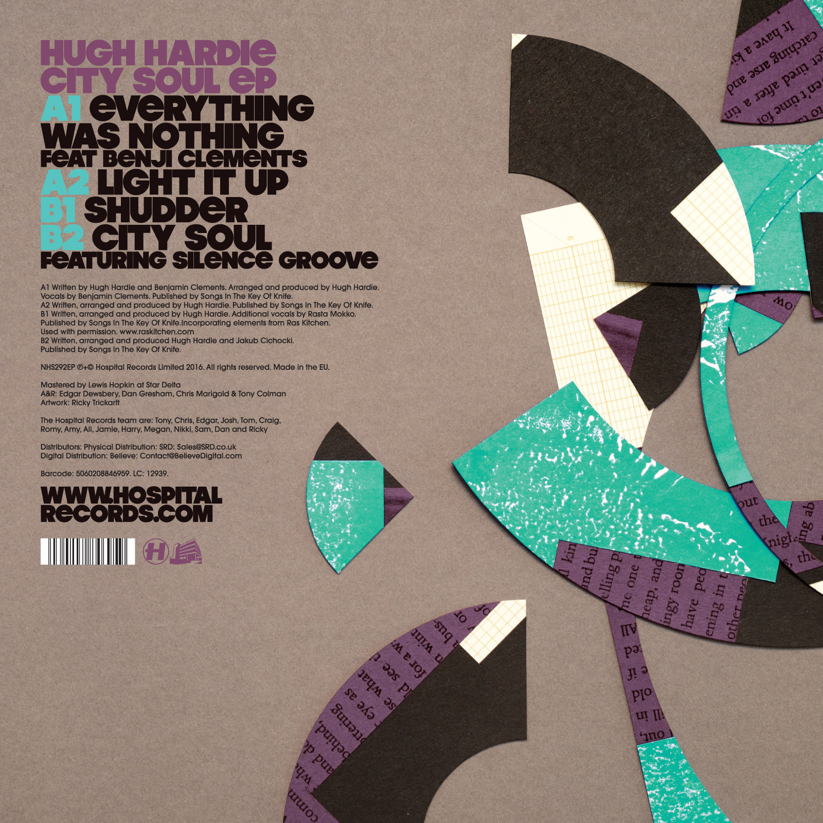
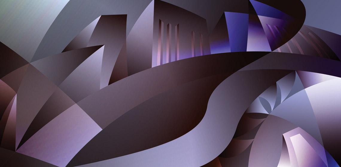
Hugh Hardie is a new Hospital signing. For his debut EP, titled ‘City Soul’, I drew a very rudimentary skyline and chopped it up into something a lot more abstract. I had recently bought myself a slightly mad paper circle cutter, and this proved the perfect job to take it for a spin.

NHS292EP-Packshot-2400px

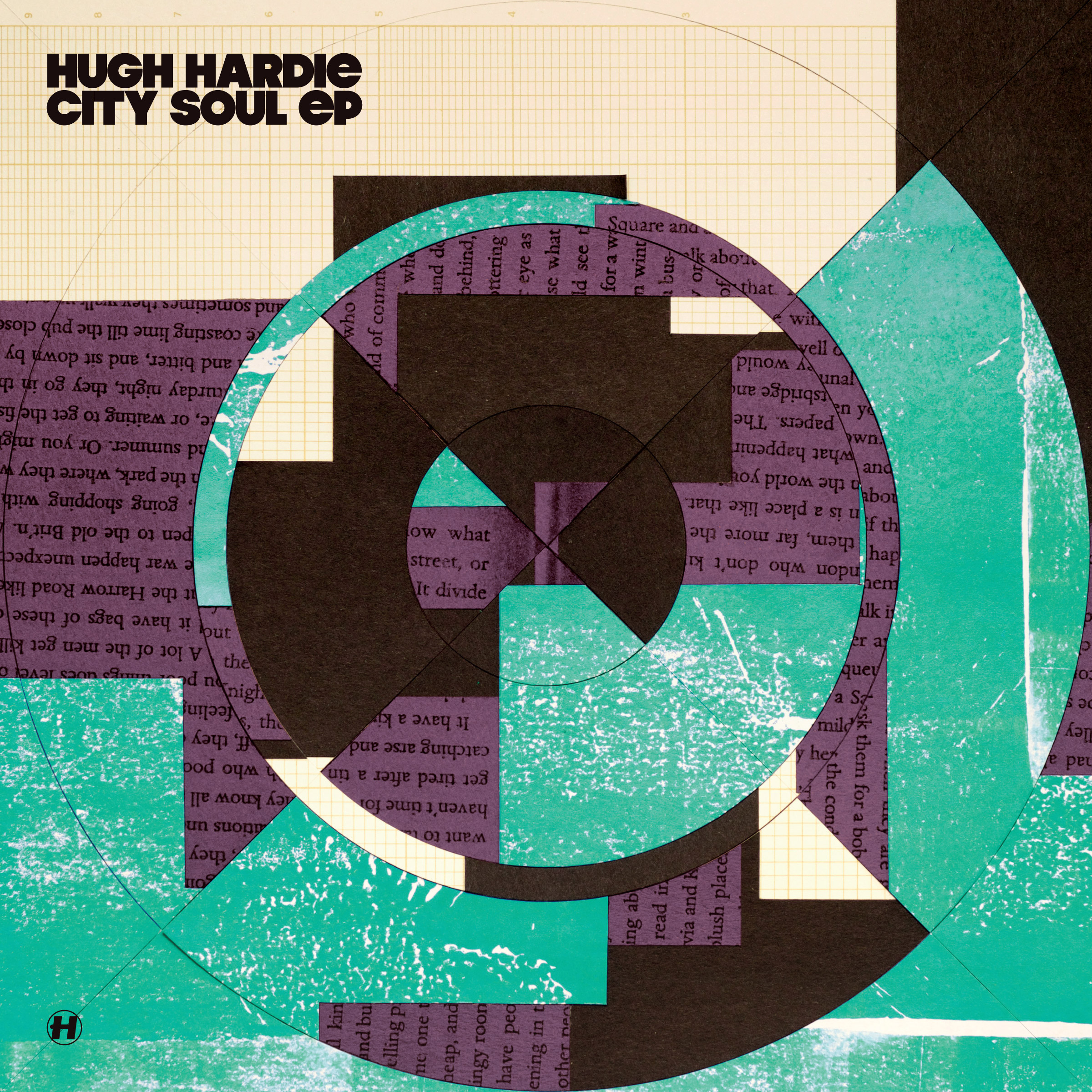
The textures came courtesy of logarithmic graph paper from my grandpa, excess ink from Etherwood’s Blue Leaves album project, and a copy of The Lonely Londoners by Sam Selvon (which I thought was appropriately city), ran through my increasingly temperamental photocopier.

The whole cover then got a bit of explosion treatment on the back cover.

hardie-back

It’s all made of paper!

April Showers

What a scattered month!

This April I have been trying not to glue my own lips together, having strange dreams about sandal-shaped buses and sunbathing goths, spending far too much money on MP3s (Streaming services? What are they?), and a little bit of travelling here and there too.

My favourite square came quite early this April, in the form of the advice slip. I’ve never understood why ATM receipts are labelled as advice slips. It’d make much more sense if they really dispensed advice, as I pondered in my drawing.

I was sad the world lost Prince too – another hero of imagination has gone. As I noted on Twitter, I’m still in denial about Bowie, so having His Purple Majesty go too is an extra sad time. Shame I couldn’t come up with a better post-it note to commemorate him.

Post-it notes, April 2016

After the fold are all the old direct links, for posterity’s sake. Continue reading “April Showers”

Record Cover Roundup: Spring Tingz

Spring Records

Hello Internet! I thought I should show you some highlights from the record covers I’ve been designing over the past couple of months.

NHS283-Packshot-1200px

rainbows

2016 started a lot like 2015 at Hospital Records, just with a lot more rainbows. It’s a trusted design, now with rainbows on everything (just how I like it!) – CDs, picture discs, posters, T-shirts, stickers, slipmats, you name it.

MEDIC56-Packshot-1200px

futurist-gatefold

Over at Med School the first album of the year was ‘Futurist’ by Keeno. Young Keeno picked the title just because he liked the word, so I came up with this futurism-inspired illustration of a man composing at a grand piano. Of course, with a title like Futurist, I had to use the typeface Futura for the artwork!

tyoms

Med School hit the decade landmark in 2016, which is a terrifies me if I think about it too much because I came up with the original blood-stained identity for the label back in 2006. The Ten Years extravaganza took a few twists and turns, but ended up here, in what I’m affectionately referring to ‘Tennis Years of Med School’.

tyoms-early

Also included here are a couple of earlier ideas for this artwork – one looking back at some of the artwork from the past decade (which made no sense as this album is all new material!), and one papercut version of the final artwork that got downvoted by the label.

maduk-gatefold-brighter

onecolourpertrack

Lastly for now is Maduk’s debut album, Never Give Up. Maduk had 12 tracks on the album and a concept that each track corresponded to a position on a clock-face of colours, which gave a nice rotational direction to the artwork. Creating the artwork involved working backwards, trying to minimise what I started with his single last year. I’m really pleased with this one, but as is no secret, I’m always pleased by bright colours!

Robot Achievers

Whoosh! There goes the month of March in the year of 2016 into the archives of space-time. I spent a lot of time (moreso than usual) by myself this month, but that didn’t stop me coming up with some really silly pun post-it notes.

This month’s greatest success was iPad Thai, which for an idea I’ve had clinging onto a list for ages, was timed very well to meet the launch of a new iPad from Apple. My favourite drawing this month was probably the Fax Machine, because it’s just my kind of nonsense, but I think it was too much nonsense for the general public.

After the fold are all the old direct links, for posterity’s sake. Continue reading “Robot Achievers”

Primary School

This month, beside getting terrified by the unfoldings of America’s presidential primaries, I’ve done a handful of good drawings on post-it notes!

My faviourites came through earlier in the month – the Classic is so classic I find myself wondering why I had never thought of it before, there was untitled but very satisfactory drawing of Lilly and I cycling up a local hill, and Al the amazing waterproof dog was one of my finer moments too, because it actually looks like a dog.

It’s not really right that I find myself surprised when my drawings actually look like they’re supposed to!

After the fold are all the old direct links, for posterity’s sake. Continue reading “Primary School”

Canary Nonsense

Oh dear, what happened this January?

Well, David Bowie died, which I am quite sad about, and still in a little bit of denial over. I’m sure he’ll be back in one form or another at some unknown future. We had a bit of snow, though not as much as New York did, and I also pondered my digger-operating fantasies.

I drew a lot of utter nonsense this month. I like drawing nonsense at the best of times, but I particularly enjoyed this month how you guys who follow me seemed to like it too, even occasionally reading more meanings into these things than I had ever cooked up myself!

Here’s the latest twenty-eight for your fascinations:

After the fold are all the old direct links, for posterity’s sake. Continue reading “Canary Nonsense”

The Little Yellow Journal of Another Trip To America

Another winter has been spent being bewildered in the States! This year I encountered (beside all the usual bigotry, gun worship and emotionally manipulative advertising) the fattest chihuahua I had ever seen, mailboxes that looked like they were alive, and a different take on the self-service vending machine. I ate an obscene amount of tacos too, for all meals of the day. You can’t do that in Britain!

And then I flew home, and wondered what just happened. Here’s how it looked through my eyes:

After the fold are all the old direct links, for posterity’s sake. Continue reading “The Little Yellow Journal of Another Trip To America”

Twelve Panel Story

CES is in full swing this week, and its many slightly-robotic household appliances cast my mind back to a series of Post-It notes I drew a while ago. Here’s a twelve-panel story about the rise and fall of my domestic robot (now with a splash of colour)!

12panels

I hope they find a better power source than bunny rabbits soon, my carpets are getting filthy!

The Christmas Story

redcruiser

With Christmas well and truly over, hopefully everybody has received all the Santa Cruiser cards destined for them by now! Here’s the story (and a few pictures behind the design.

I really wanted to do this illustration I came up with last christmas I called ‘The Nutkraken’ for our cards this year, but even after drawing it all up properly, the idea was nixed by Lilly.

nutkraken

Back at the drawing board post-it pad, I set about coming up with some other ideas, including this one I called ‘Santa and his Elvis’. This was nixed too:

DSC_7549

Eventually we came back to trying to reflect what happened in the past year, and decided that getting bicycles was probably the biggest thing. I put Santa on various bicycles, including some more conventional bikes like our own, and fancy racing bikes like my cat stickers, but his rotund nature meant he was best suited to a very upright cruiser bike. Here’s the final sketch, before tidying up:

cruisesketch

Everything was manufactured and ready to print:

A photo posted by Ricky Trickartt (@trickartt) on

The pressing wasn’t without problems, but it came out pretty good in the end:

DSC_7581

…And for our digital-native friends I did a special gif version to email them!

multisanta

Go Fish!

Here’s the last project to close out the work-year: Hospital playing cards!

cardddd

Hospital and I had been talking about doing a deck of playing cards for a long time and I finally found a few free days to crack on with it in November, just in time to get them out for the holidays. The idea to do the King, Queen and Jack as Surgeon, Nurse and Physician came to me when we first talked about doing playing cards, so I started by drawing them up, and followed them with some more conventional number designs.

When we got the specs from the printer, I discovered there was space not just for two jokers but two extra cards too. I drew a Joker based loosely on Tony the CEO, then after a bit of scratching around I decided a bonus pair of turntables would be better than the rules of Bridge.

somecards

The last detail was the box, and I decided if there was ever a playing card package to pay homage to, it would be the magician’s favourite Bicycle.

They’ve turned out really cute – it’s nice to get ideas out of my head looking like I imagined them!