Screen star

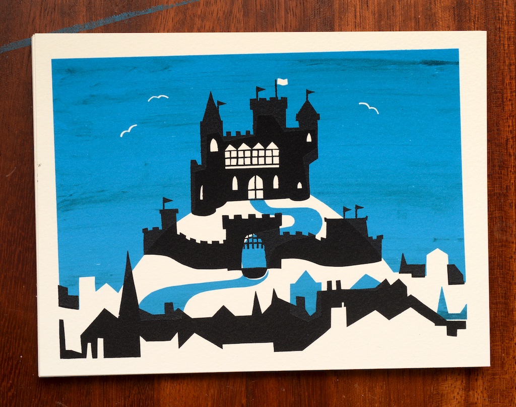
Screenprinted illustration of a castle on a hill

I first encountered screenprinting at the London College of Printing (now LCC), where I was given an introduction to the method, before I dropped out of my course there and set off on this terrible career of mine. I loved spending time in the printing studios at LCP, and at the time, it was my biggest regret about never going back. A couple more flirtations followed (including a misguided attempt at making my own UV lightbox and photosensitising screens that didn’t go very well), and the last time I really tried to do any screenprinting was now somehow about twelve years ago.

My significant other got me some new screens and squeegees for my birthday this year, so I have spent the past couple of months teaching myself how to do it again. It took a couple of attempts at a couple of methods, but I am pleasantly surprised with my eventual results. This is a (nine-minute) video of the entire process.

I picked an illustration idea from the post-it archive and got to work tracing it, separating it into the two-colour print I had imagined, and scaling it for the size of print I wanted to make. Once that was prepared, I made my first attempt at preparing the screens.

The drawing fluid and screen block method was a pretty miserable failure for me, but it’s hard to tell how much of it was user-error, how much was because my mediums were old enough to walk themselves to secondary school, and how much was just the limitation of the technique. The drawing fluid part went OK, but though the screen block didn’t seem thicker than I remembered it being when it was new, it looked a lot thicker than what I had seen in other demonstrative videos on YouTube. It took ages to dry, began crumbling even when washing out the drawing fluid, and generally yielded miserably blurry, bleedy results.

After sulking for a bit, I heard about a technique using sticky vinyl and a plotter-cutter. I don’t have a plotter-cutter, but I am a patient person with a Stanley knife, so I gave it a shot. To quote Brian Butterfield, the results have been incredible. There was still plenty to learn though – in particular, the seagulls in the design ended up coming off the first screen because I think I handled their vinyl cutout pieces too much (better get the tweezers out!), so half of the prints don’t have the gulls in them at all.

Also, my favourite 3M 3434 blue painter’s tape is too sticky to transfer the smaller details to a screen, so that required an intense tweezer job too. I was convinced this was going to fail like the seagulls, so I didn’t bother recording that part of the process. I proved myself wrong; it held up way better than the gulls, and yielded brilliant results that even survived the washing of the screen at the end of the run. My next port of call would be to try some low-tack vinyl transfer tape, but that’s another project for another project.

There is still also a lot to be improved with regard to registration, but I have a couple of ideas for addressing that. I really liked the unpredictable results from my badly-mixed paint streaking through the blue layer, and that is a technique I will also do more to exploit in future printing projects. In all, it’s only a dozen prints, but each one is a little bit different, which I love – if they were all perfect then it wouldn’t have been worth it and they may as well have been giclee prints.

I have been sucked into the world of restoration videos on YouTube recently, particularly the channel of Hand Tool Rescue. The way I put this video together is a little inspired by his (and the whole subgenre’s) work. Making video is lots of work, and lots of overhead on disk space.

If you’d like to buy one of these prints you can email me at ricky@trickartt.com. They are 20x15cm / 8×6”, which is a standard picture frame size.
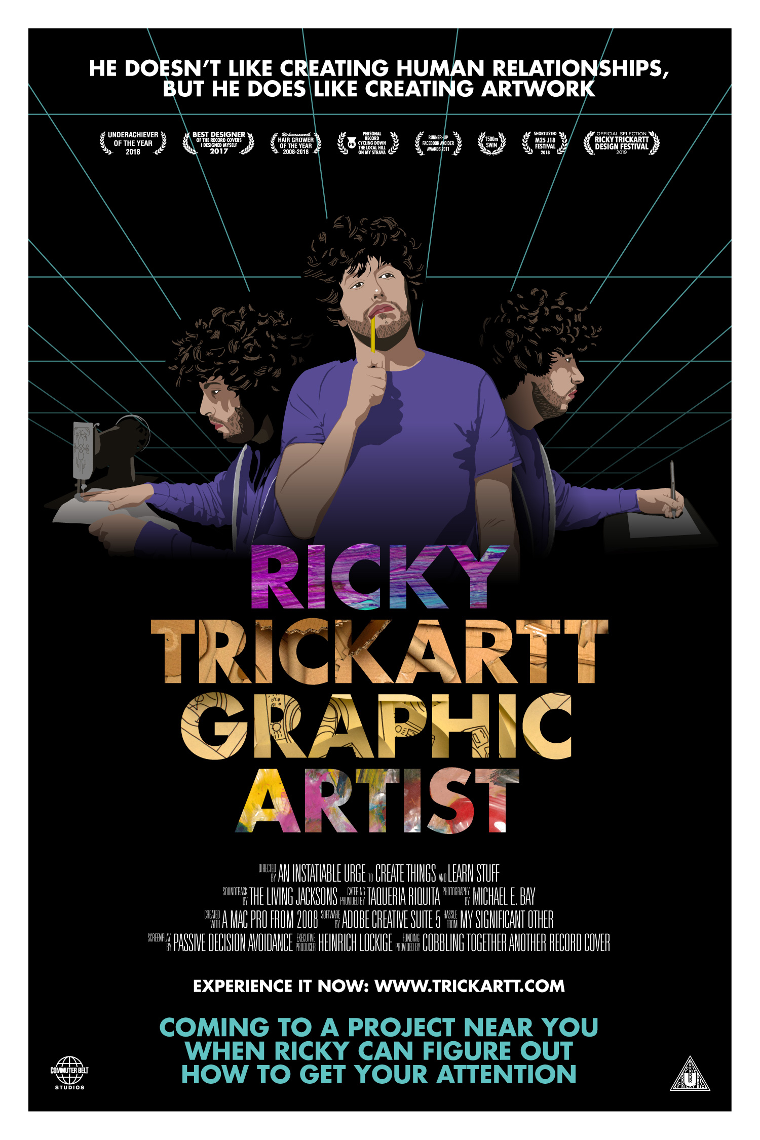
Me As A Movie Poster

An unhappily introspective moment caught me considering the bounds of my career-so-far. I decided to get myself out of the funk the best way I know how, which is by making something. I always enjoy designing posters, so I made myself a poster of myself, both playing into my strengths and needling at my shortcomings in one image.

Make no mistake about it – this is meant to be entirely self-depreciating. I had particular fun making the palmares. I think I’ve got the competition edged on Rickmansworth Hair Grower Of The Year for 2019 too.

Me as a Movie Poster

My Alma Mater

America is pervasive: Every March, Twitter lights up with talk of March Madness, a huge college basketball knockout tournament, and I am gradually beginning to understand what’s fun about it. Even though I made a new hobby out of watching NBA basketball this winter (which is another story in itself), it’s not the March Madness games that caught my attention.

America is pervasive: It’s always puzzled me a little as to why American college-style clothing became such a thing in the UK, but it did, and it always made me a little happy that my American better-half has a genuine college hoodie from a real university that she, you know, actually graduated from.

As I don’t really have any skin in the game(s), I learned that the fun part of March Madness is to look at the bracket. Look at all those fancy schools, with their fancy logos that the world likes to emulate in fashion. It brings me a small amount of disappointment to think that Kentucky would be full of kids in ‘UK’ hoodies, and small amount of pleasure to think that there are probably thousands of students walking around in Houston wearing sweatshirts that say ‘UH’ in massive on them.

Because I’m neither American nor someone who even made it to a bachelors programme to drop out of, it all made me feel a little left-out. What I am, though, is a capable designer, so in the spirit of March Madness, I took it upon myself to create an alma mater of my own:

University of Great Hair

Here’s a little timelapse of the design process:

Now I don’t feel so left out. The finished result:

A small gift to a niche of the internet

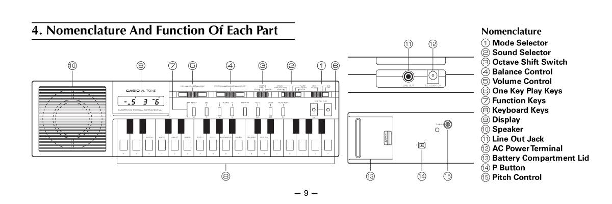
I discovered a Great Thing a couple of years ago: The Casio VL-1. It was totally up my alley – a combination synthesizer/calculator invented 40 (!) years ago. It pushed two practically-unrelated functions together to make one charmingly terrible device (maybe it was more impressive in 1979?). I adore things that make me wonder how they came to be – how someone had the notion to make such a device, how a corporation approved the creation and sale of the machine, how people must’ve also thought it was a great enough idea to buy it (me?). Brilliant.

I couldn’t help but gravitate toward eBay almost as soon as I learned of the VL-1’s existence. The one I bought showed up wrapped in somebody’s local newspaper, but without a manual. No big deal, I thought – these things would be easily available on the internet. I wasn’t wrong, but I wasn’t right either: The only copies I could find were available by jumping through some hoops on some questionable websites, and yielded pretty miserable, almost unreadable scans of the manual, which naturally upset the designer in me.

I can’t really explain what took over me, but I got an urge to recreate the entire manual. I matched the typography, redrew the illustrations by measuring my own VL-1, and put it all together as a nice and shiny PDF. I did a slight bit of re-flowing of the text to avoid splitting some of the paragraphs like Casio did with the original, but otherwise it’s a faithful recreation*.

This recreation has been sitting on my hard drive for two years, so I figured I would gift it to the VL-1 owners of the internet. Maybe I was the only one who wanted a more legible copy than the existing scans, but if you do too, here is a link to the manual in all its glory. Happy calculating, internet!

*I wish I was smart enough to have amended the instructions to make the synthesiser sound like a duck or something, but alas it’s beyond my skillset!

Bozos

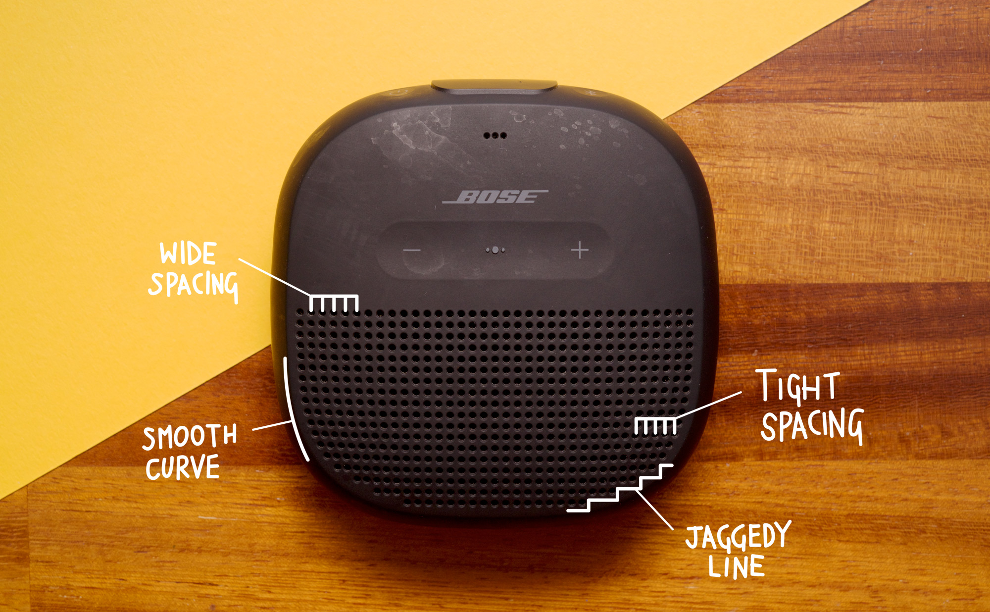
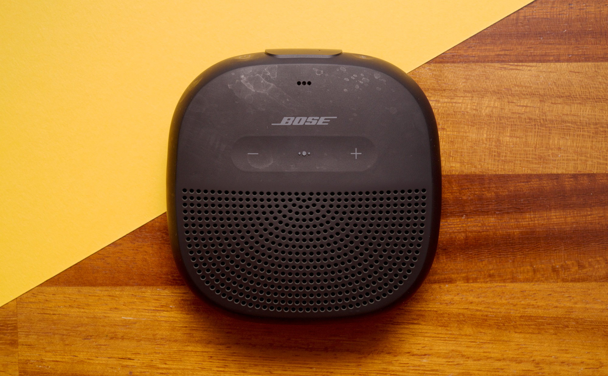
This is a post about the Bose SoundLink Micro. It’s a thing in my house. It sounds fine – better than a phone – so it is good to take on holiday. It is also waterproof, so when not on holiday, it lives in the bathroom. Every time I look at it though, I wince a little at the design:

It looks like the speaker grille on the front was designed by filling a text area with full stops and setting the text alignment to justify. I find it awkward how it follows the curve of the body of the device, until it doesn’t, and just reverts to a jaggedy edge. It’d solve all its problems if the lines followed the shape of the device, rather than just going in unevenly spaced horizontal lines:

Sometimes I wish reality was this easy to photoshop!

The New Future of Pop Music

Like most dorks of the internet, I have a small habit of buying domains without projects to go along with them. A great example of this is TheLivingJacksons.com; a domain I have been sitting on for more years than I care to admit.

There is half a reason for keeping this domain – around the time I bought it, I had decided that if I had a band, I would call it The Living Jacksons. Never mind the fact that I have no known musical skills – I can still just about beat-match records on a pair of SL-1200s, and I can drop the Rhumba rhythm on my Casio VL-1 to great effect, but beyond that, I’ve never even tried to learn an instrument. I figured, though, that an absence of musical skill doesn’t necessarily exclude a career in pop music, and decided I would put a stake in the ground and claim The Living Jacksons as my own idea by buying the domain.

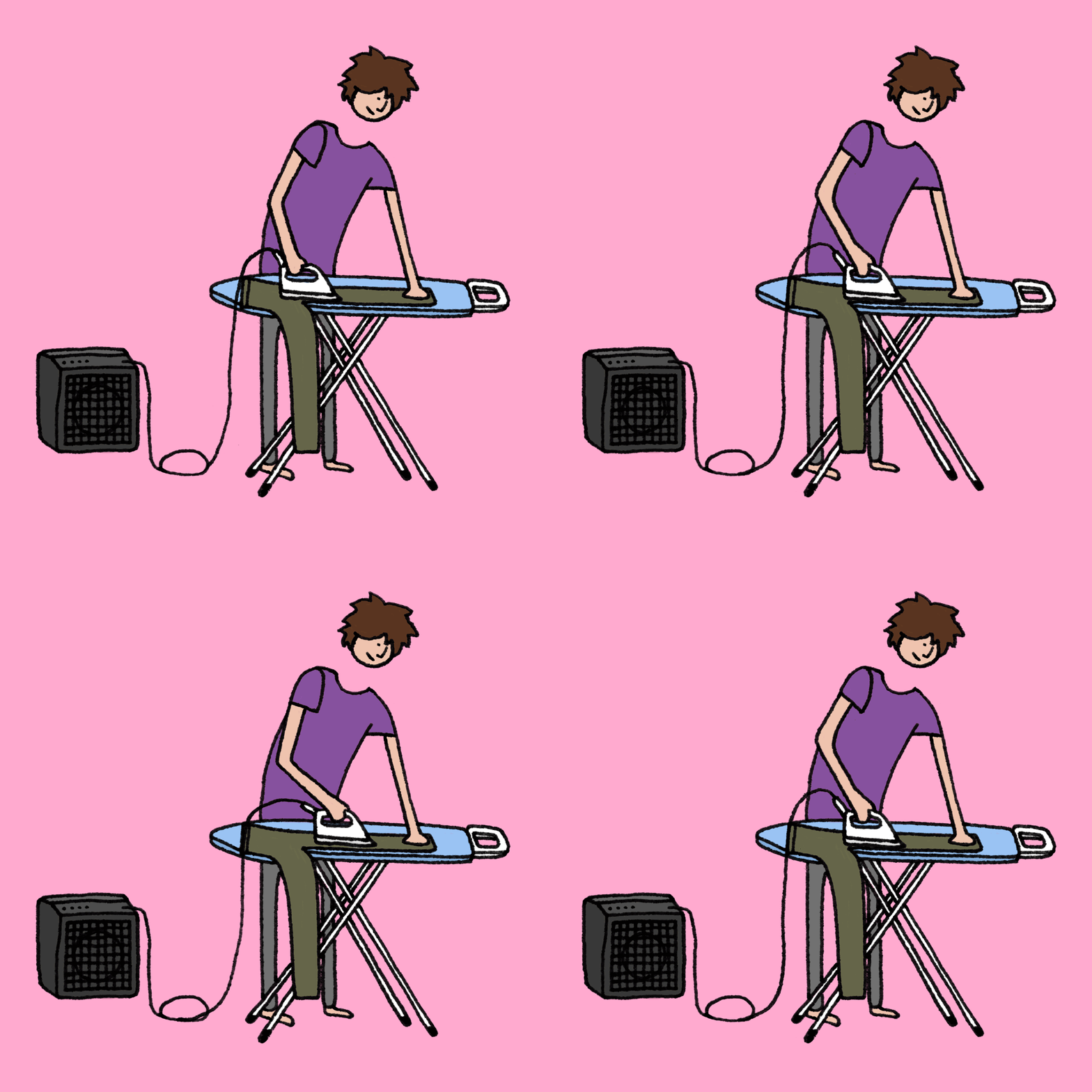
If this all sounds like an incomplete thought, that’s because it was: I knew I had no musical talent, but I didn’t even consider that I didn’t have something to put on the website. The domain sat doing less than nothing, absorbing renewal money for years, until the penny finally dropped on what the shape of my band was. Introducing The Living Jacksons:

N.b. I’m a lot more handy playing the washing machine than ironing boards, but the publicist and I both agreed that bending over to unload a washer wouldn’t have conveyed the message we are looking to convey with this band!

So finally – I created some press images of the band, and put a website together, with marginally more than nothing on it. Still no music though.

More Pandas Than China

Lilly and I went on a summer holiday to Sardinia this year, and while we were there, we were astonished by the amount of Pandas everywhere. Of course, I’m not talking about the Chinese bears, but the Fiat manufactured in the 1980s and 90s.

It was almost as if Sardinia is where Italy sent its Pandas not to die but to just keep on living.

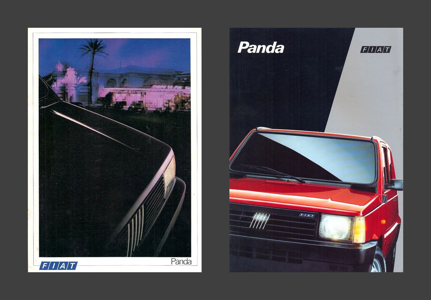
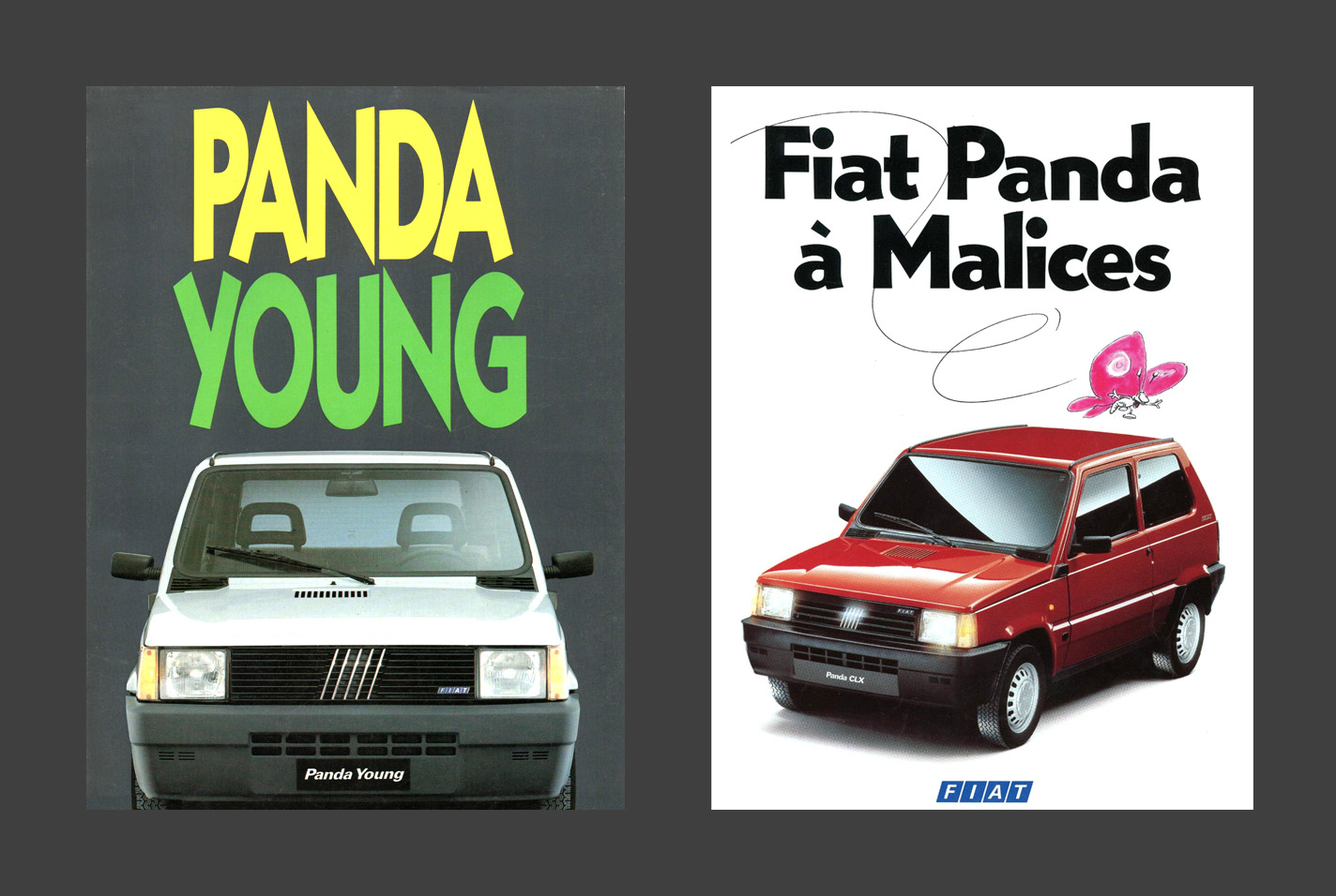
We were both charmed by these boxy little powerhouses, so it was a good cue to make Lilly a new piece of artwork for her birthday. I began researching the materials that were used to sell the car during its original run, but there was no escaping this being a car of the eighties:

As magnificent as those are, I was looking for something that spoke a bit more to how thirty years later, the cars were still so happy rattling through the dusty landscapes of the Mediterranean. The native Italian materials weren’t any more inspiring with their woefully stretched typography, but France proved to have some more playful typographic ideas for selling these little Fiats:

The only trouble is I had no idea what the French typography said, and online translation wasn’t being much help to me either. My first few attempts of running the full slogan ‘Les Voitures à Malices’ through the internet tried to tell me it meant ‘The Cars With Malice’ or ‘The Malicious Cars’, and I couldn’t imagine even the French would try and sell a car on the idea that it would harm you.

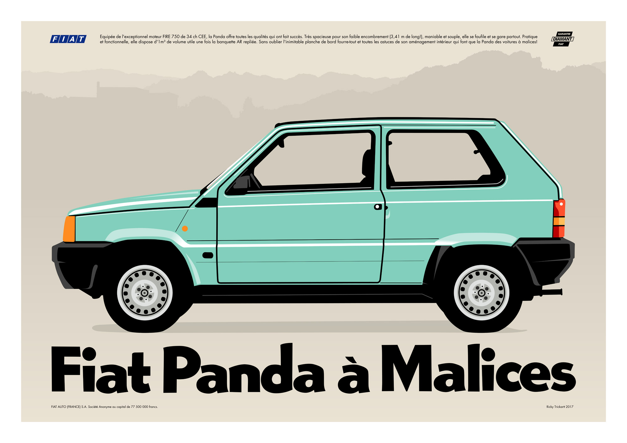
Instead I decided it must’ve been idiomatic, so I asked a French friend to help me (her response: ‘I’m so French it’s beyond belief’), who explained that it meant ‘cheeky, facetious, witty all at once’, and was like boite à malices, ‘a box with lots of stuff that would be fun for kids’; a box of tricks. That sounded perfect to me, so I had to get back into the other hard part, illustrating the car in a way that captured its humble boxiness.

My first couple of attempts looked too boyish, and like something from a video game. Definitely not the right flavour. Instead, a basic profile shot proved to be the winner, and when combined with a bit of the mountainous terrain of Sardinia and a little more of the French marketing materials, everything came together just right.

Of course, the most important thing in all of this is that Lilly loved the artwork, so we immediately put it up on the wall!

Another Post-it sketchbook is filled

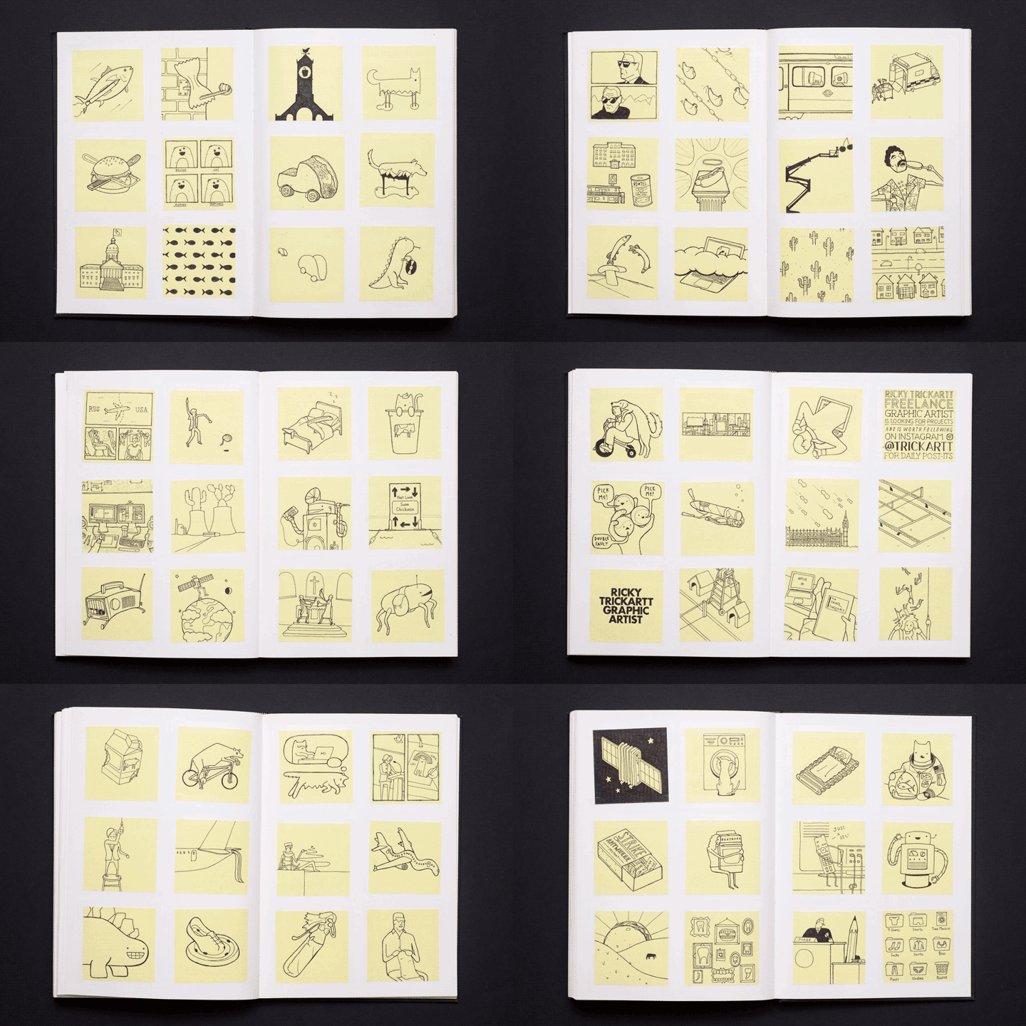
Since I started making an effort to publish a new Post-it note every day, these books have been filling up a lot faster! I filled up my latest sketchbook in February, and it covers the time from Summer 2015 to now. It’s like watching my life flash before my eyes!