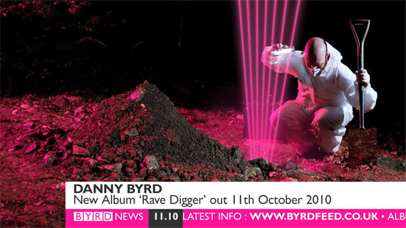
Today’s the day Rave Digger comes out- Danny Byrd’s latest album and my latest project for Hospital. This has been my biggest project both in terms of the amount of stuff I’ve created for it and the amount of exposure it has been getting, so in my usual feigned attempt at quantifying the work I’ve put in, here is a blog post showing everything I’ve managed to round up from the album, along with a bit about the process of designing it.
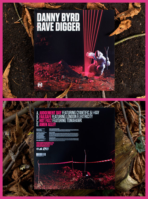
Concept
This was a surprisingly difficult album to get a concept together for; work started in late summer, just when everybody was on holiday. When I got back from my little holiday, Chris at Hospital (our lovely art director) was off on his own break, making getting an idea signed off that little bit more difficult.
The title Rave Digger had been decided on a few weeks before- you can blame/praise Matt at Hospital for coming up with it. What makes it such a good album title is how it’s open to many different interpretations, but it also makes it a difficult one to design for, because everybody working on it has interpreted it a different way, and whatever concept is decided on, it’s never gonna be as good as you imagine.
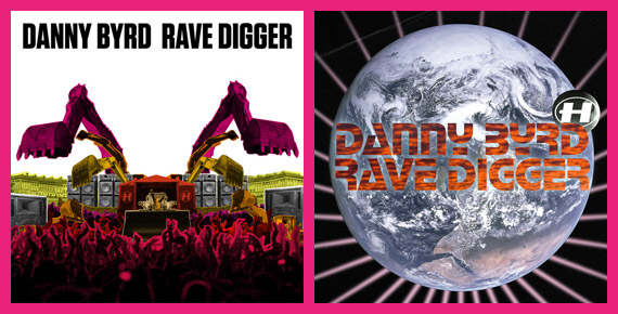
We had outlined some dos and don’ts before I got going- we wanted to avoid graveyards (as we didn’t want to suggest Danny was digging his own grave!), try and steer clear of acid smiley clichés, and I wanted to keep the typeface Tungsten from the Sweet Harmony artwork I did last year. Some ideas were thrown around- Danny seemed hot on the idea of having dug up a rave and I wanted to send him to Diggerland with Andrew Attah, but the powers that be (AKA Tony Colman) were worried it’d end up looking like a cheap UK Hip Hop cover- they were probably right about that one in hindsight.
Above are a couple of my early concepts. I was really into the one with the diggers, but it didn’t convince everyone and I had to give it up. I think the lo-fi authentic 1992 rave flyer style of the one with the blue marble was more appreciated, but we figured we’d have another Tough Guys Don’t Dance scenario, where the masses miss the point of it and just see it as a bad cover. Irony is a delicate line to tread anyway, so I’m learning that it’s probably best avoided in album covers!

In the mean time, Danny and Andrew Attah had been into the woods. They came back with a few press shots and an idea very close to how the album ended up, so with Chris away and none of my other ideas meeting unanimous approval, it was left to me to give Andrew some horribly vague directions for a reshoot to try and make their idea work. At the reshoot, Andrew proved his talent not only as a genius photographer but also as an expert hole digger too! With the new photos, a bit of Photoshop jiggerypokery, and a massive team effort between Danny and his other half, Andrew, myself and the whole Hospital team, we eventually had our cover!
Feeling Ill
The lead single was decided on as Ill Behaviour, a wildchild-referencing rinseout that went on to gain the support of BBC Radio 1 DJs both day and night. A bit of creative cropping on one of Andrew’s photos got our cover, asking exactly what Ill Behaviour he was getting up to there.
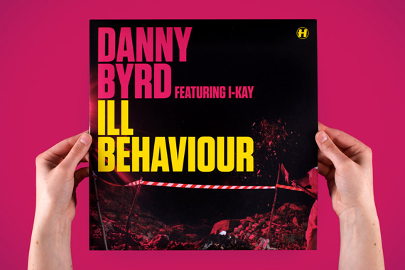
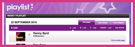
The track climbed to the very top of the Radio 1 playlist and even made its way firmly into the top 40 chart, reaching no. 36 in the hit parade. It was not only a first for me to have some of my music industry work in the top 40, but a first for both Danny and Hospital records too, so there were celebrations all around!
I Dig Raves
The album’s artwork came together without too much trouble after that, but the more interesting stuff came from all the promotional work we did.
Danny had made a couple of rave-related interludes for his album in the form of fake news reports, so I was asked to put one of them on the Hospital YouTube channel, as it made a nice teaser. I got a bit carried away with it and ended up making a fake BBC News channel graphic, complete with ticker tape:
This was well-received, especially by Danny, proclaiming ‘It’s almost 3D, this album!’, because the promotional work we had been doing on this album was bringing it to life. I made a second version of this video too, which got played in a loop on all of the TV screens around the Brixton Academy, where Hospital recently held our biggest ever Hospitality event.
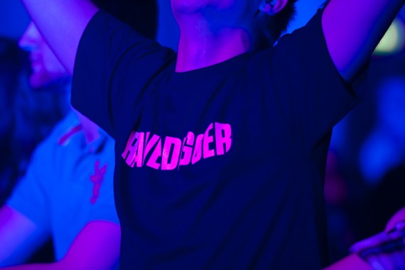
This wasn’t the only thing we did in time for Hospitality either- among the other T-shirts I designed in time for the event, we managed to do Rave Digger T-shirts, much to the amusement of Nihal and the rest of the Radio 1 Review Show. I sent instructions for them to be printed in fluorescent inks, which proved to be a winner as they glow under the UV lights of a nightclub:
The fun didn’t end there either; we even got Rave Digger glowsticks manufactured as a bonus for people pre-ordering the album from the Hospital Shop:
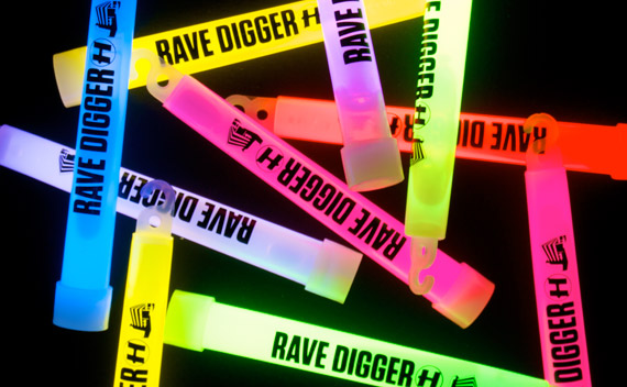
The glowsticks have even gone on to become the cover for the follow-up single We Can Have It All, which will be out in late November.
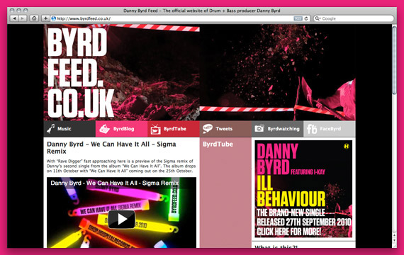
I also designed and built a website for Danny Byrd. The site is called Byrd Feed, named because it feeds off of his various social network feeds automatically- YouTube, Facebook, Twitter, Flickr etc, so as well as being able to manually update and add entries to it, it largely propels itself. The Byrd Feed was originally made earlier in the year with a different colour scheme which I think I prefer, but the new one is much more part of this project 🙂
With all the exposure the album and the Byrdman are getting, a tour has begun, giving me a whole host of Hospitality parties across the country to design flyers for. All of the regional promoters have their own preferences for sizes, so I designed bespoke flyers for each event, giving each an individual feel:


I still have a few more bits of this project to source and round up and will add those when I’ve got them, but for now, I think this post is long enough. If you don’t have it yet, you can pick the album up now from iTunes to help its album chart position, or from the Hospital Shop because you love the label / want a physical copy, as it’s out everywhere now!
