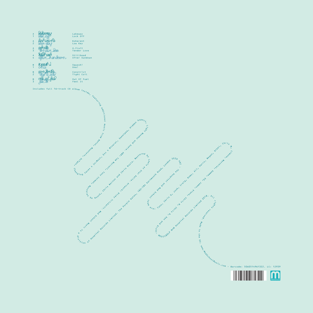
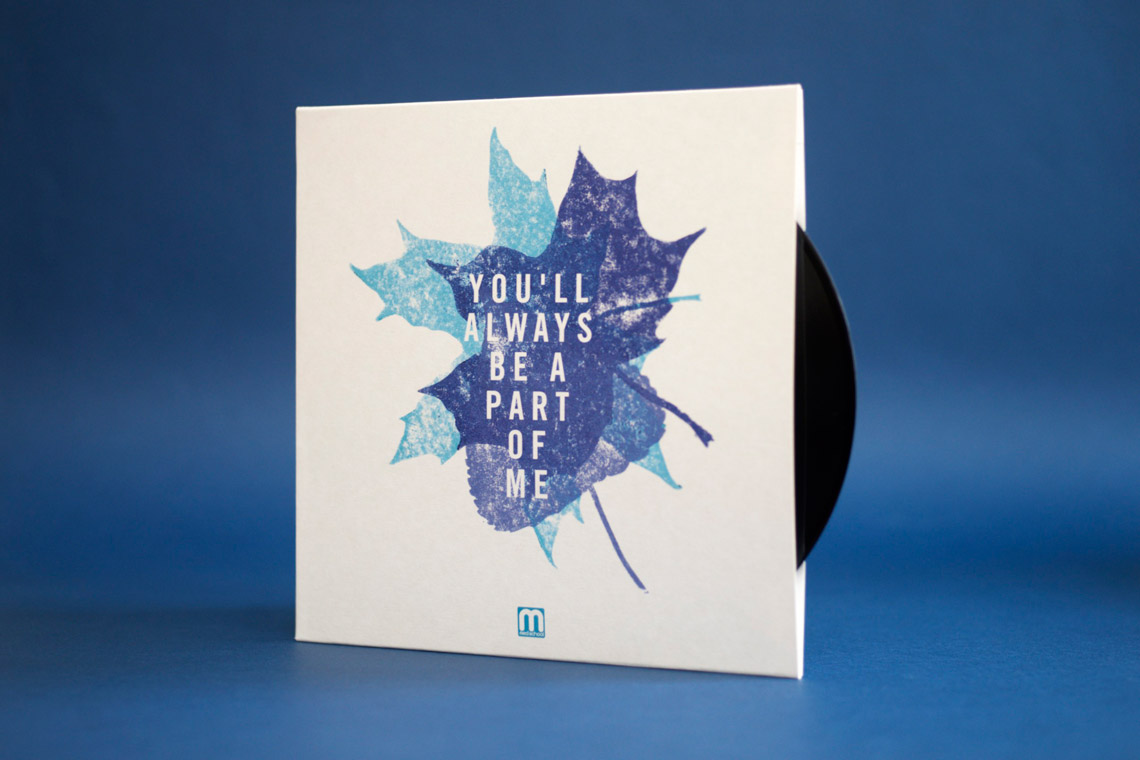
I’ve been feeling good about a lot of the record covers to come out of my brain-hands lately, but the cover for New Blood 018 deserves a spot of text to go with it – perfect for the blog.
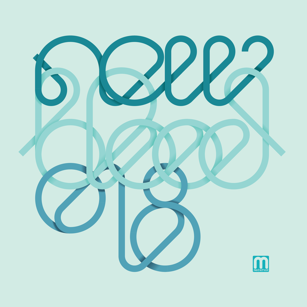
This artwork was inspired by a visit to my brother, who managed to break his leg while taking his kids to the park, and was in real-hospital as a result of the accident. One of his ward-mades was getting a transfusion while I was visiting, and I found the vividness of the blood running from the bag and through its tubing partly fascinating and partly humbling as it squiggled all over this poor chap’s bed.
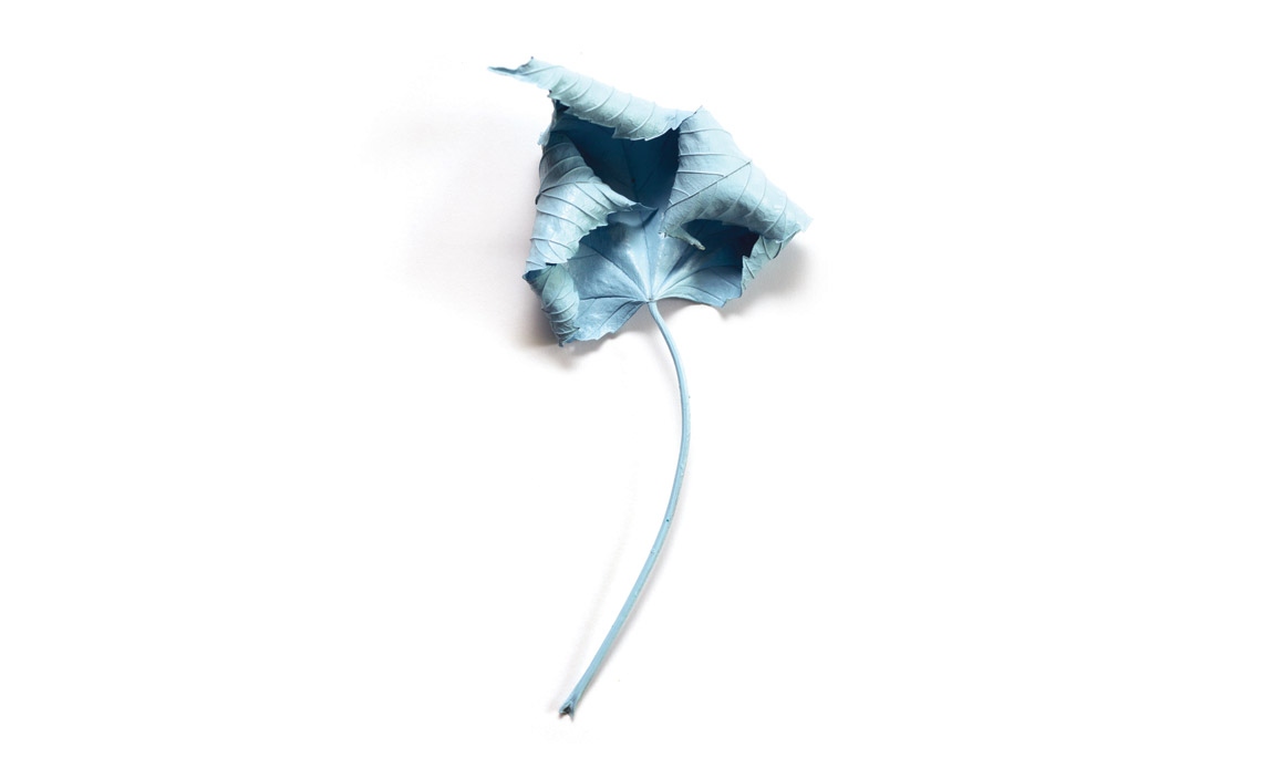
The image stayed with me, so I took the idea of the constant line to the typography for this artwork, and designed a suite of artwork around the concept. My original version was just as bold as the blood I saw in the hospital that day, but the creators of an album series called ‘New Blood’ insisted that it was too bloody, so I changed the palette entirely to some classic clinical teal shades.
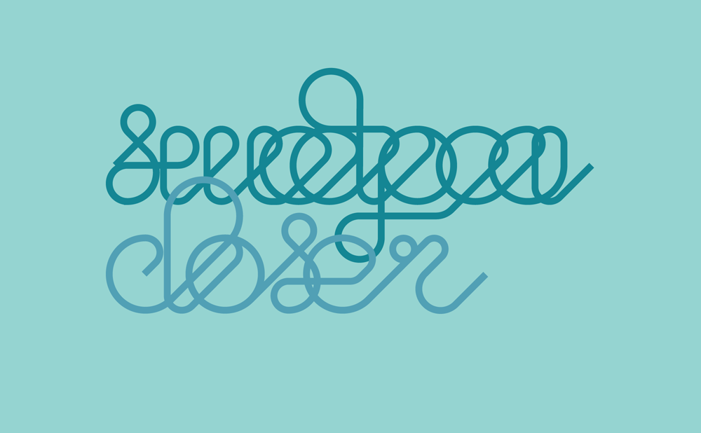
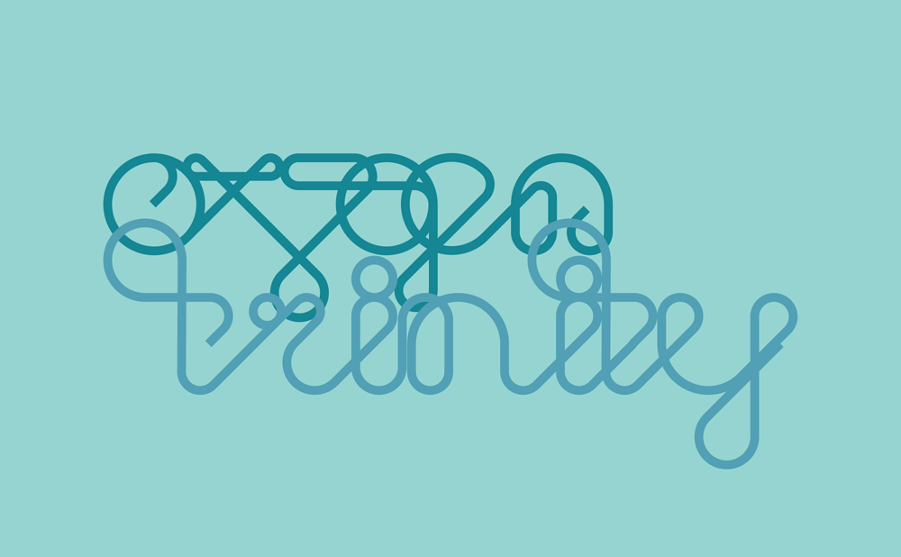
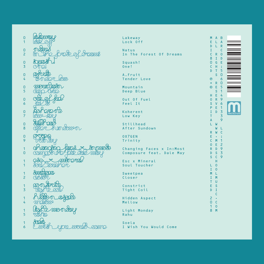
As well as the typography that made the cover itself, I also sweated the details with the entire tracklisting, with every artist and title drawn in the same single-line style. I was really pleased with how it looks, but we all agreed it wasn’t the most legible, so we compromised and I created a design that had transcriptions too.
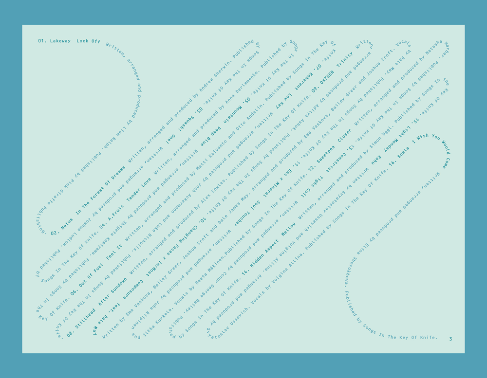
I continued the single-line concept through all aspects of the design, including all of the label copy, which I snaked on single weaving lines through the artwork on all formats. With most of my indulgences approved in the end, the album went off to press, and is out on Med School Music this week.
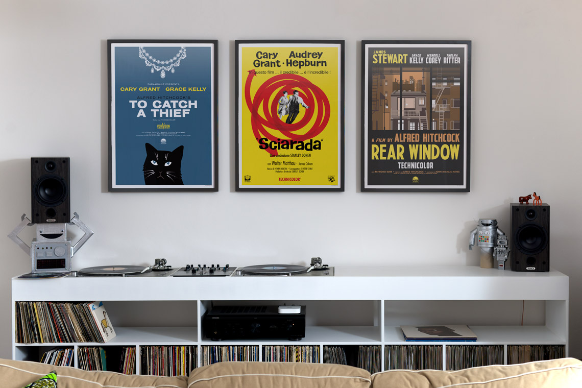
 The To Catch A Thief poster was the biggest gamble. Lilly is very fond of Grace Kelly and not-so-fond of cats, so obviously (?) this is a poster with a great big picture of a cat and no pictures of Princess Grace. I know my audience. The design is based on the
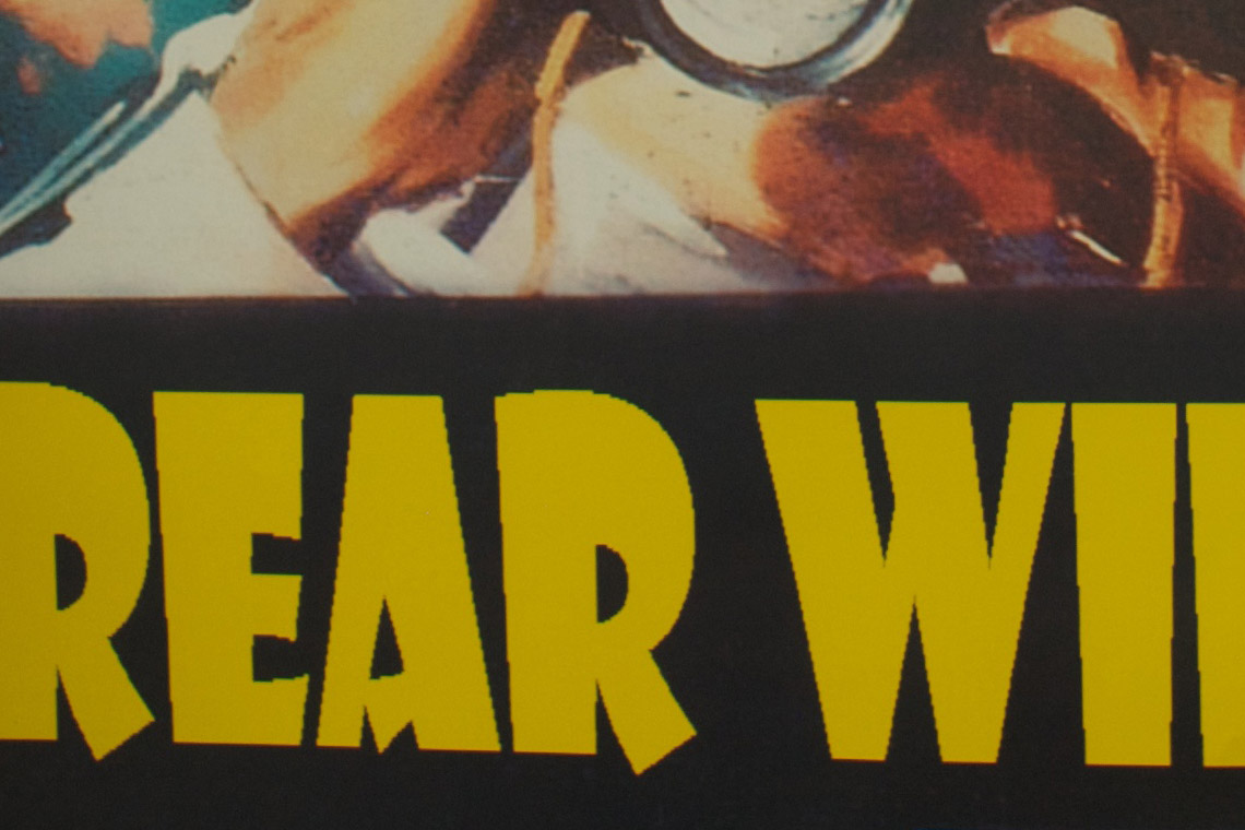
  Rear Window‘s poster took the longest to come together. My biggest problem with the
 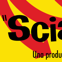 The poster for Charade came together easiest, but that’s because the source material was so great. I loved all the typography in Italian on her original poster, so that had to stay, and the bright yellow colour scheme was great fun too. All that was needed to tie it together were some of the graphics from Maurice Binder’s wonderful
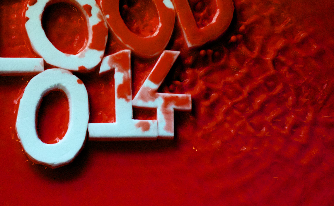


