Cover for me

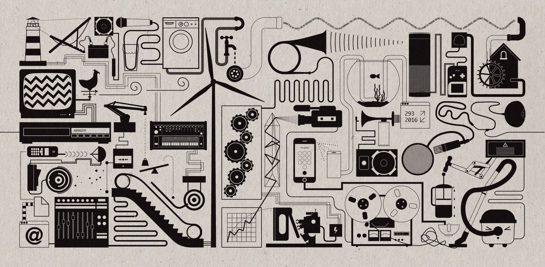
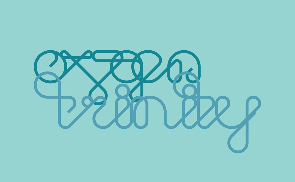
Designing record covers is ostensibly my job! Here are a couple of artworks I made this spring that I am particularly happy with:

Hospitality On The Beach 2019 Record Cover

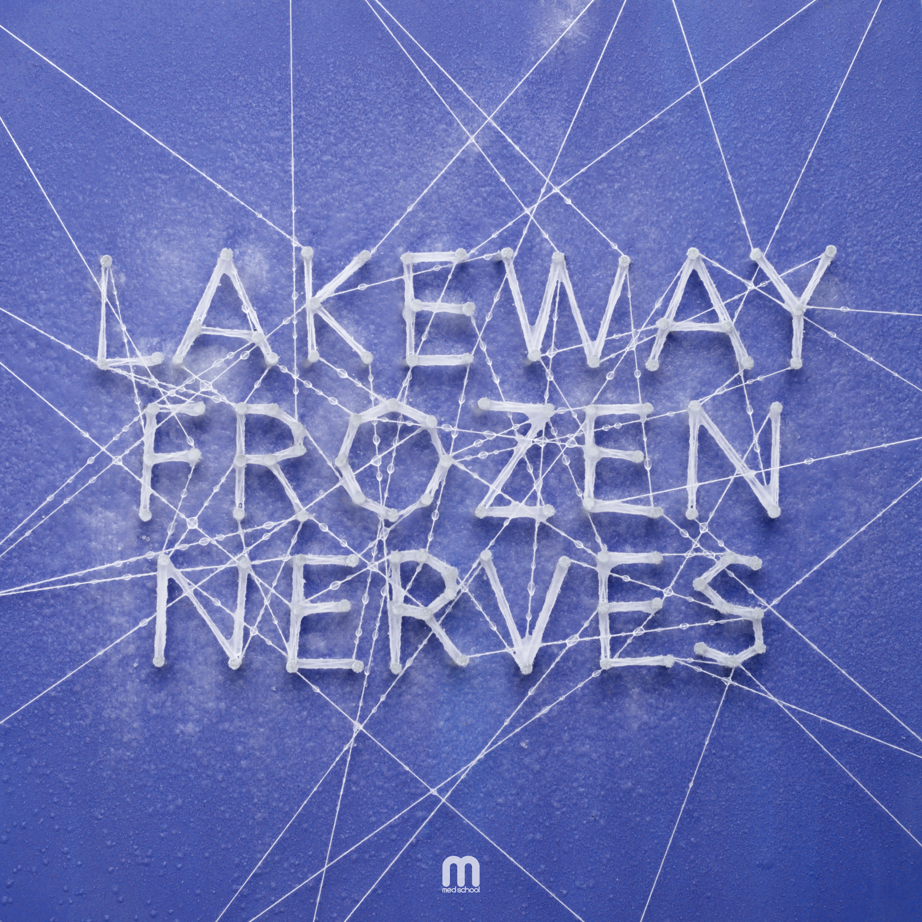
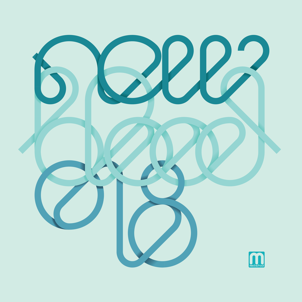
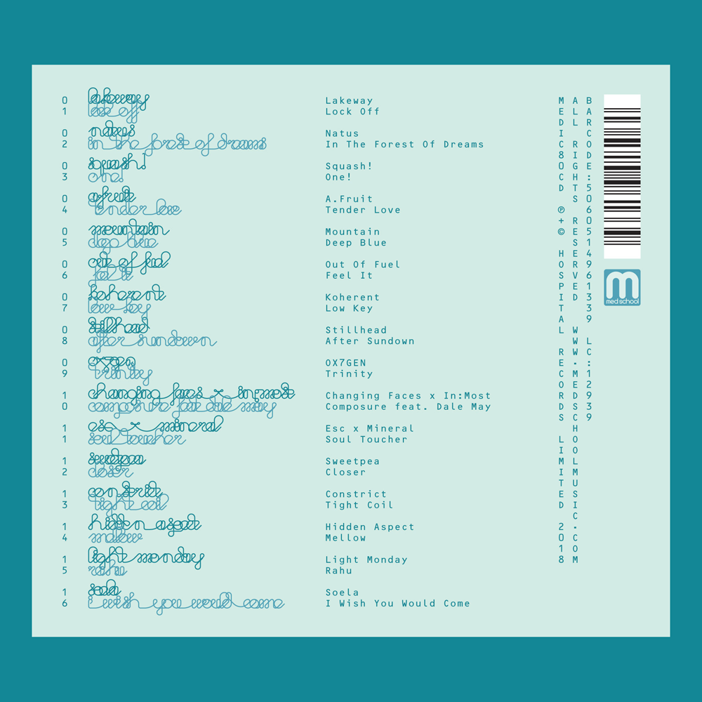
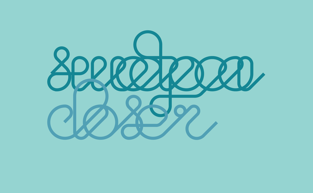
This year’s kind-of-annual Hospitality mix album was timed to tie in with the label’s Hospitality On The Beach party. Our first idea turned into an awkward problem involving a girl with a tattoo, so I decided to follow the form of the last couple of Hospitality albums, but this time make it out of sandcastles. Well, I really raided my baking cupboard and made it out of brown sugar, but the effect was perfect. I sculpted moulds out of foamboard and filler, and the cover basically did itself. I am pleased with it!

Etched vinyl disc for Urbandawn's 'Come Together' record

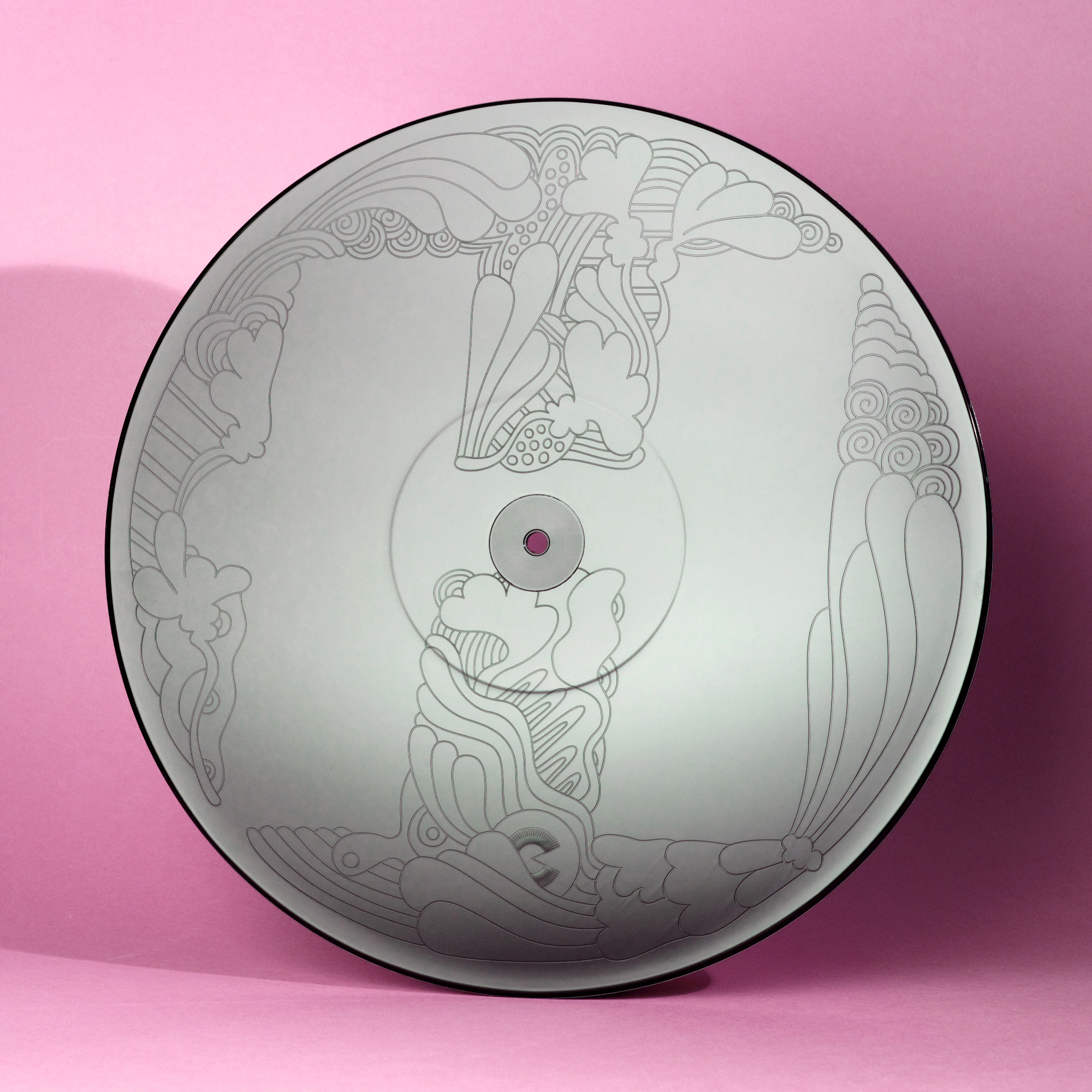
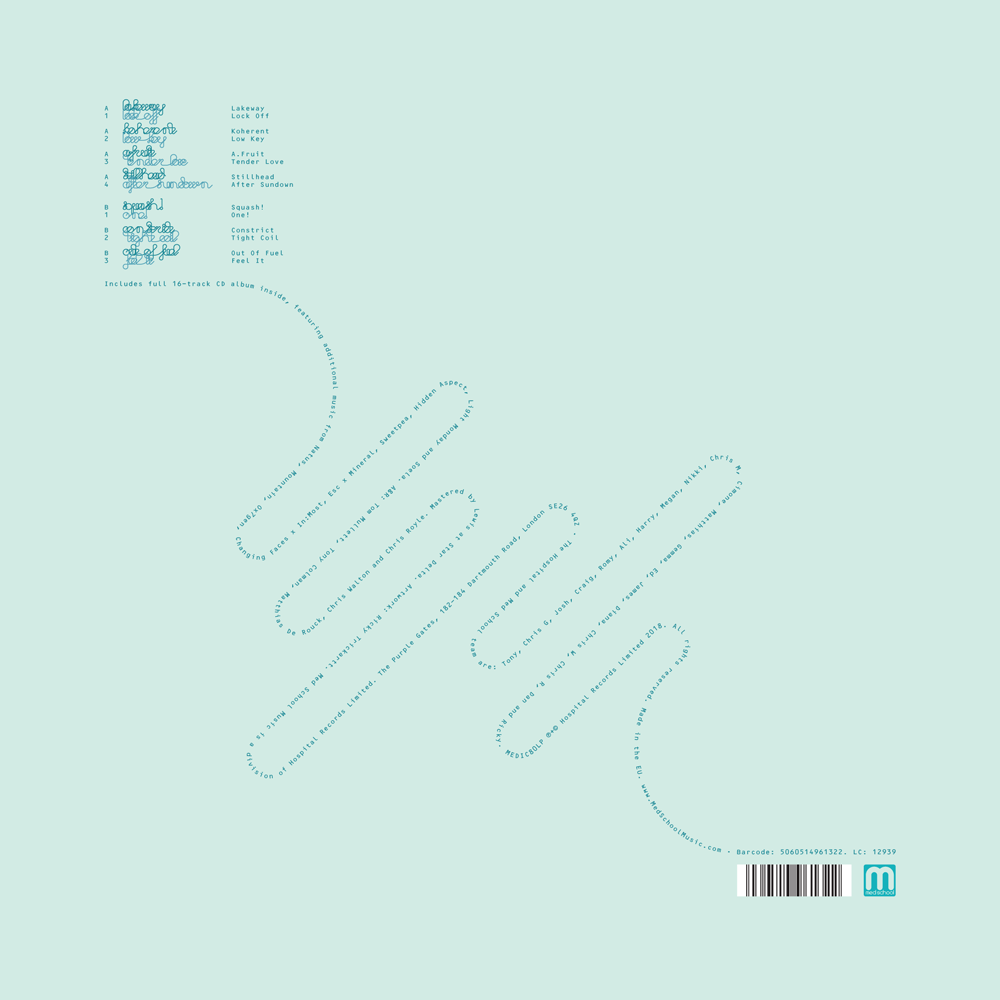
Urbandawn did a cheeky cover-version of The Beatles’ Come Together, and it blew up the club scene so much that Hospital felt obliged to release it. The cover design job fell in my lap, but having never been a fan of The Beatles, I found the job hard. It was as difficult as I found the task of designing beer labels as a non-drinker: these are worlds with very deep, revered cultures with which I have no relationship.

Given that, I must confess I don’t feel great about the actual cover I made. It’s a neo-Junglist agglomeration of Yellow Submarine and Abbey Road, so as a total outsider to Beatles Culture, I worry it seems like an awkward mashup of two things that a more learned person would never want together. But hey, it pleased the label and the artist, and has been well-received by its target market too, so maybe it’s a case of two great tastes that taste great together after all.

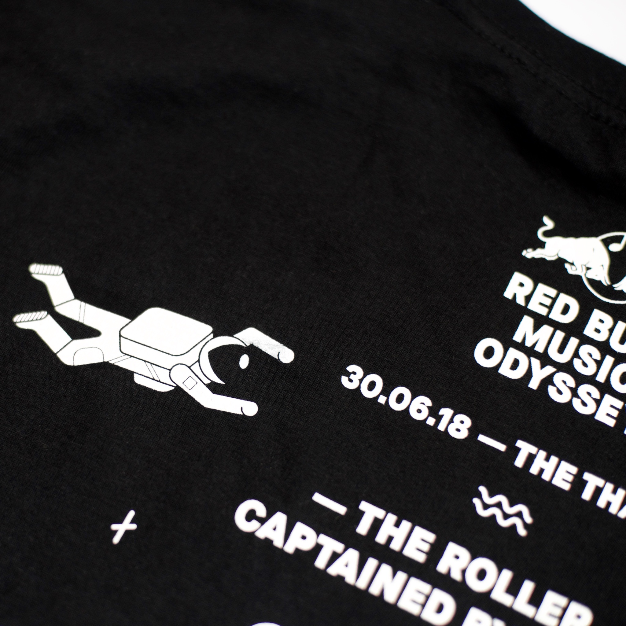
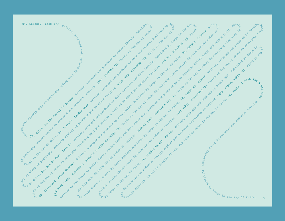
What I do feel great about, however, is what’s inside the sleeve! Hospital have been making an effort to make their vinyl more special as the market has continued its shift from DJs to collectors. Because this was a total one-off track, we got to do something for this I’ve wanted to do for a long time, which is to etch some artwork into the reverse of the record, as in most other contexts, the other side would’ve had another track.

Even better still, the design we had etched into the reverse was a revival of an illustration I did several years back. The illustration never ended up getting manufactured as the T-shirt I had intended it to be, and I was always a bit sad about its rejection as I was a big fan of the design. It suited this project perfectly, so it was an extra sweet reward to bring it back in such a unique context.

Etherwood's Lost In The Right Direction packaging

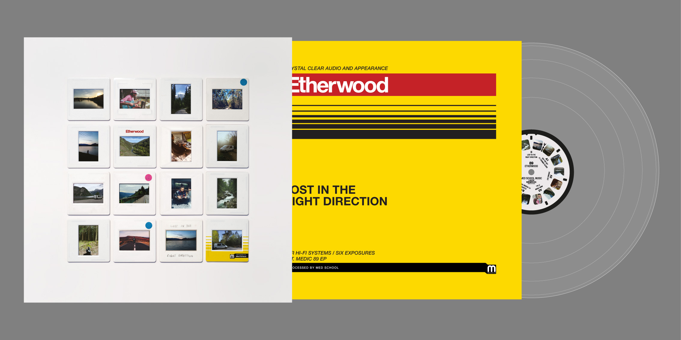
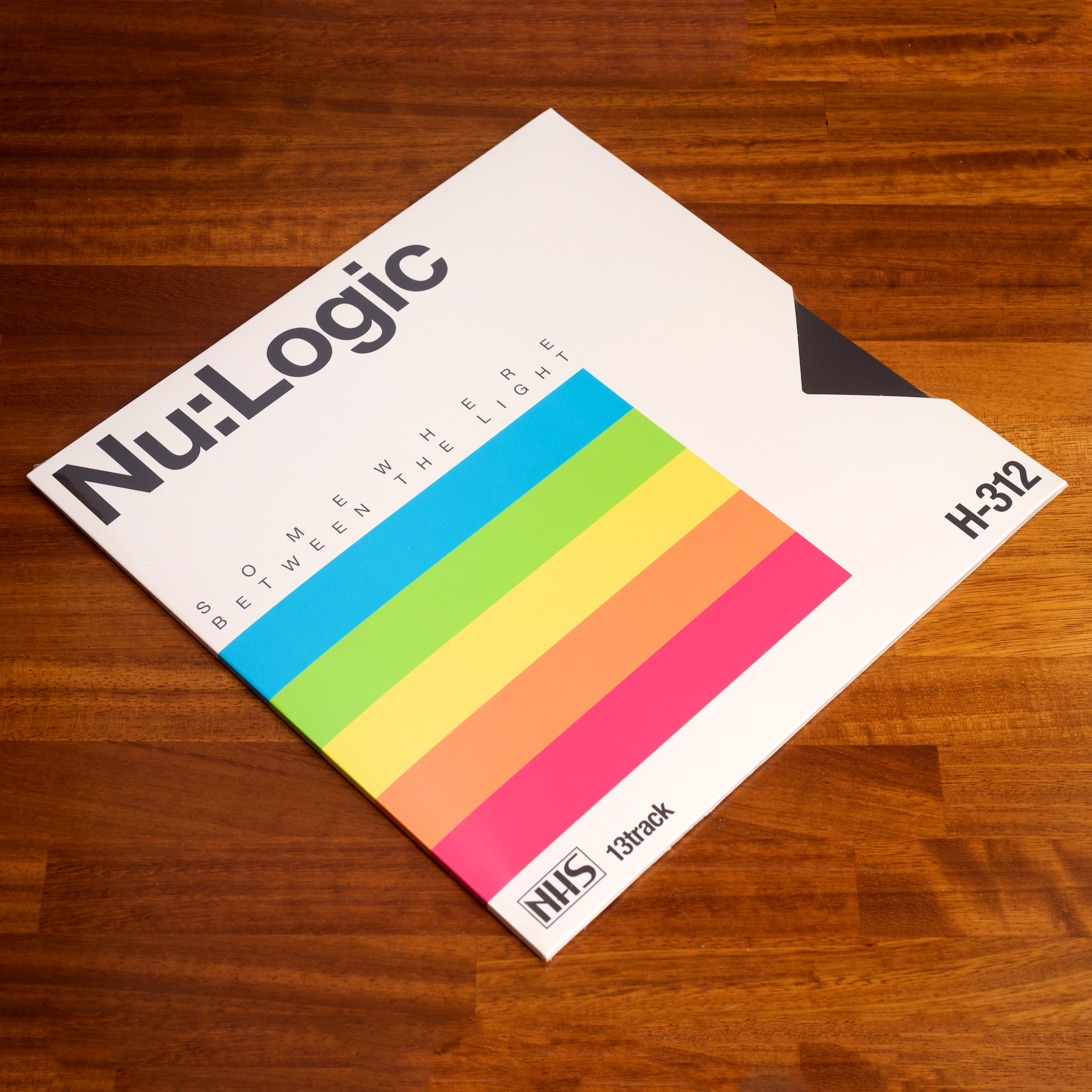
Etherwood has been living/touring in a campervan while writing music for his latest EP, ‘Lost In The Right Direction’. We wanted a way of snapshotting his life on the road, as it seemed like such a crucial part of the experience, but we only had a handful of in-the-moment smartphone photos to communicate that. We ended up using projector slides to contextualise these images on the cover, but my favourite part of this package is the inner sleeve.

Given the retro-photography concept of the cover, I extended the metaphor with the packaging of the inner sleeve. I wanted to evoke my all-too-brief darkroom days, and based on a couple of lovely comments left on my Instagram, it seems like it evoked it for other people too!

Levela - Cerebral EP

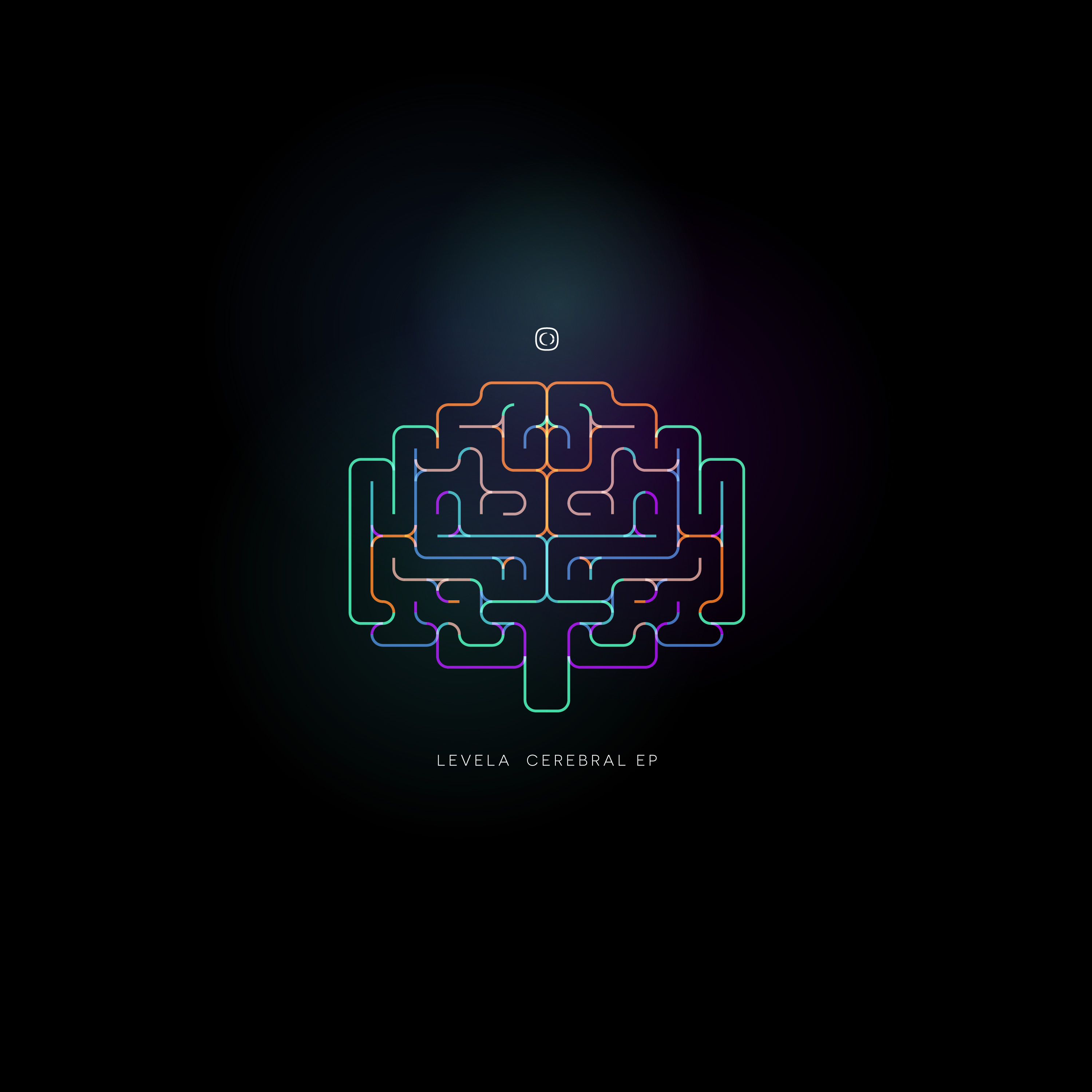
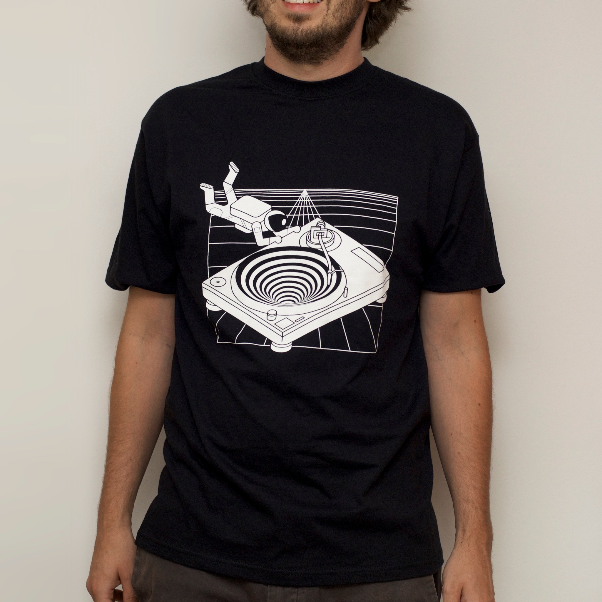
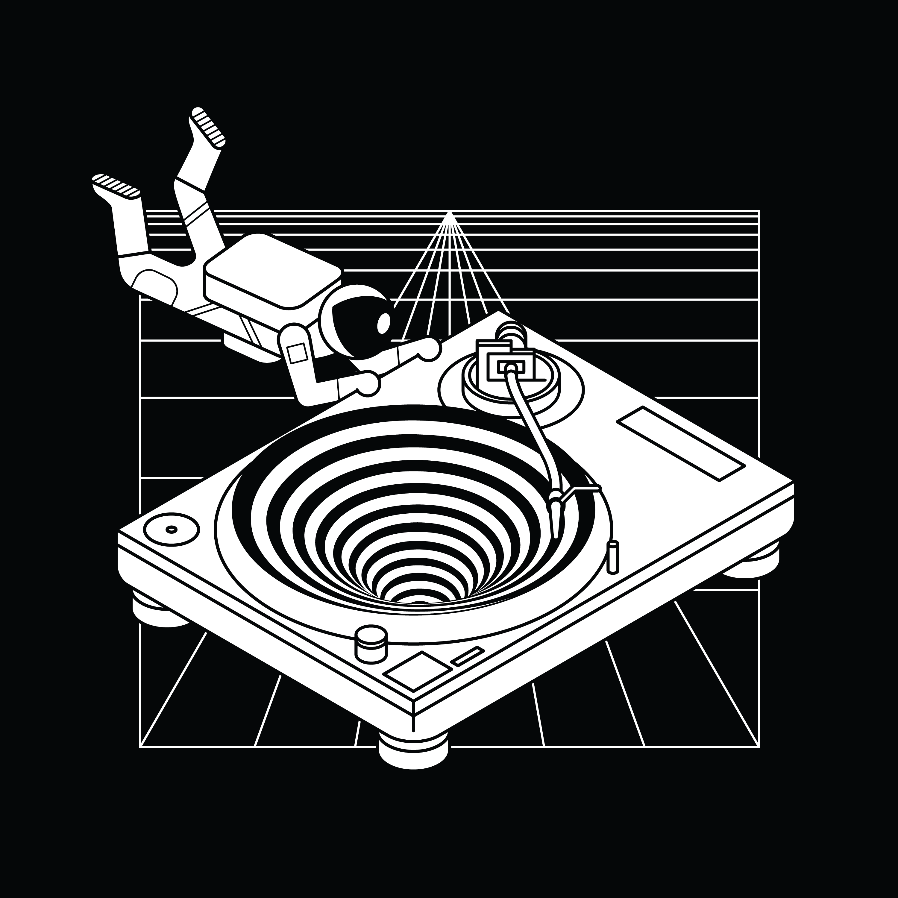
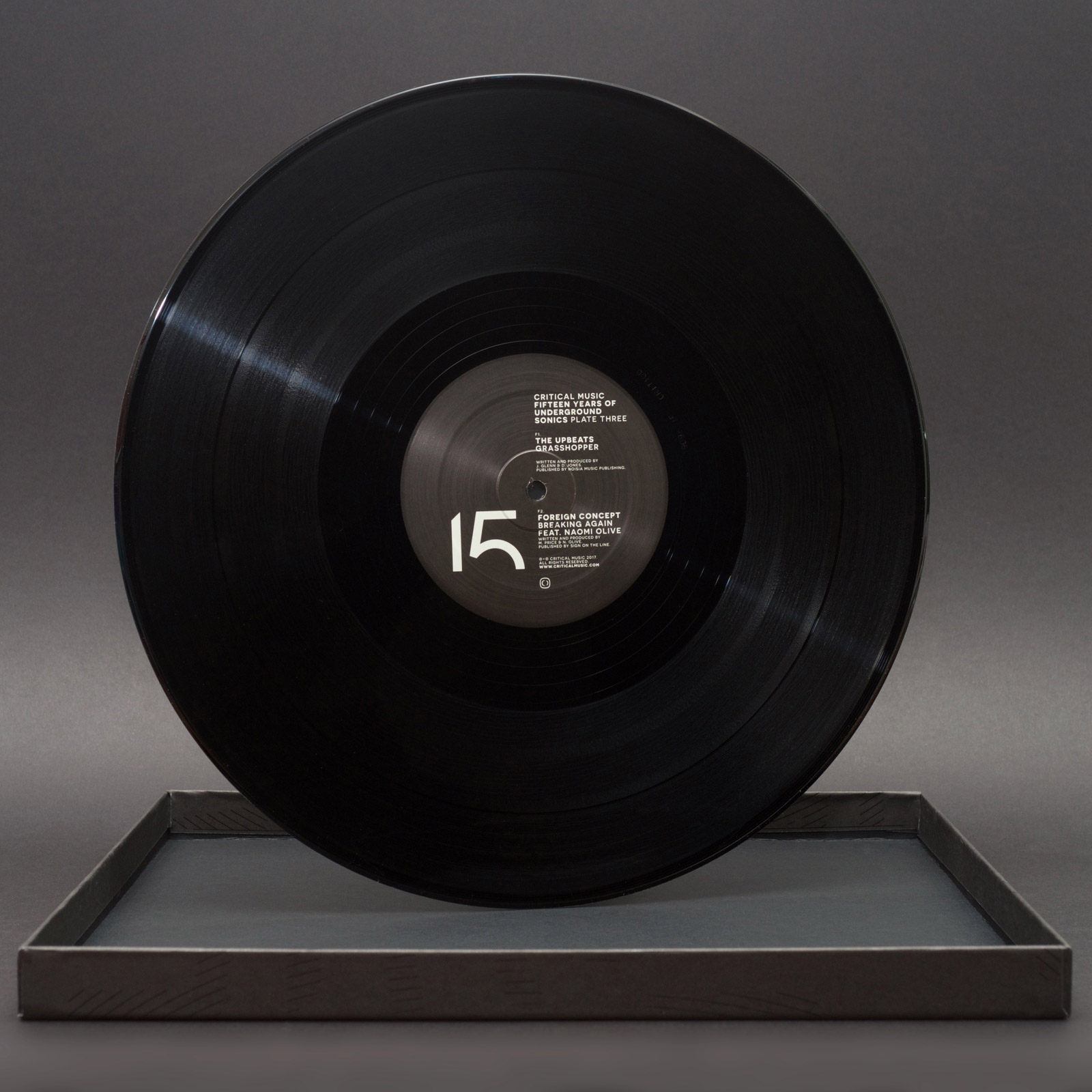
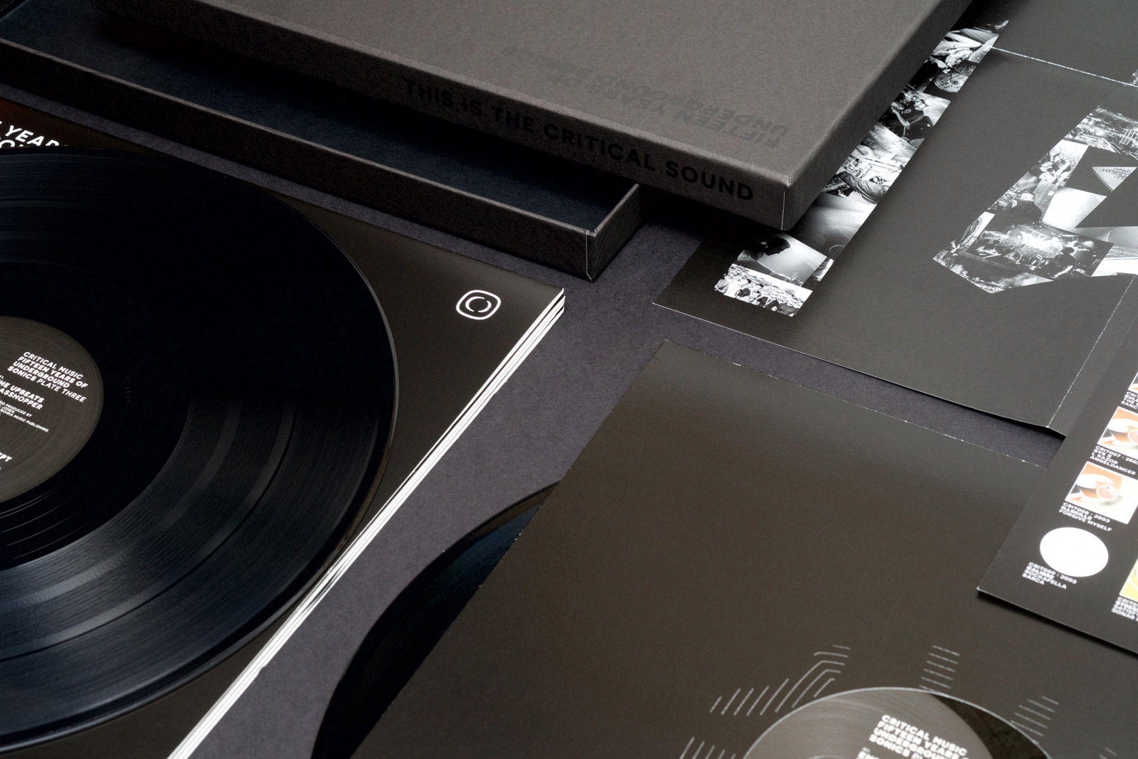
I still work with Critical, but my role with them has been a bit more technical lately, as they’ve been getting some excellent artwork done by some of tomorrow’s graphic artists. It was a nice treat to do a whole cover for them again, and this was a Critical classic – mostly black, but a shot of colours and oh-so-minimal. I’m pleased with how this one came out!

Freezing in a Heatwave

A new record cover I created is released today! It’s the debut single for a new signing to Med School Music – a chap called Lakeway. Aside from the title, I was kind of given carte blanche with the direction for this project, so I ended up creating some artwork intended to feel ‘connected’ like nerves, which I then physically froze.

I made it by hammering some carefully-placed nails into a surface I painted, then winding cotton thread between the nails (it’s all one continuous piece again!) to form the letters. I was happy with the design at that point, but it needed to represent the frozen part of the title too, so (obviously?) I put the whole thing in my kitchen’s freezer. I sprayed it with water at intervals until the ice had built up enough around the cotton threads for the lettering to solidify satisfactorially.

It hung out with the frozen peas for a couple of days while we got final approval, then for a little something extra, I timelapsed the ice melting away from it again and reversed the result, so it was becoming frozen again. Harry at Hospital Records then swept in and edited the timelapse into some nice motion graphics to accompany the track uploads to YouTube.

It’s nice to have a bit of ice-cold artwork for this long hot summer we’ve been having in Britain!

Odyssey Oddity

Exciting times arrived in Rickmansland this spring, bringing a small commission from a big company. Red Bull asked me to design a T-shirt for a music event they were hosting in June. Named The Odyssey, the event took place on a small armada of boats on the Thames.

I was asked to come up with a design that I felt represented Drum & Bass music, and being me, I wanted to steer away from the hoodies-and-graffiti visual cliches of the genre. Instead I tried to illustrate what the music does – offers a place to escape into something totally different to other stuff we have on our planet and sink into a different dimension.


Red Bull were also kind enough to post a brief interview with me onto their website, which you can read here. I am thankful that even with the tint of hindsight, I don’t sound too ridiculous in the article. If you like the T-shirt design, you can order yourself one here!

On Line

I’ve been feeling good about a lot of the record covers to come out of my brain-hands lately, but the cover for New Blood 018 deserves a spot of text to go with it – perfect for the blog.

New Blood 018

This artwork was inspired by a visit to my brother, who managed to break his leg while taking his kids to the park, and was in real-hospital as a result of the accident. One of his ward-mades was getting a transfusion while I was visiting, and I found the vividness of the blood running from the bag and through its tubing partly fascinating and partly humbling as it squiggled all over this poor chap’s bed.

NB018 CD Reverse

The image stayed with me, so I took the idea of the constant line to the typography for this artwork, and designed a suite of artwork around the concept. My original version was just as bold as the blood I saw in the hospital that day, but the creators of an album series called ‘New Blood’ insisted that it was too bloody, so I changed the palette entirely to some classic clinical teal shades.

Sweetpea - Closer - custom typography

Ox7gen - Trinity - custom typography

As well as the typography that made the cover itself, I also sweated the details with the entire tracklisting, with every artist and title drawn in the same single-line style. I was really pleased with how it looks, but we all agreed it wasn’t the most legible, so we compromised and I created a design that had transcriptions too.

NB018 Digital booklet label copy

I continued the single-line concept through all aspects of the design, including all of the label copy, which I snaked on single weaving lines through the artwork on all formats. With most of my indulgences approved in the end, the album went off to press, and is out on Med School Music this week.

NB018 Vinyl LP back cover

Somewhere Between The VCR Heads

Another record cover I designed recently has been getting a surprising amount of love… Nu:Logic’s second album ‘Somewhere Between The Light’ has been out for a couple of weeks now, and is my first Instagram post to not just reach but blow past 100 likes!

The design is a homage to old VHS packaging, which was an idea suggested by Nu:Tone and Logistics themselves. It was down to me to turn this idea into a record package, which tied together nicely with a retro thumb-hole cutout, printed inner sleeves for the records, and a solid black jewel case for the CD version too.

Even the shrink wrap looks good with the thumb hole design. Nice!

My Favourite None-More-Black Client

Critical Music marks its fifteenth anniversary and hundredth catalogue number today with the release of a super-limited-edition boxset I designed.

The design is intended to be part fanzine, part ultra-minimalist blackness, and contains five (!) pieces of black vinyl, in black sleeves, with a black booklet and black poster, in a matte black box with a gloss black print on it. Short of being made of vantablack, it’s like how much more black could I make this artwork for Kasra, and the answer is none… None more black.

To celebrate the blackness (and to torture myself photographically), here are a load of photos of black objects from the package, set against a black background.

A Quick Cuppa

Here is my latest and greatest record cover artwork! It’s for St. Petersburg’s Bop, and a collaboration between Med School and Microfunk.

Bop wanted the artwork to look “pretty but a little bit dangerous so you wouldn’t drink it”. I tried using petrol to get a thin-film effect, but it made my Rickmansland studio smell like a garage. After a different approach, I ended up on this psychedelic cup of cha. It’s one of my favourite pieces of artwork in a little while, and it’s out today!

Appendix: A Nice Way to End a Strange Year

It’s not often you get the opportunity to revisit a commissioned design project, but it happened to me this year. To close out their twentieth year in business (and the coincidental timing of the big-number NHS300 in their catalogue), Hospital has published another book.

NHS300: Appendix

We called it Appendix, which I’m sure my more loyal followers wouldn’t be surprised to hear was my idea, given my puntastic instagram feed. It’s a 180-page hardback book, approximately the size of a 12″ record, that comes with a six-track EP of collaborations between some of the label’s current album roster. It’s a proper coffee-table art book!

Appendix: Identity

NHS300 is like a bigger, better version of NHS200. As well as being a lot larger and more robust physically, it also includes a lot more content. Naturally, it includes all of the label’s history and artwork roots, a lot of which has been expanded upon and rephotographed for the project.

Appendix: Early Logistics

It also encompasses the five years that have (unbelievably) happened since NHS200. In that short time, there has been a hundred more releases on Hospital, another 38 on little-sister Med School, a huge shift in the stable of artists working on albums for the labels, and countless ever-growing parties, all of which is covered in this book.

Appendix: New Blood

As well as rethinking the design of the book from the ground up, another new feature is more writing from me! I seem to have made a bit of a career at Hospital of writing silly things on products as placeholder, only to have the label staff tell me to leave it there as they like it.

Ricky's Rejects
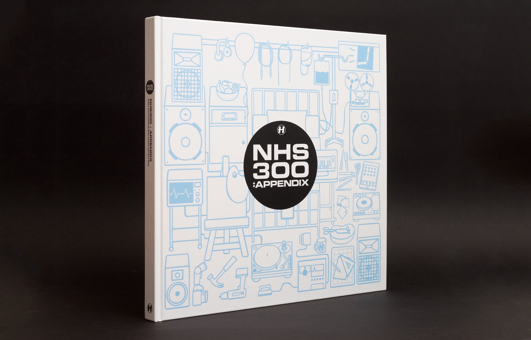
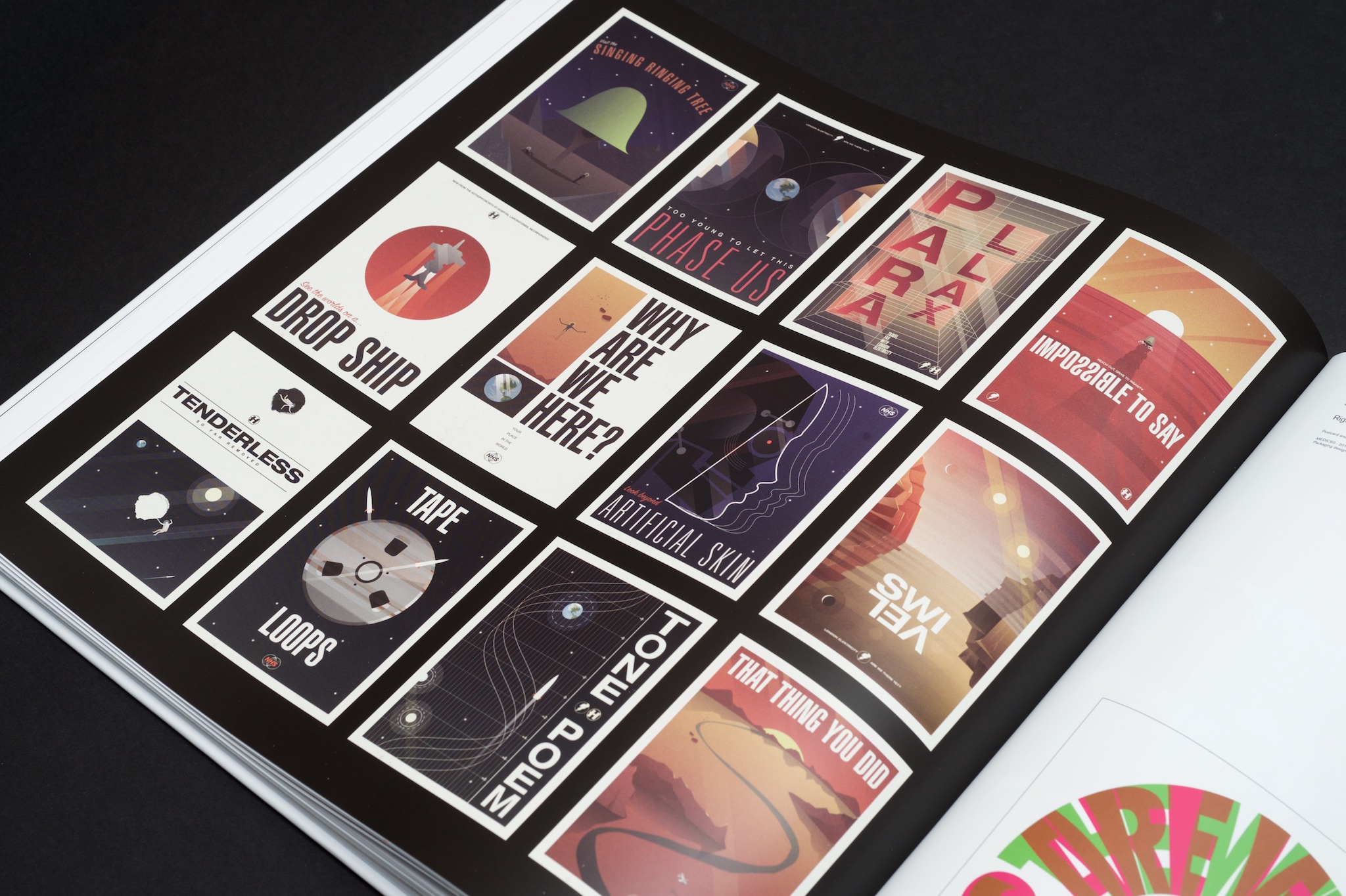
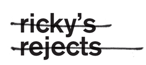
This has come out in Appendix in the form of a running ‘Ricky’s Rejects’ section, where I pick out some of my favourite record covers that never were and explain why they didn’t make the cut. From my first-ever album project at Hospital a decade ago, all the way up to NHS298, things are still getting caught in the filters, and I pick out some of the highlights. You’ll have to get the book to see them!

Appendix: Are We There Yet?

Appendix: 2016

I also got to illustrate a unique cover for this, which is another satisfying improvement over NHS200. It’s a hospital room entangled with all the things that make Hospital Records what it is – music, medicine and making things, which I hope is reflected in this book!

To promote the book, Hospital MD Chris came out to my studio in the shires and we chatted about some of the artwork highlights from the catalogue. You can see the video (and some odds and ends from inside my world!) here:

NHS300: Appendix is being sold exclusively on the Hospital Shop. It’s a totally limited product – we won’t be manufacturing any more once they’re sold. So if you want one, you can have it, and just in time for Christmas too. They’re shipping now! It’s an essential object for fans of the label.

Appendix: Spines

Still Not There Yet

One day in a meeting at The Purple Gates, Tony said ‘I’ve had a great remix done from Are we There Yet, maybe we should do a whole album of remixes’. A few weeks later, I was briefed on ‘Are We There Yet: The Med School Scans’.

Tony’s idea for the artwork was Soviet X-ray bootlegs, but this wasn’t something we could produce with any kind of authenticity, even on a small scale, without looking like just another X-ray record cover.

Instead I came up with an idea for coloured vinyl with a purpose (rather than coloured vinyl for novelty), and made a cover design that you have to scan with the record to be able to read.

The whole project looked great once printed – fluorescent Pantones worked perfectly with the colour-blocking idea and look super-tasty in person!

Mystery Machine

Krakota's Strange System

More newness! Here is the artwork I created for Krakota’s debut album. He called the album ‘Strange System’, which is totally up my alley when it comes to record titles.

The title made me think of black boxes (as in science/engineering, not aerospace), which are systems that you can give input to and get output from without having any idea of what happens inside the system. I had some crazy idea to create some artwork completely obscured by a black box, but that was too, well, obscure. Everyone on the project seemed to like what I was drawing to go into the box though, so we ended up with that as the cover itself.

Krakota Black Box

Everything is connected in this artwork! Clearly some of the objects are straight out of the mechanical/system corners of my noggin, but a lot of it comes from Krakota – his love of vinyl, celebratory beers and coffee to fuel the writing process, audio bits and pieces, and objects taken from some of his track titles. On the cover is a xylophone (from Xylo), a ghost, some samphire, an ice machine (for Ice Hands), some bones (for Lazy Bones), and the odd elastic bands. There are more track titles in the gatefold artwork too.

krakota-gatefold

I kept my illustrations on this artwork as geometric as possible to make it feel very mechanical, so to contrast that and bring it back into the world of humans, we had all the artwork printed on a nice and heavy unbleached card stock. It roughs it up just the right amount and looks pretty fresh in physical too.

Check the Hospital Shop if you need a copy in your life!