Here’s an album cover that started in an unusual place: A shop window in Camden.
After Hospital had a successful six weeks doing a pop-up shop at Shoreditch’s Boxpark in the summer, they organised another pop-up in November – on Camden High Street, and for one week only. Holidaying meant I missed the opportunity to flex my creativity at the Boxpark shop, so when I heard about the next one, I told Hospital I wanted to go there and put a big H in the window. They agreed, but didn’t really seem to understand why I was so excited by the prospect.
Setup day sprung up out of nowhere, so I met Craig and Oran from Hospital at the shop, where they were assembling Ikea furniture, and put myself to work on the window.
Inspired by the positive reception of the Robots T-Shirt I created earlier that autumn, I had the idea of making the H logo up out of a load of medical and musical items. I got myself some chalk pens, marked up the outline of the H, then started drawing. My enthusiasm didn’t last very long.
Being completely unprepared beside the vague idea in my mind, I only got about six objects in before I started worrying that A) I had ran out of ideas of objects to draw, and B) my chalk pens were going to run out on me. I think Oran and Craig spent the entire afternoon laughing at my complaints of ‘I don’t know what to draw next!’.
It took hours of perseverance and several encounters with Camden crazies (some people just stared at me like I was a zoo animal, bewildered, though I liked the people who gave me a smile or a thumbs-up), but by dinnertime I somehow managed to finish it.
This slightly rough animated GIF of the pictures I was taking as I progressed makes the whole process look a lot easier than it was:
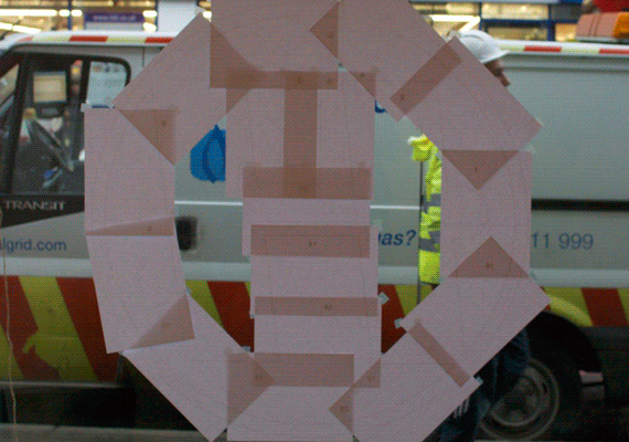
I had to draw the whole thing back-to-front as it was inside the glass!
Dinner was had and the shop opened to the public the next morning. The directors of Hospital visited to inspect the property, and finally my enthusiasm made sense to them – I hadn’t told them the specifics of my plan, so they weren’t expecting what they saw! Tony (London Elektricity) loved it so much he decreed it should be the cover for the eighteenth-anniversary album they were planning to kick off with in 2014.
Tony described this as ‘temporary art’ when he Instagrammed it, which made me smile – lots of his followers thought he meant contemporary (I guess it was that too?), but temporary was definitely the word he meant as it was washed off the window when the week’s stay was up.
The problem with Tony’s suggestion of using it for the album cover was that co-director-art-director Chris had his own ideas of what the artwork should be, and he wanted to go down the pharmaceutical route.
I decided I had better do a bit of research into the pharmaceutical packaging. I went to my local pharmacy, but sadly, they wouldn’t let me take any photos of their shelves.
Conveniently (if you could say that), a lot of my 2013 up to that point had been preoccupied with my own personal medical adventures. I was given all kinds of elaborate scans on my body that made me feel like I was in an expensive medical drama, and received a cornucopia of prescriptions in a variety of packages too. Being the design dork I am, I had been keeping all of these packaging designs, so I had plenty to inspire me after all.
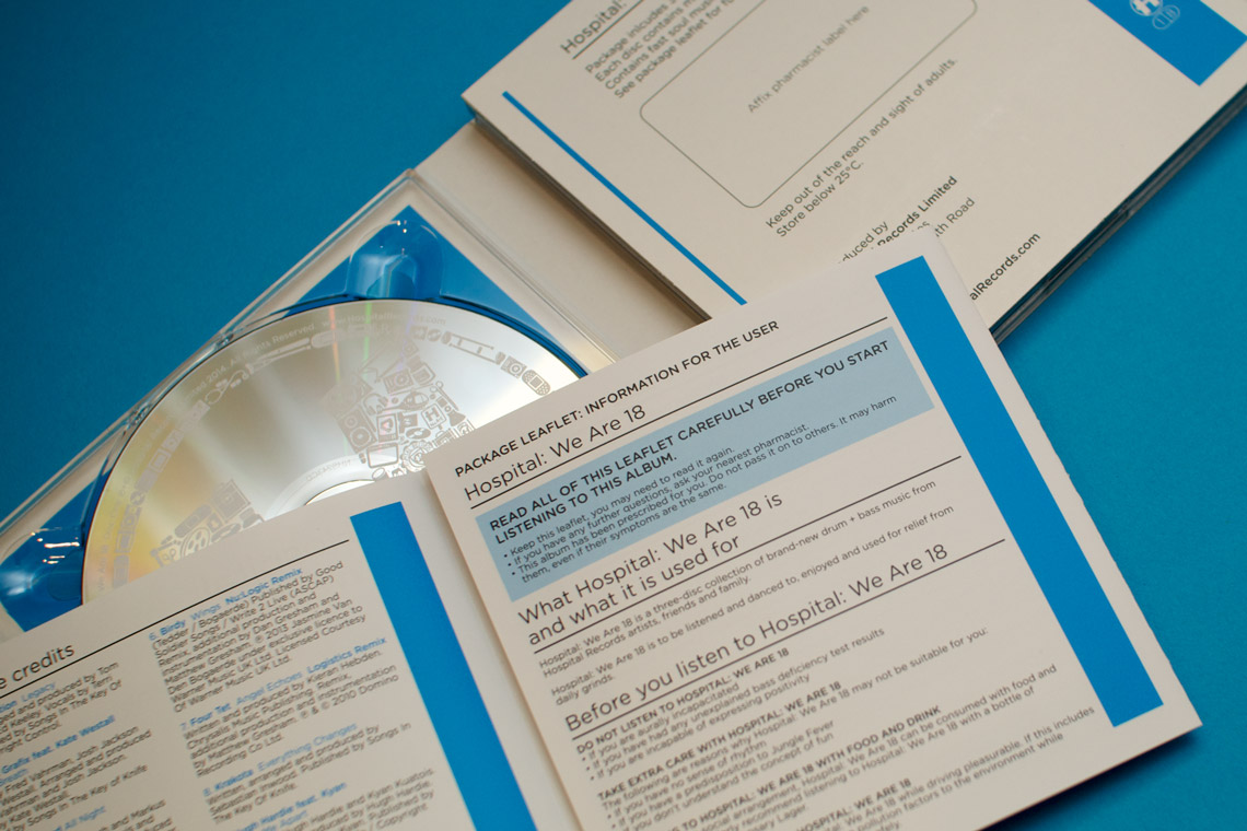
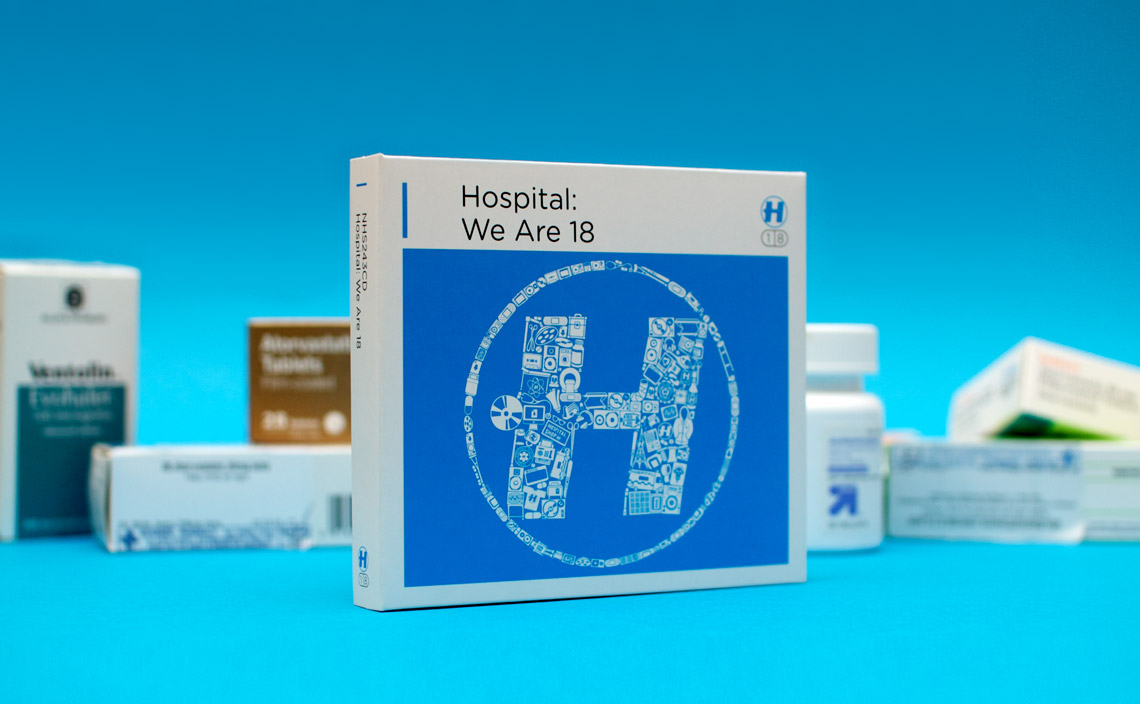
We were doing a digipak with a separate booklet inside, so I took the opportunity to make the booklet into a patient information leaflet, inspired by the leaflets in all the medicines I had been encountering. Yes, all of that silly writing is once again my fault!
The trickier part was bringing these two completely different artistic ambitions together. We didn’t have any particularly good photos of my window, and even if we did, my drawings on it were too shonky. I decided the next logical step was redrawing it so it would last longer than seven days on a piece of glass in North London. If I thought doing the original version (which I was making up as I was going along!) took a long time, I wasn’t ready for the days I spent reworking it.
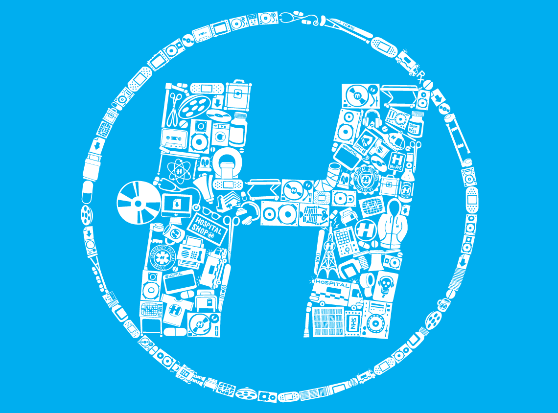
Slowly, everything fell together – both directors were pleased, the artwork was complete, the finished product was delivered to The Purple Gates last week, and in its 100% cyan print, it looks crisp.
I guess it goes to show how when you put time into developing and reiterating ideas, the results can be really worth it!